 Cédric Roussel
- i3mainz—Institute for Spatial Information and Surveying Technology, Mainz University of Applied Sciences, Mainz, Germany
Shapley additive explanations are a widely used technique for explaining machine learning models. They can be applied to basically any type of model and provide both global and local explanations. While there are different plots available to visualize Shapley values, there is a lack of suitable visualization for geospatial use cases, resulting in the loss of the geospatial context in traditional plots. This study presents a concept for visualizing Shapley values in geospatial use cases and demonstrate its feasibility through an exemplary use case—predicting bike activity in a rental bike system. The visualizations show that visualizing Shapley values on geographic maps can provide valuable insights that are not visible in traditional plots for Shapley additive explanations. Geovisualizations are recommended for explaining machine learning models in geospatial applications or for extracting knowledge about real-world applications. Suitable visualizations for the considered use case are a proportional symbol map and a mapping of computed Voronoi values to the street network.
1 Introduction
Geospatial explainable artificial intelligence (geospatial XAI) is utilized to analyze and understand machine learning outputs for geospatial use cases. One effective technique for XAI is the use of Shapley additive explanations (SHAP) (Lundberg and Lee, 2017). SHAPs enable the explanation of machine learning models globally and locally by their features. This technique is model agnostic, meaning it can be applied to any trained machine learning model. Different plots are commonly used to visualize SHAPs. For a global explanation, the summary plot is one way to show all SHAPs of all predictions at once. For local explanations, the force plot and the waterfall plot are popular, showing the local impact of the feature values on the model’s prediction. SHAPs can be used for various applications. However, when it comes to geospatial data, to our knowledge there is a lack of appropriate visualization techniques that intuitively integrate the Shapley values with the geospatial context. While the features themselves in geospatial use cases can be visualized like any other use case in known SHAP plots, the geospatial context is lost. It is possible that features with the same value may have different Shapley values at different geographic locations, which cannot be observed in these plots. To address this issue, this paper presents a novel approach how to visualize SHAPs and interpretations of SHAPs in geographic context. The innovative visualization method is demonstrated through a regression problem that predicts bike activity for a rental bike system based on real life data from the city of Hamburg, Germany, using a black-box neural network.
Regarding SHAPs, ‘[it] has been noted that they are not a measure of how important a given feature is in the real world, but rather how important a feature is to the model’ (source: https://github.com/shap/shap/issues/1120, comment by GZuin on 24 November 2020). However, we think that SHAPs have the potential to provide insights into real-world applications. The real-world model is unknown, and we aim to enhance understanding it by utilizing machine learning and XAI with an appropriate visualization. In the case of a rental bike system, it is important to know what factors influence the bookings at stations. With this knowledge, domain experts could take measures to improve the attractiveness of their rental bikes. It could also help with the installation of a new station. Of course, the bike system operator only wants to install stations in locations where many features have a positive impact on the number of bookings. These influencing factors could be analyzed by an explainable AI and communicated with suitable visualizations. In order to address the objectives, we define the following research questions.
• How can the geospatial distribution of explanations be visualized?
• How can an area-wide knowledge extraction analysis be visualized?
• How to visualize which features have the highest impact and where?
To answer research question 1, we will use a point visualization to display the exact locations of the explanations. The visualization methodology will be based on literature that identifies which visual semiotics are most effective for different types of data. For research question 2, we will utilize a visualization technique that can visualize point data across the entire geographic area of the city. To answer research question 3, we will use the techniques from the first two questions and visualize only the value and corresponding feature with the highest impact on the prediction. Within this, it is possible to visualize the highest positive, highest negative, or highest absolute impact. To evaluate our visualizations, we define requirements that the visualizations for geospatial XAI should have that are not covered by traditional SHAP plots. At this stage, we will not evaluate each visualization with humans, as the goal of this study is to demonstrate the concept and its feasibility of using SHAPs with a visualization on a geographic map.
The paper is structured as follows: In Section 2 we will present the current state of the art for geospatial XAI and relevant visualizations. In Section 3 we will focus on the data, the implemented machine learning model, the calculation of Shapley values for the selected use case, and the visualization concept. In Section 4, we present the results and discuss them, considering our stated research questions and requirements. We will conclude the results of this study and give an outlook on future work in Section 5.
2 State of the art
XAI has the potential to increase the understandability and trustworthiness of machine learning models. This is achieved by generating explanations that can be understood by humans to describe the decisions and actions of AI systems. XAI techniques are predominantly utilized in the analysis of image and tabular data. Geospatial XAI refers to AI systems for regression or classification problems using geospatial data. Geospatial data merges geographic location information with ‘attribute information (the characteristics of the object, event or phenomena concerned) and temporal information (the time or life span at which the location and attributes exist)’ (IBM, 2023, p.1). Consequently, the data itself can always be visualized in the form of geographic maps. However, this poses a challenge as the visualization of explanations from, for example SHAP, together with the geographic context becomes increasingly important. Common plots for XAI are inadequate because they do not combine XAI with the geospatial context in the visualization.
Geospatial use cases using XAI are diverse, for instance encompassing multiple applications in disaster management, such as forecasting slope failures and landslides (Maxwell et al., 2021; Al-Najjar et al., 2022; Fang et al., 2023; Youssef et al., 2023) or monitoring and combating wildfires (Cilli et al., 2022; Lan et al., 2023). Other use case categories could be potential location mapping, for example for gold mineralization (Pradhan et al., 2022) and wind and solar power plants (Sachit et al., 2022), or use cases within traffic and transport, such as the classification of road car accidents (Amorim et al., 2023; Ardakani et al., 2023). These cases serve as examples of the many possible use cases that utilize machine learning with geospatial data.
An in-depth literature review of geospatial XAI was already conducted by Roussel and Böhm (2023). The most utilized types of machine learning models are boosting techniques like the extreme Gradient Boosting Machine, Neural Networks, and tree-based models such as Random Forest and Decision Trees. The most commonly used XAI technique are SHAPs, followed by Local Interpretable Model-agnostic Explanations (LIME) (Ribeiro et al., 2016) and coefficients from models as feature importances. The review study by Roussel and Böhm (2023) examined current challenges in geospatial XAI and found that there is a shortage of appropriate visualizations for XAI in geospatial data. The study demonstrates that the geospatial context of the data is inadequately considered for a comprehensive understanding of the applied machine learning models. The authors conclude that: ‘[…] a map-supported presentation should also be included in the XAI part, as most of the commonly used plots cannot adequately visualize the geographical features. For example, research has shown that the summary plot for SHAP values is not a suitable visualization for the feature contribution of coordinates. A map-based presentation is essential to find and understand the impact of the geospatial component of the data’ (Roussel and Böhm, 2023, p.17). Other studies (Xing and Sieber 2021; Xing and Sieber, 2023) have also found that geovisualization techniques could improve the integration of XAI and GeoAI. In another study (Li, 2023), the feature coordinates was further analyzed, and the package GeoShapley was implemented. The package combines the coordinate pair into one feature, as they would be considered two separable independent features otherwise. This package allows for the calculation of a Shapley value for the geo-component, which is a significant improvement in the field of geospatial XAI. However, adequately visualizing the explanations remains a problem, not only for the coordinates but also for every feature and comparing them as well.
Currently, there is a gap in visualizing explanations like SHAP for geospatial use cases. According to the review study for geospatial XAI (Roussel and Böhm, 2023), and to our knowledge, there is a lack of studies using a suitable visualization method. One study, where visualizations of Shapley values on geographic maps where used is by Li (2022). However, the visualization method used is insufficient for our stated research questions. In the study by Li (2022), they implemented a machine learning model for the use case of ride-hailing and used SHAP to explain it. They then visualized the Shapley values on a geographic map using the census tracts in Chicago. This leads to the problem that the visualization includes areas where ride-hailing is not possible, such as rivers or buildings. In addition, they did not visualize the spatial distribution of the Shapley values of all the other features in the dataset, which is our goal. We do not want to visualize the impact of location in use cases like ride-hailing, but rather the spatial distribution of features in the use case, as they may have different impacts in different locations. Our research has different goals than the one by Li (2022) and therefore cannot be compared.
Studies that utilize geospatial data and XAI still rely on conventional SHAP plots, such as the summary plot or force plot. This study aims to show the benefits of using geovisualizations for XAI to not only better understand the machine learning model, but specifically in relation to the real-world demands of the geospatial use cases.
3 Materials and methods
This Section presents the data and the machine learning model for the use case, the rental bike system. Then, the calculation of the Shapley values and the visualization concept are shown.
3.1 Data and machine learning model
Bike stations have a geospatial context with precise locations and are therefore suitable for this kind of study. Rental bike systems have a certain capacity for each station. To help managers of these systems, it can be helpful to estimate the bookings for a station at a given time, or to estimate the bookings at a potential location for a new station. In research studies dealing with data for rental bike systems, car sharing or off-street parking, POI (Points of Interest) data from, for example, OpenStreetMap1 have been used to define geospatial factors (Wagner et al., 2014; Klemmer et al., 2016, 2018; Willing et al., 2017; Rolwes and Böhm, 2021; Schimohr and Scheiner, 2021), which can then be used for machine learning.
The original data was obtained from Deutsche Bahn AG2 and is published under the Creative Commons Attribution 4.0 International CC BY 4.0 license. The data includes booking numbers for each station in the rental bike system in Germany for the years 2014 to May 2017. The used city of Hamburg contained approximately 200 rental bike stations. The raw data was then used to calculate the density of defined POI categories around each station in the study by Roussel et al. (2022) using the metric of geospatial impact by Rolwes and Böhm (2021). This metric uses three weights. The first weight is used for the distance of a POI from a station. If a POI is further away, it becomes less important for the station, as people are less likely to book a bike at that station to go to that POI. The second weight is the probability that the POI is open. The POI data was retrieved using OpenStreetMap, which can have missing data. For this reason, a probability is calculated for a POI category to be open. The last weight is defined by the use case, in this case bike rental. Some POI categories are more important to bike users than others. For example, this weight would be different for car users. All three weights are then used to calculate a POI density for each station at each hour. Table 1 shows an example of a data point.
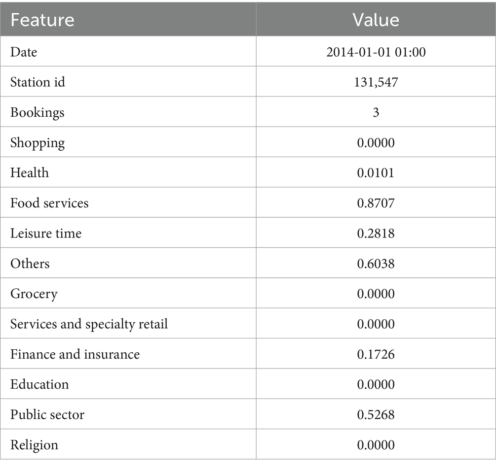
Table 1. Exemplary data point for the rental bike system use case.
This processed data is used as a regression problem to estimate the number of bookings at a station at a given time. For training, the data was divided into a training set (75%), a validation set (12.5%), and a test set (12.5%), and then scaled. In our previous study (Roussel et al., 2022), we predicted the bike activity using the processed data and a Neural Network. We predicted the number of bookings with deviations for each station for each hour. In this study we used a two hidden layer sequential Neural Network with swish activation function and Adam optimizer. We trained the Neural Network for 30 epochs with a batch size of 200 and a reduced learning rate after ten epochs to reduce the fluctuation in generalization. The model performed with a root mean square error of 3.2, which is the mean deviation of the predicted number of bookings for this use case. As this type of data, calculated with the metric of geospatial impact (Rolwes and Böhm, 2021) has not been used in other studies, the results cannot bet compared to literature. We compared the Neural Network with Logistic Regression, Decision Trees, Random Forest, and a voting classifier of all three and found it to be the best choice for this use case. In this study we will use the already trained model, as we already have assessed different machine learning models and tuning parameters in the study before.
3.2 Shapley values
SHAPs can be thought of as the impact of features on the output of the model. They are calculated using the mean prediction of the model (base value) and the model prediction of each data point. For each feature, a weighted average of marginal contributions to the prediction is calculated, resulting in the Shapley value. Following Equation 1 shows the calculation of Shapley values, which consist of three parts. First, the sum part adds up all values for possible subsets S ⊆ F \ {i}, where a feature can have a contribution to a given coalition. The middle part is the calculation of the weight, which is the probability that the feature joins a certain coalition. The third part is the difference between the outcome of the coalition with and without the considered feature. In machine learning this means that two models are trained, one with the considered feature and one where the feature is withheld.
The Shapley values then show the impact of all the features in pushing the base value towards the prediction. This means that the Shapley values depend on the average prediction of the machine learning model. If the Shapley values were calculated for only one data point, the base value and the predicted value would already be the same, and the Shapley values would not need to show any impact to push the average prediction to the true prediction. The values would all be zero. This is important to consider when recalculating SHAPs for a use case, as the sample of data must be the same. For regression problems, each feature in a prediction is assigned a Shapley value. For classification problems, there are Shapley values for each probability of a class. For example, if the use case predicts probabilities for three classes, there will be three times the Shapley value for each prediction for each feature. A disadvantage of SHAP can be that it may have problems with robustness due to data anomalies, missing data, outliers, or changes in the training set of the machine learning model. A new training set will change the mean prediction of the model, thus changing the base value of SHAP and thus all Shapley values. This needs to be kept in mind when using SHAP with different use cases, or even the same use case but different data. One solution could be to use Shapley-Lorenz values (Giudici and Raffinetti, 2021). However, this solution is currently underexplored in research and was very inefficient in an experimental implementation. For the purpose of our study, we think that SHAP is a good choice, as it is currently very well-known and stable in implementation.
We use a sample of the data to calculate the explanations (timestamp: 2016-07-23 16:00:00, Saturday). The reason for using only a sample of the data to compute SHAPs and not the whole dataset is that the time to compute SHAPs increases very quickly depending on the type of explainer chosen. Also, for a conceptual visualization, SHAPs are not needed for every data point. For the considered use case, we calculate the Shapley values using the Kernel-explainer. We cannot use the Tree-explainer, which is more efficient, as we used a Neural Network and not a tree-based algorithm. The complexity of the Kernel-explainer increases with the number of samples. For each calculation it is important to note which sample was used for reproducibility. Depending on the data sample, the base value changes and so do the Shapley values. Figure 1 shows the summary plot for our use case.
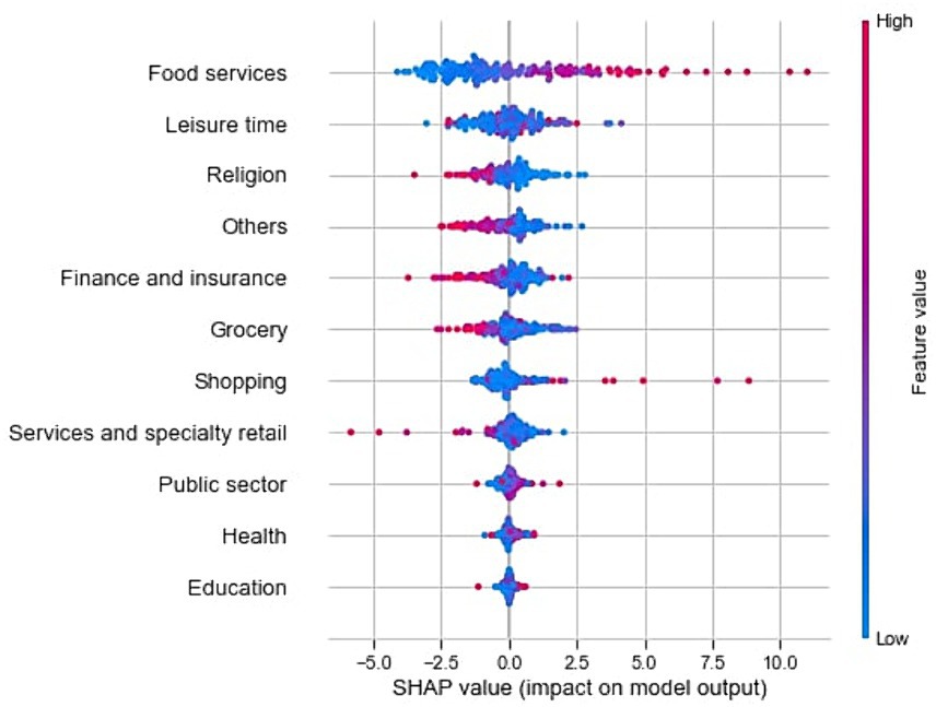
Figure 1. Summary plot for the sample data of the rental bike system.
The summary plot shows disadvantages when it comes to analyzing the Shapley values regarding the geographic context. It is not possible to identify geographic clusters, patterns, or outliers. The impact of the features cannot be analyzed in a geographic context. Our research questions cannot be answered using traditional SHAP plots. In addition, the summary plot is not interactive, and outliers cannot be further analyzed. These disadvantages lead to a lack of insight when it comes to explaining and understanding machine learning models with geospatial context. With our following concept and exemplary application to the use cases, we will show the advantages of a visualization of explainable AI for GeoAI.
3.3 Visualization requirements and concept
To implement and evaluate our visualizations, we define requirements that a visualization method should have for geospatial XAI using SHAP. We define the requirements according to our research questions and according to the current problems of insufficient SHAP plots.
1. Geospatial context: the visualization method must include the geospatial context in the explanations. This means that the use of a geographic map is inevitable.
2. Recognition factor: the visualization should be recognizable and based on the original use of the XAI method. For SHAP, this means that the known color scheme should be included in the visualization.
3. Precise values: the visualization should allow to extract precise values through interaction. A color scale on the side where the values are roughly measured is not sufficient.
4. Highest impacts: the visualization should have the ability to analyze the geospatial distribution according to the highest impact among all features.
Requirement 1 is the most important one, as this is the main goal of our study and is also represented in the research questions. We fulfill this requirement through our final geovisualizations, using geographic maps. To meet requirement 2, we use the quantitative divergent asymmetric color scale of SHAP, ranging from blue (RGB: 0,0,255) to magenta (RGB: 255,0,255). This leads to a better recognition factor, as users who are already familiar with SHAP can understand the visualization method more quickly. To reduce cognitive overload in the visualization due to many colors, we choose a gray map base layer. Otherwise, colors in the base layer such as blue rivers or green parks could be misleading in interpretation. We use Tableau3 as our visualization tool. Tableau is useful for prototyping because it allows for quick implementation of visualizations and has sufficient functionality for our study. In addition, the software allows for interaction by hovering and clicking to get more information. With this, we follow the visual information seeking mantra for user interface design by Shneiderman (1996, p.1): ‘overview first, zoom and filter, then details on demand’. With this, we can interactively extract precise values, which is necessary according to requirement 3. However, the processed data and the visualization method itself must be able to provide these precise values. To perform geographic calculations and operations, we use QGIS4, an open-source geographic information system. In preparation for requirement 4, we add six columns to our dataset. These columns contain the following variables: the feature with the highest positive impact (or smallest negative impact if there are no positive values) and its corresponding impact value, the feature with the highest negative impact (or smallest positive impact if there are no negative values) and its corresponding impact value, and the feature with the highest absolute impact and its corresponding impact value.
To address our research questions, we need two different types of visualization methods, one for a precise visualization and analysis of Shapley values, and one for an area-wide knowledge extraction analysis. Both types of visualization should also be transferable to answer research question 3 with the highest impact. As a solution, we propose a point visualization as a proportional symbol map using size and coloring, and a mapping of the impacts to the street network. The point visualization will primarily be used to address research question 1. Following known visual variables and their syntactics (Roth, 2017), we use location as the placement of the points on the map, color for the Shapley values, and size for the feature values, which are also shown in the summary plot. For the quantitative data we have, location and size are considered good choices. Other visual variables that are marginal but not poor choices are orientation, hue, color value, texture, and saturation. We use the SHAP color scale to satisfy the recognition factor requirement. Using another visual variable would reduce the recognition of the Shapley values and hinder the interpretation of the visualization. This visualization could also be used to answer research question 3, with the color representing the category that has the highest impact. The Shapley value is visualized by size, which can reveal differences in impact even when two points belong to the same category. The feature value is discarded as it is not relevant to this research question.
To obtain a visualization that covers more than just the exact locations, we will map the impacts for an area-wide analysis. A commonly used technique for an area-wide analysis of point data are heat maps, which are easy to implement and can be configured in a variety of ways (Netek et al., 2018). However, given our research goal, heat maps do not meet all of the requirements. Requirement 1 is met, as the heat map is a geovisualization and can show the data in a geospatial context. Requirement 2 could also be met, because the SHAP color scale can be used. With the third requirement, we have the first disadvantage of heat maps. It is hardly possible to extract precise values by hovering over locations. Impacts can only be estimated by the color and color scale in the legend. Requirement 4 cannot be met either. The heat map cannot be transferred to visualize the highest impacts. Features cannot be distinguished because heat maps do not allow multiple colors. After further consideration, there are more challenges that come up. One is that heat maps are affected by clustered points or outliers. Outliers appear less important and clustered points appear more important. Also, positive and negative values of clustered points can cancel each other out, which is hard to see in a heat map. Additionally, a heat map would overlay the entire city. Not only would the infrastructure be invisible, but the heat map would also show impacts over areas where it is impossible to place bike stations, such as rivers and buildings. This could be reduced by reducing the size of the heat map parameter and increasing the opacity, but then the colors and purpose of the heat map are lost. We do not think that heat maps are the solution regarding our target. Following Section shows our solution to this problem.
3.4 Shapley mapped Voronoi values
As a solution to the disadvantages mentioned in the Section before, we propose our Shapley mapped Voronoi values (SMVV), where we map the Shapley values to the city’s street network. It would be possible to use heat maps and intersect the heat map color with the street network, but it will only show colors, and not precise values. For various reasons, such as more detailed analysis by domain experts or machine learning engineers, it is better to work with precise values than with estimated color values. As alternative intermediate step for precise values, we propose to use Voronoi (Aurenhammer, 1991), also called Thiessen polygons (Brassel and Reif, 1979). A Voronoi polygon for a single point covers the entire area closest to that point. If there are several points at one location, the Voronoi polygons become smaller. Conversely, if there are fewer points, they become larger. In some cases, two Voronoi polygons can be neighbors with a significant difference in value. At the boundary of the two Voronoi polygons, the value can ‘jump’ by moving very few in the other direction. To smooth this out, it is possible to extract the supporting points of all Voronoi, then assign them the average value of all surrounding Voronoi and recalculate the Voronoi. This can be repeated after visual inspection. By visual inspection we mean that after an iteration it should be checked if there are places where two Voronoi with a high difference in values are still located near each other. Depending on the geographical dimension of the use case, visual inspection may not be possible or may be too time consuming. As a solution it could be possible to create a data frame with all points, their values and their neighbor points with values. Then, a threshold for the difference of two neighboring Voronoi values could be defined when another smoothing iteration should be considered.
We then map the Voronoi with its values onto the city’s street network. To do this, we extract all relevant streets using the Overpass API5 for OpenStreetMap. We use the following values for the key highway to extract the network for the rental bike use case: motorway, trunk, primary, secondary, tertiary, unclassified, residential, service, sidewalk. We excluded values such as motorway or footway because they refer to streets where rental bike stations are not allowed or where bikes are not allowed to be ridden. We intersect the Voronoi and the extracted street layer in QGIS to create a line layer for all streets with impacts. The layer is then visualized twice: once to show the distribution of explanations for a feature, and once to show the highest impacts among all features.
4 Results and discussion
In this Section, we apply the concept of our visualizations to our use case, the rental bike data, and evaluate it against our defined requirements. Using geovisualizations, we always meet requirement 1. First, we visualize the distribution of explanations of a feature and the distribution of highest positive Shapley values with features using the proportional symbol map. Figure 2A shows an example of the distribution of Shapley values for the feature Food services. The color shows the Shapley values (satisfying requirement 2) of the feature Food services, and the size is represented by the original values of the feature Food services. Through interaction, precise values can be extracted, satisfying requirement 3. This allows us to see slight changes in the impacts, even if the color appears almost the same. Compared to the summary plot (Figure 1), clusters can be identified. In this plot, some stations with a high positive Shapley value (magenta) and a high feature value (larger size) are close to each other. This is not apparent in the summary plot. In the summary plot (Figure 1), we can see, that lower values of the feature Food services tend to have a negative impact on the model output, and higher values tend to have a positive impact. However, it is not possible to locate geographic clusters, which can be seen on the map and enhances the understanding of the model regarding the geospatial component. Another finding is that the feature becomes smaller in the east of the city. The Shapley value also becomes negative (blue). This means, that the feature Food services has a rather negative impact on predicting the number of bookings in this direction. There is a pattern of impact of the geospatial context within the feature that can only be found through geovisualization. This satisfies requirement 1, which is to show the geospatial distribution of explanations. Finally, we need to transfer the visualization to show the highest impacts, to satisfy requirement 4. Figure 2B shows the distribution of features with the highest positive Shapley value in predicting the number of bookings. The size represents the impact. This shows, that in many cases, Food services (orange color) has the highest positive impact, but there are also four stations in the city center where Shopping (brown color) has the highest positive impact. When visualizing the highest negative impacts, the distribution is more random. The distribution of a feature can be seen, but it can also lead to misinterpretation. With this visualization, we meet all the requirements and could also answer research questions 1 and 3. However, there is a problem that may appear in Figure 2. The size of the points may give the wrong impression. Although size is considered a good choice for this type of data (Roth, 2017), we think that it may not be appropriate for interpreting impacts. Larger points (in this case, positive impacts in magenta for Figure 2A) appear more important and grab the viewer’s attention. However, the smaller points (with negative impacts in blue) are equally important. It is possible not only to make the larger points appear more important, but also to make them overlap with the smaller points. One way to solve this would be to create two different visualizations. One where the size ranges from small to large values, and one inverted, where small values are shown larger. This would also make it possible to analyze the points with negative impacts because they have a smaller feature value. Research question 2 is not answered because the points only show exact locations. For these questions, we need the following visualization.
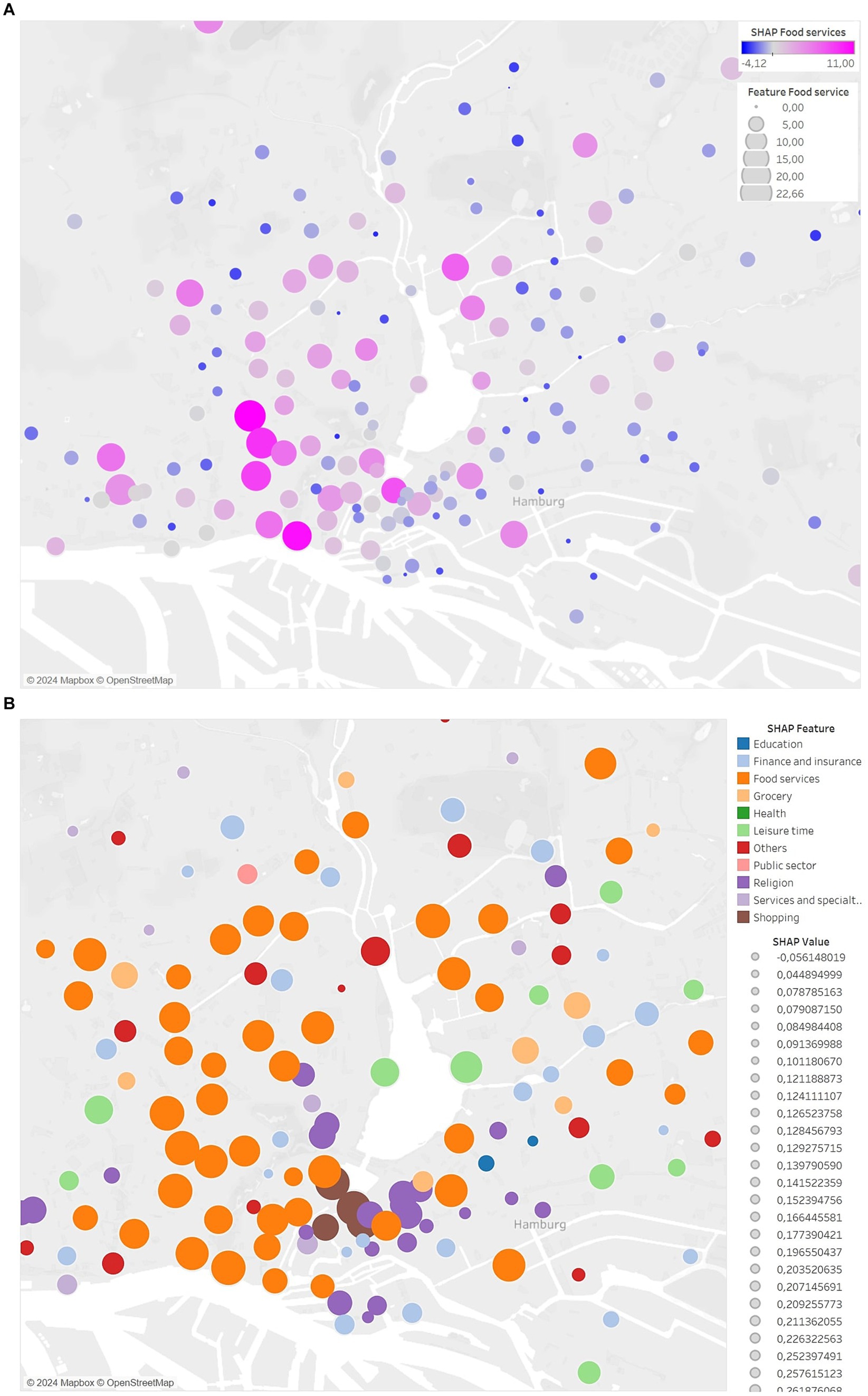
Figure 2. Proportional symbol map for the (A) distribution of the Shapley values for the feature Food services using a proportional symbol map. (B) Distribution of the highest positive Shapley values among all features.
Next, we visualize our new concept, the SMVV, where we compute Voronoi and map them onto the street network. First, we compute the Voronoi using only the bike stations and color them with the SHAP value of the feature Food services. The computation of Voronoi can lead to hard transitions of values in some places. In order to eliminate these unrealistic transitions, we decide to smooth the Voronoi. In Figure 3A, we can see an example of a place where the influence ‘jumps’, just by moving a very small amount. For an impact of a feature to jump like that in our use case is not logical. Therefore, we extract the supporting points of the Voronoi and assign them the average impact of the surrounding Voronoi. Then the Voronoi are recalculated with the station points and the support points, which can be seen in Figure 3B. It is possible, that a single iteration of our Voronoi smoothing process is not sufficient. As a solution, we take an iterative approach, where multiple iterations can be applied. In this case, after visual inspection, we decide to apply two iterations. Figure 3C shows the same location after the second smoothing iteration. Now the transitions of the impacts are smoother, which is closer to the real world.
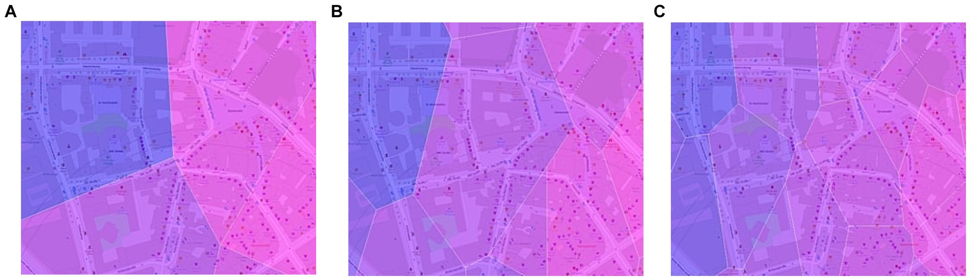
Figure 3. Example of smoothening the Voronoi visualization. (A) Voronoi for all rental bike stations. (B) Voronoi after first iteration of smoothening. (C) Voronoi after second iteration of smoothening.
Figures 4A,B shows the full visualization for the distribution of the feature Food services (satisfying requirement 2 with the SHAP color scale) and for the highest positive impacts across all features (satisfying requirement 4), when using Voronoi. The advantage of using Voronoi is that we now have precise values for each region (satisfying requirement 3), which we can extract interactively. We can also see the distribution of the features with the highest positive impact. None of this was possible with heat maps. But there is still the problem that the visualization also includes areas with impact where it is impossible to locate bike stations. It is also difficult to see the city’s infrastructure.
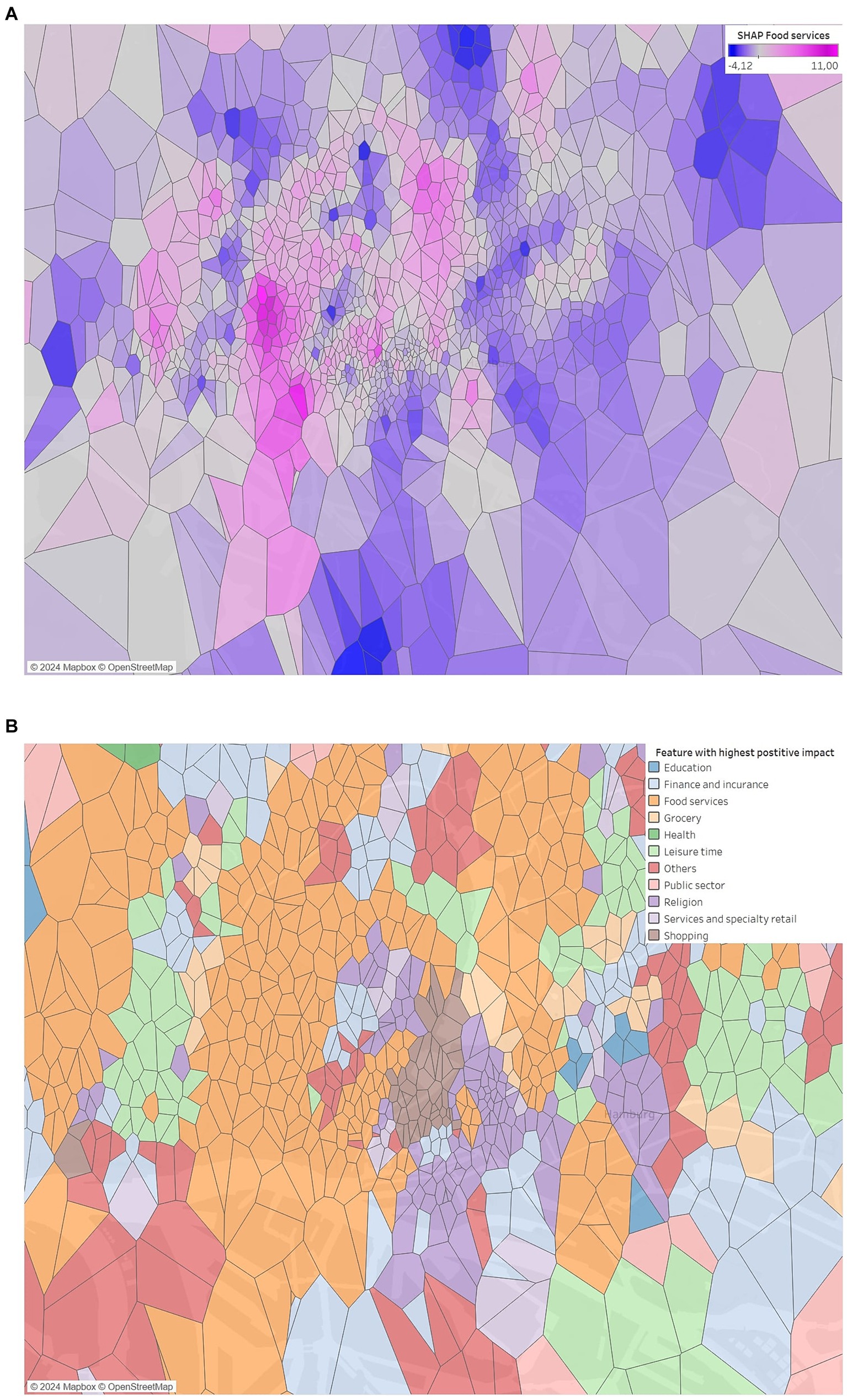
Figure 4. Voronoi visualization for (A) the feature Food services and (B) the highest positive impacts among all features.
As a final step for our SMVV, we map the Voronoi values onto the street network. Figures 5A,B shows both results. With this visualization, we eliminate the drawback from before. Through selected street types, we now visualize only geographic locations where bike stations could be located or where bikes are allowed to ride. In addition, the city’s infrastructure is visible because there is no overlap. The orientation for analysis and interpretation is now much easier than with heat maps or Voronoi that cover the whole city. The visualization can help for further analysis and interpretation. Our SMVV meet all the requirements. It shows the geospatial distribution, without overlapping, uses the SHAP color scale when visualizing a feature, has precise values, and can be used to show the highest impact distribution. However, unlike a point visualization, small errors may occur.
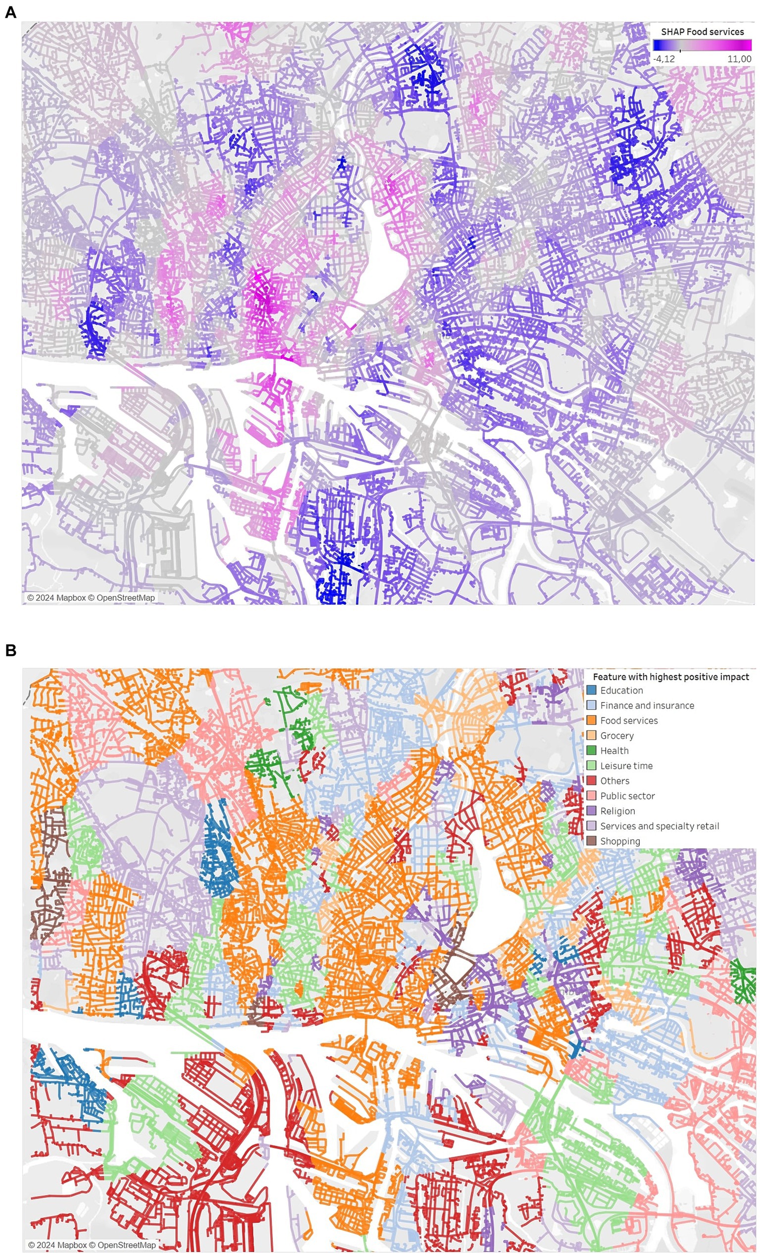
Figure 5. Street network visualization for (A) the feature Food services and (B) the highest positive impacts among all features.
Figure 6 shows an area where the Voronoi mapping has led to an error. Above the river (white area) there is a small area where the feature Services and specialty retail (marked by interaction) is considered to have the highest positive impact. The previous Voronoi also had a small area overlapping the river to the area in the south. The street mapping now also shows that this feature has the highest impact there. But it is more likely that the feature Others (red) has the highest impact there, since it covers most of the streets at this area. These are small errors that can occur due to the calculation process. It is important to keep this in mind when interpreting the visualization.
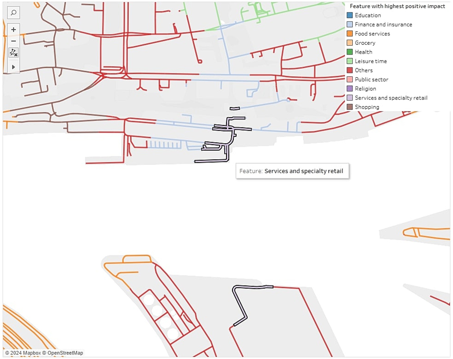
Figure 6. Error in the mapping of the Voronoi impact values to the street network of the city.
A potential problem with the visualizations that show the highest impacts, such as Figures 2B, 4B, 5B, may be the number of features. Fewer features mean fewer colors, which are easier to interpret. Too many colors can lead to cognitive overload, which should be avoided. Which colors and how many of them are considered ‘still okay’ should be evaluated with test users. Otherwise, some features could be excluded from the visualization if domain experts could decide that they are not relevant for the use case.
Regarding our research questions, we think that the first visualization, using a proportional symbol map, is useful to answer research questions 1 and 3 when it comes to understanding the machine learning model. This visualization uses only the originally computed Shapley values, so it is a good choice to analyze the current state of the model. The point visualization shows the geographic distribution, revealing clusters, patterns, or outliers, which we consider a big advantage over the traditional SHAP summary plot. When it comes to answering research question 2, with the background information of trying to understand specific demands in the use case, such as the placement of a new rental bike station, we propose the second visualization (SMVV), where we compute Voronoi values and map them onto the city’s street network. Contrary to the study by Li (2022), which only visualized the impact of the feature ‘location’, with our visualization, the impact of all features in the whole city can be analyzed and interpreted. This could be very useful for domain experts trying to better understand the reasons why, in this case, their bike rental stations are booked.
5 Conclusion and future work
In this study we proposed ways to visualize explainable AI for geospatial use cases as ‘there is still a gap between the used XAI technique and the appropriate visualization method in the case of geospatial data’ (Roussel and Böhm, 2023, p.1). To achieve this, we used Shapley values and demonstrated our concept on the use case of a rental bike system. In this use case we predict the booking numbers for all stations using a Neural Network. We applied two visualizations: a point visualization as a proportional symbol map, and a mapping of Voronoi values onto the city’s street network. Our visualizations showed several benefits over the traditional SHAP plots regarding an analysis of the geospatial distribution, in particular:
• Finding geographic clusters: The visualization on a map can be used to find clusters of data points with similar Shapley values, or clusters where one feature has the highest impact.
• Finding geographic patterns: Like the clusters, other patterns can be identified within the use case.
• Finding and analyzing outliers: The summary plot can only show if there is an outlier in the Shapley value. Our visualization can also show data points as geographic outliers. This is a consequence of the first two benefits. Also, there is no interaction in the summary plot, so the outlier cannot be further analyzed. With interactive maps, outliers can not only be found, but also further analyzed by experts and end users. This also plays into the next benefit.
• Time savings: Going through every local explanation with, for example waterfall plots, it is possible to gain insights like the three mentioned benefits above. However, this is extremely time consuming. With a geographic visualization and interactivity, time can be saved in understanding the models and in discussions between domain experts, end users and other stakeholders.
With respect to our stated research questions, we have proven the concept to visualize explainable AI for geospatial use cases with a geographic map and shown its feasibility. We think that the shown proportional symbol map using points with color and size is suitable to analyze the current state of the machine learning model. This means analyzing the distribution of a feature or the highest impacts in the model, embedded in the geospatial context. For other use case specific demands, we think more visualizations are useful, such as our SMVV, where we compute Voronoi values and map them on the street network. Rental bike system operators not only want to understand the machine learning model, but also want to interpret its explanations with respect to their use case specific demands. It might be interesting to see how the features behave not only at the stations, but also in the whole city. This could, for example, help in the process of finding a location for a new station, as operators only want to find locations where many features have a high positive impact.
In future work, additional visualizations could be considered to gain further insight and understanding of the machine learning model. For example, time series visualizations using animated graphs or slider bars could be explored. The traditional SHAP plots, as well as our visualization, do not illustrate changes in Shapley values over time. Including such visualizations would provide additional insight into the temporal component of the data. Other visualization methods, such as glyphs, could also be beneficial. Glyphs can be used as visual symbols to represent data and could improve the interpretability of geospatial visualizations by providing a compact and intuitive representation of complex data points. For example, different shapes, sizes, and colors of glyphs could be used to represent Shapley values of different features at a geographic data point, making it easier to recognize patterns and insights directly on the map. For the interested reader, we refer to the well-known work of Müller et al. (2014).
Another step for future work is to evaluate our visualization, especially for the use case of bike sharing. It would certainly be useful to work with domain experts to evaluate the impacts in the city of Hamburg, Germany. For this, further analyses and visualizations might be appropriate, such as a cluster analysis of the distribution of Shapley values of a feature. This could help the operators of the bike sharing system to better understand the reasons why people book their bikes more or less in different regions. This would be a use case specific study, which is why we did not include these steps in this study. We certainly believe that this would lead to many new insights.
In addition, it is important to visualize the uncertainties in the model output, such as deviations for regression problems or probabilities for classification problems. This is crucial for the end user, who should not blindly trust machine learning models, as there will always be uncertainties. These uncertainties also play a role in explainable AI. Another potential avenue for future work is to conduct a more in-depth analysis of feature relationships. This could be accomplished using a bivariate mapping technique, which merges two Shapley values of features into a single-color scale. Another option is to incorporate ratios, such as the ratio of the feature Food services to actual booking numbers, to provide additional information in the visualization. Our focus was to implement conceptual visualizations for geospatial XAI using Shapley values on a geospatial use case. We evaluated the visualizations against defined requirements. We showed that a combination of explanations with a geovisualization can be a solution for a better understanding of the machine learning model and for further analysis and interpretation of specific use case requirements. With this finding, we think that further studies should be conducted where evaluations with domain experts are performed. An evaluation with humans is necessary to measure the effectiveness of the visualization and to improve it with, for example, new color schemes or new visualization methods may be more suitable for each specific use case.
Data availability statement
The raw data supporting the conclusions of this article will be made available by the authors, without undue reservation.
Author contributions
CR: Conceptualization, Data curation, Methodology, Visualization, Writing – original draft, Writing – review & editing, Project administration.
Funding
The author declares financial support was received for the research, authorship, and/or publication of this article. This work was supported by the Carl Zeiss Foundation under grant P2021-02-014.
Acknowledgments
I want to thank my supervisor Prof. Dr. Klaus Böhm, which supported me in my research through valuable feedback and proofreading my manuscript. The research for this paper is part of the AI-Lab at Mainz University of Applied Sciences, which is part of the project ‘Trading off Non-Functional Properties of Machine Learning’ at the Johannes-Gutenberg-University Mainz. The Carl Zeiss Foundation funds it.
Conflict of interest
The author declares that the research was conducted in the absence of any commercial or financial relationships that could be construed as a potential conflict of interest.
Publisher’s note
All claims expressed in this article are solely those of the authors and do not necessarily represent those of their affiliated organizations, or those of the publisher, the editors and the reviewers. Any product that may be evaluated in this article, or claim that may be made by its manufacturer, is not guaranteed or endorsed by the publisher.
Footnotes
1. ^https://www.openstreetmap.de/, accessed on 15 February 2024.
2. ^https://data.deutschebahn.com/dataset/data-call-a-bike.html, accessed 27 September 2023
3. ^https://www.tableau.com/, accessed 19 February 2024.
4. ^https://www.qgis.org/en/site/, accessed on February 19, 2024.
5. ^https://overpass-turbo.eu/, accessed 13 March 2024.
References
Al-Najjar, H. A. H., Pradhan, B., Beydoun, G., Sarkar, R., Park, H.-J., and Alamri, A. (2022). A novel method using explainable artificial intelligence (XAI)-based Shapley additive explanations for spatial landslide prediction using time-series SAR dataset. Gondwana Res. 123, 107–124. doi: 10.1016/j.gr.2022.08.004
Amorim, B. D., Firmino, A. A., Baptista, C. D., Júnior, G. B., Paiva, A. C., and Júnior, F. E. (2023). A machine learning approach for classifying road accident hotspots. ISPRS Int. J. Geo Inf. 12:227. doi: 10.3390/ijgi12060227
Ardakani, S. P., Liang, X., Mengistu, K. T., So, R. S., Wei, X., He, B., et al. (2023). Road Car accident prediction using a machine-learning-enabled data analysis. Sustain. For. 15:5939. doi: 10.3390/su15075939
Aurenhammer, F. (1991). Voronoi diagrams—a survey of a fundamental geometric data structure. ACM Comput. Surv. 23, 345–405. doi: 10.1145/116873.116880
Brassel, K. E., and Reif, D. (1979). A procedure to generate Thiessen polygons. Geogr. Anal. 11, 289–303. doi: 10.1111/j.1538-4632.1979.tb00695.x
Cilli, R., Elia, M., D'Este, M., Giannico, V., Amoroso, N., Lombardi, A., et al. (2022). Explainable artificial intelligence (XAI) detects wildfire occurrence in the Mediterranean countries of southern Europe. Sci. Rep. 12:16349. doi: 10.1038/s41598-022-20347-9
Fang, H., Shao, Y., Xie, C., Tian, B., Shen, C., Zhu, Y., et al. (2023). A new approach to spatial landslide susceptibility prediction in karst mining areas based on explainable artificial intelligence. Sustain. For. 15:3094. doi: 10.3390/su15043094
Giudici, P., and Raffinetti, E. (2021). Shapley-Lorenz eXplainable artificial intelligence. Expert Syst. Appl. 167:114104. doi: 10.1016/j.eswa.2020.114104
IBM (2023). What is geospatial data? Available at https://www.ibm.com/topics/geospatial-data (Accessed 7/25/2023).
Klemmer, K., Brandt, T., and Jarvis, S. (2018). Isolating the effect of cycling on local business environments in London. PLoS One 13:e0209090. doi: 10.1371/journal.pone.0209090
Klemmer, K., Willing, C., Wagner, S., and Brandt, T. (2016). Explaining Spatio-temporal dynamics in Carsharing: a case study of Amsterdam. AMCIS 2016 Proceedings.
Lan, Y., Wang, J., Hu, W., Kurbanov, E., Cole, J., Sha, J., et al. (2023). Spatial pattern prediction of forest wildfire susceptibility in Central Yunnan Province, China based on multivariate data. Nat. Hazards 116, 565–586. doi: 10.1007/s11069-022-05689-x
Li, Z. (2022). Extracting spatial effects from machine learning model using local interpretation method: an example of SHAP and XGBoost. Comput. Environ. Urban. Syst. 96:101845. doi: 10.1016/j.compenvurbsys.2022.101845
Li, Z. (2023). GeoShapley: A game theory approach to measuring spatial effects in machine learning models. doi: 10.48550/arXiv.2312.03675
Lundberg, S., and Lee, S. I. (2017). A unified approach to interpreting model predictions. doi: 10.48550/arXiv.1705.07874
Maxwell, A. E., Sharma, M., and Donaldson, K. A. (2021). Explainable boosting Machines for Slope Failure Spatial Predictive Modeling. Remote Sens. 13:4991. doi: 10.3390/rs13244991
Müller, H., Reihs, R., Zatloukal, K., and Holzinger, A. (2014). Analysis of biomedical data with multilevel glyphs. BMC Bioinform. 15:S5. doi: 10.1186/1471-2105-15-S6-S5
Netek, R., Pour, T., and Slezakova, R. (2018). Implementation of heat maps in geographical information system – exploratory study on traffic accident data. Open Geosci. 10, 367–384. doi: 10.1515/geo-2018-0029
Pradhan, B., Jena, R., Talukdar, D., Mohanty, M., Sahu, B. K., Raul, A. K., et al. (2022). A new method to evaluate gold mineralisation-potential mapping using deep learning and an explainable artificial intelligence (XAI) model. Remote Sens. 14:4486. doi: 10.3390/rs14184486
Ribeiro, M. T., Singh, S., and Guestrin, C. (2016). "Why should I trust you?": explaining the predictions of any classifier.
Rolwes, A., and Böhm, K. (2021). “Analysis and evaluation of geospatial factors in SMART CITIES: a study of off-street parking in Mainz, Germany” in The international archives of the photogrammetry, remote sensing and spatial information sciences, ISPRS TC IV 6th international conference on Smart data and Smart Cities—17 September 2021, vol. XLVI-4/W1-2021. Eds: V. Coors, P. Rodrigues, C. Ellul, S. Zlatanova, and R. Laurini (Stuttgart: Germany. Copernicus GmbH), 97–101. Available at: https://isprs-archives.copernicus.org/articles/XLVI-4-W1-2021/index.html
Roth, R. E. (2017). Visual variables. International encyclopedia of. Geography 2017, 1–11. doi: 10.1002/9781118786352.wbieg0761
Roussel, C., and Böhm, K. (2023). Geospatial XAI: a review. ISPRS Int. J. Geo Inf. 12:355. doi: 10.3390/ijgi12090355
Roussel, C., Rolwes, A., and Böhm, K. (2022). Analyzing geospatial key factors and predicting bike activity in Hamburg. Int. Conf. Geoinform. 143, 13–24. doi: 10.1007/978-3-031-08017-3_2
Sachit, M. S., Shafri, H. Z., Abdullah, M., Fikri, A., Rafie, A. S., Gibril, M., et al. (2022). Global spatial suitability mapping of wind and solar systems using an explainable AI-based approach. ISPRS Int. J. Geo Inf. 11:422. doi: 10.3390/ijgi11080422
Schimohr, K., and Scheiner, J. (2021). Spatial and temporal analysis of bike-sharing use in Cologne taking into account a public transit disruption. J. Transp. Geogr. 92:103017. doi: 10.1016/j.jtrangeo.2021.103017
Shneiderman, B. (1996). The eyes have it: a task by data type taxonomy for information visualizations. Proceedings 1996 IEEE Symposium on Visual Languages.
Wagner, S., Brandt, T., and Neumann, D. (2014). Smart City planning—developing an urban charging infrastructure for electric vehicles. Available at https://www.semanticscholar.org/paper/Smart-City-Planning-Developing-an-Urban-Charging-Wagner-Brandt/10ba98c601f820932475c4547c9e8ad3a4121e94
Willing, C., Klemmer, K., Brandt, T., and Neumann, D. (2017). Moving in time and space – location intelligence for carsharing decision support. Decis. Support. Syst. 99, 75–85. doi: 10.1016/j.dss.2017.05.005
Xing, J., and Sieber, R. (2021). Challenges of using XAI for geographic data analytics. The 1st International Workshop on Methods, Models, and Resources for Geospatial Knowledge Graphs and GeoA. Available at https://eprints.ncl.ac.uk/278928
Xing, J., and Sieber, R. (2023). The challenges of integrating explainable artificial intelligence into GeoAI. Trans. GIS 27, 626–645. doi: 10.1111/tgis.13045
Keywords: machine learning, explainable AI, Shapley values, visualization, geospatial data
Citation: Roussel C (2024) Visualization of explainable artificial intelligence for GeoAI. Front. Comput. Sci. 6:1414923. doi: 10.3389/fcomp.2024.1414923
Edited by:
Rafael Martins, Linnaeus University, SwedenReviewed by:
Paolo Giudici, University of Pavia, ItalyAndreas Holzinger, Medical University Graz, Austria
Copyright © 2024 Roussel. This is an open-access article distributed under the terms of the Creative Commons Attribution License (CC BY). The use, distribution or reproduction in other forums is permitted, provided the original author(s) and the copyright owner(s) are credited and that the original publication in this journal is cited, in accordance with accepted academic practice. No use, distribution or reproduction is permitted which does not comply with these terms.
*Correspondence: Cédric Roussel, Y2VkcmljLnJvdXNzZWxAaHMtbWFpbnouZGU=
†ORCID: Cédric Roussel, http://orcid.org/0000-0002-7302-5431