 Rozianawaty Osman
 Faustina Hwang
95% of researchers rate our articles as excellent or good
Learn more about the work of our research integrity team to safeguard the quality of each article we publish.
Find out more
ORIGINAL RESEARCH article
Front. Comput. Sci. , 05 May 2021
Sec. Human-Media Interaction
Volume 3 - 2021 | https://doi.org/10.3389/fcomp.2021.631241
This article is part of the Research Topic Web Accessibility View all 9 articles
This study offers insights, gathered from co-design activities with older adults, on the design of e-commerce websites. Twenty older adults (aged 52–75 years) took part in a paper-based design activity in which they were presented with a web browser window, cutouts of a selection of web objects (e.g., product images and “add to cart” buttons) in a range of designs, and office stationery for making annotations and asked to select and place web objects onto the browser window to express their design ideas for two types of shopping experience: purchasing a grocery item that is inexpensive and typically purchased in multiples (carrots) and purchasing an assistive technology item which is considered expensive and normally purchased as a one-off (wheelchair). Objects selected frequently by the older adults for inclusion in both types of e-commerce websites included product images, price, and an “add to cart” button. Some objects were selected for inclusion depending on the type of website—quantity selection was selected for the cheap, multiple purchase item, whereas descriptions, reviews, and shipping/return information were deemed important only for the expensive, single-item purchase. Regarding the relative placement of the “add to cart” button, participants most often placed the button close to the quantity selection and/or the price. Furthermore, participants expressed that having these three elements presented within a visually distinctive “buy box” would be beneficial. This study offers insight into which website elements are deemed important by this older adult participant group for e-commerce websites and how the elements should be arranged, and the results also indicate that some design requirements may differ between different types of shopping experience. The findings can potentially benefit designers, developers, and industries to more fully grasp the potential of usable online shopping applications.
Guidelines and principles on designing web pages for older adults are well established and widely accepted, and they include the Web Content Accessibility Guidelines (WCAG) (Caldwell et al., 2008), SilverWeb Guidelines (Zaphiris et al., 2009; Zaphiris et al., 2007; Kurniawan and Zaphiris 2005), and senior-friendly guidelines (Hodes and Lindberg 2009). Despite the existence of these guidelines, it is not uncommon for older adults, especially novice computer and web users, to experience difficulties with e-commerce websites, especially in the operation of certain web objects (Osman, 2019).
Placing web objects appropriately within a website may improve the use of a system (Wells, 2003). Therefore, the choice and placement of web objects on websites have been the subject of much study in the literature including Bernard (2001), Burt and Gibbons (2011), Cassidy and Hamilton (2014), Jach and Kulinski (2015), Roth et al. (2010), Roth et al. (2013), and Wells (2003). These studies span a range of website domains, including organizations, finance, tourism, online shopping, and news. However, these studies investigated non-domain specific web objects, such as those found in the main area, menu navigation, logo, login, search, shopping cart, about us, help, contact, and footers. In contrast, the present study focuses on the web objects that make up the main content of product listing pages on e-commerce websites, to further our understanding of how these pages can be better designed to meet the needs and expectations of older adults.
The study investigates both participants’ choice of web objects to include in a site, as well as where participants expect the objects to be placed. Knowing where users anticipate an object to be located within a website can improve the visibility and use of the web object (Wells, 2003). Thus, knowledge of participants’ expectations for placement of key objects such as the “add to cart” button can potentially facilitate user navigation, usability, and sales. To determine and quantify participants’ placement of web objects in design prototypes, researchers have introduced the use of grids on the design space (Bernard, 2001; Roth et al., 2013). Bernard (2001) used a depiction of a browser window with an 8 × 7 grid, while Roth et al. (2013) used a 12 × 8 grid, and the concentration of the placement of web objects on particular grid squares was used to visualize the results.
The study adopts a co-design approach with older adults, using paper-based prototypes. McGee-Lennon et al. (2012) suggested that paper-based prototypes can help participants actively engage in the design process and help them to provide suggestions without hesitating over mistakes that could be made with digital prototypes. Furthermore, they also reported that older participants enjoyed the paper-based design sessions. A more recent study (Heintz et al., 2018) compared paper-based and tool-based prototypes to provide feedback on e-learning prototypes. Although this study was conducted among working adults (science teachers from different European countries), it found that the paper-based approach was able to generate more feedback. Rice and Alm (2008) also used low-tech objects, such as a blank canvas and graphical cutouts of various components (e.g., menu, labels, and icons) to investigate the use of digital television among older adults. They also discussed techniques that can help to promote active discussion, elicit the reasoning behind people’s ideas and suggestions, and encourage participants to provide opinions about the ways in which other people in their age group would use technology. Another co-design method that uses a lo-fi paper-based prototype is PICTIVE. Introduced by Muller (Muller, 1991; Muller et al., 1993), this method of participatory design uses low-tech objects to encourage participants to express thoughts and ideas. In this method, a participant is presented with a workspace and design materials such as office stationery (e.g., markers, post-it notes, stickers, and labels) and prepared materials (e.g., plastic icons) to articulate their design, and the design sessions are video recorded.
Motivated by these previous studies reporting the successes and benefits of using paper-prototypes with older adults (Rice and Alm 2008; McGee-Lennon et al., 2012), we adopted this method with an aim of engaging participants in the design process and to generate as much feedback as possible during co-design activities. In the present study, older participants were invited to co-design e-commerce websites using paper-based prototypes. Participants were asked to place physical (paper cutout) web objects (e.g., menu, product image, and “add to cart” button) where they would expect to see them on the presented user interfaces.
This study adopts the PICTIVE method (Muller 1991) which combines low-tech objects with video recording as an approach to facilitate user participation in the design process. With PICTIVE, participants are presented with a workspace to create their designs, along with a collection of design objects including office materials (e.g., markers, post-it notes, stickers, and labels) and paper and plastic representations of user interface elements. Participants use the design objects to express their design ideas, and the process is video recorded. PICTIVE was originally described as a group activity, and participants were each asked to undertake a homework assignment prior to the group design session, such as thinking through what they would want the system to do for them.
In the current study, the design workspace consisted of a depiction of a web browser window and participants were provided with office stationery and prepared paper cutouts of web objects. The paper cutout web objects were prepared to be approximately the actual size that objects would appear on a monitor screen. The materials were also designed to meet recommendations on designs for older users (e.g., using a large font size). In contrast with the original PICTIVE method which included plastic icons, in our study, the web objects were printed on paper and the design workspace was on a foam material (see Web Objects). Participants were video recorded throughout the design session. The design was carried out as an individual activity rather than as a group activity, and participants in our study were not asked to complete any pre-work prior to the design session.
Although a low-tech, paper-based method seems easy to use, issues encountered while using this technique have also been documented. Massimi and Baecker (2006) reported that older participants had difficulty engaging in design activities because they were unable to understand the task that needed to be performed and because they lacked confidence. Taking these potential issues into account, in the present work, pilot experiments were conducted prior to the main study to uncover any difficulties with the instructions or the protocol. In the pilot, participants reported that they were confused due to an overload of information at the start. Therefore, instructions were simplified, and detailed explanations on what the participants needed to do were provided in stages, just before each part of the co-design task, rather than explaining all the activities and tasks at the outset. To improve participants’ confidence, an icebreaker was introduced to put participants at ease and to help them feel comfortable during all the sessions of the study, and they were given ample encouragement throughout to not restrict their design activities.
Twenty volunteers (14 men and 6 women) ranging in ages from 52 to 75 years old (mean = 64) took part in the study. Participants were recruited via a University of Reading database of research volunteers, posters displayed at the university, or word of mouth.
Participants had to have some knowledge and experience of using online shopping websites, in order that the study could focus on eliciting design ideas that were informed and based on prior experience.
All participants reported accessing the Internet every day or at least 2–3 days a week. The main device used by participants to access the Internet included a desktop (45%), laptop (30%), tablet (15%), and smart phone (10%). Participants mostly used the Internet for shopping, communication, and entertainment. In terms of making purchases online, among the top items bought online were tickets for events (85%), holiday accommodation (75%), and travel arrangements (75%). While all participants had at least some experience of online shopping, only eight participants (40%) had experience with online grocery shopping.
Participants were presented with a workspace to create their designs. The workspace consisted of a paper template depicting a web browser window (see Figure 1). The template was designed to be approximately the physical size of a 19-inch Dell 1908FP monitor screen. This depiction of a browser window also included an adaptation of the technique used in (Bernard, 2001; Cassidy and Hamilton, 2014; Jach and Kulinski, 2015; Roth et al., 2010; Roth et al., 2013), where grid squares were marked on the template to facilitate the users’ task of placing objects onto the interface prototypes (see also Web Objects and Figure 1). Common web objects such as the logo, search box, main menu navigation, shopping cart, and help were pre-placed on the template (Roth et al., 2010; Roth et al., 2013; Heinz et al., 2017).
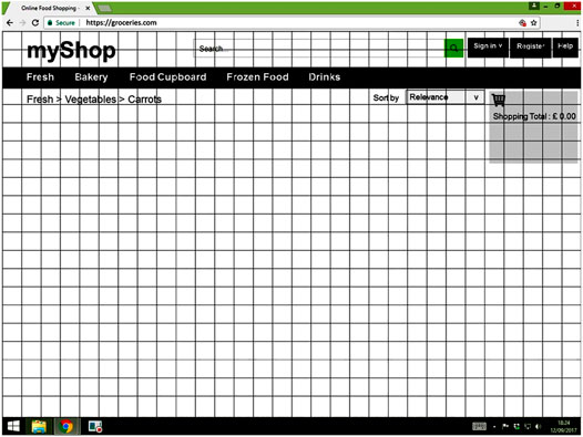
FIGURE 1. Web browser template used as the design workspace.
In the co-design sessions, participants were asked to choose and place web objects onto the workspace template. The web objects were crafted from paper cutouts that were prepared to be approximately the sizes they would be if viewed on a 19-inch Dell 1908FP monitor with a screen resolution of 1,280 by 1,024.
The web objects included objects commonly found on e-commerce sites: product images, titles, descriptions, prices, “add to cart” buttons, quantity selections, shipping/returns, wish lists, links (e.g., email and social media such as Facebook and Twitter), and reviews. The web objects were also designed to meet the guidelines and design principles for older web users. For example, to facilitate older users’ reading, sans-serif typefaces are suggested (Hodes and Lindberg, 2009), and thus, in this study, Arial was used for all text. Larger text has also been recommended to ease reading for older people, for example, the use of 12 or 14 point fonts (Darroch et al., 2005; Hodes and Lindberg, 2009). A study conducted by Yeh (2020) which compared younger and older users’ performance on button position and touchscreen font size on a healthcare device found that with a larger font size (i.e., 22 point), the older users’ performance was competitive with that of the younger users’. Therefore, in the current study, text that appeared on the co-design materials, either within the design workspace or on the web objects, had a minimum font size of 12 points. The maximum font size was 24 points.
In order to ease the participants’ handling of the web objects during the co-design activities, the materials used were carefully selected to make the web objects easy to pick up, hold, and move around, yet to not glide too much across the workspace in order that the web objects would stay in place once positioned on the workspace. Foam sheets were chosen for the workspace and a thick paper (180 gsm) was used for the web objects.
Some web objects were made available in multiple variants, with the aim of understanding which object designs older users would prefer and select. For example, product images were prepared in both a small size (height 5.37 cm and width 5.87 cm) and a big size (height 8.86 cm and width 10.68 cm). Titles were also prepared in two different font sizes: 18 points and 24 points. The “add to cart” button was prepared in four different background colors (with white text): blue, orange, red, and black. These colors were selected based on the results of our previous research (Osman, 2019) which found that these were the most commonly used colors for “add to cart” buttons on existing e-commerce sites. The “add to cart” button was also prepared in two different case texts (capital and mixed) and two different sizes (small and big), again, based on findings from our previous research. The full selection of web objects is shown in Figure 2.

FIGURE 2. Paper cutout web objects available to participants for the co-design activity. (A) Images, (B) product titles, (C) product descriptions, (D) “add to cart” buttons, (E) quantity selections, (F) price, and (G) others (e.g., wish list and shipping/return).
The study was carried out in a quiet room, equipped with good lighting, and enough space for materials to be laid out (see Figure 3).
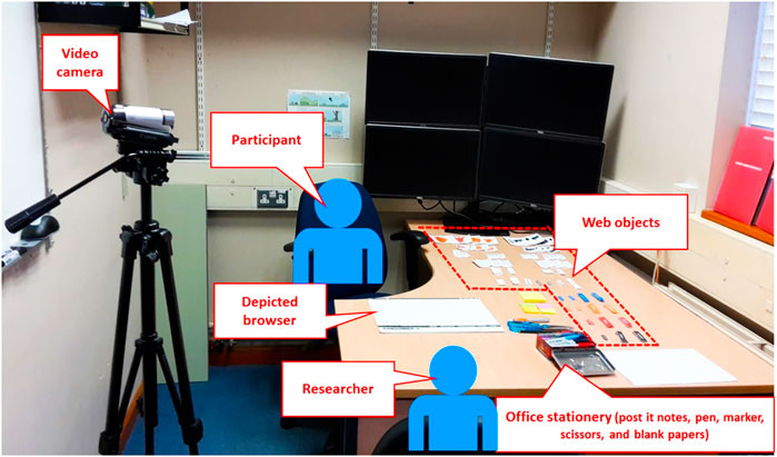
FIGURE 3. Room setting for the co-design activity. Participants were seated at a desk with the design materials laid out in front of them. The researcher sat across from the participant, and there was a video camera positioned to capture the co-design activities.
The participant was seated at a desk with a foam web browser template (i.e., workspace), web object paper cutouts, and office stationery laid out in front of them. The researcher sat across from them and there was a video camera positioned to capture the co-design activities.
This study was reviewed according to procedures of the University of Reading Research Ethics Committee and was given a favorable ethical opinion for conduct. All participants provided informed written consent prior to beginning the study.
The study began with a questionnaire on demographics, and online shopping and online grocery shopping experience. This was followed by a warm-up session in which the participant was asked: “Do you experience any problems or difficulties while doing online shopping?” The reply was not included in analysis, as the purpose of this warm-up session was to create a comfortable environment between the participant and the researcher.
The main activity, the co-design, started after the warm-up session. The participant was asked to design e-commerce interfaces for two types of websites, an online grocery shopping website and a website for purchasing assistive technology. The scenarios of purchasing carrots and purchasing a wheelchair were used for the two types of site, respectively. These two types of website and shopping tasks were devised to investigate potential differences between a relatively inexpensive purchase of multiple items and a relatively expensive one-off purchase.
The activity started with the scenario of buying carrots. The scenario was described to the participants as follows: “Assume that you are going to buy carrots. You go to an online grocery shopping site, and you click on menus and select carrot. So now you are in the carrots selection area.” Then, the participant was asked what they thought the screen should look like and were asked to design the page in which the “add to cart” button is usually first displayed, in order to initiate a purchase. Using the foam web browser template, paper cutout web objects, and office stationery, the participants designed the pages on the workspace by following the procedure described in (Bernard, 2001). Web objects could be placed on the provided workspace either horizontally, vertically, overlapping, or centered between the grid lines. Participants were also reminded that it was not mandatory to include all of the available objects; instead, any objects that they deemed important could be included in the design. If the participant wanted to include an object that was not provided as a paper cutout, they could use the blank cards, post-it notes, or new paper cutouts to represent it.
When the participant stopped designing, they were asked the following question: “Would you like to add your carrots now?” If they answered “yes,” this marked the end of their design activities. If the answer was “no,” an additional page usually needed to be designed, after which the procedure was repeated until the answer was “yes.” Blank paper was used to design additional pages, where necessary. Photographs were taken of the designed pages.
The procedure was then repeated for the second scenario of buying a wheelchair.
Following the co-design activities, participants were asked questions about design preferences for the “add to cart” button specifically. Participants were asked about their preferences for how the button should be labeled (text only, icon only, or both text and icon), and about which image was most suitable for the “add to cart” button (trolley, plus sign, bag, or basket–representing commonly used icons on existing websites).
The final part of the session focused on “buy box” designs. The “buy box” design was inspired by the design implemented on Amazon, where a box is used to indicate the starting point of a buying process and the place where items are added to the shopping cart (Amazon Seller Central, 2018). The box contains the “price of the product, shipping information, the name of the seller, and a button to purchase the product” (Chen et al., 2016). It is useful to understand whether placement of the box around certain objects (e.g., price and “add to cart” button) better attracts older users’ attention to the items within the box, compared to designs that lack a “buy box.” To investigate this, participants were presented with two website designs, with and without a “buy box” design simultaneously (see Figure 4), and were asked which design they preferred and also to elaborate on the reasons for their selection. Using the same website design with “buy box,” participants were also asked what elements should be included in the buy box.
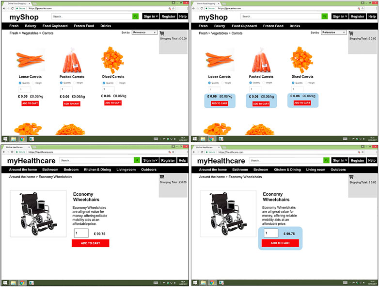
FIGURE 4. Carrot and wheelchair pages with and without “buy box” designs.
Finally, each participant was thanked for their efforts and contribution to the study.
The co-design activities were video recorded to capture the reasoning behind the selection of the web objects or suggestions for design. The video recording started when the co-design activity started (i.e., the scenario of buying carrots) and ended when the co-design activities ended (i.e., the end of the “buy box” design activity). The pages designed by the participants were also photographed as further documentation of the locations of web objects in their designs.
Photographs were analyzed specifically to note the selection and placement of web objects on the depicted browsers. Data on the layout patterns, the choice of web objects included in the designs, and the choice of “add to cart” button designs were collated from the photographs. Figure 5 shows a sample of the pages designed by the participants. A number of recurring layouts broadly defined by the clustering together of particular combinations of web objects were identified, and participants’ designs were categorized into one of the following layouts: horizontal list, vertical list, grid, single item, and “other.”
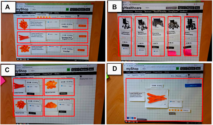
FIGURE 5. Samples of the layout of pages designed by participants. (A) Horizontal, (B) vertical, (C) grid, and (D) single item.
The horizontal list layout presents one product per row, typically with an image on the left, an “add to cart” button on the right, and other web objects (e.g., product description and price) arranged to be read from left to right. In comparison, the vertical list layout presents one product per column, usually with an image at the top, the “add to cart” button usually placed near the bottom, and the other web objects arranged to be read from top to bottom. The grid layout presents more than one item in a row or column. A single item layout was defined as when a page was designed to present only one item. Any pages with layouts that did not fit any of the above were categorized as “other.”
The photographs were also analyzed in terms of which web objects were selected for inclusion on the page. The selected color and size of the “add to cart” button were also noted. Taking into consideration that an object can facilitate user navigation when it is placed in the most expected location (Wells, 2003), older adults’ expectations of where on the page the “add to cart” button should be located was also of interest, and so the locations of “add to cart” buttons were also analyzed.
The study initially planned to analyze web object locations using a percentage of concentration of grid technique, which is used in (Bernard, 2001; Roth et al., 2013). However, the variation of design layouts made it almost impossible to come to a consensus. Instead, we analyzed the relative location of the “add to cart” button as follows: any objects that were “close to” an “add to cart” button (i.e., within two grid squares) were noted, and the frequency of the occurrences was analyzed.
The frequency of “buy box” design preferences was also noted, as were objects suggested for inclusion in the “buy box” design.
The videos were used to gain insights into the reasoning for the web object selections, “add to cart” button designs, and “buy box” designs. Verbal responses from the videos were extracted and transcribed. These verbal responses were then grouped by topic, for example, all responses related to the reasoning for the “add to cart” button selection were grouped together. The verbal responses relating to each topic were then coded, and patterns or themes identified. These themes offered insights into the rationale behind participants’ design selections and suggestions.
Participants generated 48 pages for analysis (20 participants × 2 websites [carrots and wheelchair] plus eight “additional” pages). The “additional pages” were typically designed by participants to display further information to be accessed either by clicking on a “more info” button or link or by clicking on the image of an item. For example, when participants felt that more information was needed for a particular product, an additional page containing the further information was created.
The number of participants who opted for each layout is shown in Table 1 for the main shopping page and in Table 2 for the additional pages.
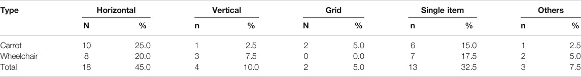
TABLE 1. Page design layouts.
TABLE 2. Additional pages design layouts.
As shown in Table 1, the horizontal list layout was designed most often (18 out of 40 = 45% of all main shopping pages, see also Figure 5A), followed by the single-item layout (13 out of 40 = 32.5%, see also Figure 5D). Where “additional” pages were designed (n = 8), the single-item layout was the most popular for these pages (see Table 2), which reflects the rationale for creating the additional page; that is, typically, participants elected to design these pages when they wanted more detailed information about a particular item. Only one additional page was designed with a vertical layout; in that case, the participant wanted to use that page to compare items for potential purchase.
The participants were given the freedom to select, from a selection of common web objects (see Figure 3), which web objects to include in their page designs. Figure 6 shows the percentage of pages designed by the participants that included each web object. Objects that were most commonly included in the design were price (100% of pages for both carrots and wheelchair), an “add to cart” button (100% and 92% of pages for carrot and wheelchair, respectively), and an image (92% and 96% of pages for carrots and wheelchair, respectively). For some objects, there were also differences between the carrot and wheelchair pages in the number of times the object was selected for inclusion (see Figure 6); this difference was particularly notable for the description, quantity selection, shipping/return, and reviews (individual McNemar tests, respectively p = 0.002, p = 0.008, p = 0.039, and p = 0.001). The description, reviews, and shipping/return objects were included more frequently for the wheelchair page, which represents an expensive and one-off purchase, while quantity was included more often for carrots, which represent an inexpensive item often purchased in multiples.
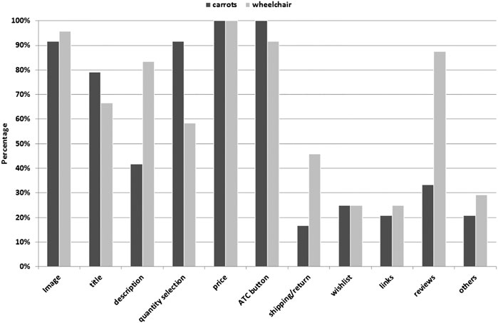
FIGURE 6. Percentage of designed pages containing the various web objects.
Participants commented that more information was needed when buying a more expensive item, compared to a cheaper purchase. Reviews from others, such as “experience in using the products,” were said to be helpful when making purchase decisions about expensive items. Shipping/return information was wanted for knowing how to return unwanted goods, especially with expensive purchases.
It is also interesting that, for the grocery page, some participants wanted reviews (33% of the pages designed for carrots) and shipping/return (17% of the pages designed for carrots) information to be included. When asked what information was expected from these web objects, participants suggested that reviews should provide other buyers’ opinions about their purchases, particularly in terms of quality, packaging, delivery, and cooking suggestions, while shipping/return information should offer an easy process for returning unacceptable groceries.
As explained in Web Objects, the paper cutout objects presented in this study were prepared to approximate the actual size in which they would appear on the screen. Some objects were offered in a range of sizes; for example, image objects were offered in both a small size (height 5.37 cm and width 5.87 cm) and a big size (height 8.86 cm and width 10.63 cm). Of all the designed pages, 58.3% used small size images, 33.3% used big size images, 6.33% used no image, and 2.1% used both images. The product title object was also offered in two sizes, and the designed pages favored Arial 18 pt (47.9%) over Arial 24 pt (25.0%).
Participants also suggested including objects that were not originally offered; their suggestions included compare (2 people), contact us (2), delivery option (e.g., 3 days, 1 week) (1), delivery cost (2), payment (as an alternative to “add to cart”–see also the next section) (1), more info (4), origin (1), update cart (1), voucher (2), and unit sold (1).
Almost all the designed pages included “add to cart” buttons, with the exception of two pages that were designed instead with a “payment” button to direct the user to the payment section (i.e., not via a shopping cart). Four pages were designed to have only one “add to cart” button for multiple items displayed on the same page which contrasts with existing designs that have a dedicated “add” button for each individual item. When asked about this selection mechanism, participants reported that the image should first be clicked to select an item, followed by clicking the “add to cart” button to put the item into their cart. However, it is worth noting that this selection mechanism could have some issues, as it may be unclear which items would be added to the cart.
An analysis of the 48 designed pages provides an indication of the most popular color, size, and text case for the “add to cart” button designs (see Table 3). Participants most often preferred options with blue (30.4% of pages) or black (32.6% of pages) button color, medium size button (61% vs. 39% with a big button), and a label with mixed text case (i.e., 56% “Add to cart” vs. 44% “ADD TO CART”). In addition, when asked explicitly to indicate their preference for how the button should be labeled (text only, icon only, or both text and icon), 75% of participants reported a preference for a button incorporating both an icon and text. When asked their preference of which image to use on the “add to cart” button (trolley, plus sign, bag, or basket), trolley was the most preferred graphic (see Table 4).
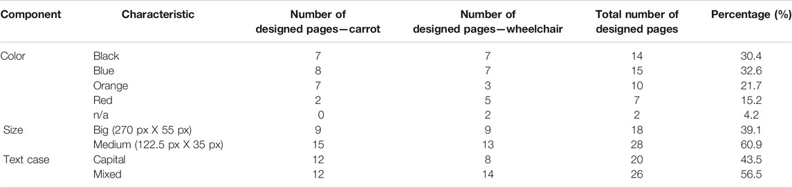
TABLE 3. Characteristics of “add to cart” button selected by participants.
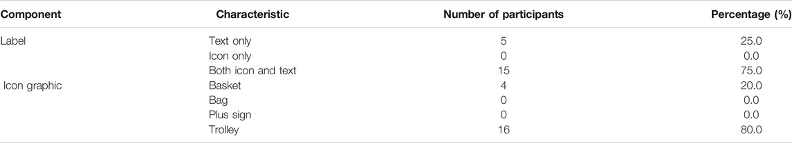
TABLE 4. Characteristics of label of “add to cart” button preferred by participants.
Various rationales were given for the color choice of the “add to cart” button. Some participants (n = 9) had “no particular reason” for selecting a color, or it was simply personal preference (for example, “I like blue”). Color choice was also influenced by the meaning associated with the color; for example, some participants (n = 4) selected blue because they thought “blue is an action color” or that “blue is a conservative color.” Previous experience may also have influenced color choice. For example, one participant associated blue with hyperlinks: “I remember [an] earlier website; it always hyperlinked. Anything you clicked on was always in blue. The text was in blue. So it is just a memory from 20 years ago. So, I relate to that.”
Again, with black, the participants mentioned that they simply like black. Other reasons included the color’s “high contrast,” which made it “easy to read” and “stand out.” One participant chose black because it has a similar color to another object within the website (i.e., the main menu).
Interestingly, some participants (n = 3) chose the color according to the product’s color. In this study, participants were buying carrots that were orange in color, which influenced their selection of the button’s color. One participant suggested color coding the button according to the product’s color: “Well, carrots pretty obvious[ly] would be this color (orange), isn’t it? Orange, carrot. Good visual thing. Orange, orange [referring to the carrot’s color then the button’s color]. I mean if I am going to buy frozen fish, I go for the blue. Red, only if I was shopping for the hot chili. I will color code my purchase to what I expect to see.” Other reasons reported for selecting the color orange were its “distinctive color” and a personal preference for the color.
Red was less popular because, to some, this color had a connotation of “no” or “do not.” Words that were mentioned in this regard included “danger” (2), “do not do” (1), “do not push me” (1), “emergency” (1), and “mistake made” (1). Conversely, some participants chose red for its attractiveness (2) and also because of the association of “red for medical” (1), which the participant chose for the wheelchair because they associated it with hospitals.
The location of the “add to cart” button in relation to other objects on the page was also analyzed. The frequency with which web objects were placed close to the “add to cart” button is tabulated in Table 5. In this study, “close to” is defined as being within two grid squares. The results show that participants frequently placed the quantity selection and price close to the “add to cart” button. Figure 7 presents examples of the location of “add to cart” buttons, relative to the quantity selection and price objects.
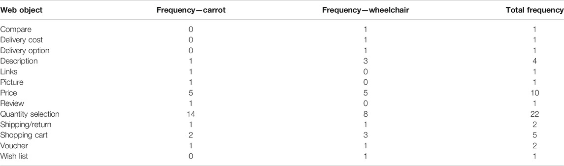
TABLE 5. Frequency of the web objects placed within two grid squares of the “add to cart” button.
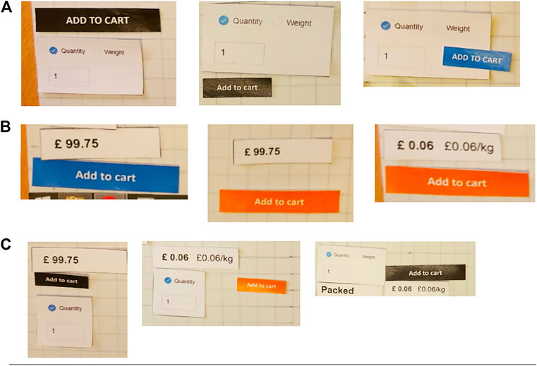
FIGURE 7. Examples of the location of “add to cart” buttons, relative to the quantity selection and price objects. (A) Close to quantity selection, (B) close to price, and (C) close to both price and quantity selection. Note that “close to” is defined as being within two grid squares.
In the “buy box” design sessions, participants were asked about their preferences of two designs: with and without the “buy box” (see Figure 4). 80% of participants chose to have a “buy box” design for groceries (one-sample proportion test, z = 2.683, p < 0.01) and 85% for assistive technology (one-sample proportion test, z = 3.130, p < 0.01). 75% of the participants mentioned that the “buy box” designs stood out and drew their attention to objects within the box. They also noted that the designs attract or catch the eye, as highlighted by a participant: “I think the ‘add to cart’ button is quite pronounced, quite different. You can’t miss it…. you will be able to quickly see where the ‘add to cart’ is.”
Participants were subsequently asked a further question to identify objects that should be included in the “buy box.” The objects most commonly mentioned were price, the “add to cart” button, and quantity selection (see Table 6).
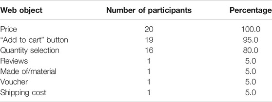
TABLE 6. Web objects for inclusion in “buy box” designs.
This study has investigated how older adults design product list pages for two types of e-commerce websites, using the scenarios of buying carrots and buying a wheelchair. In the co-design process, various paper cutout web objects were offered for incorporation into designs.
Results showed that the inclusion of a quantity selection was common for the carrots page, confirming the importance of this feature for purchases that are often made in multiple quantities. Meanwhile, product descriptions, reviews, and shipping/return were more important when purchasing an expensive item such as a wheelchair, which will usually be a one-off purchase. Users may want to ensure that they have made a worthy purchase, relying on the description to provide further details about the product and reviews to help them decide about their purchase of an expensive item. As in (Maslowska et al., 2017), which investigated the role of reviews in purchase decisions, reviews can influence the purchase of higher-priced products. Participants suggested that reviews should provide information about the product’s quality. Shipping/return item information should ensure customers can return purchased items to the seller when the item is no longer required, thereby offering assurance when purchasing a higher-priced product. For example, in one study (Akçay et al., 2013), the retail sales and profit increased as the retailer offered assurance through a “money-back-guaranteed” sales policy. This shows that once a customer believes that the risk is low, confidence in purchasing may increase. In a field experiment by Petersen and Kumar (2015), the authors found that a firm’s profits increase with the customer’s perceived low risk on purchases. Therefore, the inclusion of shipping/return object for an expensive item in our study could have contributed by this confidence of low risk to the purchase decision.
In our study, product titles were not selected for inclusion often, however, this may have been because the item descriptions (unintentionally) included the title of the product at the start (see Figure 8), rather than being an indication that product titles are not useful.
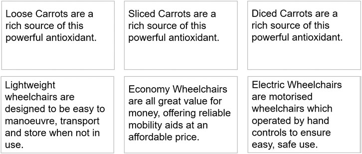
FIGURE 8. Samples of product descriptions used in the study.
The results from this study also suggest that web objects such as price, the “add to cart” button, and image are important for both types of purchases, as evidenced by inclusion on a high proportion of the designed pages (price–100% of pages, “add to cart” button–97.5%, and image–95%). Furthermore, “add to cart” buttons were notably placed by participants to be in close proximity to the quantity selection and/or price.
Overall, the horizontal list layout was the design most frequently adopted (45% of all designed pages). This may be related to previous report (Schmutz et al., 2010) that this format offers a low cognitive load. In that study, they examined the effects of presentation format (i.e., list vs. matrix) on cognitive load. Data from 199 participants, ranging in age from 16 to 62, were analyzed and results shows that a list format offers a lower cognitive load to operate. Another reason for participants adopting a horizontal list layout may be that this format encourages reading about a product from left to right, in line with the usual reading of English text.
For the wheelchair product pages, the horizontal and single item layouts were adopted with almost equal frequency (20% and 17.5% of page designs, respectively). This single item layout was arising from a desire to have more information about the product before making a purchase decision. The single item layout dedicates the whole page for an item, thus, the page can provide more space to display more information, as compared to the horizontal layout which shares the display across multiple items in one page. As discussed by Oblak et al. (2017), consumers do tend to seek out online information when making purchase decisions, especially for expensive products. Particularly for expensive products, then, the single item layout may be preferable over a horizontal list layout, because the former has more space to display information such as reviews, descriptions, and shipping/returns information.
Differences between the carrot and wheelchair pages in terms of participants’ most preferred layout and in the web objects selected for inclusion on the page suggest that a “one design for all products” approach is suboptimal. Instead, results suggest that different products warrant different design choices.
Overwhelming users with information could be troublesome especially to older adults. It is important for a website to avoid displaying too much information, as it could make the website look unnecessarily complex with a risk of deceiving users (Tuch et al., 2009). With older adults, technology that is found to be too complex runs a risk of being rejected by users (Harte et al., 2014). With a view to offering guidance about what information is “sufficient” without overloading users, Table 7 summarizes the important objects that should be included in e-commerce websites as indicated by the older participants in this study. These objects appear to be sufficient for users to make their purchase decisions. Inclusion of further unnecessary or less important elements could potentially contribute to cognitive overload, with detrimental effects for older adults particularly, though this would require further investigation.
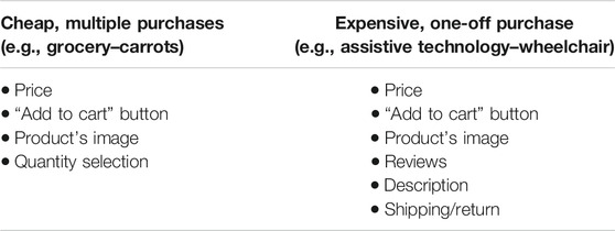
TABLE 7. Important objects for e-commerce websites.
Where participants had the option to choose between two sizes of web object (e.g., in the case of image sizes, button sizes, or font sizes), it was interesting that participants often favored the smaller sizes despite expectations that larger sizes should be easier to read and to click on. This may suggest that, so long as the objects are “big enough” for participants to see and read clearly, there is no need to scale up further. This is useful when working with limited screen real estate, but even for larger screens as used in this study, web objects that are just “big enough” may be preferable so as not to clutter the screen unnecessarily.
“Add to cart” buttons are crucial in online shopping pages, yet a review of “add to cart” button design conventions on 51 e-commerce websites (Osman, 2019) showed that designs vary widely in current practice, for example, in button color, button label, and icon used to represent the process of adding an item to the cart. In the present study, four colors of “add to cart” button were offered, that is, blue, orange, red, and black and participants chose blue and black more often, as compared to orange and red. This could have been related to the high contrast offered by the blue and black colors, as suggested by comments from some participants that their reasons for the color selection, especially black, were “high contrast.” This is aligned with a number of published guidelines and principles (e.g., Kurniawan and Zaphiris 2005; Zaphiris et al., 2007; Caldwell et al., 2008; Zaphiris et al., 2009; Hodes and Lindberg 2009; Tognazzini, 2014) that to ensure text is readable, foreground and background colors should have high contrast. Participants’ responses from the present study also indicate a preference for “add to cart” buttons that are labeled with both an icon and text (vs. one or the other on its own), and for using a trolley icon (rather than alternatives such as a basket, a plus sign, or a bag). These aspects could be investigated more extensively to support the development of guidelines for “add to cart” button designs.
Furthermore, participants commented that the “add to cart” button could be grouped together with the price and a quantity selection object inside a “buy box” in order to draw attention to the objects needed to make a purchase. “Buy boxes” were said to “stand out” and “draw attention.” The addition of “buy boxes” could potentially improve e-commerce designs because they are visually distinctive and attract attention. Further investigation should be undertaken to understand the effectiveness of “buy box” designs in supporting actual shopping behavior.
This study has focused on only two items (i.e., carrots and a wheelchair), which may limit generalization of the findings to other types of purchases. Nevertheless, the information generated provides us with useful insights about objects that can be included, and where they should be placed, in e-commerce website designs from the perspective of our study participants. Our study participants were adults ranging in age from 52 to 75 years old; however, based on the present study design, it is not possible to know if these findings relate specifically to age. It would be interesting to investigate if differences exist between older and younger participants, and if so, what is the nature of those differences. The findings of this study have potential implications for web designers and developers and also to key players in the e-commerce arena about how to grasp the full potential of online shopping applications. Considering the perspectives of older adults on what they consider important may indicate where and what these populations are looking for in e-commerce websites. An interesting avenue for further research is to investigate whether the objects selected by the participants in this study are sufficient to influence purchasing behavior, for example, within a real online shopping environment.
The raw data supporting the conclusions of this article will be made available by the authors, without undue reservation.
This study was reviewed in accordance with the procedures specified by the University of Reading’s Research Ethics Committee and given a favourable ethical opinion for conduct.
RO and FH contributed to conception and design of the study. RO conducted the study and data analysis and wrote the first draft of the manuscript. RO and FH contributed to manuscript revision and read and approved the submitted version.
This work is funded by the Ministry of Higher Education, Malaysia.
The authors declare that the research was conducted in the absence of any commercial or financial relationships that could be construed as a potential conflict of interest.
We are grateful to all the volunteers who participated in the study. We thank the University of Reading’s Hugh Sinclair Unit of Human Nutrition for their assistance in recruiting volunteers for this study.
Akçay, Y., Boyacı, T., and Zhang, D. (2013). Selling with Money-Back Guarantees: The Impact on Prices, Quantities, and Retail Profitability. Prod. Oper. Manag. 22 (4), 777–791. doi:10.1111/j.1937-5956.2012.01394.x
Amazon Seller Central (2018). “How the Buy Box Works,” Amazon.Com, Inc. [Online]. Available: https://sellercentral.amazon.com/gp/help/external/37911?language=en-US&ref=mpbc_200401830_cont_37911. [Accessed May 15, 2018].
Bernard, M. L. (2001). Developing schemas for the location of common web objects. In Proceedings of the Human Factors and Ergonomics Society Annual Meeting, Los Angeles, CA: Sage CASAGE Publications, 1161–1165. doi:10.1177/154193120104501502
Burt, C. D., and Gibbons, S. (2011). The Effects of Donation Button Design on Aid Agency Transactional Trust. Int. J. Nonprofit Volunt. Sect. Mark. 16 (2), 183–194. doi:10.1002/nvsm.412
Caldwell, B., Cooper, M., Reid, L. G., Vanderheiden, G., Chisholm, W., Slatin, J., et al. (2008). Web Content Accessibility Guidelines (WCAG) 2.0. WWW Consortium (W3C), 290. [Online]. Available at: https://www.w3.org/TR/WCAG20/ (Accessed April 21, 2017).
Cassidy, L., and Hamilton, J. (2014). Location of Service Industry Web Objects: Developing a Standard. 25th Australasian Conference on Information Systems, Auckland, New Zealand. [Online]. Available: https://researchonline.jcu.edu.au/34951/ (Accessed February 19, 2018).
Chen, L., Mislove, A., and Wilson, C. (2016). An Empirical Analysis of Algorithmic Pricing on Amazon Marketplace. Proceedings of the 25th International Conference on World Wide Web, 1339–1349. doi:10.1145/2872427.2883089
Darroch, I., Goodman, J., Brewster, S., and Gray, P. (2005). The Effect of Age and Font Size on Reading Text on Handheld Computers. IFIP Conference on Human-Computer Interaction. Berlin, Heidelberg: Springer, 253–266. doi:10.1007/11555261_23
Harte, R., Glynn, L., Broderick, B., Rodriguez-Molinero, A., Baker, P., McGuiness, B., et al. (2014). Human Centred Design Considerations for Connected Health Devices for the Older Adult. Jpm 4 (2), 245–281. doi:10.3390/jpm4020245
Heintz, M., Law, E., and Andrade, P. (2018). Comparison of Paper-And Tool-Based Participatory Design Approaches: a Case Study with PDotCapturer. In Proceedings of the 32nd International BCS Human Computer Interaction Conference, 32, 1–12. doi:10.14236/ewic/HCI2018.29
Heinz, S., Linxen, S., Tuch, A. N., Fraßeck, L., and Opwis, K. (2017). Is it Still where I Expect It?—Users’ Current Expectations of Interface Elements on the Most Frequent Types of Websites. Interact. Comput. 29 (3), 325–344. doi:10.1093/iwc/iww012
Hodes, R. J., and Lindberg, D. A. B. (2009). Making Your Web Site Senior Friendly: A Checklist. National Institute on Aging and the National Library of Medicine. [Online]. Available at: https://repository.arizona.edu/handle/10150/106378 (Accessed April 21, 2017).
Jach, K., and Kuliński, M. (2015). Factors Influencing Online Shop Layout Preferences. In International Conference on Human-Computer Interaction. Cham: Springer, 419–429. doi:10.1007/978-3-319-21006-3_40
Kurniawan, S., and Zaphiris, P. (2005). Research-derived Web Design Guidelines for Older People. In Proceedings of the 7th international ACM SIGACCESS conference on Computers and accessibility, 129–135. doi:10.1145/1090785.1090810
Maslowska, E., Malthouse, E. C., and Viswanathan, V. (2017). Do customer Reviews Drive Purchase Decisions? the Moderating Roles of Review Exposure and Price. Decis. Support Syst. 98, 1–9. doi:10.1016/j.dss.2017.03.010
Massimi, M., and Baecker, R. (2006). Participatory Design Process with Older Users. In Proc. UbiCoomp2006 Workshop on Future Media. https://citeseerx.ist.psu.edu/viewdoc/download?doi=10.1.1.118.6913&rep=rep1&type=pdf
Mcgee-Lennon, M., Smeaton, A., and Brewster, S. (2012). Designing Home Care Reminder Systems: Lessons Learned through Co-design with Older Users. In 2012 6th International Conference on Pervasive Computing Technologies for Healthcare (Pervasive Health) and Workshops. IEEE, 49–56. doi:10.4108/icst.pervasivehealth.2012.248684
Muller, M. J. (1991). PICTIVE—An Exploration in Participatory Design. In Proceedings of the SIGCHI Conference on Human Factors in Computing Systems, 225–231. doi:10.1145/108844.108896
Muller, M. J., Wildman, D. M., and White, E. A. (1993). “Equal Opportunity” PD Using PICTIVE. Commun. ACM 36 (6), 64. doi:10.1145/153571.214818
Oblak, L., Pirc Barčić, A., Klarić, K., Kitek Kuzman, M., and Grošelj, P. (2017). Evaluation of Factors in Buying Decision Process of Furniture Consumers by Applying AHP Method. Drvna Ind. 68 (1), 37–43. doi:10.5552/drind.2017.1625
Osman, R. (2019). Designing to Assist Older Adults’ Navigation in E-Commerce Websites. Doctoral dissertation. Reading, (United Kingdom): University of Reading.
Petersen, J. A., and Kumar, V. (2015). Perceived Risk, Product Returns, and Optimal Resource Allocation: Evidence from a Field Experiment. J. Marketing Res. 52 (2), 268–285. doi:10.1509/jmr.14.0174
Rice, M., and Alm, N. (2008). Designing New Interfaces for Digital Interactive Television Usable by Older Adults. Comput. Entertain. 6 (1), 1–20. doi:10.1145/1350843.1350849
Roth, S. P., Schmutz, P., Pauwels, S. L., Bargas-Avila, J. A., and Opwis, K. (2010). Mental Models for Web Objects: Where Do Users Expect to Find the Most Frequent Objects in Online Shops, News Portals, and Company Web Pages? Interact. Comput. 22 (2), 140–152. doi:10.1016/j.intcom.2009.10.004
Roth, S. P., Tuch, A. N., Mekler, E. D., Bargas-Avila, J. A., and Opwis, K. (2013). Location Matters, Especially for Non-salient Features-An Eye-Tracking Study on the Effects of Web Object Placement on Different Types of Websites. Int. J. human-computer Stud. 71 (3), 228–235. doi:10.1016/j.ijhcs.2012.09.001
Schmutz, P., Roth, S. P., Seckler, M., and Opwis, K. (2010). Designing Product Listing Pages-Effects on Sales and Users' Cognitive Workload. Int. J. human-computer Stud. 68 (7), 423–431. doi:10.1016/j.ijhcs.2010.02.001
Tognazzini, B. (2014). First Principles of Interaction Design (Revised & expanded). Ask TOG: Interacfion Design Solufions for the Real World. https://asktog. com/atc/principles-of-interacfion-design.
Tuch, A. N., Bargas-Avila, J. A., Opwis, K., and Wilhelm, F. H. (2009). Visual Complexity of Websites: Effects on Users' Experience, Physiology, Performance, and Memory. Int. J. Human-Computer Stud. 67 (9), 703–715. doi:10.1016/j.ijhcs.2009.04.002
Wells, C. A. (2003). Location, Location, Location: The Importance of Placement of the Chat Request Button. Reference User Serv. Q. 43 (2), 133–137. [Online]. Available: http://www.jstor.org/stable/20864156 (Accessed April 24, 2017).
Yeh, P. C. (2020). Impact of Button Position and Touchscreen Font Size on Healthcare Device Operation by Older Adults. Heliyon 6 (6), e04147. doi:10.1016/j.heliyon.2020.e04147
Zaphiris, P., Kurniawan, S., and Ghiawadwala, M. (2007). A systematic approach to the development of research-based web design guidelines for older people. Univers. Access Inf. Soc. 6 (1). 59–75. doi:10.1007/s10209-006-0054-8
Keywords: co-design, web object, add to cart, web design, aging, shopping
Citation: Osman R and Hwang F (2021) E-Commerce Design by Older Adults: The Selection and Placement of Web Objects on Shopping Sites. Front. Comput. Sci. 3:631241. doi: 10.3389/fcomp.2021.631241
Received: 19 November 2020; Accepted: 07 April 2021;
Published: 05 May 2021.
Edited by:
Roberto Therón, University of Salamanca, SpainReviewed by:
Walter Gerbino, University of Trieste, ItalyCopyright © 2021 Osman and Hwang. This is an open-access article distributed under the terms of the Creative Commons Attribution License (CC BY). The use, distribution or reproduction in other forums is permitted, provided the original author(s) and the copyright owner(s) are credited and that the original publication in this journal is cited, in accordance with accepted academic practice. No use, distribution or reproduction is permitted which does not comply with these terms.
*Correspondence: Rozianawaty Osman, cm96aWFuYUBmc2ttLnVpdG0uZWR1Lm15
Disclaimer: All claims expressed in this article are solely those of the authors and do not necessarily represent those of their affiliated organizations, or those of the publisher, the editors and the reviewers. Any product that may be evaluated in this article or claim that may be made by its manufacturer is not guaranteed or endorsed by the publisher.
Research integrity at Frontiers
Learn more about the work of our research integrity team to safeguard the quality of each article we publish.