- 1Department of Psychology, Psychologie und Sportwissenschaft, Giessen University, Giessen, Germany
- 2Brain and Cognition, KU Leuven, Faculty of Psychology and Educational Sciences, Leuven, Belgium
- 3Department of Psychology, Faculty of Social and Behavioural Sciences, Utrecht University, Utrecht, Netherlands
Object color space is highly structured due to optical constraints (radiant power non-negative, reflectance factors between zero and unity) and ecological context (daylight illuminant). In this setting trichromacy induces a natural geometry through a unique spectral tripartition. Different from null-context colorimetry, one gains two desirable relations: The colorimetric coordinates are coarse-grained spectral reflectance factors and there is a direct link to color experiences, since RGB–coordinates provide ostensive definitions. The framework allows one to deal with subtractive color mixture, source variation, effects of metamerism and relations between scenes and image data in a unified, structured manner. In ecological contexts, colors are effectively object properties. The formal framework is linear algebra and convex geometry. Applications in human biology, computer graphics, design, etc., are immediate.
1 Introduction
Are colors object properties? Answers depend on the intended ontological roots. Instances are “physical colors” (radiant power spectra and spectral reflectance factors), “colorimetric colors” (like red, nominal;
Balanced accounts of such diverse interrelations are rare. We present a minimalist formal account, with various novel developments.
1.1 Minimal Context of “Object Colors”
We use “object color” as relevant in ecological human biology. Visual objects (stones, apples, rabbits, … ) are due to surface scattering (“reflection”) of environmental radiation (“daylight”). Object colors appear similar to all observers, viewing perspective playing only a minor role. When objects appear in different guises, they count as distinct visual objects. Extreme examples of mismatch between material and visual objects are mirrors and Morpho wings.
Environmental radiation is noticeable in its visual effect on scenes. “White Objects” reveal its nature:
Definition 1 (White object). A white object is a Lambertian scattering surface with unit spectral albedo.Reason: This settles both viewpoint independence and spectral properties.
Examples are white chalk, pressed
We also define the “Black Object.” Its definition is even simpler:
Definition 2 (Black object). A black object has zero spectral albedo.
The standard laboratory implementation is a black hole (Kortüm, 1969). For informal use, black velvet will do. Finally, we define “visual object”:
Definition 3 (Generic visual object). A generic visual object is a Lambertian surface with spectral albedo less than that of the white object throughout the spectrum.
For informal experiments one uses colored papers. These definitions involve only physics, no chemistry, psychology or physiology.
We ignore radiometrical intricacies [structure of the radiant field, shapes and other geometrical factors, multiple scattering and vignetting, … (Koenderink and van Doorn, 1983)]. Objects are scattering surfaces presented in a single plane and are irradiated with a uniform beam. This leaves problems of a phenomenological nature. A carefully designed standard display minimizes these (Supplementary Section S1.1; Supplementary Figure S1).1 Observers tend to agree on the color of a patch when the overall situational awareness is “natural.” In evolutionary terms that implies steppe or savannah hunter–gatherer existence (Koenderink, 2019). Thus a screen display is less natural than colored papers on a table top, or a bed of flowers.
In this context, people readily learn to associate coarse-grained spectral reflectance factors with “seen colors.” Although such
There is something like a fuzzy map of colorimetric colors to quale (Nagel, 1974):
where
One cannot deploy
Thus
2 Radiant Power Spectra, Spectral Reflectance Factors and Colorimetric Coordinates
We comment on standard radiometric and colorimetric backgrounds (Bouma, 1946; Wyszecki and Stiles, 1967; Koenderink, 2010; Centore, 2017). Readers are assumed to be familiar with it.
2.1 Radiant Power Spectra
Radiant power spectra are denoted
Wavelength is a continuous coordinate. Radiant spectra are points in a vector space
2.2 Spectral Reflectance Factors
The object property to consider is the spectral albedo, specified as spectral reflectance factor. This is the fraction of the scattered power relative to that scattered by the white object in the same attitude at the same location. Spectral reflectance factors are naturally dimensionless. Geometrically, they are represented as diagonal matrices [written
2.3 Colorimetry
Colorimetry considers the equivalence of radiant beams in controlled settings. If members of a pair cannot be distinguished we note that as
Results are well described by a linear projection operator M (say) such that
The explanation is that only the ratios of absorptions in three retinal photo-pigments (Stockman et al., 2000) causally affect
Since
2.3.1 Fundamental Physical Constraints
Formally, colorimetry is linear algebra. There is no particular reason to select a specific basis.
This is true for the physics. Newton’s (Newton, 1704) notion that sunlight is a “confused mixture” of atomic elements is nonsense. In linear spaces there are no atomic elements. The wavelength basis is a convenience. Radiant power spectra imply finite resolution (Born and Wolf, 1999). Monochromatic beams are fictions. Wavelengths stand neither for beams, nor
Fundamental physical constraints put highly constraining structure on the amorphic linear continuum. Relevant ones are:
Physics 1 (Fundamental physical constraints). Two physical constraints structure object color space:
1. radiant power is positive;
2. reflectance factors range over the interval
An additional constraint is physiological:
3. the co-dimension of
The latter constraint applies to the bulk of the population (roughly one-tenth of the males is dichromatic). Additional constraints that render “color as object property” possible are ecological. We consider these later.
2.3.2 The Spectrum Cone
That radiant power is positive implies that all colors are contained in a conical convex hull, confined to a half-space (Figure 1). An important empirical fact is:
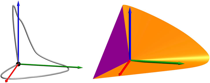
FIGURE 1. At left the curve of the rgb-colors of unit energy monochromatic beams. All realizable colors (for any radiant power of the source) lie within the convex hull of the lines through the origin and this curve. The surface of the “spectrum cone” in
Empirical fact 1 (The spectrum cone). The generators of the boundary of the spectrum cone are monochromatic beams.NoteThis is necessarily an ideal limit, since monochromatic beams cannot exist as physical objects.
This is of crucial importance (West and Brill, 1983; Koenderink, 2010). In terms of the sharp map (Eq. 1), the wavelength parameterizes (ignoring trivial matters of resolution) distinct qualia. It fails to cover the range. For instance
In some conventional spectral ranges one encounters minor violations of convexity near the spectrum limits. One may avoid this by limiting the visual range to 390–710 nm. The very minor violations at either end are of no practical consequence (Dropping this clipping makes a fractional xyz difference of less than
The purple sector is best seen in a view from the direction of the color
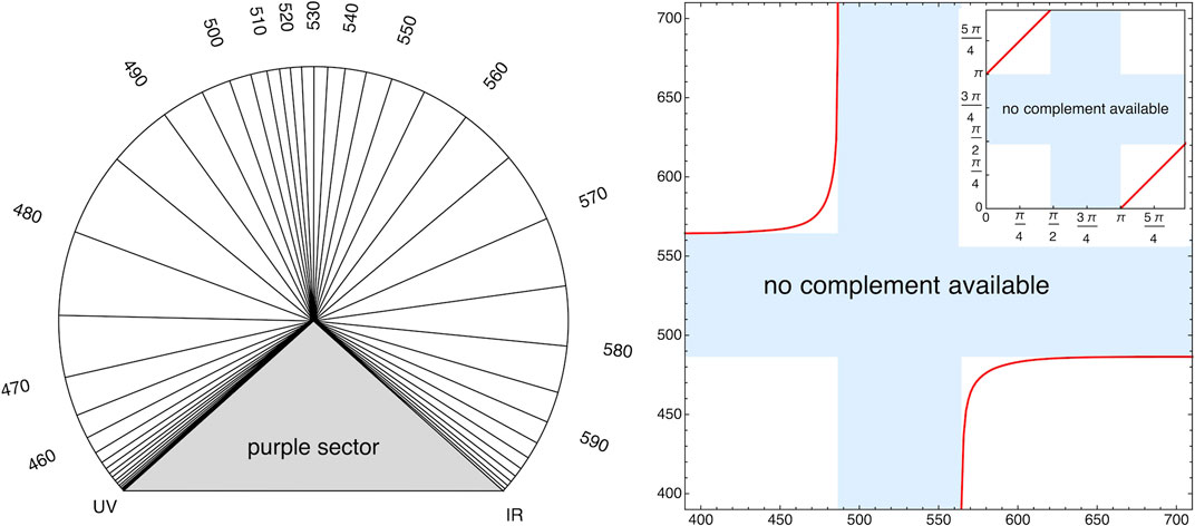
FIGURE 2. Left: This view is in the rgb–space (Section 4.3), which has a Euclidian metric. It is an orthographic view of the spectrum cone from the direction of the achromatic direction. In this geometry angles in the plane orthogonal to the achromatic direction are meaningful. The parameterization by angle is then preferable over parameterization by wavelength. The latter is essentially arbitrary. Right: Complementary wavelengths are defined by spectrum generators that are coplanar with the achromatic direction W. In the angular parameterization (in this figure and Section 4.3) they are an angle π apart (the inset). Note that not every wavelength has a complementary mate.
Complementarity is a formal relation between color triples in colorimetry proper. In the context of object colors complementarity has a formal and a physical meaning. Complementary object colors satisfying
3 Object Color Space
We proceed to construct object color space. The mere colorimetry of beams, does not offer handles to arrive at a “canonical basis” (cie xyz–space is a convenience). Ways to go beyond that either turn to physiology (the cone fundamentals as a preferred basis) or psychometry (thresholds, just noticeable differences), or even phenomenology (“eye measure”) (Bouma, 1946).
In contradistinction, object color space allows one to establish a preferred basis and even a metric (Section 4.3). That is a decisive step forward.
3.1 The Schrödinger Color Solid
In the standard context of object colors the radiant source is fixed. The generic instance is “average daylight.” This is indeed of crucial importance, as evident from the efforts of visual artists (painters through the ages, photographers for almost two centuries, cinematographers for a century, museum directors, and so forth).
Suppose the beam irradiating the gamut of samples is fixed to the equal energy spectrum
The beams scattered to the eye of the observer are spectrally dominated by the beam scattered by the white object. The normalization (denominator) achieves
Since the projection is linear, the gamut of object colors
Such an object was first intuited by a painter in the early 19th century (Runge, 1810), then by a combination of intuitive, formal and empirical methods approximately constructed by Ostwald (1919), finally formally defined by Schrödinger (1920). Schrödinger proved (also intuited by Ostwald a decade earlier):
Theorem 1 (Schrödinger’s Optimal Colors). The colors on the boundary of
1. they are characteristic functions in the wavelength domain, that is to say, the spectral reflectance factors are either zero or one;
2. the spectral reflectance factors have no more than two transitions over the visual range.
The proof is immediate (Schrödinger, 1920): With 3–degrees of freedom (dog) one can move the color away from the origin. Schrödinger’s constraints veto that possibility.
Ostwald (Ostwald 1917a; Ostwald, 1919) proposed a simplifying intuition. If one conceives of the spectrum limits as (colorimetrically) connected (discounting the purple gap), the colors on the boundary are singly connected characteristic functions.
Due to the maximum distance from K, Schrödinger (1920) spoke of “optimal colors” (G., Pigmente von größter Leuchtkraft).
One way to visualize
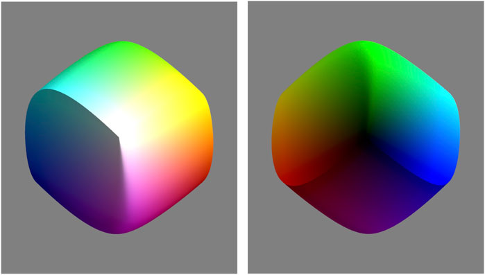
FIGURE 3. Two views of
Of course, the result will depend upon the spectrum (not just the color!) of the radiant environment (daylight say). The consequences of the choice are considered in Section 6. Until further notice we stick to the “equal energy” spectrum
3.2 The Edge–Color Curves
Although the boundary of the color solid is a surface, thus two-dimensional, it is a very constrained surface. Technically it is a double surface of translation (Koenderink, 1990; Koenderink, 2010). The surface can be constructed from a curve. That curve is the cumulated source radiant power spectrum. Since one may start cumulation from either spectrum end, one may construct two of such curves. These are mutually congruent. The curves are known as “edge–colors,” or boundary colors after the German Kantenspektren. These were accidentally discovered by Goethe (1810) as he playfully looked at a window edge through a prism (Supplementary Section S4; Supplementary Figure S4.).
Starting accumulation from the short wavelength end, the curve is [don’t confuse K (black) with
where
Supplementary Figure S4 gives an impression of the edge colors as one sees them when looking at a light-dark edge through a prism. Formally the edge–colors are the colors of the accumulated radiant spectrum of the illuminant. Each contains all information present in the combination of the radiant spectrum of the source and the color matching functions. They wrap up all that is needed for object color colorimetry. Note that
Both curves are helices of half a turn (Supplementary Figure S3). Since they are made up of optimal colors, they run over the boundary of the color solid. Any optimal color is either
Theorem 2 (optimal colors). All optimal colors are obtained as chords from one edge–color curve.
Figure 4 shows the cool edge–color curve and the surface defined by its chords. This is one half of the boundary of the Schrödinger
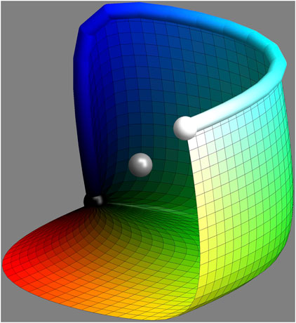
FIGURE 4. This is the cool edge color curve and the surface constructed from its chords. This is one half of the surface of the color solid. The other half is obtained by central symmetry on the gray point—or the chords of the warm edge color curve. The gray sphere indicates the centre of symmetry.
4 Spectral Partitions
4.1 Spectral Bipartitions
If one cuts the spectrum at any wavelength, one has a bichromatic contrast, namely the accumulated spectral radiant power at the short wavelengths side, and the accumulated spectral radiant power at the long wavelengths side. Such bipartitions were explored by Schopenhauer (1816) in the early 19th century—before the advent of colorimetry. Some bipartitions turn out to be special (Supplementary Section S5). Schopenhauer did it by eye. Numerically one considers the chromatic power of the contrast in a meaningful coordinate system (We consider suitable reference frames in Section 4.3).
The largest overall chromatic contrast occurs for a cut at 529 nm. Then the parts are teal and orange. This is evidently the cool-warm contrast universally recognized by visual artists. We consider such cuts in more detail in Section 4.3.
Other special cuts are at 474 nm (blue-yellow) and 577 nm (turquoise-red)—and, trivially, black–white. Schopenhauer also considered spectral extents and would express the chromatic contrasts in terms of (simple!) ratios of spectral extents. From our perspective the latter makes little sense, although the singularity of certain cuts is indeed phenomenologically apparent (Supplementary Figure S5).
Schopenhauer mentions Schwarz-Weiß (black-white), Violet-Gelb (evidently blue-yellow), and Blau-Orange (clearly teal-orange) (Supplementary Figure S6). He also has Grün-Roth, but mentions that the red is really a carmine, so he must indicate our green-purple. This needs two cuts, so it is really a tripartition (Section 4.2). Schopenhauer’s eye-measure is clearly “explained” by our computations.
What is especially relevant here, is that the highly chromatic colors are all but “monochromatic.” These colors have radiant power over large spectral ranges. This is a major step away from the Newtonian notions that still largely determine the understanding of philosophers of color. Color has very little to do with wavelengths. Teal and orange each scatter about half the equal energy spectrum. The best yellow scatters all wavelengths longer than about 474 nm, that is about the whole spectrum! This is an important insight that we will explore in this paper.
4.2 Spectral Tripartitions
A basis of color space involves three mutually independent colors (vectors)
Since there is no metric, vectors cannot be compared with respect to length, nor are angles spanned by pairs of vectors comparable. However, there is one comparison that does make sense:
Intuition 1 (Volume–ratio is the invariant of color space). In a linear space the ratio of volumes is the only meaningful, quantitative comparison.
That is an irrelevant fact in generic (context free) colorimetry, simply because there are no volumetric regions to compare. It is the crux of object color formalism. In object color space the color solid provides a unique reference volume.
This suggests a unique crate, the crate of maximum volume inscribed into the color solid. Some geometrical requirements are obvious: the vectors are optimal colors, the tangent plane at the color solid at A must be parallel to the plane
This optimum spectral tripartition for average daylight (say) may well be the most important structure in the colorimetry of object colors.
Such spectral partitions were pioneered by Schopenhauer (1816), taking cues from Goethe. He identified certain parts as atomic “parts of white.” Such parts are hugely different from Newton’s “spectral atoms.” The Schopenhauer “parts of white” cover broad spectral ranges, they are as different from the Newtonian atoms as conceptually possible. What they really are is spectrum bins:
Intuition 2 (rgb coordinates). rgbcoordinates are coarse–grained spectral reflectance factors (Formalized below,Eqs. 4 and 5).
The maximum volume
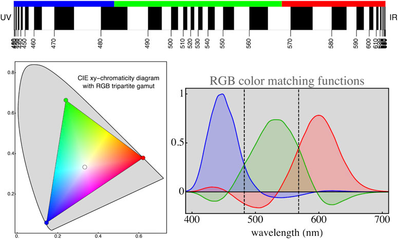
FIGURE 5. Top: The relation between wavelengths and hue-angles is very non-uniform (Figure 2). Whereas wavelength ranges from 0 to
The colors of the crate vectors look
“Color fictionalism” (Gatzia, 2010) conveniently enables one to discuss such tricky topics while holding on to objective science in which
One has a “contraction map”
that maps spectra on rgb colors. One defines an “expansion map”
that maps rgb colors on spectra. The rows of
Note that a Moore-Penrose pseudo-inverse (Rao and Mitra, 1971) requires a metric. Its use by Cohen and Kappauf (Cohen and Kappauf, 1982) is unfortunate.4 One obtains the same advantages using the present formalism. The product
The intuitive meaning of
4.3 The RGB Cube Metric
The optimum crate allows comparison of directions and magnitudes in color space. The parts have equal standing as “mutual parts of white” (Koenderink et al., 2018a; Koenderink et al., 2018b), and have disjunct spectral footprints. Geometrically, one treats the crate as the “unit cube”
Proposition 1 (The rgb Unit Cube
This metric has nothing to do with phenomenology, psychometrics, or eye measure. It derives from colorimetry, physical constraints and a conventional radiant source [
Note the close connection between colors and spectra. One denotes colors by coordinates, as
Supplementary Figure S4 shows an impression of the “edge spectra,” seen when looking through a prism at any light-dark edge. Unlike the spectrum, the edge spectra are really bright, Goethe’s major point against Newton.
We use an alternative orthonormal frame in
Supplementary Figure S10 shows some further properties of the edge–colors. The figure shows projections of the edge–colors on these directions. The achromatic component has two major peaks,
The relation between wavelengths and geometry is seen in a view from the achromatic direction (Figure 2). Spectrum cone generators are labeled by wavelength, but can also be measured by angle in the
Another example of the use of the angle metric is to consider the rate of change of angle of the cone generators with wavelength (Supplementary Figure S11). The relation is nonlinear, with sudden spurts at
4.4 The Semi-chromes, or Full Colors
One uses “dominant wavelength” for the label of a spectrum generator coplanar with the achromatic direction and the color, such that the color is in between. It may or may not exist. Empirically, the dominant wavelength labels may double as
Among colors of a dominant wavelength, some
In terms of optimal colors, all are (roughly) centered on the same spectrum generator, but they come in various spectral widths. Tints may scatter most of the source spectrum, whereas shades may scatter only a narrow region.
Figure 6 shows the example for a dominant wavelength of 530 nm, which appears

FIGURE 6. Example of a section of the color solid through the spectrum generator labeled 530 nm (left figure). There is no complementary wavelength. Optimal colors of that type tend to look
The best color is defined through maximum chromatic content. It has band limits at mutually complementary wavelengths. This is because one adds white when the band width is slightly broadened, whereas one adds black (in the sense of removing white) on narrowing it—always keeping the dominant wavelength fixed. Adding white dilutes the color into a tint, adding black dims the color into a shade.
Because of the complementary band limits, the best colors were denoted “semichromes” by Ostwald. But because they are the “best colors” in the sense of maximum chromatic content he also used the term “full colors” (G., Vollfarben). Empirical semichromes indeed look highly colored, but—especially in the red—some shades actually look a tad
The semichrome locus geometrically (Supplementary Section S6; Supplementary Figure S12) appears as the “equator” of the color solid in that a circumscribed cylinder with generators parallel to
Supplementary Figure S14 shows the achromatic content of the semichromes. It is evident that certain colors are special. We call them “cardinal colors” for that reason. These are close to the chromatic vertices of the crate (Supplementary Figure S27). They evidently come in two types:
• The “primary” cardinal colors correspond to the parts of the tripartition of white. They look
• The “secondary” cardinal colors correspond to the unions of pairs of the tripartition of white. They look
Supplementary Figure S14 right illustrates the relation of the semichrome locus to the
Semichromes come in a periodic sequence that includes the “extra–spectral”
5 The Ostwald Heuristic
Wilhelm Ostwald was a chemist (Nobel Prize 1909 on catalysis) who worked on color after his retirement. His color system dominated in education and industry in continental Europe before ww–ii. It has features that are sorely missed in modern accounts, as well as some that need to be amended. Various features are easily included in the formal colorimetry of object colors. A convenient technical and critical account is Bouma (1946).
What is especially valuable is the close connection between object colors and reflectance spectra. The Ostwald system focusses on colors as object properties. It depends on physical measurement.5 It is ontologically distinct from eye-measure systems such as that of Munsell (1905). Perhaps unfortunately, conventional colorimetry fails to recognize this ontological chasm.
One basic intuition is illustrated in Figure 7. It concerns the relation of the color circle (the periodic set of
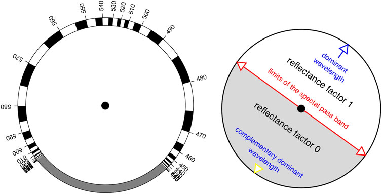
FIGURE 7. This is perhaps the most attractive of Ostwald’s intuitions. The idea is that you cut out the disks and put the right one on top, on a common axis. You then have a circular slide rule that relates the dominant wavelength and spectral passband limits for the full colors.
Does it work (Supplementary Section S8)? This requires explicit calculation, which Ostwald does not provide. He used an inverted spectroscope—an excellent idea, perhaps picked up when reading Maxwell (1855) on the “color box.” He could select parts of daylight and look at arbitrary optimal colors. We know few modern color scientists who ever had that opportunity. Electronic display is no alternative. What he saw convinced Ostwald that the intuition applied. We won’t call him wrong—just somewhat sloppy, perhaps “visionary” is the word.
Our calculation is presented in Figure 8 (a more conventional representation of the same structure is Supplementary Figure S13). It is a pity Bouma (1946) doesn’t show it. We are not aware of a depiction in the 1920’s literature; to many scientists at that time it would have looked familiar. The intuition is not perfect, but the deviation is zero at twelve hue angles, whereas the standard deviation of errors in the hue angles is
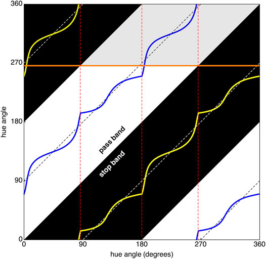
FIGURE 8. In this “Ostwald diagram” Ostwald’s intuition covers only the dashed diagonal lines. The domain is the product of the color circle with itself, that is
Note that there are four distinct types of semichromes. This is most easily understood by using the slide rule to check when the pass band meets the spectrum limits at either side. These types are the essentially different families of spectral reflectance factors, thus important qualitative object properties:
medium pass bands These look
long pass bands These look
medium stop bands These look
short pass bands These look
The medium pass and stop band cases are ecologically rare, the long pass bands are common with organic colors (Supplementary Section S12).
There are four basic families, not three or six, as one might intuit on the basis of tripartition. This is due to the closure of the spectrum by way of the sector of purples. Ostwald’s construction is the unique formal explanation of the “color circle,” long familiar to artists on purely phenomenological grounds. Ostwald’s construction comes from the tripartite structure of white augmented with closure of purples. A close look will reveal the four families.
The families come in two mutually complementary types, the medium stop and pass bands (
The vectors
These polarities occurred in the theory of color as the “Hering opponent colors” (G., Gegenfarben; Hering (1905–1911)). Hering’s idea (G., Vierfarbentheory) was thought to clash with trichromacy, until Schrödinger cleared up the confusion (Schrödinger, 1925). We use the “h” of the
The reason why the Hering basis is of great importance is not so much its phenomenological origin, as the fact that it effectively decorrelates spectral reflectance factors [(Buchsbaum and Gottschalk, 1983); Supplementary Section S12].
For many applications the Hering basis is more appropriate than the rgb tripartition. A good example is the chromaticity diagram. It is possible to base a conventional chromaticity diagram on the tripartition (we use that later), but an orthographic projection along the
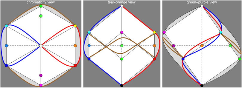
FIGURE 9. The “chromaticity diagram” introduced in this figure is a view of the color solid from
It is of some interest to compare the cie–xy diagram with the orthographic projection. Both are projections of the same objects. The generators of the spectrum cone are infinite half-lines that are based at the origin. In the cie diagram they appear as points of a curve, the direction image in the plane at infinity. In the orthographic projection the cone generators appear as rays radiating from the origin. Thus a wavelength is indicated by a direction, or half-line. The best colors are found near the semichrome locus in both diagrams.
In the cie diagram, the spectral locus corresponds to the black object colors. There is no metric and there are no affine notions like bisection of stretches or parallelity. Only coincidence and collinearity is meaningful (if you know how to interpret these). In contradistinction, in the orthographic projection affine relations count, one even has a Euclidean metric.
In the cie diagram, a point stands for a color of arbitrary intensity. In the orthographic projection a point stands for a color of arbitrary black-white content.
Figure 10 illustrates an example that clearly shows the power in the structure of the chromaticity diagram in Figure 9. It can be used to compute the diagram of Supplementary Figure S13 or that of Figure 6. Such nomographic calculations were common pre–ww-ii. Nowadays one uses straight number-crunching. Figure 10 shows one reason why the proposed chromaticity diagram (Figure 9) makes sense. Understanding the structure of the chromaticity diagram well yields a lot of power. Moreover, it ensures that one keeps a clear view of the relations between the various colorimetric objects. Such uses were common in the pre-computer era.
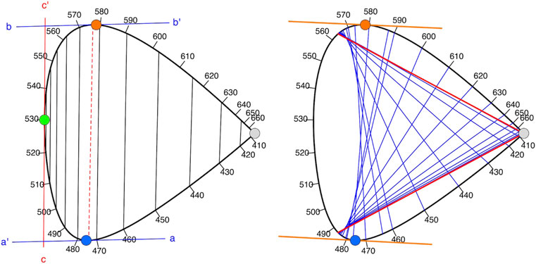
FIGURE 10. Left: The cool edge color curve can be used to find interesting relations. Since
Supplementary Figure S21 summarizes much of the structure. Note the close relation between edge–colors and semichromes, as well as the explicit relation between the semichrome colors and their spectrum. This is all about broadband spectra, the“monochromatic beams” are degraded to mere wavelength calibration in the background.
The object color chromaticity diagram of Figure 9 is much less intuitive for additive mixture (although it can be done) than the conventional chromaticity diagram. This is no big deal, because there is (except for very unlikely settings) no such a thing as the additive mixture of object properties.
In the case of object colors mixture mostly implies union and intersection of characteristic functions, or multiplicative combinations. The chromaticity diagram is well suited for that, since the spectral range is shown in the background.
The main thing to mind is that semichromes are not at all “monochromatic,” but actually scatter half of the source spectrum. Combining object colors should always be understood as an operation on spectra, not colors. This two-way relation between the semichromes (points) and band limits (diagonal lines) is a conjugation relation that should always be kept in mind when using the chromaticity diagram.
The chromaticity diagram is less symmetrical than it might seem (Supplementary Section S6). This is intuitively evident from the fact that the color solid at the black and white points has the shape of the spectrum cone. Near the white point you see basically the shape (Supplementary Figure S12) of the boundary of the planar cut of the spectrum cone illustrated in Figure 1 right.
The “chromaticity diagram” introduced in Figure 9 left is actually a view of the color solid from
For beam colors the classical chromaticity diagram makes sense, because intensities may run all the way from 0 to
It has a power
This is very different for objects colors, which have well defined positions in the color solid. Here chromaticity alone leaves out crucial information. That is why the representation that uses three canonical views of the color solid is preferable. The orthographic projection orthogonal to the kw–axis is like a chromaticity diagram. The projections on the kw–to and kw–gp planes complement that in a useful way. One treats these as three orthogonal views of a 3 D–object.6 This is far more useful than conventional chromaticity plots. The link to spectral composition is as close as can be.
5.1 Ostwald’s Color, White and Black Contents
Wilhelm Oswald proposed a canonical spectral reflectance for any color as the appropriate partitive combination of a semichrome, the standard white, and the standard black. Then any color is parameterized by way of:
hue that is “which” color. One naturally uses something like the angle parameter;
color content that is the attenuation factor for the semichrome, the “color content”;
white content that is the addition of a constant, subject to the constraint that the total reflectance factor may not exceed one;
black content which is simply one minus the sum of the attenuation factor and the white content.
What is special as compared with other systems is that colors come with a unique canonical spectral reflectance factor.
Color content, white content and black content sum to unity. For any hue one has a variety of choices, neatly parameterized by the content in a triangular, barycentric scheme. These became the pages (each hue a page) of the Ostwald atlas (Figure 11).
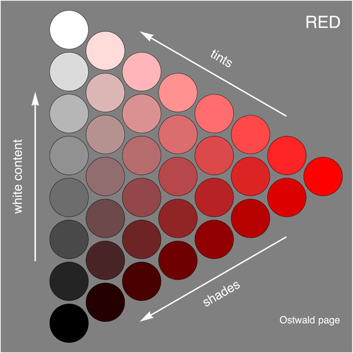
FIGURE 11. A computed page of the Ostwald atlas. The chips interpolate between the semichrome (“full color”), black and white. Mixtures with white are “tints,” mixtures with black are “shades.” Mixtures that include both black and white tend to appear muddy. The idea is that the set of all pages fills out the color solid, thus represents all object colors. The shape of the triangle is arbitrarily taken equilateral.
Ostwald (Ostwald, 1917a; Ostwald, 1917b) actually constructed and published implementations. Although objects of rare beauty, they are only approximations. It was the best a top-notch chemist as Ostwald could do with actual pigments. In contradistinction, the “true” atlas is a formal object, not a physical thing. Today, anyone can easily program it on an electronic display. Various industrial designs of “color pickers” essentially implement it.
The Munsell (1905) atlas is today’s de facto standard. It is due to eye-measure, not physics. There is no relation to object properties and there is no fundamental formal structure. It cannot be constructed from first principles.
There is room for both ontologically distinct types. The real miracle is that the atlases are remarkably similar. Unfortunately, this is also a reason why the ontological roots tend to be ignored. This “miracle” is another manifestation of the efficaciousness of the sharp map
The Ostwald description was reinvented by Alvy Ray Smith (Smith and Lyons, 1996), of early cg fame. It is the hwb color system. Starting with
5.2 An Ostwald Basis
The Ostwald system uses an over-complete, continuous basis (Supplementary Section S9). Thus it is really different from the tripartite (optimal basis). It overlaps significantly with the rgb basis (Figure 12; Supplementary Figures S25–S27) and exhausts 78.5% of the color solid.
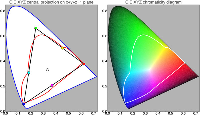
FIGURE 12. At left the CIE–xy-chromaticity diagram, with the gamuts of the tripartition and of the Ostwald semichrome basis. The black triangle shows the outline of the rgb cube. The red line indicates the semichrome locus. Note how the outlines mutually intersect. At right the CIE diagram with colors of the optimal color coloring. The “best” colors are located near the semichrome locus, the central location is white, the spectral boundary and the line of purples are black. That is because the boundary of the diagram is the image of the origin of color space.
The set of all optimal colors is a continuous basis that captures all colors. In principle such a system is impossible to beat, in practice its implementation would be a nightmare.
5.3 Canonical Spectra
We have mentioned various “canonical spectra”:
parts of white constant reflectance factor over the spectral parts of white, produced from an rgb color through the expansion map, Eq. 5;
Ostwald system an attenuated semichrome, diluted with white;
attenuated or diluted optimal color one might say the attenuated optimal color is Schrödinger’s proposition.
A diluted optimal color (mixture with gray) as mentioned above is a similar notion.
In typical cases, such canonical spectra yield quite good approximations to the actual spectrum (Supplementary Section S7; Supplementary Figure S16).
We show a few examples, using a flower color as example. Tropaeolum majus is cultivated for its

FIGURE 13. The Tropaeolum majus is also known as Indian cress. It is mainly valued for its brilliant orange or red flowers. Here the spectral reflectance factor is approximated by the canonical RGB-reflectance and the Ostwald attenuated and diluted full color spectrum. Both are quite good approximations. All three spectra yield exactly the same color.
5.4 The Topology of “Subtractive Color Mixture”
One usually distinguishes “additive” and “subtractive” color mixture, although there are numerous ways to combine spectrally selective scattering. Additive mixture is rarely of interest in the theory of object colors. It is fairly trivial, the main result being that the gamut of beams is confined to the convex hull of the monochromatic beams.
“Subtractive” is actually a misnomer of “multiplicative.” In some circumstances multiplicative combinations of spectral reflectance factors are excellent descriptions, in some cases mere serviceable approximations. It is important to understand the ideal case as a point of departure.
In the additive case it makes no difference whether one adds spectra or colors. In the multiplicative case one has to multiply the spectra. Canonical spectra make a good start. Deviations from canonical may have surprising effects (Section 7.1).
In the cases of the tripartite canonical spectra one may actually multiply the color coordinates, so this is an especially simple case. One has a map of the product of the color circle with itself to the color circle, that means a map from
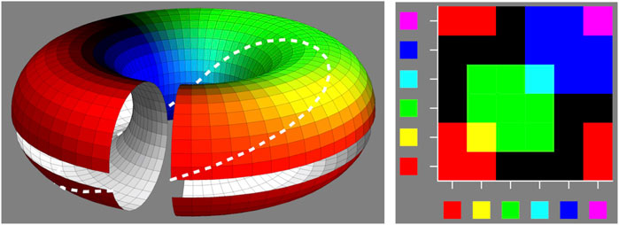
FIGURE 14. Subtractive color mixture is a map
As said, deviations from the canonical spectrum may have non-trivial influences. Differences in the source spectrum may have non-trivial consequences too. That is because the proximal stimulus is the product of the source spectrum and the object spectral reflectance factor (Section 7.1).
6 Variation of the Source and Automatic White Balance (AWB)
So far, we have fixed the source to
6.1 Automatic White Balance
Many electronic cameras use a dedicated sensor to estimate the spectral slope (and perhaps the spectral curvature) of the source spectrum. Even mid-level cameras allow users to enter corrections for both slope and curvature. This allows awb with optional manual correction. Ideally white objects in the scene will be represented as white in the picture.
awb can be implemented colorimetrically by a scaling in rgb–space such as to force a spectrum of certain spectral slope and curvature to map on
We do not consider phenomenology, psychology, or physiology, but simply pursue the effects of awb. “Proper context” serves to indicate ecological limits. Out-of-limits anything goes and “color vision is impossible” [for a proof (Koenderink and van Doorn, 2020)]. Analytic philosophers who will not accept ecological constraints conclude that colors are mere mental paint or that one only pretends to experience them. Many of such ideas are “right” in the sense of not being wrong, but in ways that are irrelevant if one is out alone in the cold. But that is where all biological agents are, including Homo.
The most basic constraint for an effective awb is that the white standard should look
Here
where
It is the denominator that implements awb. Note that one does not need the source spectrum for that, the color of the white standard suffices and that is available from observation.
The
In this ideal system the white standard will look white under any source. So does (trivially!) the black standard. Because of linearity the whole gray axis remains invariant. Chromatic colors in general change, because the proximal stimulus is the coarse-grained product of the object property and the source spectrum.
That is why featureless source spectra are best. They leave the floor to the object properties so to speak. Source spectra with spectral gaps are effectively useless. Examples include low pressure sodium or mercury vapor lamps.
Generically, in ecologically valid contexts, such a system works remarkably well [(Koenderink, 2010; Centore, 2012); Figure 15].
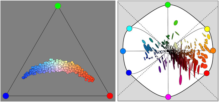
FIGURE 15. At left a gamut of source colors. Spectral slope and curvature are drawn from mutually independent normal distributions. We plot in the conventional chromaticity diagram (though RGB, not the CIE-xy) because these are beam colors. At right 75% confusion ellipses in the orthographic chromaticity diagram, computed for a large database of pigments. Most of the confusion is (roughly) in the purple–green. Because the reflectance spectra are arbitrary, the pattern of ellipses has a chaotic pattern. This is a very wide gamut of sources, so the conclusion is that awb does a good job of correcting for source variations.
Some rules of thumb relating to the effects of slope and curvature in source and reflectance are frequently useful, like in “relighting” applications (Debevec, 2020).
Intuition 3 (Metameric effects of spectral slope and curvature). These are some useful rules of thumb to keep in mind:
• judge the effect for each of the three parts of white separately. For global effects look at the levels instead;
• the effect scales with the product of the slope of the source and of the reflectance spectrum, including sign;
• slope and curvature do not interact;
• the effect of curvature is mainly due to reflectance, it scales linearly (including sign);
• higher order wriggles may safely be ignored since the spectral envelope modulation falls off by the fourth power of frequency.
In most cases one will be able to foresee effects of metamerism quite easily using the hexapartition of white (Section 7). With some experience even quantitative estimates can be made.
Fairly extreme cases are shown in Figure 16 and more in Supplementary Section S13. These examples cover about the range relevant to generic human vision. Notice that awb is evidently not perfect, but amply good enough for the early hominin hunter-gatherer life style.
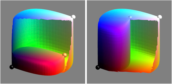
FIGURE 16. The color solid of a black body radiator—with AWB switched off—compared with the color solid for the equal energy spectrum. As an arbitrary scaling (this allows visual comparison) we let the former fit snugly in the latter. At left a “cool” source (
7 Metamerism
The spectrum that hits the eye is the product of the spectral reflectance factor (the “object property”), and the spectrum of the source (the “context”). Since human vision only selects three dimensions out of
Split each of the three spectrum parts into two. One may use an arc-length rectification of the edge–color curves to find suitable cut loci. This refines the tripartition of white into a hexapartition. This six-dimensional spectral representation has a three-dimensional null-space, a subspace of
as possible. The rgb basis remains simply (essentially a tripartition, not a hexapartition—the additional stuff is a refinement):
Such a basis is readily constructed (Supplementary Section S14; Supplementary Figure S16 right).
This “hex-basis” may be deployed in many applications. Intuitively, it renders the parts of white sensitive to spectral slope. In that sense, it may be understood as a first order extension of the tripartite system. Further subdivision yields an even better approximation, but only marginally so. The simple hexa-chromatic model easily captures the brunt of the action.
Canonical hex-spectra necessitate constraints due to the over-complete basis. Either a maximum entropy “smoothest” approximation or a minimax fit associates any rgb–color with a unique hex-spectrum (Supplementary Section S10). These tend to be excellent approximations of natural spectra (Figure 17; Supplementary Figure S16 right).

FIGURE 17. The hex-partition yields an even better approximation to the spectrum than the tri-partition. Here we show a maximum entropy spectrum at left and a minimax spectrum at right (Supplementary Section S10). Of course, one may construct infinitely many metameric versions.
Maximum entropy approximations of spectral reflectance factors can be computed on the basis of the rgb color coordinates. If one has an actual spectrum, one may also compute the hex-representation of the true spectrum. For databases of reflectance spectra of various natural objects one finds that the estimations on the basis of colors are very close to veridical. The reason is, no doubt, that natural spectra do not show wild variations over the visual range. Indeed, the estimates are so good that hyperspectral methods might well be overkill for many applications, including effects of metamerism (Koenderink and van Doorn, 2017).
Metamers of
Metamers of the flat central gray reflectance factor, involve arbitrary amounts of the black components. In the worst case the spectral reflectance will be zero or one in at least one of the six parts. Such metameric reflectance factors are not revealed by the standard source. Phenomenologically, they all are
Viewing all fake objects under all fake sources yields 676 (
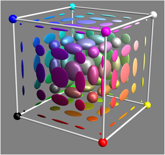
FIGURE 18. Metameric confusion regions are space variant (Note that the optimal colors are not affected at all.) This is a simplified sketch of what happens. Near the faces of the RGB cube the confusion region flattens, near the edges they become needle-shaped, near the vertices (optimal colors) they become arbitrarily small spheres.
The result should give ample food for thought. Suppose you are a magician, then this would make a great act: You show a gray object next to a white standard. It looks
So what is “the color of the object” then? It evidently “has none.” This is the reason people say that “colors are not object properties.”
Colors cannot be labels for objects, for given two objects of different colors (red roses and blue violets, say), you may imagine a world with fake objects and sources in which roses turn blue and violets red for no apparent reason. If you are a hunter-gatherer you cannot depend on the experience that blue berries are good to eat whereas red berries will give you a belly ache. Color is useless and one wonders why evolution ever bothered.
Of course, one knows better, for color works pretty well in daily life. Reason is that the fake cases are very rare:
the visual range is so narrow that spectral radiant power or spectral reflectance do not wildly vary over the range. The correlation range is at least of the order of the width itself. Spectra of any kind are smooth;
there are no physical processes that let spectral radiant power and spectral reflectance be mutually correlated. Surprises will be extremely rare.
The correlation issue is crucial, for the metameric effect depends on it. The multiplicative process in surface scattering, followed by an averaging by retinal absorption, is just a kind of correlation mechanism. Supplementary Figure S40 demonstrates this.
In a simple simulation one prepares random combinations of the metameric blacks to produce slightly perturbed radiant and reflectance spectra (Figure 19, based on a million samples). The distribution is highly kurtotic (Supplementary Section S16), thus something like the convex hull is not a useful measure. Suppose we compute the 99% covariance ellipsoids.
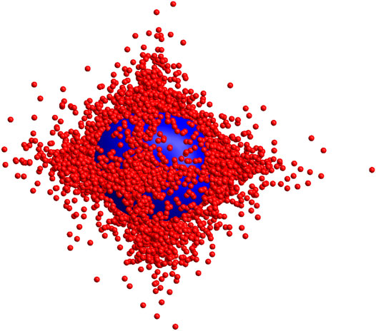
FIGURE 19. This shows samples from colors due to perturbation of the standard source
Their size depends on the magnitude of the perturbation used in computing the fakes. Use a normal deviate with standard deviation σ to perturb the source spectrum (1.0 throughout the spectrum) and the object spectral reflectance factor (0.5 throughout the spectrum). Then the volume of the ellipsoid is proportional to
From the simulation we find
7.1 Metamerism and Multiplicative Mixture
When mixing stuffs characterized by canonical rgb spectra one obtains unique results. One has a well defined map
The figure shows the worst case expectation for mixtures of gray with gray, observed under the standard source
So artists may use their understanding of the deterministic map
This is a rare example where the fact that colors are not always good indicators of object properties matters.
8 Conclusion
Spectral object properties, in relation to human vision, call for a formal “object color colorimetry”. It builds on generic (null-context) colorimetry. It is highly structured due to three factors.
One is a dedicated source spectrum (average daylight, sunlight, … ), another is basic constraints of physics, the third are various ecological constraints. Due to these, object color colorimetry is qualitatively different from null-context colorimetry.
Ignoring this, and treating object colors by way of null-context colorimetry necessitates arbitrary constraints and has led to considerable confusion.7
The geometrical structure of object colorimetry is the proper basis for color vision research, fundamental computer vision and image science.
Chromatic contrast is certainly an aid to optical navigation, space perception and so forth, but this is not to be reckoned proper “color vision.” Color vision implies qualia, the use of chromatic spectral structure as an intentional mark, or cue. The cues for many important physicochemical object properties are spectral. This renders the chromatic qualia important to human biological fitness.
The ecologically relevant variations due to metamerism, both in source spectra and spectral reflectance functions of generic objects, dwarf psychophysical thresholds and physiological constraints (Supplementary Sections S14, S15). Color vision as a way to sense object properties is not limited by the physiology. In contradistinction, color as a spatial discrimination device may well run into physiological limits, but does not recognize color as a quale. “Color vision” proper is about object colors as object properties.
The key difference between object color colorimetry and null-context colorimetry is the close connection between (coarse–grained and awb’d) spectral reflectance functions and experienced
There are two mutually opposing perspectives on this (Byrne and Hilbert, 2003). One perspective is that ecology has nothing to do with what is the case in the physical world at large (often called “reality”). The upshot is that colors are a quirk of the human mind. They hold no relation to object properties at all. This drives one to fictionalism. Neither are roses red, nor violets blue, but we all politely pretend (Gatzia, 2010).
Another perspective is that the ecological parameters drive evolutionary processes. Color is indeed useful in the human life world. In this context roses indeed are red and violets are blue. Colors are pretty good cues to object properties, at least, as far as the evolution of the human species is concerned.
The former perspective is correct, but irrelevant. The latter conclusion is strictly spoken false, but happens to capture the human condition. It is the biological perspective. The one that counts. Surprises should be reckoned with, but should be rare. An individual failing to cope may die. No big deal if such is a rare event.
This is also of importance to computer vision and image science. The ecological statistics have driven the evolution of human color vision. These statistics also offer constraints (Supplementary Sections S11–S14) that may well be exploited by computer vision (Koenderink and van Doorn, 2017; Koenderink et al., 2020).
In the rgb account, especially when augmented by the hexa-partition of white, most two-way relations between colors and spectra become intuitive. The rgb colorimetric coordinates are coarse-grained spectral reflectance factors (the
That is why the tripartite representation is the natural geometry for object color space. The basic formalism presented in this paper serves as the proper base of departure for many applications [Supplementary Sections S12, S14, S17 and (Koenderink and van Doorn, 2017; Koenderink and van Doorn, 2020; Koenderink et al., 2020)].
Data Availability Statement
The original contributions presented in the study are included in the article/Supplementary Material, further inquiries can be directed to the corresponding author.
Author Contributions
All authors listed have made a substantial, direct, and intellectual contribution to the work and approved it for publication.
Funding
The work was supported by the DFG Collaborative Research Center SFB TRR 135, project number 222641018 headed by KG (Justus-Liebig Universität Giessen, Germany). JK is supported by the Alexander von Humboldt Foundation and by Miller Institute for Basic Research in Science, University of California Berkeley.
Conflict of Interest
The authors declare that the research was conducted in the absence of any commercial or financial relationships that could be construed as a potential conflict of interest.
Acknowledgments
JK and AD are grateful to KG for providing a congenial environment at the Department of Psychology, Justus Liebig University, Giessen, Germany.
Supplementary Material
The Supplementary Material for this article can be found online at: https://www.frontiersin.org/articles/10.3389/fcomp.2021.630370/full#supplementary-material
Footnotes
1The supplement to this paper contains various technical details and additional illustrations. Due to length limitations much material has been moved to this supplement. We recommend to skip to the supplement anytime the text refers to it. It will aid in getting the picture. Throughout the text we refer to it. References to sections are “Supplementary Sections and Figures.” The supplement is available at the publisher’s website.
2Here
3Here, as in Eq. 7, we intend the Hadamard (or Schur) element-wise product or quotient.
4Cohen and Kappauf assumed a scalar product where there isn’t any. They implicitly use that when defining a Moore-Penrose pseudo-inverse. “Color space” does not allow for that, it is only a Hausdorff space.
5Often using the human observer as null–detector, but this should not be confused with psychophysics. In our days one would use photoelectric equipment.
6Thus the material to be shown should be suitably sorted “in depth.”
7E.g., the common enough notion that the best colors (object colors implied) would be monochromatic.
References
Albertazzi, L., Koenderink, J. J., and van Doorn, A. (2015). Chromatic dimensions earthy, watery, airy, and fiery. Perception 44, 1153–1178. doi:10.1177/0301006615594700
A. V. Arkhangelskii, and L. S. Pontryagin (Editors) (1990). General topology I. Berlin, Germany: Springer-Verlag.
Born, M., and Wolf, E. (1999). Principles of optics. 7th Edn. Cambridge, United Kingdom: Cambridge University Press.
Bouma, P. J. (1946). Kleuren en kleurenindrukken. Amsterdam, Netherlands: Philips Technische Bibliotheek, Meulenhoff & Co. N.V.
Buchsbaum, G., and Gottschalk, A. (1983). Trichromacy, opponent colours coding and optimum colour information transmission in the retina. Proc. R. Soc. Lond. B, Biol. Sci. 220 (220), 89–113. doi:10.1098/rspb.1983.0090
Byrne, A., and Hilbert, D. R. (2003). Color realism and color science. Behav. Brain Sci. 26, 3–21. doi:10.1017/s0140525x03000013
Centore, P. (2011). A zonohedral approach to optimal colours. Color Res. Appl. 38 (2), 110–119. doi:10.1002/col.20713
Centore, P. (2012). Geometric invariants under illuminant transformations. Color Res. Appl. 39 (2), 179–187. doi:10.1002/col.21769
CIE (1932). Commission Internationale de l’Éclairage proceedings 1931. Cambridge, United Kingdom: Cambridge University Press.
Cohen, J. B., and Kappauf, W. E. (1982). Metameric color stimuli, fundamental metamers, and wyszecki’s metameric blacks. Am. J. Psych. 95 (4), 537–564. doi:10.2307/1422186
Feynman, R., Leighton, R., and Sands, M. (1964). The feynman lectures on physics (3 volumes). 7th Edn. Boston, MA: Addison–Wesley.
Foley, J., Dam, A. V., Feiner, S., and Hughes, J. (2005). Computer graphics, principles and practice. 2nd edition. New York, NY: Addison-Wesley Publishing Company.
Grassmann, H. (1853). Zur theorie der Farbenmischung. Ann. Phys. Chem. 165 (5), 69–84. doi:10.1002/andp.18531650505
Griffin, L. D., and Mylonas, D. (2019). Categorical colour geometry. PLoS One 14 (5), e0216296. doi:10.1371/journal.pone.0216296
Helmholtz, H. (1855). Ueber die zusammensetzung von spectralfarben. Ann. Phys. Chem. 170, 1–28. doi:10.1002/andp.18551700102
Hering, E. (1905–1911). Grundzüge der Lehre vom lichtsinn. 1st Edn. Berlin, Germany: Springer-Verlag.
Koenderink, J. J., and van Doorn, A. J. (1983). Geometrical modes as a general method to treat diffuse interreflections in radiometry. J. Opt. Soc. Am. 73 (6), 843–850. doi:10.1364/josa.73.000843
Koenderink, J., and van Doorn, A. (2017). Colors of the sublunar. Iperception 8 (5), 1–30. doi:10.1177/2041669517733484
Koenderink, J., van Doorn, A., and Gegenfurtner, K. (2018a). Compositorial colour weight. Iperception 9 (5), 1–46. doi:10.1177/2041669518788582
Koenderink, J., van Doorn, A., and Gegenfurtner, K. (2018b). Color weight photometry. Vis. Res. 151, 88–98. doi:10.1016/j.visres.2017.06.006
Koenderink, J., van Doorn, A., and Gegenfurtner, K. (2018c). Graininess of RGB–display space. Iperception 9 (5), 1–46. doi:10.1177/2041669518803971
Koenderink, J., van Doorn, A., and Gegenfurtner, K. (2020). Colors and things. Iperception 11 (5), 1–43. doi:10.1177/2041669520958431
Kortüm, G. (1969). Reflectance spectroscopy Principles, methods, applications. Berlin, Germany: Springer.
Kries, J. V. (1905). “Die gesichtsempfindungen,” in Handbuch der physiologie des menschen. Editor W. Nagel (Braunschweig, Germany: Vieweg), Vol. 3, 109–282.
Maloney, L. T., and Wandell, B. A. (1986). Color constancy: a method for recovering surface spectral reflectance. J. Opt. Soc. Am. A. 3, 29–33. doi:10.1364/josaa.3.000029
Maxwell, J. C. (1855). Experiments on colour, as perceived by the eye, with remarks on colour blindness. Trans. Royal Soc. Edinb. 21, 275–289. doi:10.1017/S0080456800032117
Newton, I. (1704). Opticks: or, A treatise of the reflexions, refractions, inflexions and colours of light. London, UK: Sa.Smith and Benj.Walford.
Rao, C. R., and Mitra, S. (1971). Generalized inverse of matrices and its applications. New York, NY: John Wiley & Sons.
Runge, P. O. (1810). Die farben-kugel, oder construction des verhältnisses aller farben zueinander. Hamburg, Germany: Perthes.
Schopenhauer, A. (1816). Ueber das Sehn und die Farben: eine Abhandlung. 2nd Edn. Leipzig, Germany: Hartknoch.
Schrödinger, E. (1920). Theorie der Pigmente von größter Leuchtkraft. Annalen der Physik 4 (62), 603–622. doi:10.1002/andp.19203671504
Schrödinger, E. (1925). Über das verhältnis der vierfarben–zur dreifarbentheorie. sitzungsberichte der akademie der wissenschaften in Wien. Mathematisch-naturwissenschaftliche Klasse 134, 471–490.
Smith, A. R., and Lyons, E. R. (1996). HWB-A more intuitive hue-based color model. J. Graphics Tools 1 (1), 3–17. doi:10.1080/10867651.1996.10487451
Stockman, A., Sharpe, L. T., Merbs, S., and Nathans, J. (2000). Spectral sensitivities of human cone visual pigments determined in Vivo and in Vitro. Methods Enzymol. 316 (42), 626–650. doi:10.1016/s0076-6879(00)16754-0
Vazquez-Corral, J., O’Regan, J. K., Vanrell, M., and Finlayson, G. D. (2012). A new spectrally sharpened sensor basis to predict color naming, unique hues, and hue cancellation. J. Vis. 12 (6), 1–14. doi:10.1167/12.6.7
Webster, M. A., and Miyahara, E. (2000). Variations in normal color vision. II. unique hues. J. Opt. Soc. Am. A. Opt. Image Sci. Vis. 17 (9), 1545–1555. doi:10.1364/josaa.17.001545
West, G., and Brill, M. H. (1983). Conditions under which Schrödinger object colors are optimal. J. Opt. Soc. Am. 73 (9), 1223–1225. doi:10.1364/josa.73.001223
Wyszecki, G., and Stiles, W. S. (1967). Color science: concepts and methods, quantitative data and formulae. New York, NY: Wiley.
Keywords: RGB-color, ecological optics, metamerism, color solid, automatic white balance, color mixtures, color statistics
Citation: Koenderink J, van Doorn A and Gegenfurtner K (2021) RGB Colors and Ecological Optics. Front. Comput. Sci. 3:630370. doi: 10.3389/fcomp.2021.630370
Received: 17 November 2020; Accepted: 17 February 2021;
Published: 30 April 2021.
Edited by:
Sven Dickinson, University of Toronto, CanadaReviewed by:
Ko Nishino, Kyoto University, JapanJesús Malo, University of Valencia, Spain
Michael Brown, York University, Canada
Copyright © 2021 Koenderink, van Doorn and Gegenfurtner. This is an open-access article distributed under the terms of the Creative Commons Attribution License (CC BY). The use, distribution or reproduction in other forums is permitted, provided the original author(s) and the copyright owner(s) are credited and that the original publication in this journal is cited, in accordance with accepted academic practice. No use, distribution or reproduction is permitted which does not comply with these terms.
*Correspondence: Jan Koenderink, a29lbmRlcmlua2phbkBnbWFpbC5jb20=
 Jan Koenderink
 Andrea van Doorn1,3
 Karl Gegenfurtner