
94% of researchers rate our articles as excellent or good
Learn more about the work of our research integrity team to safeguard the quality of each article we publish.
Find out more
METHODS article
Front. Future Transp., 27 March 2023
Sec. Transportation Systems Modeling
Volume 4 - 2023 | https://doi.org/10.3389/ffutr.2023.1127742
This article is part of the Research TopicWomen in Transportation Research 2022View all 4 articles
 Simone Weikl*
 Patricia Mayer
Most planning guidelines for bicycle networks define a consistent set of qualitative criteria. All relevant destinations should be reached by bike in a safe, coherent (i.e., continuous bicycle facilities), direct (i.e., minimal detours), comfortable and attractive way. For transportation planners, few information exist on the degree to which these qualitative criteria are (still) fulfilled for already existing bicycle networks. However, these information are essential for the definition and prioritization of appropriate bicycle infrastructure measures under limited budget. Until now, no standardized methodology for the purely data-driven quantitative assessment of all of these five (and potentially more) qualitative bicycle network criteria exists. This paper develops a data-driven quality assessment methodology for bicycle networks. Based on an extensive literature review of existing guidelines, design manuals and literature on bicycle network planning, a comprehensible set of relevant qualitative criteria for bicycle networks including sub-criteria are defined in detail. For each sub-criterion, possible measurable indicators and data sources are identified as well. Indicators are translated into precise and transparent evaluation scales with a strong foundation. They are based on widely used guidelines and design manuals for bicycle traffic in European countries, especially the ones of pioneer countries for cycling such as the Netherlands. The work differentiates between local indicators of single bicycle facilities (edge-based, e.g., surface quality), route-wide indicators (e.g., travel time ratio) and network-wide indicators (e.g., network density) and integrates these into an overall framework. A methodology is developed that combines and weights several sub-criteria to consolidated scores for each criterion as well as one final overall score for bicycle network quality. Finally, the applicability of the approach is shown within a case study for the city of Munich, Germany. The key findings for Munich’s cycling network are as follows. The cycling network has a medium level of quality, indicating clear potential for improvement. The analysis of sub-criteria revealed that the city of Munich should focus primarily on expanding the main cycling network, on decreasing the number of conflict points and on decreasing the travel time of cyclists.
Motorized individual transport, which has been the focus of urban planning since the 1970 s, leads to a variety of problems in many cities today, such as noise, exhaust fumes and traffic congestion. In today’s car-based city, large areas are no longer accessible to residents, but are instead reserved for cars and trucks. Thus, the quality of life and health suffers. One way to overcome these problems is to strengthen cycling and thus to reduce motorized individual transport. Netherlands, for example, recognized this several years ago and radically changed its transport and urban planning policy, making it one of the pioneers in the field of cycling. In addition to improving the cityscape and reducing noise emissions, strengthening cycling reduces CO2 emissions. In order to mitigate climate change and its drastic consequences, an increasing number of countries like Germany are urgently seeking solutions to promote cycling.
Whether cycling is used as an alternative to cars, however, depends to a large extent on the quality of the service. High-quality cycling infrastructure can motivate people to cycle Buehler and Dill (2016), as can be seen in the Netherlands and Denmark. Here, a generous expansion and conversion of the cycling infrastructure has resulted in many people using the bicycle as an everyday means of transport. So far, it is often difficult for politicians and planners to assess the quality of existing or future cycling infrastructure. However, this knowledge is crucial for the evaluation of expansion and maintenance plans for cycling infrastructure as well as for identifying infrastructure measures with highest positive impact on cycling. Ideally, there is a simple way of carrying out this evaluation, for which a data-based approach is especially suitable.
In this paper, such a data-based approach for the quality assessment of cycling infrastructure is developed and presented. It enables the identification of weaknesses in cycling networks to derive options for action and to support policymakers and planners. Although a wide range of data on cycling and cycling infrastructure is already collected today, these are not linked with each other and are therefore difficult to understand and interpret. The aim of this study is the development of a method for data-based quality assessment of cycling networks and its application to a real-world cycling network.
For this purpose, relevant criteria for cycling network quality are identified. Criteria are understood to be universal categories that can be applied irrespective of the location and whose fulfilment contributes to an increase in cycling (CROW-Fietsberaad, 2016; European Commission, 2022). Each quality criterion is assigned a number of suitable sub-criteria. Sub-criteria are a finer gradation of criteria and their fulfilment contributes to the fulfilment of the criterion. Each sub-criterion is assigned a number of measurable indicators. Indicators describe characteristics of a road or path and are used to measure the performance of a sub-criterion. For example: for the criterion safety, one of the sub-criteria is collision risk, which can be described by the indicator “guidance of bicycle traffic” or the indicator “distance to stationary traffic”. First, the quality of the cycling network is assessed individually for each indicator on the basis of a five-stage evaluation scale, the results of which are transferred to the corresponding sub-criterion. Subsequently, sub-criteria and criteria are weighted in relation to each other based on a survey. Finally, the overall result is derived by summing up weighted evaluation results of sub-criteria and criteria. The developed method is applied to the city of Munich, Germany within a case study.
Compared to existing methods, our approach has several advantages. It is purely data-driven, exclusively uses measurable indicators and translates these indicators into precise and transparent evaluation scales. These evaluation scales have a strong foundation. They are based on the most widely used guidelines and design manuals for bicycle traffic in European countries, especially on the ones of pioneer countries for cycling such as the Netherlands. Our methodology covers all major criteria for cycling networks defined in these guidelines and thus delivers a fully comprehensive view of the cycling network’s quality. As criteria are broken down into detailed sub-criteria, users have the opportunity to understand more precisely the reasons for a low overall rating. The combination of different types of indicators (edge-based, route-based, network-based) guarantees that quality levels can be assessed spatially as detailed as possible. All sub-criteria and criteria are weighted in order to be able to differentiate their actual importance for the overall quality of the bicycle network.
The outline of this paper is as follows: In Section 2.1, quality criteria for cycling networks used in literature are identified. In Section 2.2, existing methods for the quality assessment of cycling networks are introduced. Here, a special focus is on the criteria covered by the methods, on the methods’ advantages and disadvantages and on the identification of research gaps. Based on the extensive literature review, we define sub-criteria, indicators, potential data sources and evaluation scales for the data-driven quality assessment method in Section 3.1. The different types of indicators (edge-based, route-based, network-based) are explained in Section 3.2 and formulas for the aggregation to network-wide results are introduced. In Section 3.3, we develop a methodology for weighting assessment results of sub-criteria and criteria in order to derive an overall quality result of the cycling network. The developed method is implemented in a Python framework and finally applied to the study area, the Munich bicycle network, in Section 4. We conclude this study with a discussion where we focus on key findings and limitations of this study and on future work.
This chapter provides an overview of quality criteria for bicycle-friendly cities used in literature. It also reviews existing methods for the quality assessment of cycling facilities and cycling networks.
According to the Dutch design manual for bicycle traffic (CROW-Fietsberaad, 2016), there are five criteria to be met for a high quality cycling network: coherence, directness, attractiveness, safety and comfort. These criteria are defined as follows.
• Safety: “The cycling infrastructure ensures the road safety of cyclists and other road users.”
• Comfort: “The cycling infrastructure allows for a smooth and comfortable flow of cycling traffic.”
• Directness: “The cycling infrastructure always offers the cyclist the most direct route possible (detours are kept to a minimum).”
• Coherence: “The cycling infrastructure represents a coherent whole and makes accessible all origins and destinations of cyclists.”
• Attractiveness: “The cycling infrastructure is designed and integrated into the environment in such a way that cycling is attractive.”
Safety ensures a safe ride between the origin and the destination, in terms of physical integrity. This includes not only technical safety, which is measured quantitatively, but also social safety, which is a subjective perception. Social safety is crucial for bicycle use (CROW-Fietsberaad, 2016; DfT, 2020). Several scholars (Pikora et al., 2003; Fraser and Lock, 2010; Pucher and Buehler, 2010) showed that safety is positively associated with higher cycling levels, especially for elderly people and even on rainy days (Hong et al., 2020). Comfort is defined as the minimization of energy expenditure and mental concentration. Cyclists must take into account the physical forces of rolling and air resistance as well as the force of gravity on inclines. In addition to constant high loads, irregular loads such as braking and restarting can reduce comfort. Hull and O’Holleran (2014) conclude in their study that besides safety, comfort should be at the forefront of infrastructure design. Directness refers to routes that are as short and direct as possible. Gerike et al. (2022) highlight that detours and time wasted, e.g., due to waiting times at intersections should be kept to a minimum. Coherence, also referred to as cohesion, states that all routes should be sufficiently connected to each other and that access to the network is guaranteed from any point. In addition, CROW-Fietsberaad (2016) states that “[t] he infrastructure […] represents a coherent whole and provides access to all origins and destinations of cyclists”. The importance of coherence for the attractiveness of cycling is supported by a literature review on environmental correlates of cycling (Saelens et al., 2016). Attractiveness refers to the environment while cycling, e.g., the presence of green areas. According to Ta et al. (2021), contact with green space during cycling positively impacts cyclists’ satisfaction. Thus, attractiveness should be considered as a quality criterion for cycle networks. In CROW-Fietsberaad (2016), the five criteria safety, comfort, directness, coherence and attractiveness are always on the same level, i.e., none of the criteria is weighted higher or lower.
The handbook for cycling-inclusive policy development (Pettinga et al., 2009) refers to the criteria listed by CROW-Fietsberaad (2016). As this is a policy development manual, it mainly outlines how to develop a bicycle-friendly policy plan.
In ASTRA (2008), the Swiss manual for planning cycling routes, only the three criteria of safety, attractiveness and cohesion are used. The criterion attractiveness comprises the flow of traffic, which means smooth driving without interruptions. It also contains the attractiveness of the environment as well as the quality of the surface. The criterion safety includes bicycle traffic guidance under consideration of traffic volumes. Safety also comprises homogeneity (the number of changes in road and path categories), the number of danger spots and the perception of safety, which is described by the number of problem spots. The criterion cohesion is described by directness, which is evaluated using a formula of effective distance, air distance and effective height metres. Cohesion also incorporates accessibility, which assesses the distance of important destinations from cycling routes.
According to the United Kingdom (UK) guide for cycling infrastructure design (DfT, 2020), the five design principles to be fulfilled for cycling networks are to be coherent, direct, safe, comfortable and attractive. The assessment is based on the Cycling Level of Service (CLoS), which will be discussed in Section 2.2.
The London cycling design standards (Transport for London, 2016) added another design principle: adaptability. Adaptability means that cycling infrastructure is designed to accommodate all types of bicycles and an increasing number of cyclists.
According to a German cycling handbook (StMB, 2011), the essential basic requirements for a cycling network are traffic safety, freedom from detours, social safety and speedy progress. In addition, network planning criteria are listed, some of which can be translated into the criteria of CROW-Fietsberaad (2016): link quality (directness), access quality (coherence), traffic safety (safety), quality of stay (attractiveness), social safety (attractiveness), rideability (comfort), travel time (directness), orientation (coherence), service, and operation of bicycle facilities. Service means service offers such as bicycle parking facilities at public transport stations or bicycle transport options in public transport. The operation of bicycle facilities includes the consideration of bicycle routes for cleaning and winter services as well as safe guidance and rerouting in case of construction sites.
The German recommendations for cycling facilities, ERA, (FGSV, 2010), provide methods for quality assurance. Various objectives are defined and these can be assigned to the criteria defined in CROW-Fietsberaad (2016): traffic safety (safety), subjectively safe routing (attractiveness), rideability at a certain speed level (directness), minimum waiting time (directness), detour minimization (directness), slope minimization (comfort), no hazards to fall (safety), low rolling resistance of surfaces (comfort), good maintenance and operating condition (comfort) as well as equipment of main connections with signposting (coherence).
Hull and O’Holleran (2014) developed the Bicycle Infrastructure Score to determine which bicycle infrastructure design promotes bicycle traffic. This score is a qualitative and subjective evaluation of bicycle facilities in the categories of coherence, directness, attractiveness, road safety, comfort, spatial integration, experience, and socioeconomic value. Spatial integration includes the integration of bicycle infrastructure into the spatial context. Experience is the cyclist’s comprehensive impression of the route. Socioeconomic value represents an assessment of how well routes connect destinations. For each criteria, sub-criteria were defined. The authors concluded that the following design principles for bicycle-friendly infrastructure should be considered: wide bike lanes; direct routes that connect all uses; separation, where possible, especially on busy main roads; clear signage; no interruption of bike lanes at dangerous locations; either bypasses or traffic signals with priority for cyclists at intersections; use of high quality materials for bike lanes; barriers that are visible even at night and do not force cyclists to dismount; high-quality lighting; attractive design (e.g., green spaces); frequent and high-quality parking facilities; bicycle infrastructure not as an add-on, but in a multi-modal system.
According to Furth (2021), a bicycle network must provide low-stress connectivity. Origins and destinations should be accessible without long detours or excessive inclines. The criteria mentioned are separation from traffic congestion (safety), pleasant, well-lit and low-crime environment (attractiveness), smooth, well-maintained pavement (comfort), avoidance of long, steep grades (comfort), and connected and direct routes (coherence and directness). These criteria correspond closely with the criteria of CROW-Fietsberaad (2016).
To summarize it can be said that the most frequently mentioned criteria in literature and planning guidelines are safety, attractiveness, comfort, directness, and coherence. These criteria enable a differentiated evaluation of cycling infrastructure and networks and serve as a benchmark for bicycle-friendly transportation planning. This is why in the following they build the basis for this research.
Having identified various criteria and sub-criteria for cycling networks discussed in literature in the previous section, we will now focus on literature that discusses quality assessment methods for bicycle networks. The criteria covered as well as advantages and disadvantages of these methods are highlighted in Table 1.
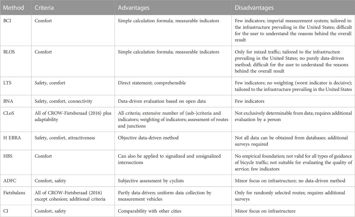
TABLE 1. Summary of quality assessment methods for cycling networks.
The Bicycle Compatibility Index (BCI) (Liu et al., 2019) indicates the comfort of roadway segments for cyclists using a formula. This index does not take intersections into account. To ensure compatibility with the Highway Capacity Manual (HCM) (National Research Council, 2010), the results are mapped into the A through F system of the HCM (Pritchard et al., 2019). The formula incorporates presence of a bicycle lane or a paved shoulder
The Bicycle Level of Service (BLOS) is a method developed by Sprinkle Consulting Inc. (2007) to determine the level of comfort in mixed traffic. It is based on the evaluation of comfort by subjects who biked along various bicycle paths under various traffic situations within a study. By relating the subjective evaluation of comfort to various characteristics of the environment, a formula for the BLOS score was developed and mapped to six levels of service (A to F) similar to FGSV (2015). The infrastructure characteristics considered are traffic volume, total number of lanes, maximum speed, percentage of heavy traffic, surface condition, and average width of the outer lane. The BLOS method was continued in the Highway Capacity Manual (National Research Council, 2010) and, in addition to calculations for street segments, calculations for intersections, links, and bicycle facilities were introduced.
Level of Traffic Stress (LTS) is a method developed by Mineta Transportation Institute (Mekuria, 2012), in which roadway segments are classified into four levels with respect to various characteristics based on a stress level scale. The worse the cycling infrastructure, the higher the stress level. Different indicators of the road section (number of lanes, speed of motorized vehicle traffic, existing bicycle facilities, width of the bicycle facilities, existing stationary traffic, width of stationary traffic) as well as different indicators of the intersection (bicycle lane, mixed traffic with existing right-turn lane) are considered individually and the LTS is determined in each case on the basis of a table. The decisive factor for the evaluation of the road segment is the worst rating, i.e., the highest stress level that occurs. The four levels of LTS are based on the four groups of cyclists established by Dill and McNeil (2016): “strong and fearless,” “enthused and confident,” “interested but concerned,” and “no way, no how.” The “no way” group is being disregarded and the group “interested but concerned” is divided into two groups, one for children and one for adults. The thresholds for LTS levels are based on Dutch planning guidelines like CROW-Fietsberaad (2016), since these guidelines have encouraged a large number of the population to cycle. Connectivity in this context means that the connected route segments do not exceed the defined stress level or, if the defined stress level is exceeded, that the resulting detours are as small as possible.
The Bicycle Network Analysis (BNA) (PeopleForBikes, 2022) is an analysis tool for assessing the stress on route segments and the connectivity of the bicycle network, similar to and building on LTS. In contrast to LTS, the assessment of connectivity is more sophisticated. It includes the six categories of connectivity of people, to educational facilities, to central services, to recreational areas, to retail, and to transportation, which are rated on a point scale from 0 to 100. This takes into account what stress level the connection to the particular destination has. In contrast to the LTS, the stress level is only differentiated into high-stress and low-stress. The LTS concept was adjusted for Europe and supplemented by missing types of cycling facilities. The determination of the road segments’ stress level is based on the indicators type of cycling facility, speed of motorized vehicle traffic, number of lanes, existing stationary traffic, and width of the bicycle facility. The stress level at intersections is determined using the indicators type of intersection, number of lanes, speed of motorized vehicle traffic, and median island. The evaluation is based on data from OpenStreetMap (2022) (OSM).
Cycling Level of Service (CLoS) is a method developed by Transport for London (2016) to assess cycling infrastructure and junctions. The method focuses on rideability, i.e., the cycling experience, as well as the performance of routes and junctions, and does not differentiate between road types, as the choice of appropriate infrastructure is a primary consideration. As a result, assessment areas may need to be adjusted for road type. Cycling infrastructure is evaluated on six criteria: safety, directness, coherence, comfort, attractiveness, and adaptability. Adaptability is understood to mean that cycling infrastructure is designed to accommodate all types of bicycles and an increasing number of cyclists (Transport for London, 2014). The criteria are subdivided into sub-criteria, which are in turn supported by one or more indicators, which then measure performance. For example, the safety criterion is subdivided into the criteria of collision risk, sense of safety, and social safety. The sub-criterion collision risk is described by the indicators left/right turn at intersections, side or rear collision, roadside activity, risk of collision with a car door or by another vehicle disregarding the right of way or traffic signal. The indicators are evaluated with the help of a three-stage point system (0-basic, 1-good or 2-highest possible). Critical indicators are given a higher weighting and are multiplied by three in the overall evaluation. The overall score is obtained by summing up all points, whereby a maximum score of 100 points can be achieved. Finally, the points are divided into low, medium and high. The assessment of junctions is carried out for each node arm individually by a three-level scale (red, yellow, green), whereby here only the risk of collision is considered.
The H EBRA (FGSV, 2021) describe a procedure to put such evaluations on a more objective basis, and to be able to quickly identify parts of the cycling network with a need for action. The evaluation of the cycling facility is divided into the two parts of guidance and facility condition. The worst value is included in the overall evaluation. The guidance, which is similar to the criterion of safety, comprises the guidance of motorized vehicle traffic and the guidance of pedestrian traffic. These are evaluated on the basis of how much the actual state deviates from the target state according to the German recommendations for cycling facilities (ERA) (FGSV, 2010). The facility condition, which is similar to the comfort criterion, is determined by deficiencies. A scale is introduced in which deviations from the target are penalized with loss points. The attractiveness is determined with the help of a point system and weighted with factors. Positive experience qualities generate plus points, while negative qualities generate minus points. The points are also multiplied by factors that reflect the perception of attractiveness. Perception is understood to mean whether the cyclist can perceive his or her environment or if the cyclist needs all his concentration for focussing on the traffic. The attractiveness value can then be read from a five-point scale.
In the German Manual for the Design of Road Traffic Facilities (HBS) (FGSV, 2015), the quality of traffic flow for bicycle traffic is measured and then classified into traffic flow quality levels from A to F, where A is the best level and F is the worst level. The traffic quality rating serves as evidence that on bicycle facilities, the expected traffic demand can be handled with the desired quality. The essential criterion is the ability of cyclists to move freely (i.e., without interference by other cyclists) taking into account route characteristics, traffic regulations and own abilities. According to this definition, this method can be assigned to the criterion comfort. The quality level results from the disturbance rate for one-way and two-way traffic. The disturbance rate includes the notional width, the design traffic volume, the overtaking rate, encounters and punctual disturbances. In addition to the traffic quality on road sections, HBS offers the possibility to measure the quality levels for signalized and unsignalized intersections based on waiting times.
The ADFC Bicycle Climate Test is a non-representative survey of cyclists throughout Germany conducted by the German bicylcle club ADFC. The survey is conducted every 2 years over a 3-month period and includes 27 questions on cycling and traffic climate, the importance of cycling, cycling safety, cycling comfort, and the cycling network (ADFC, 2022). On a six-point scale participants can indicate their opinion. This is a subjective assessment of the participants and no data-driven analysis. In addition to questions on infrastructure, other areas such as cycling climate are also assessed, which means that infrastructure is only one part of the method. The main criteria evaluated are safety and comfort.
The Fietsbalans (the cycling balance) is a methodology developed by the Dutch cycling federation Fietsersbond for the objective evaluation of cycling networks (Borgman, 2017). The basis are the five main criteria directness, coherence, attractiveness, safety, and comfort defined in CROW-Fietsberaad (2016). These have been broken down to eleven simple objective criteria to provide reliable and plausible results: directness, obstruction (comfort), road surface (comfort), attractiveness, competitiveness to the car, bicycle parking, bicycle use, road safety for cyclists, urban density, cyclists’ satisfaction, and transport policy. The criteria are described and evaluated by one or more indicators. For example, directness includes detour factor, delay, and average speed. To collect the data, national data are analyzed, surveys of city and municipal officials and opinion polls of cyclists are conducted, and parking facilities and infrastructure are assessed. A measurement car and measurement bicycle were specially designed to assess the infrastructure in order to collect all relevant bicycle facility data in a uniform manner.
The Copenhagenize Index was developed by the Copenhagenize Design Company in 2011 in order to assess and compare the bicycle-friendliness of cities (Copenhagenize Design Company, 2019). The assessment is made in three categories: streetscape, culture and ambition. A total of 13 indicators are measured and given a score between zero and four. The streetscape indicators are bicycle infrastructure, bicycle facilities, and traffic calming. The culture category is measured by the indicators gender split, modal share for bicycles, modal share increase over the last 10 years, safety indicators, image of bicycles and cargo bikes. Ambition is composed of the indicators advocacy, politics, bike share, and urban planning.
In summary, there are many approaches to evaluate cycling facilities and cycling networks. Table 1 summarizes all of the described methods with their associated criteria, advantages and disadvantages. It can be seen that only a few approaches use all of the criteria identified in Section 2.1 as the basis for the assessment. The approaches of CLoS and Fietsbalans go in that direction, but they do not provide an exclusive data-driven assessment. In most cases, only single criteria are used for the assessment. However, this does not create a differentiated picture of the cycling network. As highlighted in Section 2.1, all criteria must be met in order to develop a bicycle-friendly city. Therefore, all criteria should be included in the evaluation of cycling networks. Within this work, all five identified criteria for cycling networks are incorporated and are evaluated solely through data.
The quality of the cycling network is assessed with regard to several independent criteria. For this purpose, the major criteria prevailing in the literature were already identified in Section 2.1. Within this section, several sub-criteria are defined for each criterion along with measurable indicators based on literature. Potential data sources are elaborated for each of the indicators. Afterwards, we develop precise and transparent evaluation scales for each indicator based on widely used guidelines and design manuals for bicycle traffic in European countries. Here, a special focus is on guidelines of cycling pioneer countries such as the Netherlands. The developed method is based on different types of indicators (edge-based, route-based, network-based) that can be extrapolated to the whole network. Thus, quality levels can be assessed spatially as detailed as possible. Each indicator’s evaluation result is assigned to the corresponding sub-criterion. In case a sub-criterion has several indicators, the worst indicator result is assigned to the sub-criterion. Based on a survey, sub-criteria and criteria are weighted in relation to each other. This weighting is considered for the aggregation of sub-criteria to criteria results as well as for the calculation of the overall quality score.
In the literature, as shown in Section 2.1, the five assessment criteria of safety, comfort, directness, coherence, and attractiveness are dominant, as stated among others by CROW-Fietsberaad (2016); Pettinga et al. (2009); Transport for London (2016). Therefore, these criteria build the foundation of this work. Building on this, appropriate sub-criteria for the data-driven quality assessment are developed as well as associated indicators and possible data sources. We also derive an evaluation scale for each indicator. Each indicator is rated on a scale of one to five, with one representing very poor and five representing very good.
Based on the literature review of criteria, sub-criteria and quality assessment methods in Section 2.1; Section 2.2, the following sub-criteria were defined for the safety criterion: width of the bicycle facility, speed difference of motorized and bicycle traffic, collision risk, conflict points, and lighting.
In the literature, this sub-criterion is not explicitly mentioned for the safety criterion. However, this sub-criterion is necessary to assess the collision risk mentioned in Transport for London (2016). The more space available, the lower the collision risk as typical driving errors can be forgiven. The bike lane should provide sufficient width for safe overtaking. If cyclists have to overtake in lanes of motorized traffic or on the sidewalk, this compromises the cyclist’s safety, as it can lead to conflicts between traffic participants. Cyclists also feel safer when they are not harassed by faster cyclists. To avoid this, fast cyclists must be offered a safe overtaking opportunity. Indicator: The indicator for this sub-criterion is the width of the bicycle facility itself. Data source: One possible data source is OpenStreetMap (2022), whereby the usability strongly depends on the number of edges for which a width is specified. Evaluation scale: The width of the bicycle facility is assessed depending on the prevailing bicycle traffic guidance and the corresponding minimum and standard width according to FGSV (2010). The rating is very good if the width is greater than the standard width, good if it is equal to the standard width, medium if it is greater or equal to the minimum width, poor if it is below the minimum width, and very poor if the width is more than 30% less than the minimum width.
According to CROW-Fietsberaad (2016), the speed difference is decisive in reducing the severity of accidents and in avoiding collisions between bicycle and motorized traffic. If bicycle traffic is routed on the road, an increase in safety can be achieved by reducing the speed difference, as highlighted in DfT (2020). On top of that, Transport for London (2016) includes the speed of motorized vehicles in the evaluation of safety. The lower the speed difference, the safer the cyclists feel according to ADFC (2018). Indicator: The indicator is the speed difference which is the difference between the permitted speed of motorized traffic and the average speed of bicycle traffic. The indicator speed difference is considered only on bicycle lanes guided on the road. These include mixed traffic, protective bike lane, bike lane and bicycle street. Data source: The permitted speed of motorized traffic can be obtained from OpenStreetMap (2022). Cyclists’ average speed is derived from Falkenberg et al. (2003), in which an average speed of 16.9 km/h was determined among approximately 6,900 cyclists. Evaluation scale: A very good rating is given if the difference is less than 5 km/h. The further grading takes place in 10 km/h steps. The rating is only determined for on-road bike lanes, since for separated bike lanes the speed difference is only decisive in the intersection area. The evaluation scale is based on the speeds and maximum speeds for mixed traffic recommended by ADFC (2018) and CROW-Fietsberaad (2016).
For assessing the risk of collision with moving traffic, the guidance of bicycle traffic is important. There are several ways to guide bicycle traffic: mixed traffic, protected bike lane, bike lane, bike path, shared sidewalk and bicycle path, and bicycle street. The further cyclists are separated from motorized traffic, the greater the safety on these routes, as the probability of collisions is reduced. Cyclists feel safer when they are spatially separated from motorized traffic, as highlighted by ADFC (2018). This is especially true for inexperienced cyclists, who prefer structurally separated bike lanes (Gehring, 2016). However, Meschik (2008) states that at intersections conflicts between separately guided bicycle traffic and right-turning motorized traffic can occur. If bicycle traffic is led on the road, there is a risk of accidents caused by overtaking vehicles (Transport for London, 2016). Indicator: For the risk of collision with moving traffic, we combine the type of bicycle traffic guidance with motorized traffic volume. Data sources: The type of traffic guidance is indirectly available in good quality in OpenStreetMap (2022) and motorized traffic volume can be obtained from traffic counts. Alternatively, it is possible to use accident data recorded by the police for assessing the collision risk with moving traffic, for example, data from the German accident atlas (German Federal Statistical Office, 2022). Evaluation scales: According to FGSV (2010), the safest way to separate motorized and bicycle traffic is through structural separation, which can be rated as very good. A joint sidewalk and bike path can also be rated as very good (FGSV, 2010). In the case of bicycle traffic that is guided on the road without structural separation from motorized traffic, such as protected bike lanes or bike lanes, a bike lane wider than 2 m can be rated as good, and one narrower than 2 m can be rated as medium. In addition, guidance in mixed traffic is still good at low traffic volumes of less than 500 vehicles per day, but medium at traffic volumes of 500–2,500 vehicles per day. The bike lane is classified as poor if it is guided in mixed traffic with traffic volumes between 2,500 and 5,000 vehicles per day. A very poor rating is given if the cycling path is used in mixed traffic with a traffic volume of more than 5,000 vehicles per day, because according to Bohle et al. (2015) the risk of accidents increases above this value. The assessment levels are based on the approaches of (FGSV, 2010, Transport for London, 2016 and CROW-Fietsberaad, 2016), among others.
The collision risk with stationary traffic increases when bicycle traffic is routed parallel to stationary traffic, e.g., due to the opening of vehicle doors. Therefore, Transport for London (2016) recommends that a sufficiently large safety distance from stationary traffic should be maintained. Indicators: We define the distance between bicycle traffic and stationary traffic as the indicator for the collision risk with stationary traffic. Data sources: The distance to stationary traffic could be derived by automatic processing of aerial images or on-site visual inspection. Alternatively, it is possible to use accident data recorded by the police for assessing the collision risk with stationary traffic, for example, data from the German accident atlas (German Federal Statistical Office, 2022). Evaluation scales: The evaluation levels were based on Transport for London (2016) and supplemented by the minimum safety distance according to FGSV (2010). A very good rating is achieved if there are no parking spaces within a distance of more than 5 m. A good rating is achieved when the distance is more than 2 m, a medium rating when the distance is between 1.5 and 2 m, a poor rating when the distance is between 0.75 and 1.5 m, and a very poor rating if the safety separation strip of 0.75 m prescribed by ERA (FGSV, 2010) is not maintained.
Conflict points are addressed in ADFC (2022), FGSV (2010) and ASTRA (2008). Conflict points can include, for example, vehicles parked on bike lanes, public transport stops, signalized and unsignalized intersections, and driveways. The fewer conflict points, the less likely that collisions will occur. Indicator: The indicator for conflict points is composed by the number of intersections and the number of obstacles. Data source: Intersections can be reliably obtained from OpenStreetMap (2022), while obstacles can be determined from reporting platforms like City of Munich (2022a). Evaluation scales: The evaluation of the number of intersections and obstacles is based on the conflict point rating scale of Fietsersbond (2008), and a rating of very good is given for a value of less than 3 intersections/obstacles per kilometer. The grading is done in increments of 1.
Lighting plays an important role, especially in the evening and at night and is decisive for social security during these hours (CROW-Fietsberaad, 2016). Also Transport for London (2016), and FGSV (2010) list lighting as sub-criterion for social security. Uttley et al. (2019) found in a study that at low illuminance levels below six lux, even a small increase in illuminance will result in more cyclists using the bike lane. Indicator: Illuminance is chosen as indicator for lighting. Data source: Illuminance levels could be measured by measurement vehicles with light sensors. Evaluation scale: According to CROW-Fietsberaad (2016), an illuminance of seven lux is required. Starting from this value, which is considered to be very good, the other evaluation levels are developed. Zero lux, i.e., no illumination, receives a rating of very poor. This results in linear values of five to six lux for good, three to four lux for medium, and one to two lux for poor.
Table 2 summarizes the sub-criteria, indicators and data sources for the safety criterion. It also contains the guidelines and design manuals based on which the evaluation scales for each indicator were defined.
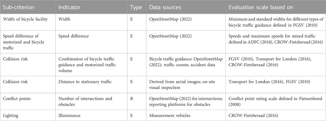
TABLE 2. Safety: sub-criteria, indicators, type of indicators (E: edge-based, R: route-based, N: network-based), data sources and sources for evaluation scales.
The following sub-criteria were defined for the Comfort criterion: width of the bicycle facility, slope, surface, braking frequency, and bicycle parking facilities. While the first four sub-criteria are frequently discussed in the literature (FGSV, 2010; StMB, 2011; Mekuria, 2012; Hull and O’Holleran, 2014; CROW-Fietsberaad, 2016; Transport for London, 2016; Furth, 2021; ADFC, 2022), bicycle parking facilities receive little attention.
Sufficiently wide bicycle facilities are more comfortable because less concentration is required for lane keeping. Children have room to tumble and can be accompanied by their parents to the side (DfT, 2020). In addition, a sufficiently wide bike lane allows for comfortable overtaking, as the person overtaking does not have to slow down and accelerate again, but can overtake at their own chosen speed in one go. The indicator, data source and evaluation scale for width of the bicycle facility was already introduced in Section 3.1.1.
In addition to short steep slopes, relatively flat but very long slopes can also be unpleasant for cyclists. Therefore, climbs per se should be kept to a minimum (CROW-Fietsberaad, 2016). Indicator: To enable a better assessment of the slope, the severity of slope index was developed by CROW-Fietsberaad (2016), which divides the squared slope H by the length of the slope L:
This slope index is used as an indicator for the sub-criterion slope. Data source: To calculate the slope index, the elevation at different locations is needed, as well as the distance between locations. Whereas the elevation can be reliably read out with Open Elevation (2022), OpenStreetMap (2022) reliably provides the distances between locations. Evaluation scale: According to CROW-Fietsberaad (2016), a slope index below 0.033 is very good, below 0.075 is recommended, and 0.24 is given as the maximum. Therefore, the five evaluation levels are defined linearly as follows: S < 0.033 as very good, S < 0.075 as good, S < 0.2 as medium, S < 0.4 as poor, and S ≥ 0.4 as very poor.
The surface of a cycling path should keep the cyclist’s energy expenditure low. The most suitable surfaces for this purpose are fine asphalt and concrete (ASTRA, 2008). In addition to the type of surface, the quality of the pavement also plays a role. A surface made of asphalt is not beneficial if it has many defects such as potholes. Indicator: The indicator for the surface is thus the surface condition. Data source: The surface condition is derived from the two data sets type and quality of the pavement. Both can be fetched from OpenStreetMap (2022). Evaluation scales: The evaluation of the surface condition is based on all possible values that occur in OpenStreetMap (2022). The values were divided into the categories very bad to very good in accordance to how the different surface types were assessed in the literature, e.g., in CROW-Fietsberaad (2016) and ASTRA (2008). Very good can only be achieved if, in addition to the surface type T5 = [asphalt, concrete], the quality of the pavement is also rated better than good, i.e., Q5 = [very good, excellent]. A good rating is assigned for T4 = [metal] surfaces or when the quality is defined as Q4 = [good]. A medium rating is assigned for values of T3 = [compacted soil, pavers, wood, concrete plates] or a quality of Q3 = [medium]. A poor rating is assigned for the types T2 = [cobblestones, fine gravel, grass pavers] or a quality of Q2 = [poor]. A very poor rating is assigned for the values T1 = [gravel, rock, pebbles, earth, grass, mud, unpaved] or a quality of Q1 = [very bad, horrible, very horrible, impassable].
According to CROW-Fietsberaad (2016), cyclists must apply the same amount of energy for a stop as for 70–100 m of distance. Cyclists attempt to avoid intersections with stop signs and traffic signals, where braking is usually required. This was elaborated in Buehler and Dill (2016), showing that braking is undesirable. Indicator: As an indicator for the braking frequency, we set the number of intersections without right-of-way for cyclists. Data sources: The specification of traffic signs, e.g., give way, is not reliable in OpenStreetMap (2022). Alternatively, these kind of data can be requested from the city’s traffic department. Evaluation scales: The evaluation of the number of intersections without right-of-way is based on the evaluation of the braking frequency in Fietsersbond (2008). A braking frequency of less than 0.75 per kilometer is considered very good. The rating is done in increments of 0.3.
Parking facilities should be located as close as possible to the destination and enable safe parking. A pure evaluation according to quantity does not make sense, as according to Heinen and Buehler (2019) the quality of the parking facilities also plays a role. Covered and illuminated bicycle parking stations or bicycle lockers offer the best protection against theft and vandalism and are most comfortable (very good). The German recommendations for facilities of stationary traffic (EAR) (FGSV, 2012a) rate the different types of bike racks as follows. Frame holders offer a good hold of the bicycles and sufficient protection against theft (good). Two tier stands make it possible to connect the bike to the frame but are inconvenient due to the poor accessibility of the upper tier (medium). Handlebar holders meet the requirements for bicycle holders only inadequately (poor). They do not hold bicycles bikes during loading and unloading and are not suitable, for example, for children’s bicycles. Front wheel holders hold the bicycle only at the front wheel. A secure stand of the bicycle and effective protection against theft is not possible (very poor). Indicator: We define two indicators for parking facilities. First, the average utilization of bicycle parking facilities within a radius of 100 m from the destination. Second, the type of the closest bicycle parking facility to the destination. Data source: The locations of parking facilities can be determined from OpenStreetMap (2022). The average utilization and types of bicycle parking facilities could be derived from regularly taken aerial photos, regular camera recordings by measurement vehicles or on-site visual inspections. Evaluation scale: The rating scale for the average utilization of parking facilities was defined based on the five rating levels for parking pressure for motorized vehicles from the German recommendations for traffic surveys (EVE) (FGSV, 2012b). An utilization of less than 60% results in a very good rating, less than 70% in a good rating, less than 80% in a medium rating, less than 90% in a poor rating and more than 90% in a very poor rating. For the types of bicycle facilities, the following evaluation scale is used in accordance with FGSV (2012a): covered bicycle parking stations or bicycle lockers are rated very good, frame holders as good, two tier stands as medium, handlebar holders as poor and front wheel holders as very poor.
Table 3 summarizes the sub-criteria, indicators and data sources for the comfort criterion. It also contains the guidelines and design manuals based on which the evaluation scales for each indicator were defined.
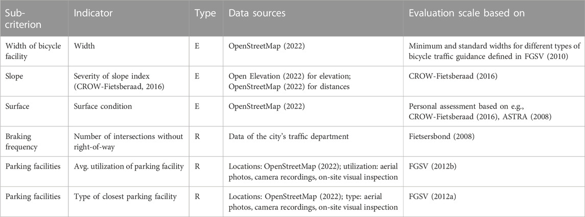
TABLE 3. Comfort: sub-criteria, indicators, type of indicators (E: edge-based, R: route-based, N: network-based), data sources and sources for evaluation scales.
The following sub-criteria, which have been adopted from CROW-Fietsberaad (2016), are considered for the directness criterion: detours, delay, and travel time ratio.
Detours are described by the detour factor. The detour factor is the ratio of the distance between the origin and the destination to the airline distance. According to CROW-Fietsberaad (2016), the longer the total distance, the lower the detour factor must be kept, since the absolute detour distance increases if the detour factor remains the same but the route distance increases. Thus, the detour factor must be kept as low as possible. Indicator: We set the indicator for detours to the detour factor. Data source: The detour factor can be calculated reliably using routing services like OpenRouteService (2022). Evaluation scale: To evaluate the detour factor, we used the levels of Fietsersbond (2008). A detour factor of less than 1.2 is considered very good, and the rating is done in increments of 0.1.
Waiting times caused by stops at intersections generate delays, which have a negative effect on directness in terms of time required. At the same time, stops reduce the average speed. Waiting times depend on the type of intersection. DfT (2020) highlights that by making adjustments to intersection situations, delays for cyclists can be reduced. Indicator: The time loss per kilometer as well as the average speed form each an indicator of delay. The indicator with the lowest score is decisive for the sub-criteria delay. In order to be able to determine the waiting times at intersections in a simplified way, FGSV (2010) provides a table in which typical intersection types are provided with standardized loss points. One loss point corresponds to a value of one second. Data source: In OpenStreetMap (2022) nodes can be assigned a type, but this has hardly been applied in Munich. Alternatively, these kind of data can be requested from the city’s traffic department. The average speed, on the other hand, can be calculated using routing services like OpenRouteService (2022) or Google Maps. Alternatively, average speeds can be inferred via measurement vehicles, GPS tracking data, or publicly available bikeshare data. Evaluation scale: To evaluate the time loss, we used the levels of Fietsersbond (2008). A time loss of less than 16 s per kilometer is considered very good, and the grading becomes very bad at greater than 46 s per kilometer, with increments of 10 s per kilometer in between. The evaluation of the average speed is based on the evaluation scale of Fietsersbond (2008). A very good rating is given to routes with an average speed of more than 16 km/h. The grading of the evaluation scale is done in 2 km/h steps.
The travel time ratio expresses the ratio of the travel time required by bicycle to the travel time required by car, and thus indicates which means of transport reaches the destination faster, i.e., more directly. People are inclined to choose the mode of transport that allows them to reach their destination the fastest (CROW-Fietsberaad, 2016). A ratio less than one indicates that the destination can be reached faster by bicycle than by car and consequently favors switching from car to bicycle. Indicator: The indicator for the travel time ratio is the travel time ratio itself. Data source: The travel time ratio can be calculated reliably using routing services like OpenRouteService (2022). Evaluation scale: The evaluation of the travel time ratio is based on Fietsersbond (2008), and a ratio of less than 1 is considered very good. The grading is done in increments of 0.1.
Table 4 summarizes the sub-criteria, indicators and data sources for the directness criterion. It also contains the guidelines and design manuals based on which the evaluation scales for each indicator were defined.
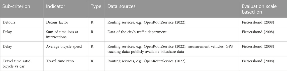
TABLE 4. Directness: sub-criteria, indicators, type of indicators (E: edge-based, R: route-based, N: network-based), data sources and sources for evaluation scales.
Within this work, coherence is assessed using the following sub-criteria: density of the cycling network, share of the main cycling network and signposting. The main cycling network is the cycling network that has been officially defined and is maintained by the city or municipality.
The density of the bicycle network indicates how far the access to the bicycle network is from the cyclists’ starting positions. It is frequently cited in the literature with regard to coherence, for example, by CROW-Fietsberaad (2016); ASTRA (2008); Transport for London (2016); Furth (2021). Density is related to coherence because the denser the cycling network, the more origins and destinations are accessible and therefore reachable. Indicator: The indicator is the density of the cycling network itself. The density is calculated by dividing the area of the city or municipality by the length of all bike paths, resulting in the unit of meters. Data source: The area of the city or municipality as well as the length of all bike paths can be calculated based on data from OpenStreetMap (2022). Evaluation scale: The rating is based on a combination of CROW-Fietsberaad (2016); Transport for London (2016), with a very good rating given for a value of less than 250 m, a bad rating for a value up to 400 m, a medium rating for a value up to 500 m, a bad rating for a value up to 1,000 m, and a very bad rating for a value over 1,000 m.
This sub-criterion is used in the literature only by CROW-Fietsberaad (2016), where it is called uniform quality standard. However, it should be considered here because the main function of the main cycling network is to connect origins and destinations (CROW-Fietsberaad, 2016) and thus is closely related to coherence. The higher the share of the main road network in the total network, the more origins and destinations are connected. Indicator: The indicator is the share of the main bicycle network itself. It is calculated by dividing the length of the bike paths that are officially defined and operated by the city by the length of the overall cycling network. Data source: The length of the overall cycling network can be calculated based on data from OpenStreetMap (2022). Data on officially defined main bike paths must be requested from the city or municipality. Evaluation scale: According to CROW-Fietsberaad (2016), the main bicycle network should make up 70% of the total network. We therefore use a grading system that increments in 10% steps starting from these 70%, resulting in a very poor rating for a value below 40%.
Signposting should make it easier for cyclists to find their way and also offer the possibility to choose from different routes, as stated in Pettinga et al. (2009). Signposting is addressed by CROW-Fietsberaad (2016), Transport for London (2016), and FGSV (2010), among others. Coherent signposting along the entire route is necessary to enable cyclists to find their way. In inner-city areas, cyclists normally ride on non-designated routes because origins and destinations are diverse and individual, in contrast to long-distance routes. For this reason, signposting is especially useful for central destinations. According to FGSV (2012a), central destinations should be indicated at all nodes with decision-making potential by so-called full signposts, at all other nodes by intermediate signposts. Indicator: The indicator for signposting is the coverage of decision-making nodes with full signposts. Data source: Signposts can theoretically be obtained from OpenStreetMap (2022) but data availability is low. Alternatively, these kind of data can be requested from the city’s traffic department. Evaluation scale: We defined the following evaluation scale for signposting: a coverage of more than or equal 90% is rated as very good, of more than or equal 80% as good, of more than or equal 70% as medium, of more than or equal 60% as poor and of less than 60% as very poor.
Table 5 summarizes the sub-criteria, indicators and data sources for the coherence criterion. It also contains the guidelines and design manuals based on which the evaluation scales for each indicator were defined.
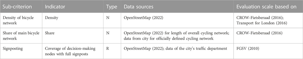
TABLE 5. Coherence: sub-criteria, indicators, type of indicators (E: edge-based, R: route-based, N: network-based), data sources and sources for evaluation scales.
Cyclists, unlike car drivers, are exposed to environmental factors. As a result, they perceive their environment more consciously and feel more comfortable in a pleasant and attractive environment (CROW-Fietsberaad, 2016). Attractiveness thus refers to psychological factors that determine the experience of the ride (Fietsersbond, 2008). Attractiveness is composed of three sub-criteria: share of green space, noise pollution, and air quality, which are dominant in the literature (Transport for London (2016); CROW-Fietsberaad, 2016; ASTRA, 2008; Hull and O’Holleran, 2014) and are explained in more detail below.
Cyclists find rides through parks, along rivers or lakes more attractive than rides through gray concrete deserts. In addition to the positive influence of nature on health (Triguero-Mas et al., 2015), trees in particular provide shade on hot summer days. Indicator: The indicator for this sub-criterion is the share of green and water areas next to a street segment. Data sources: The green and water areas are reliably stored in OpenStreetMap (2022). Further green areas could be identified on the basis of aerial photographs, which, however, has not been investigated in more detail in this work. Evaluation scale: The grading is linear in 25% steps between the best (100%) and worst value (0%), starting from 0% for very poor. Thus, a very good results from a value of 75%.
Noise is usually perceived as annoying and unattractive by cyclists. In urban environments, motorized vehicle traffic represents the main source of noise. In addition, noise has an impact on human health and quality of life (Aubrecht et al., 2021). Indicator: The indicator for noise used in this work is the average daily sound pressure level, which can be obtained from noise mapping. Data source: All EU member states are required to conduct noise mapping every 5 years and report to the European Commission (European Commission, 2002). However, measurements are only made on main roads. Alternatively, data from measurement vehicles could be used. Evaluation scale: The assessment levels are based on the levels indicated in Fietsersbond (2008). The street segment receives a very good rating if the sound pressure level is below 60 dB (A). The gradation of the rating levels is done in 5 dB (A) increments. Therefore, the value very poor is assigned when the average daily sound pressure level exceeds 75 dB (A).
Poor air quality reduces attractiveness and is harmful to health (Umweltbundesamt, 2019). For example, particulate matter (PM10) is absorbed through the respiratory tract and, depending on its size, can reach the bloodstream. Nitrogen dioxide (NO2) and ozone (O3) are other pollutants that are relevant to human health (Aubrecht et al., 2021). Indicators: All three types of pollutants are treated as indicators of the sub-criterion air quality. The indicator with the worst score is taken as the decisive one for the assessment of the air quality. Data source: In Germany, data are for instance available from the Federal Environment Agency (Umweltbundesamt, 2019). However, air values in Germany are only determined at a few locations and only in large cities. Alternatively data could be derived from measurement vehicles. Evaluation scales: The air quality rating results from the worst rating for the three pollutant classes NO2, PM10 and O3. For the rating levels of the three pollutants, the rating scale of Germany’s Federal Environment Agency (Umweltbundesamt, 2019) is used. The input value is the mean of daytime (in Germany: 6–18 o’clock) and evening values (in Germany: 6 p.m.–2 p.m.), since there is usually less bicycle traffic at night.
Table 6 summarizes the sub-criteria, indicators and data sources for the attractiveness criterion. It also contains the guidelines and design manuals based on which the evaluation scales for each indicator were defined.
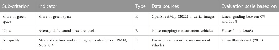
TABLE 6. Attractiveness: sub-criteria, indicators, type of indicators (E: edge-based, R: route-based, N: network-based), data sources and sources for evaluation scales.
Finally, Tables 7, 8 contain the evaluation scales of all indicators with grades 1-very poor to 5-very good.
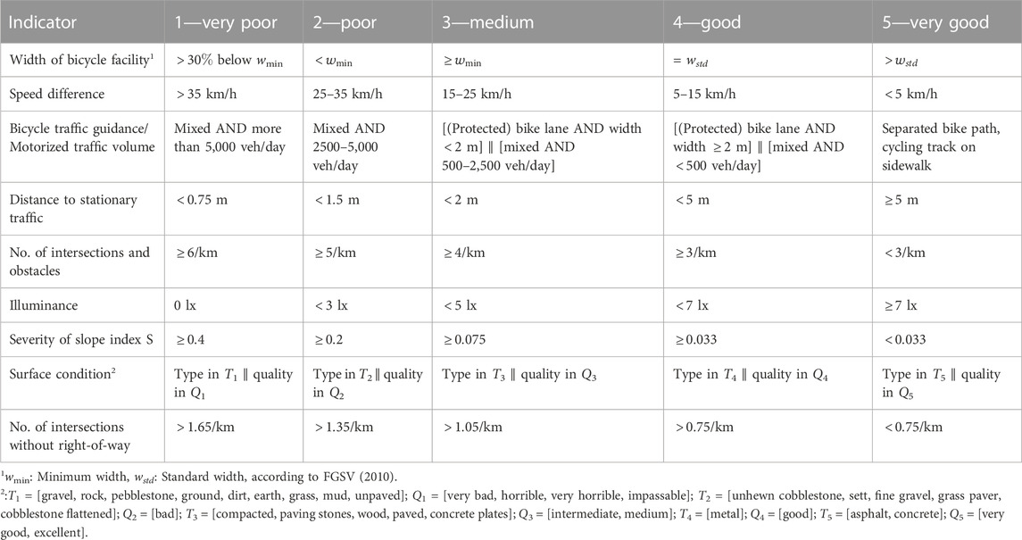
TABLE 7. Indicators: evaluation scales—part I.
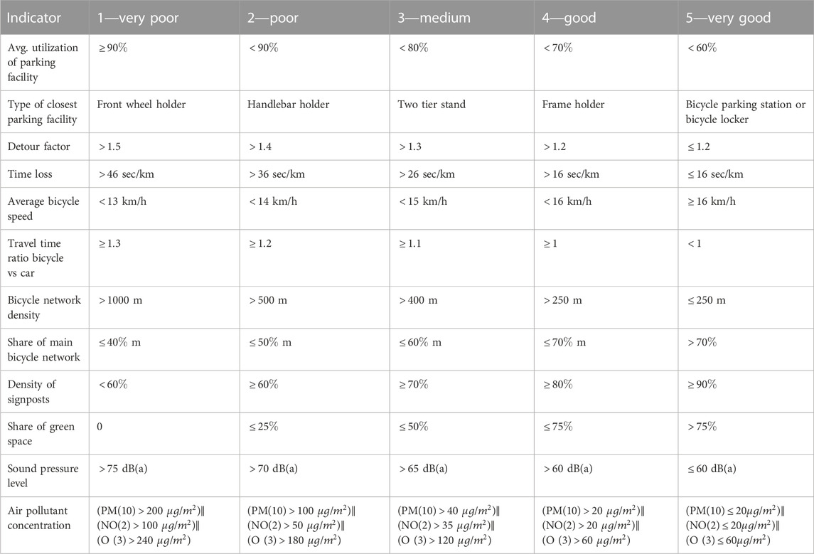
TABLE 8. Indicators: evaluation scales—part II.
There are three types of indicators: edge-based, route-based, and network-based indicators. Edge-based indicators, such as width of the bicycle facility, are evaluated for each street segment. Route-based indicators, such as the detour factor, are evaluated using a sample of routes. Network-based indicators are evaluated using data from the entire bicycle network, such as the density of the cycling network.
Edge-based indicators are evaluated separately for each street segment. In order to combine edge-based values into a valid value for the entire network, edge-based values are multiplied by the corresponding length of the street segment, summed up and divided by the total length of the bicycle network (see Eq. 2). Thus, longer street segments are weighted more heavily than shorter ones.
Route-based indicators are indicators that can only be determined on the basis of a route and not on the basis of street segments, e.g., the detour factor. In order to generate a meaningful number of routes, routes between the centers of urban districts are determined. The centers are combined so that each center is connected to each center by a route. In the end, only routes that are less than 5 km are considered because more than 80% of actual bike distances traveled are less than 5 km (Dufour, 2010).
Analogous to edge-based indicators, route-based indicators can be aggregated to the network level. Therefore, the rating is weighted according to the length of the route. This results in the following formula:
Network-based indicators are derived from data of the entire network, rather than from individual street segments or routes.
An overview of all proposed criteria, sub-criteria, types of indicators and evaluations scales can be found in Supplementary Tables S1, S2.
The weighting of criteria was based on a survey with 30 participants. The participants were asked to indicate how important the sub-criteria for each criterion were to them as well as to sort the criteria according to their importance. For this purpose, a four-point scale (unimportant—less important—rather important—important) was to be used to rate the importance of each sub-criterion for the main criterion.
For the safety criterion, it can be seen that the participants attach particular importance to the width of the bicycle facility, on a separated guidance of the cycling track and on the lowest possible number of obstacles (about 1/4 each). Lighting and speed difference, on the other hand, are less important. From this distribution, the following formula for the evaluation of safety can be derived:
For comfort, the importance of the five sub-criteria width, surface, slope, parking facilities and braking frequency were asked in the survey. Here, the evaluation reveals a significant influence of the width and the surface on the comfort. The presence of parking facilities is less important. The formula resulting from the distribution is:
The directness is evaluated for the sub-criteria detours, delay and travel time ratio. The survey showed that detours are more important than delay and travel time ratio. This results in the following formula for calculating directness:
For coherence, the density of the cycling network has been weighted slightly more than the other two sub-criteria share of the main cycling network and signposting. The formula for calculating coherence based on the evaluation of the sub-criteria is as follows:
For attractiveness, the sub-criteria share of green space, noise and air quality are weighted. The evaluation resulted in an almost equal weighting of the three sub-criteria. The resulting formula is:
For the participants in the survey, safety was by far the most important criterion, followed by directness, comfort and coherence. The attractiveness of the route is less important in everyday traffic. Based on the importance of the individual criteria, the following formula was derived for the overall quality assessment.
The study area is the city of Munich with its 25 boroughs. The total area of Munich is 311 km2, of which about 1.5% are water bodies and about 13.4% are green spaces. With its surface area, Munich ranks 19th place in a nationwide comparison. Around 1.5 million people live in the city of Munich, making it the third largest city in Germany. With a population density of 4,799 inhabitants per square metre, it is the most densely populated municipality in Germany. Cycling accounts for 18% of all trips in the city, which has steadily increased in recent years. However, about one in three trips in Munich are still done by car. The total length of the official cycling network managed by the city of Munich is about 1,130 km (City of Munich, 2022b). Per capita investment per year for cycling infrastructure in the city of Munich accounts for 2.30 Euros, which is low compared to other German cities (Tiemann et al., 2018). For instance, Stuttgart spends 5 euros per capita on cycling infrastructure. In an international comparison with Amsterdam or Copenhagen, Munich’s investment is even further behind. Amsterdam spends around 11 euros per capita and year, Copenhagen even 35.60 Euros per capita and year. One can conclude that there is great potential for improvement in the expansion of the bicycle infrastructure in Munich. However, investments must be made in the right places and on the right scale so that the potential for the bicycle as a means of transport is optimally exploited.
In this chapter, the quality of Munich’s bicycle network is assessed based on the method developed in the previous sections.
When evaluating the safety of Munich’s cycling network, we considered the width of the cycling facilities, the speed difference, and the number of conflict points, as data on collision risk and lighting were not available. The unweighted results of the individual sub-criteria were as follows: the evaluation of the width of the cycling facilities resulted in a medium value of 3.4, the evaluation of the speed differences resulted in a good value of 3.7, and the evaluation of conflict points resulted in a very poor value of 1. This suggests that the city of Munich should focus primarily on reducing conflict points, i.e., the number of intersections that cyclists must cross and the number of obstacles such as barriers that impede cyclists.
Munich’s cycling network reaches an overall safety score asafety of 2.5 between poor and medium.
Comfort of Munich’s cycling network is calculated based on the sub-criteria of cycling facility width, slope and surface, as data on braking frequency and parking facilities were not available. The evaluation of width resulted again in a medium score of 3.4. The evaluation of the slope resulted in a score of 4.5 between good and very good, due to the fact that Munich has a slight slope from south to north with a height difference of approximately 100 m. The surface quality in Munich scored with a value of 3.6 between medium and good. Thus, in the comfort criterion, the city of Munich should especially focus on increasing the width of cycling lanes.
Munich’s cycling network reaches an overall comfort score acomfort of 3.8, indicating an almost good level of comfort.
Directness is composed of the sub-criteria of detours, delay, and travel time ratio. This resulted in a medium score of 3.3 for detours, a very good score of 4.9 for delay, and a very poor to poor score of 1.5 for the travel time ratio. As a consequence, the city of Munich should primarily focus on decreasing travel times for cyclists.
Munich’s cycling network reaches an overall score of 3.3 for directness, indicating a medium level of directness.
Coherence is composed of the sub-criteria of density of the cycling network, share of the main cycling network, and signposting. While evaluations are possible for density of the cycling network and share of the main cycling network, signposting cannot be evaluated due to a lack of data for Munich. The density of the cycling network in Munich is calculated to be 275 m, resulting in a good score of 4. The share of the main cycling network in the overall network is approximately 22%, resulting in a very poor score of 1. This shows that the city of Munich should officially define, maintain and operate more cycling routes.
Munich’s cycling network reaches an overall score of 2.8 for coherence, indicating a medium level of coherence.
Attractiveness is calculated based on the sub-criteria of share of green space, noise, and air quality. Green space was calculated using data from OpenStreetMap (2022) according to the previously described method, resulting in a score of 2.4, which indicates a poor to medium level. This result is plausible, as the majority of the city consists of buildings and roads. Noise cannot be evaluated for Munich, as data is only available for major roads. Air quality cannot be evaluated either, as there are only five measurement stations for the city of Munich as a whole. Thus, the attractiveness score for Munich is based solely on the green space criterion and is 2.4, indicating a poor to medium level of attractiveness.
Table 9 summarizes for each criterion the sub-criteria that were calculated for the Munich case study. It also contains the evaluation score for each sub-criterion as well as the overall criterion score. The evaluation of the individual criteria is also summarized in Figure 1. Safety is poor to medium with a score of 2.5, comfort is good with a score of 3.8, directness is medium with a score of 3.3, coherence is medium with a score of 2.8, and attractiveness is poor to medium with a score of 2.4. It can be seen that especially the safety and attractiveness criteria have to be improved for Munich. Weighting the criteria based on Eq. 9, the overall score for Munich is 2.9, indicating a medium level of quality. This shows that there is room for improvement for the Munich cycling network. Figure 2 presents the score of all evaluated sub-criteria. It can be seen that especially the sub-critera share of the main cycling network, conflict points, and travel time ratio have to be improved. Improvements in all three indicators can be achieved through the expansion of the cycling infrastructure and the prioritization of cycling at intersections.
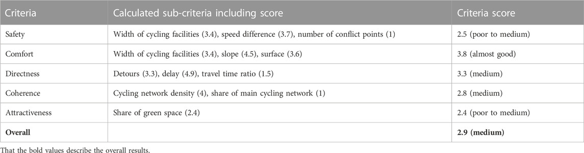
TABLE 9. Quality assessment of the Munich bicycle network - calculated sub-criteria including scores and overall scores per criteria (1-very poor, 2-poor, 3-medium, 4-good, 5-very good).
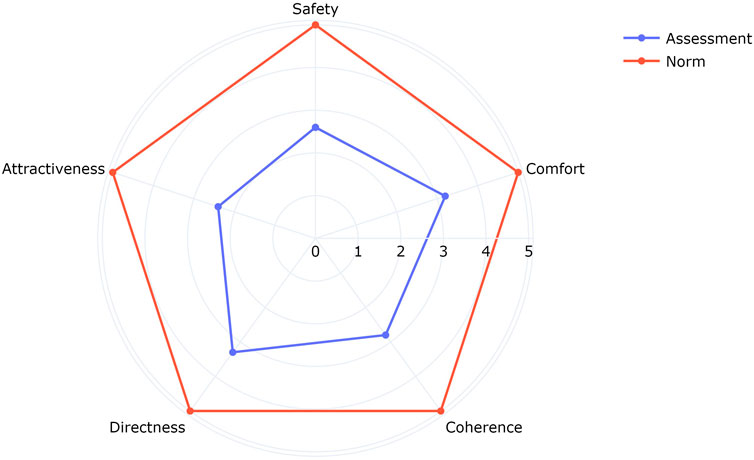
FIGURE 1. Quality assessment of the Munich bicycle network per criterion (1-very poor, 2-poor, 3-medium, 4-good, 5-very good).
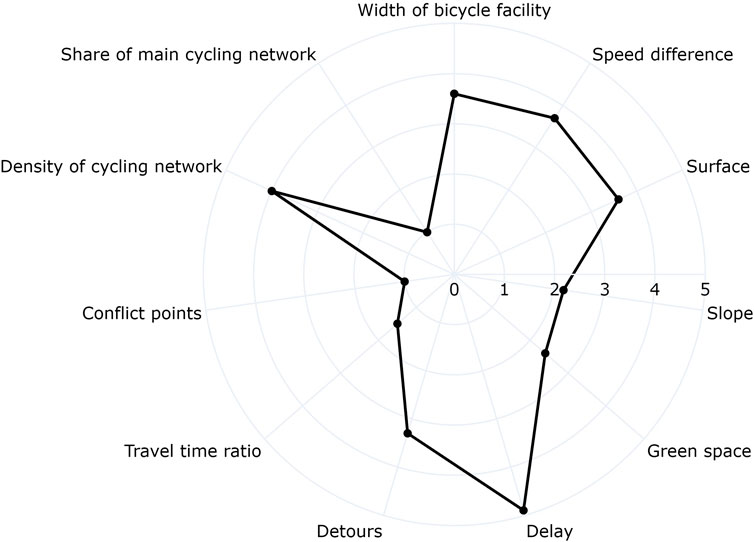
FIGURE 2. Quality assessment of the Munich bicycle network per sub-criterion (1-very poor, 2-poor, 3-medium, 4-good, 5-very good).
In this study, we developed a data-driven approach to assessing the quality of bicycle networks. After discussing existing literature and identifying the major evaluation criteria for cycling networks (safety, comfort, directness, coherence, and attractiveness), a generalizable concept was developed. This concept addresses the research gaps in existing approaches and has several advantages.
First, our methodology covers all major criteria for cycling networks and thus delivers a fully comprehensive view of the cycling network’s quality. Second, as criteria are broken down into detailed sub-criteria, users have the opportunity to understand more precisely the reasons for a low overall rating. Third, our work continuously defines measurable indicators for each sub-criteria. Moreover, potential data sources were identified for each indicator. Most indicators can be measured based on openly available data like OpenStreetMap (OpenStreetMap, 2022). Thus, the approach can easily be applied to other cities for comparison. The combination of different types of indicators (edge-based, route-based, network-based) guarantees that quality levels can be assessed spatially as detailed as possible. All sub-criteria and criteria are weighted in order to be able to differentiate the actual importance of the individual factors for the overall quality of the bicycle network. The method is purely data-driven, exclusively uses measurable indicators and translates these indicators into precise and transparent evaluation scales. All evaluation scales have a strong foundation. They are based on widely used guidelines and design manuals for bicycle traffic in European countries, especially the ones of pioneer countries for cycling such as the Netherlands.
We demonstrated the method’s applicability in a case study for the Munich cycling network. It has been shown that the developed approach is applicable and produces meaningful results that can serve transportation planners and politicians as foundation for improving cycling networks and strengthening bicycle traffic. The developed methodology can be easily applied to other cities for comparative analysis. The possibility to weight criteria and sub-criteria differently allows some flexibility in applying the model to other geographic areas. For example, when applied to developing countries where the expansion of the bicycle network is still in its early stages, there could be less focus on directness and cohesion compared to, for example, safety and comfort.
The key findings for Munich’s cycling network are as follows. The cycling network has a medium level of quality, indicating clear potential for improvement. The analysis of the sub-criteria revealed that the city of Munich should focus primarily on expanding the main cycling network, on decreasing the number of conflict points and on decreasing the travel time of cyclists.
Nevertheless, the developed approach still faces a few challenges that will be addressed in future work. First, it has been found that for a few indicators publicly available data sources such as OpenStreetMap (OpenStreetMap, 2022) are incomplete or of insufficient quality. Examples include data on parking areas for motorized vehicles, lighting levels, detailed characteristics of intersections (e.g., right-of-way regulations) or parking facilities for bicycles. This is also true for the study area of Munich, where, despite the city’s size, we could not integrate a few sub-criteria due to data availability. In future work, we will have a look at methods for generating or deriving such data. This includes the automatic evaluation of aerial or camera images, for example, to identify and categorize infrastructure automatically or to capture the utilization and type of bicycle parking facilities. Second, we will improve the calculation of route-based indicators. Instead of artificial routes between all centers of urban districts, we will use actual routes between origin and destination locations. For the Munich case study, we plan to take the GPS trajectories of representative routes that were collected during a mobility study in 2022 (Adenaw et al., 2022). Third, we also plan to continue the survey conducted for the weighting of criteria and sub-criteria (Section 3.3) as we are currently faced with a small sample size of 30 respondents only. Finally, the focus of this work was on the development of the methodology. As a minor focus was on the case study, we will show the results of the case study in more detail in future work. This includes the visualization of results on the edge and route level. We will also apply the approach to other European cities, compare the results and derive valuable recommendations for improving bicycle networks and infrastructure.
The original contributions presented in the study are included in the article/Supplementary Materials, further inquiries can be directed to the corresponding author.
Ethical review and approval was not required for the study on human participants in accordance with the local legislation and institutional requirements. Written informed consent from the participants was not required to participate in this study in accordance with the national legislation and the institutional requirements.
SW and PM contributed to the conception and design of the study. PM and SW reviewed the literature. SW and PM organized the database. PM implemented the Python code. PM and SW interpreted the results. PM wrote the first draft of the manuscript, SW enriched and finalized the manuscript. All authors approved the submitted version.
The authors acknowledge the contributions of Andreas Keler, who co-supervised the thesis related to this study. The authors would also like to thank Prof. Klaus Bogenberger, who supported the authors’ work.
The authors declare that the research was conducted in the absence of any commercial or financial relationships that could be construed as a potential conflict of interest.
All claims expressed in this article are solely those of the authors and do not necessarily represent those of their affiliated organizations, or those of the publisher, the editors and the reviewers. Any product that may be evaluated in this article, or claim that may be made by its manufacturer, is not guaranteed or endorsed by the publisher.
The Supplementary Material for this article can be found online at: https://www.frontiersin.org/articles/10.3389/ffutr.2023.1127742/full#supplementary-material
Adenaw, L., Ziegler, D., Nachtigall, N., Gotzler, F., Loder, A., Siewert, M. B., et al. (2022). A nation-wide experiment: Fuel tax cuts and almost free public transport for three months in Germany – report 5 insights into four months of mobility tracking. Available at: http://arxiv.org/pdf/2211.10328v1 (Last accessed Dec 19, 2022).
ADFC (2022). Questionnaire - ADFC Fahrradklima-Test 2022. Available at: https://fahrradklima-test.adfc.de/fileadmin/BV/FKT/Download-Material/Material_2022/adfc_FKT_Fragebogen_DIN_A4_2022_rz.pdf (Last accessed Dec 13, 2022).
ADFC (2018). So geht Verkehrswende-Infrastrukturelemente für den Radverkehr. Available at: https://www.adfc.de/artikel/so-geht-verkehrswende (Last accessed Dec 13, 2022).
Aubrecht, E. L., Balzer, F., Biewald, A., Bilharz, M., Bünger, B., Dauert, U., et al. (2021). Daten zur Umwelt: Umweltmonitor 2020. Dessau-Roßlau: Umweltbundesamt.
Bohle, W., Maier, R., Enke, M., Pohle, M., Zimmermann, F., and Alrutz, D. (2015). Einfluss von Radverkehrsaufkommen und Radverkehrsinfrastruktur auf das Unfallgeschehen. Forschungsbericht/Unfallforschung der Versicherer (UDV).
Borgman, F. (2017). Benchmarking Dutch cities. From objective to subjective. Available at: https://ecf.com/system/files/JaapKamminga_BenchmarkingDutchCities.pdf (Last accessed Dec 13, 2022).
Buehler, R., and Dill, J. (2016). Bikeway networks: A review of effects on cycling. Transp. Rev. 36, 9–27. doi:10.1080/01441647.2015.1069908
City of Munich (2022a). Meldeplattform Radverkehr. Available at: https://meldeplattform-rad.muenchenunterwegs.de/ (Last accessed Dec 13, 2022).
City of Munich (2022b). Open Data Muenchen. Available at: opendata.muenchen.de (Last accessed:13 Dec 2022)
Copenhagenize Design Company (2019). Copenhagenize index 2019. Available at: https://copenhagenizeindex.eu/about/methodology (Last accessed Dec 12, 2022).
CROW-Fietsberaad (2016). Design manual for bicycle traffic, 28. of CROW record (The Netherlands: Crow).
Dill, J., and McNeil, N. (2016). Revisiting the four types of cyclists: Findings from a national survey. Transp. Res. Rec. 2587, 90–99. doi:10.3141/2587-11
Dufour, D. (2010). PRESTO Cycling policy guide. Cycling infrastructure. Available at: https://repository.difu.de/jspui/bitstream/difu/186051/1/DS0100.pdf.
European Commission (2022). Basic quality design principles for cycle infrastructure and networks. Available at: https://transport.ec.europa.eu/transport-themes/clean-transport-urban-transport/cycling/guidance-cycling-projects-eu/cycling-infrastructure-quality-design-principles/basic-quality-design-principles-cycle-infrastructure-and-networks_en (Last accessed Dec 13, 2022).
European Commission (2002). Environmental noise directive (END). Available at: https://environment.ec.europa.eu/topics/noise/environmental-noise-directive_en (Last accessed Dec 13, 2022).
Falkenberg, G., Blase, A., Bonfranchi, T., Cosse, L., Draeger, W., Vortisch, P., et al. (2003). “Bemessung von Radverkehrsanlagen unter verkehrstechnischen Gesichtspunkten,” in Transports et espace français. Editor M. Chesnais (Paris and New York: Masson: Collection Géographie).
FGSV (2010). Empfehlungen für Radverkehrsanlagen: Era. Cologne: Forschungsgesellschaft für Straßen- und Verkehrswesen.
FGSV (2012a). Empfehlungen für Anlagen des ruhenden Verkehrs: EAR. Cologne: Forschungsgesellschaft für Strassen- und Verkehrswesen.
FGSV (2012b). Empfehlungen für Verkehrserhebungen: Eve. Cologne: Forschungsgesellschaft für Strassen- und Verkehrswesen.
FGSV (2015). Handbuch für die Bemessung von Straßenverkehrsanlagen: HBS. Cologne: Forschungsgesellschaft für Straßen- und Verkehrswesen.
FGSV (2021). Hinweise zur einheitlichen Bewertung von Radverkehrsanlagen: H EBRA. Cologne: Forschungsgesellschaft für Straßen- und Verkehrswesen.
Fietsersbond (2008). Rapportage fietsbalans-2 zwolle: Deel 2 onderzoeksverslag. Available at: https://files.fietsersbond.nl/app/uploads/sites/39/2017/01/03172838/fietsbalans_2006_zwolle_rapport_deel_2.pdf (Last accessed Dec 13, 2022).
Fraser, S. D., and Lock, K. (2010). Cycling for transport and public health: A systematic review of the effect of the environment on cycling. Eur. J. Public Health 21, 738–743. doi:10.1093/eurpub/ckq145
Furth, P. G. (2021). “Bicycling infrastructure for all,” in Cycling for sustainable cities. Editors R. Buehler, and J. Pucher (Cambridge: MIT Press), Urban and industrial environments), 81–102. doi:10.7551/mitpress/11963.003.0009
Gehring, D. B. (2016). Bikability-Index für Dresden – Wie fahrradfreundlich ist Dresden? Master thesis. Dresden: TU Dresden.
Gerike, R., Weikl, S., Koszowski, C., and Bogenberger, K. (2022). “Network level design for cycling,” in Cycling. Editors E. Heinen, and T. Gotschi (Amsterdam: Academic Press), 10, 77–109. of Advances in transport policy and planning. doi:10.1016/bs.atpp.2022.04.005
German Federal Statistical Office (2022). Unfallatlas (accident atlas). Available at: https://unfallatlas.statistikportal.de/_opendata2022.html (Last accessed Dec 12, 2022).
Heinen, E., and Buehler, R. (2019). Bicycle parking: A systematic review of scientific literature on parking behaviour, parking preferences, and their influence on cycling and travel behaviour. Transp. Rev. 39, 630–656. doi:10.1080/01441647.2019.1590477
Hong, J., Philip McArthur, D., and Stewart, J. L. (2020). Can providing safe cycling infrastructure encourage people to cycle more when it rains? The use of crowdsourced cycling data (strava). Transp. Res. Part A Policy Pract. 133, 109–121. doi:10.1016/j.tra.2020.01.008
Hull, A., and O’Holleran, C. (2014). Bicycle infrastructure: Can good design encourage cycling? Urban, Plan. Transp. Res. 2, 369–406. doi:10.1080/21650020.2014.955210
Liu, Q., Homma, R., and Iki, K. (2019). Utilizing bicycle compatibility index and bicycle level of service for cycleway networks. MATEC Web Conf. 259, 03005. doi:10.1051/matecconf/201925903005
Mekuria, M. C. (2012). Low-stress bicycling and network connectivity. San José, CA: Mineta Transportation Institute Publications.
Open Elevation (2022). Open elevation. Available at: https://open-elevation.com/ (Last accessed Dec 13, 2022).
OpenRouteService (2022). OpenRouteService. Available at: https://openrouteservice.org/ (Last accessed Dec 13, 2022).
OpenStreetMap (2022). OpenStreetMap. Available at: https://www.openstreetmap.org/ (Last accessed Dec 13, 2022).
PeopleForBikes, (2022). City ratings. Available at: https://cityratings.peopleforbikes.org/about/methodology (Last accessed Dec 13, 2022).
Pettinga, A., Rouwette, A., Braakman, B., Pardo, C., Kuijper, D., de Jong, H., et al. (2009). Cycling-inclusive policy development: A handbook
Pikora, T., Giles-Corti, B., Bull, F., Jamrozik, K., and Donovan, R. (2003). Developing a framework for assessment of the environmental determinants of walking and cycling. Soc. Sci. Med. 56, 1693–1703. doi:10.1016/S0277-9536(02)00163-6
Pritchard, R., Frøyen, Y., and Snizek, B. (2019). Bicycle level of service for route choice—a GIS evaluation of four existing indicators with empirical data. ISPRS Int. J. Geo-Information 8, 214. doi:10.3390/ijgi8050214
Pucher, J., and Buehler, R. (2010). Walking and cycling for healthy cities. Built Environ. 36, 391–414. doi:10.2148/benv.36.4.391
Saelens, B. E., Sallis, J. F., and Frank, L. D. (2016). Environmental correlates of walking and cycling: Findings from the transportation, urban design, and planning literatures. Ann. Behav. Med. 25, 80–91. doi:10.1207/S15324796ABM2502_03
Sprinkle Consulting Inc (2007). Bicylce level of service: Applied model. Available at: https://nacto.org/docs/usdg/bicylce_Level_of_service_model_sprinkle_consulting.pdf (Last accessed Dec 13, 2022).
StMB (2011). Radverkehrshandbuch Radlland Bayern (Oberste Baubehörde im Bayer. Staatsministerium des Innern, für Bau und Verkehr).
Ta, N., Li, H., Chai, Y., and Wu, J. (2021). The impact of green space exposure on satisfaction with active travel trips. Transp. Res. Part D Transp. Environ. 99, 103022. doi:10.1016/j.trd.2021.103022
Tiemann, M., Avantario, V., and Kress, T. (2018). Radfahrende schützen - Klimaschutz stärken: Sichere und attraktive Wege für mehr Radverkehr in städten (hamburg).
Transport for London (2014). London cycling design standards: 1. Design requirements. London. Available at: https://content.tfl.gov.uk/lcds-chapter1-designrequirements.pdf (Last accessed Dec 13, 2022).
Transport for London (2016). London cycling design standards: 2. Tools and techniques. London. Available at: https://content.tfl.gov.uk/lcds-chapter2-toolsandtechniques.pdf (Last accessed Dec 13, 2022).
Triguero-Mas, M., Dadvand, P., Cirach, M., Martínez, D., Medina, A., Mompart, A., et al. (2015). Natural outdoor environments and mental and physical health: Relationships and mechanisms. Environ. Int. 77, 35–41. doi:10.1016/j.envint.2015.01.012
Umweltbundesamt (2019). Berechnungsgrundlagen Luftqualitätsindex. Available at: https://www.umweltbundesamt.de/berechnungsgrundlagen-luftqualitaetsindex (Last accessed Dec 13, 2022).
Keywords: cycling, cycling networks, quality assessment, data-driven method, sustainable transport mode
Citation: Weikl S and Mayer P (2023) Data-driven quality assessment of cycling networks. Front. Future Transp. 4:1127742. doi: 10.3389/ffutr.2023.1127742
Received: 19 December 2022; Accepted: 14 March 2023;
Published: 27 March 2023.
Edited by:
Valentina Mirović, University of Novi Sad Faculty of Technical Sciences, SerbiaReviewed by:
Leise Kelli De Oliveira, Federal University of Minas Gerais, BrazilCopyright © 2023 Weikl and Mayer. This is an open-access article distributed under the terms of the Creative Commons Attribution License (CC BY). The use, distribution or reproduction in other forums is permitted, provided the original author(s) and the copyright owner(s) are credited and that the original publication in this journal is cited, in accordance with accepted academic practice. No use, distribution or reproduction is permitted which does not comply with these terms.
*Correspondence: Simone Weikl, c2ltb25lLndlaWtsQHR1bS5kZQ==
Disclaimer: All claims expressed in this article are solely those of the authors and do not necessarily represent those of their affiliated organizations, or those of the publisher, the editors and the reviewers. Any product that may be evaluated in this article or claim that may be made by its manufacturer is not guaranteed or endorsed by the publisher.
Research integrity at Frontiers
Learn more about the work of our research integrity team to safeguard the quality of each article we publish.