 Yanran Yang
 Gabrielle Wong-Parodi
 Baruch Fischhoff
95% of researchers rate our articles as excellent or good
Learn more about the work of our research integrity team to safeguard the quality of each article we publish.
Find out more
ORIGINAL RESEARCH article
Front. Commun. , 31 August 2023
Sec. Visual Communication
Volume 8 - 2023 | https://doi.org/10.3389/fcomm.2023.1232156
This article is part of the Research Topic Communicating Scientific Uncertainty about Issues that Impact Human Health View all 3 articles
We offer a general method for testing the usability of visual displays communicating scientific uncertainty, illustrated with publicly available results from CDC's influenza forecasts. The heavy toll of seasonal influenza has prompted major investments in improving these forecasts, making them a focus of machine learning research. However, little research has been devoted to how well users can understand and use these forecasts to inform decisions under uncertainty. Our approach extends psychological theory to experimental tasks posing hypothetical, but realistic decisions using alternative displays based on actual forecasts. Based on Tversky's theory of conceptual-spatial congruence, we predicted actual and perceived usability of four displays (bar chart, tree map, PDF, and 90% confidence interval). Participants (N = 301, recruited on Amazon MTurk) were randomly assigned to use one of four displays for four decision tasks, created to reflect our extension of the theory. We evaluated participants' comprehension, confidence, and judgments of perceived helpfulness, when the display and the decision were congruent or non-congruent. Participants had better comprehension with the most familiar display (bar chart), for all four decisions. However, they did not perceive that display as more helpful or have greater confidence in their responses to it. Participants who reported greater familiarity with a display performed more poorly, despite expressing greater confidence and rating it as more helpful. We discuss the need to evaluate performance, as well as ratings, and the opportunities to extend theoretical frameworks to specific contexts.
Whereas, numbers and verbal quantifiers are often used for communicating scientific uncertainty (Van Der Bles et al., 2019), visual displays can be a potentially powerful way to convey the complex information needed to inform decisions (Larkin and Simon, 1987; Woloshin et al., 2023). However, that potential is only realized if people can extract and apply the information that they need, and have appropriate confidence in their success. Overconfidence can lead to decisions based on wrong information. Under-confidence can lead to neglecting good information. The COVID-19 pandemic has led experts to produce visual displays for many statistics in many formats. However, few, if any, of those displays have been subject to user testing. We offer a general methodology for such user testing. We demonstrate it with displays used by the Centers for Disease Control and Prevention (CDC) for seasonal influenza forecasting. We also test an extension of a prominent theory of display usefulness in this novel context.
Seasonal influenza infects 9–35 million Americans annually, with 140,000–810,000 hospitalizations and 12,000–61,000 deaths (CDC, 2020). CDC has invested heavily in improving flu forecasts, hoping to inform both public health decisions (e.g., vaccine manufacture and distribution) and personal health decisions (e.g., taking flu shots and avoiding public areas). Since 2013, CDC has organized a weekly flu forecasting challenge, FluSight, with the twin goals of improving forecasts and developing common data standards. Submitted forecasts provide binned predictive distributions for several influenza events of interest (Reich et al., 2019). However, there is little evidence that the forecasts are being used by the many decision makers who might benefit from them (e.g., health officials, pharmacies, nursing homes, travelers). One possible barrier to wider use is how the forecasts are presented. Currently, flu data are displayed as the suite of confidence intervals submitted by the various teams on CDC's website. While important to CDC and forecasters, those details of epistemic uncertainties and expert disagreements might overwhelm potential users with less technical knowledge or more specific interests.
As Pinker proposed, the usefulness of different types of graphs depends on the type of information being extracted (Pinker, 1990). According to Tversky's prominent account of visual information processing, natural correspondence theory (Zacks and Tversky, 1999; Tversky, 2011), a display's usefulness depends on those specific interests. Building on Gestalt principles, the theory posits that displays are more useful when there is a congruent mapping between them and the intended use. Congruency has been found to increase users' ratings of display usefulness and confidence in their decisions. For example, bar charts have been found to be more useful and preferred for discrete comparisons (e.g., males are taller than females), whereas lines are superior for trends (e.g., height increases over time; Tversky et al., 1991, 2000).
One general principle of conceptual-spatial congruence theory is that bars, as closed containers, separate things that are inside and outside them, making them useful for communicating categorical information. In contrast, lines suggest connections, hence are useful for communicating continuous information. Thus, for example, Tversky et al. (2012) found that frequency is better represented by a continuous visual variable (e.g., thickness or distance), such that there is a congruence of continuous information and continuous format than by a container (e.g., closed circles); conversely, grouping is better presented by a container than by a continuous display. Tversky et al. found that people preferred and derived greater understanding from congruent mappings, compared to non-congruent ones.
We extend the natural correspondence principles to examine how congruence between four displays and four decisions affects people's (a) comprehension, (b) confidence in their decisions, and (c) ratings of display helpfulness. Many studies have examined graph comprehension in terms of inferences drawn from main effects (Shah and Freedman, 2011) or the interpretation of causal and correlational relationships (Fansher et al., 2022). Here, we examine comprehension in terms of understanding uncertainties, as reflected in participants' interpretation, utilization, and evaluation of displays, in the message assembly and interrogation aspects of graph comprehension (Pinker, 1990).
We focus on a focal measure in CDC's forecasts, the percentage of patients at medical offices who have influenza-like illnesses, or %ILI. CDC uses this measure, rather than actual influenza cases, because there is too little testing to know which patients' symptoms reflect flu, rather than other causes. Participants in our study made one decision under uncertainty based on each of the four flu-related probabilistic forecasts that FluSight teams make each week: (i) onset week, when the flu season will begin; (ii) peak week, when the flu season will be most intense; (iii) peak week intensity, as measured by %ILI during that week; and (iv) next week flu intensity, in %ILI. Two decisions had categorical options (vaccination campaign and staying home from daycare); two had continuous options (transferring hospital patients and travel plans).
We use four displays (Figure 1). Based on our interpretation of natural correspondence theory, two of the displays are categorical (bar charts, tree maps) and two are continuous [probability distribution functions (PDFs), confidence intervals]. In terms of our three dependent variables, when there is natural correspondence, we expect greater comprehension, decision confidence, and perceived helpfulness.
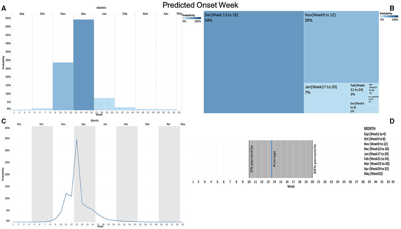
Figure 1. The four visual displays for “vaccination campaign” decision. (A) bar chart (upper left); (B) tree map (upper right), (C) probability density function (PDF; lower left), and (D) confidence interval (lower right).
Hypothesis 1: Comprehension, decision confidence, and perceived helpfulness will be higher when categorical decisions (when to start a vaccination campaign, when to stop sending a child to daycare) are based on categorical displays (bar charts, tree maps) and when continuous decisions (how many patients to transfer, how safe it is to travel) are based on continuous displays (PDFs, confidence intervals)—compared to when there is no such natural congruence.
Previous studies have considered bar charts, pie charts, stick figures, and probability density plots, for communicating scientific uncertainty in domains that have included seismic risk, weather forecasts, and health risks (Ibrekk and Morgan, 1987; Lipkus and Hollands, 1999; Bostrom et al., 2008). Most have examined user comprehension and preferences, and occasionally decision making (Fernandes et al., 2018; Padilla et al., 2018; Stephens et al., 2019). Some have investigated individual user features, including familiarity (Friel et al., 2001), subjective numeracy (Fagerlin et al., 2007; Zikmund-Fisher et al., 2007; Peters et al., 2019; Rolison et al., 2020), and subjective visual literacy (Galesic and Garcia-Retamero, 2011; Okan et al., 2012; Garcia-Retamero et al., 2016; Garcia-Retamero and Cokely, 2017). Expecting these results to be replicated, we predict that:
Hypothesis 2: Comprehension, decision confidence, and perceived helpfulness will be higher for the displays with which participants are most familiar.
Hypothesis 3: Comprehension, decision confidence, and perceived helpfulness will be higher for participants with higher subjective numeracy and subjective visual literacy scores.
We also conducted exploratory analyses for how displays relate to decision making, following the findings that visual displays promote risk-avoidant choices, compared to numeric displays (Stone et al., 1997), and that geographical heatmaps promote risk-avoidant behavior, compared to picto-trendlines (Fagerlin et al., 2017).
Adult participants were recruited on Amazon Mechanical Turk (MTurk) in early October 2020. MTurk has been frequently used for evaluating or piloting data visualization aids (Hullman et al., 2015; Okan et al., 2020). Heer and Bostock (2010) found consistent results with MTurk and previous laboratory-based studies of visual displays. An a priori power analysis for OLS (Ordinary Least Squares) with four display groups and four covariates, alpha = 0.05, and power = 0.95, determined a sample size of 236 to reveal a small effect size (0.10). Following Kennedy et al. (2020), we identified 301 responses with valid IP and geolocation addresses out of 370 completed responses for data analyses. Participants took ~25–30 min to complete the survey and were compensated $5.00 for their time. The research complied with the American Psychological Association Code of Ethics and was approved by the Institutional Review Board at Carnegie Mellon University. Informed consent was obtained from each participant.
Figure 2 shows the experimental design. Participants were randomly assigned to one of four Forecast Displays: Bar Chart, Tree Map, PDF, or Confidence Interval. They were then asked to use the information in that display to help hypothetical friends make four decisions, presented in random order: “Vaccination Campaign,” “Transferring Hospital Patients,” “Staying Home from Daycare,” and “Travel Plan.” For each decision, participants read background information and completed a task designed to increase their engagement and assess their attention, after which they saw the display and responded to it. After completing the four decision tasks, participants evaluated how familiar they had been with their assigned display before the study, assessed several related risks, and answered questions about themselves. See Supplementary material for the full survey. Figure 1 presents the four displays of one decision. Figure 3 presents the full text of one decision.

Figure 2. Schematic of the experiment design.
Figure 3. Text for the “vaccination campaign” decision.
Participants were first introduced to CDC's FluSight challenge and to the four forecasts events: onset week (when the flu season will begin), peak week (when the flu season will be most intense), peak intensity (%ILI during that week), and short-term intensity (%ILI for next week). They were asked to help CDC find the best way to present these forecasts.
Participants were randomly assigned to one of four display types: (a) bar chart, (b) tree map, (c) PDF, and (d) 90% confidence interval. We interpreted two displays as categorical (2a, 2b) and two as continuous (2c, 2d). All four used data from the same hypothetical forecast, based on forecasts displayed on the CMU Delphi website at the time (https://delphi.cmu.edu).
Each task asked participants to extract information from their assigned display to help a hypothetical friend make a decision. Two decisions (vaccination campaign, staying home from daycare) were designed to have congruent mapping with categorical displays and two decisions (transferring hospital patients, travel plans) were designed to have congruent mapping with continuous displays.
This task involved determining the flu season's onset week, to help the director of a local university's health center decide when to send out vaccination reminders.
This task involved determining the peak week for flu intensity, during the next 4 weeks, to help the manager of a large local hospital decide how many patients with mild illnesses to transfer to other places before the peak, to guarantee having enough beds for patients with severe flu symptoms.
This task involved determining the flu season's peak week, to help parents of a 4-year-old child with a health condition choose the best time to stop sending their child to daycare.
This task involved determining flu intensity for the following week at a travel destination, to help someone with a weak immune system decide whether to go there.
After reading the description of each decision, participants indicated which of a set of factors their friend should consider when making the decision. The list had both relevant options, to engage them (e.g., the cost of canceling the trip), and an obvious decoy option, to serve as an attention check (e.g., the terminal your friend will be arriving at).
For each decision, participants (a) estimated the value relevant to the decision task from the forecast display (scored as 0 = incorrect, 1 = correct) and (b) identified the range within which that estimated value should fall (scored as 0 = incorrect, 1 = correct). An overall comprehension score summed these two scores for the four decisions (0–8). The comprehension score for categorical decisions summed scores (0–4) for the “Vaccine” and “Daycare” decisions; for continuous decisions (0–4), it summed scores for the “Hospital” and “Travel” decisions.
We scored participants' advice to their friend as risk avoidant or risk accepting, either discretely for the categorical decisions or continuously for the others. Thus, (a) Vaccine advice was coded as risk avoidant, if participants thought the campaign should start now (= 1, = 0 otherwise). (b) Travel advice was coded as risk accepting, if they thought their friend should go on the trip next week (= 1, = 0 otherwise). (c) Hospital advice was coded as the number of patients that participants suggested transferring (0, 5, 10… 500), with higher values indicating greater risk avoidance. (d) Daycare advice was coded as the week number that they suggested to start keeping the child at home, with lower values indicating greater risk avoidance. To increase engagement, participants were asked to provide reasons for their advice, which we read, but did not analyze.
We assessed confidence in terms of participants' perception of their ability to perform their assigned tasks. Participants rated their confidence in their advice for each decision, on a scale anchored at 1 = not at all confident and 5 = extremely confident. We took the mean decision confidence for all four decisions (Cronbach's alpha = 0.78), the two categorical decisions (= 0.72), and the two continuous ones (= 0.55), respectively.
Participants indicated how helpful they found their assigned display when making each decision, where 1 = not at all helpful to 5 = extremely helpful. We took the mean perceived helpfulness rating for the four decisions (Cronbach's alpha = 0.8), the two categorical (= 0.76), and the two continuous ones (= 0.74).
After finishing the four decision tasks, participants rated how familiar their assigned display was before the study, on a scale anchored at 1 = not at all familiar and 5 = extremely familiar.
Participants indicated whether they had any background knowledge or work experience related to medical care or epidemiology, where 1 = yes and 0 = no.
Participants rated themselves on a four-item subjective numeracy scale (Peters et al., 2019), anchored at 1 = not at all good and 6 = extremely good, for each item. We took the mean rating (Cronbach's alpha = 0.86) as their subjective numeracy score.
Participants rated their visual literacy, on a three-item scale developed for this study. It asked participants how well they could use three common displays (graph, map, and manuals; Tversky et al., 2000), for each of four tasks, on a scale anchored at 1 = not at all good and 6 = extremely good. We took the mean of the three items (Cronbach's alpha = 0.72) as their subjective visual literacy score.
Participants answered questions about their age, gender, income, political orientation, education, and health condition at the end of the survey. Participants reported being, on average, 37.7 years old (Median = 34.0, SD = 11.8), with 34.9% being female, 61.1% White or European American, and 64.7% having at least some college education, with 51.8% having a yearly household income above $50,000. On average, participants reported being ideologically moderate (Mean = 3.7, Median = 3.0, SD = 1.9), where 1 = extremely liberal and 7 = extremely conservative; and in relatively good health (Mean = 2.5, Median = 2.0, SD = 1.0), where 1 = Excellent and 5 = Poor. Participants skewed younger, better educated, and with more males, than the general U.S. population (Supplementary Table 3.1). One hundred out of 301 (33.2%) reported having some medical background.
We recorded how long participants spent on the survey, in minutes. All responses took over 5 min (Mean = 30.6, Median = 24.8).
We preregistered our predictions and analyses for Hypotheses 1–3 before conducting any statistical analyses1. To assess the success of our randomization, we conducted separate one-way ANOVAs for subjective numeracy and education, across the four display conditions. As was pre-registered, we assessed participants' completion time and correctness for the attention-check questions and compared the results with and without participants who took two standard deviations less than the mean time to complete the survey or failed all four attention-check questions.
To test Hypothesis 1, we first conducted OLS regressions comparing participants' performance (comprehension, decision confidence, and perceived helpfulness) when the decision and display were congruent and when they were not. Next, we compared performance on the two congruent and the two non-congruent displays. Finally, we compared performance on the two categorical and continuous displays.
To test Hypotheses 2 and 3, we conducted OLS regressions predicting comprehension, decision confidence, and perceived helpfulness from the three individual-difference measures: familiarity with the display, subjective numeracy, and subjective visual literacy. We also conducted the following exploratory analyses: (a) non-parametric Kendall's tau correlations for participants' performance and time spent on tasks given the non-normal distribution of the completion times and (b) one-way ANOVAs for how many patients to transfer and which week to stop sending the child to daycare, by display groups, and Chi-square tests for proportions of responses for sending a vaccination reminder and continuing the trip. We conducted the preregistered analyses with and without demographic predictors as covariates and found no significant differences. All statistical tests were two-tailed. Exact p-values at < 0.05 level are reported here. However, only those < 0.01 were interpreted as significant, given the multiple tests.
One-way ANOVAs revealed no differences across the four forecast displays in terms of participants' subjective numeracy [F(3, 297) = 1.6, p = 0.19] or education [F(3, 297) = 0.81, p = 0.49], indicating successful randomization. All participants spent at least 5 min on the survey, thereby passing that screening test. Twenty indicated that the decoy option was relevant for all four tasks, failing that attention check. As specified in our pre-registration plan, all responses were included in the analyses, regardless of completion time or attention check performance. Repeating the analyses without these responses revealed no differences in any of the patterns reported below (see Supplementary Sections 4–6).
Table 1 shows correlations between the three dependent measures, and other variables. Participants with greater decision confidence (2) rated the displays as more helpful (3) (τ = 0.60, p < 0.001). Neither variable was, however, correlated with comprehension (1).
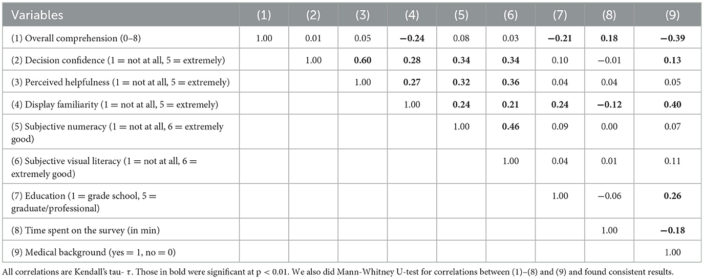
Table 1. Correlations (Kendall's tau- τ) of participants' performance and main covariates.
Table 2 shows means for each dependent measure for each of the four decisions, for each of the four displays. Two-way ANOVAs (with repeated measures for decision) found a significant between-groups difference for comprehension [F(3, 297) = 5.2, p < 0.01], but not the other dependent measures. The interactions between decision and display group were significant for comprehension [F(9, 891) = 4.5, p < 0.001] and perceived helpfulness [F(9, 891) = 3.3, p < 0.001], but not for decision confidence. The following analyses consider the patterns underlying these overall results.

Table 2. Mean (SD) for participants' performance on the three dependent measures.
Figure 4 shows the distributions of responses for the three dependent variables, comparing tasks with and without conceptual-spatial congruence. Supplementary Table 1.1 shows the corresponding OLS analyses. Table 3 shows OLS predictions from the individual difference variables. We report results for each performance measure in turn. Finally, we report risk avoidance for the four recommended decisions with the four displays (Table 4).
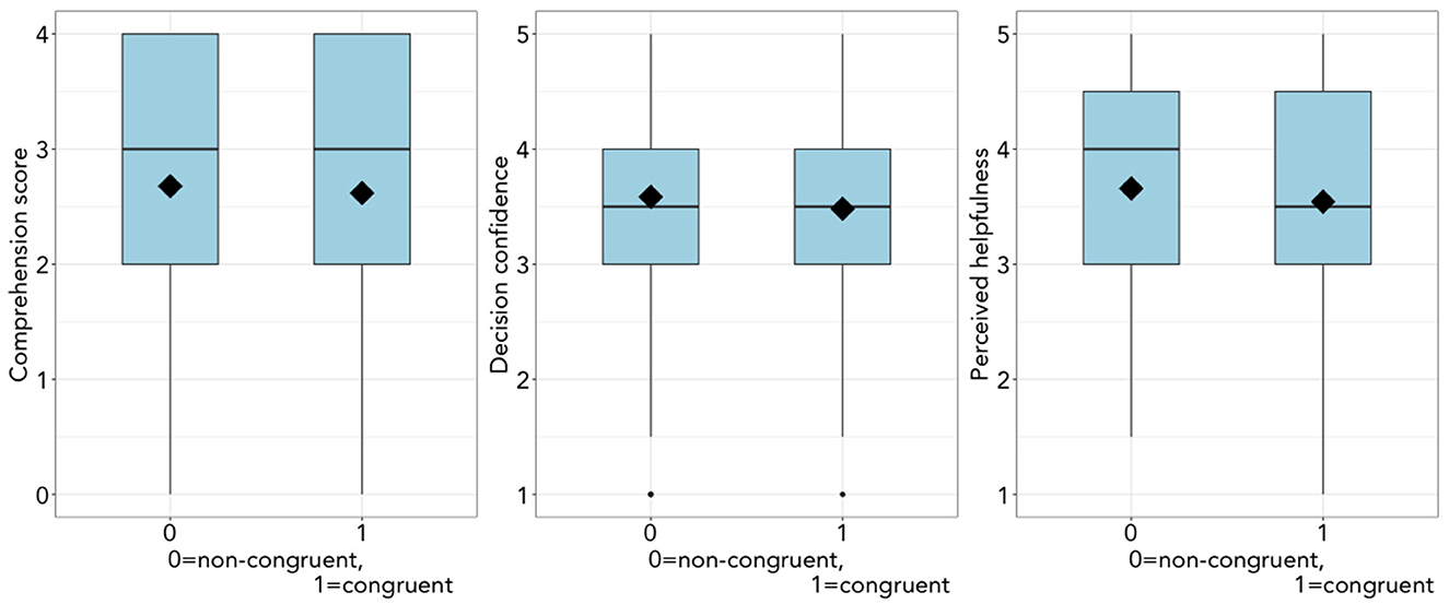
Figure 4. Participants' performance by conceptual-spatial congruence (0 = non-congruent, 1 = congruent). (Left) Comprehension score (ranging from 0 to 4), (Middle) decision confidence (ranging from 1 = not at all to 5 = extremely), and (Right) perceived helpfulness (ranging from 1 = not at all to 5 = extremely).
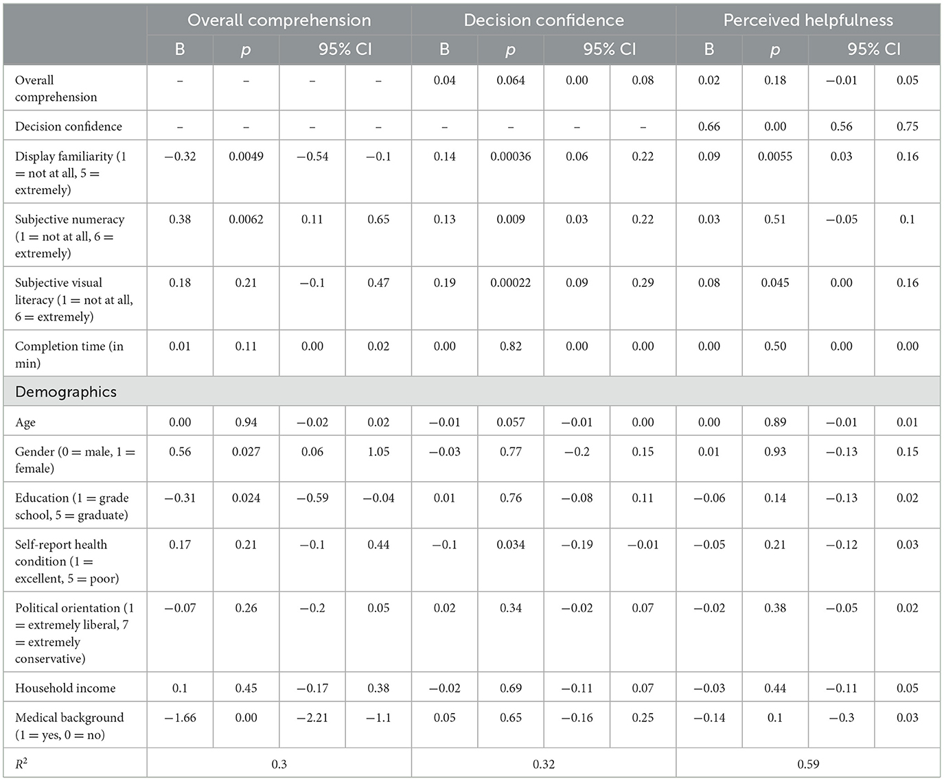
Table 3. OLS regressions with the dependent measures (overall comprehension, decision confidence, and perceived helpfulness) and independent variables (display familiarity, subjective numeracy, subjective visual literacy, completion time, and demographics).
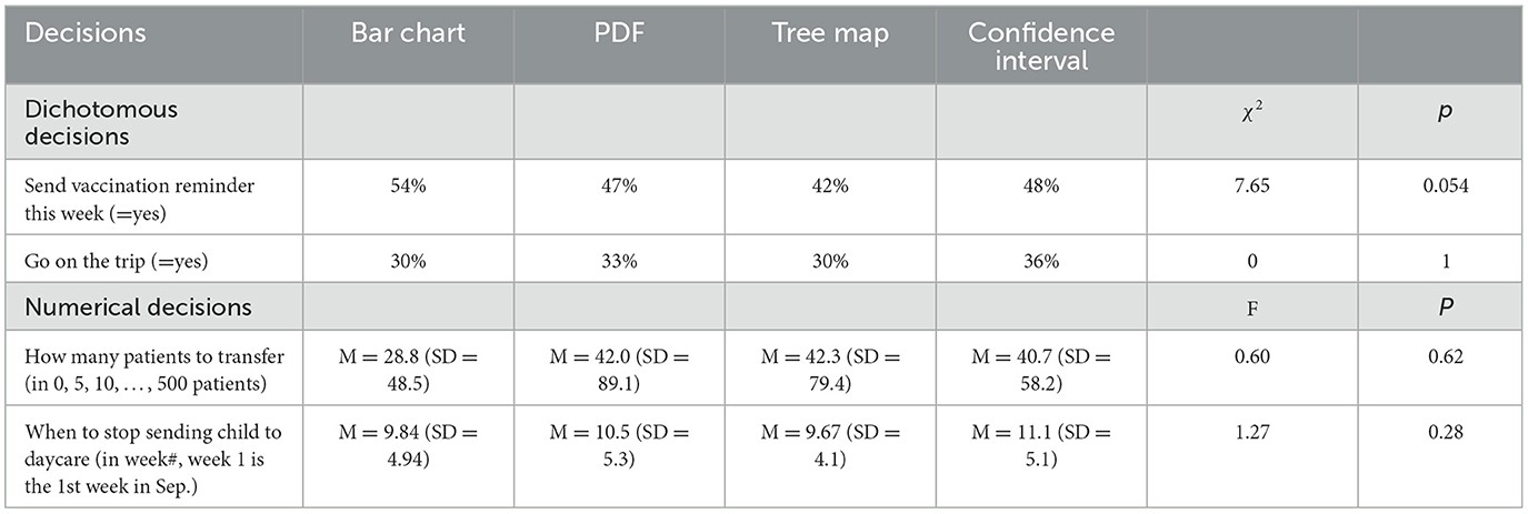
Table 4. Decisions.
Comprehension was unrelated to conceptual-spatial congruence (Figure 4). Thus, we did not observe the hypothesized congruence effect. Looking at cases where the display and decision were congruent, there was no difference between the two categorical displays (bar chart, tree map). PDF was better than CI, the other continuous display, for one measure: comprehension was better with PDF than with CI [p = 0.012; B = −0.44, SE = 0.17, 95% CI = (−0.78, −0.10)] (Supplementary Table 1.2). As predicted in our pre-registered analysis, comprehension was significantly greater with the bar chart than with the other three displays (Table 2, Supplementary Table 4.1).
Contrary to Hypothesis 2, OLS regressions (Table 3, Figure 5) found that individuals who reported greater familiarity with their assigned display had lower overall comprehension (also Supplementary Table 4.2). Subjective numeracy and subjective visual literacy were unrelated to overall comprehension (Supplementary Table 4.3). Exploratory analyses found that respondents with higher comprehension scores had less education (τ = −0.21, p < 0.001), were less likely to have a medical background (τ = −0.39, p < 0.001), and spent more time on the survey (τ = 0.18, p < 0.001).
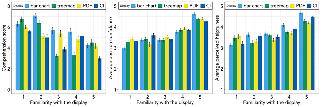
Figure 5. Display familiarity and participant performance by display group. (Left) Comprehension, (Middle) Decision confidence, and (Right) Perceived helpfulness. Error bars are 95% CIs based on standard errors.
Decision confidence was also unrelated to decision-display congruence (Figure 4, Supplementary Table 1.1), contrary to Hypothesis 2. When display and decision were congruent, there was no difference in participants' confidence in the two categorical displays (bar chart, tree map) or the two continuous ones (PDF, CI; Supplementary Table 1.2). Pre-registered analyses did not find the predicted greater confidence with the bar chart.
OLS regressions (Table 3) found that individuals reporting greater familiarity with their display had greater confidence in their decision, as shown in Figure 5 (also Supplementary Table 5.3). Greater confidence was also associated with greater subjective numeracy and subjective visual literacy. All these results are consistent with Hypothesis 2 and 3 (Supplementary Table 5.4). Respondents with higher decision confidence saw themselves as having greater numeracy (τ = 0.34, p < 0.001) and visual literacy (τ = 0.34, p < 0.001). They were also more likely to have a medical background (τ = 0.13, p < 0.01; Mann-Whitney U-test found consistent results).
Perceived helpfulness was also unrelated to decision-display congruence (Figure 4, Supplementary Table 1.1), contrary to Hypothesis 1. When decisions and displays were congruent, the two continuous displays (PDF, CI) were seen as equally helpful; the bar chart was rated as the more helpful of the two categorical displays [p < 0.01; B = −0.43, SE = 0.15, 95% CI = (−0.72, −0.14)] (Supplementary Table 1.2). Pre-registered analysis found, as predicted, that participants rated the bar chart as more helpful than the other three displays (Table 2, Supplementary Table 6.2).
OLS regressions (Table 3) found that participants who rated displays as more familiar, also rated them as more helpful, as shown in Figure 5 (also Supplementary Table 6.3), consistent with Hypothesis 2. Higher subjective numeracy and higher subjective visual literacy were both associated with greater perceived helpfulness, consistent with Hypothesis 3 (Supplementary Table 6.4). Respondents who saw their assigned display as more helpful were also more familiar with it (τ = 0.27, p < 0.001), and saw themselves as more numerate (τ = 0.32, p < 0.001) and more visually literate (τ = 0.36, p < 0.001).
Unlike previous research, there were no significant differences in the decisions, and risk aversion, of individuals using the four displays. Pooling across the display groups, 48.0% of participants would advise sending a vaccination announcement the next week; 32.4% would advise their friend to take the trip. On average, they would advise transferring 38.5 patients and advise their friend to stop sending their child to daycare in week 10.2 (around mid-November).
We present a general method for evaluating visual displays communicating scientific uncertainty, using hypothetical decisions that require extracting and employing specific information from a complex display. Our method evaluates users' success (and that of the display), in terms of three performance measures: comprehension, decision confidence, and perceived display helpfulness. We illustrate the method with tasks based on CDC's weekly influenza forecasts. These tasks ask participants to advise hypothetical friends about four decisions under uncertainty, based on the scientific research summarized in one of CDC's four key forecasts, using one of four, randomly assigned visual forecast displays.
We found that participants rated the four displays as similarly helpful and had similar confidence in decisions based on them. However, their comprehension scores differed significantly across displays. The interactions between decision and display are significant for all three performance measures, indicating participants' sensitivity to decision-display combinations. Contrary to hypotheses based on previous research, however, that variation was not related to display-decision congruence or to any of our three dependent measures. Thus, participants made decisions similarly with categorical and continuous decisions, whether using categorical displays (bar charts, tree maps) or continuous ones (PDF, CI) and whether the displays and decisions were congruent or not.
Our analyses of individual differences also produced surprising results. Comprehension was poorer for some participants for whom one might expect it to be superior: those who reported being more familiar with a display; those with more education, contrary to Brick et al. (2020); and those with medical backgrounds. Participants in each of these groups also completed the task more quickly.
One possible explanation for this predictive failure of congruence theory is that our extension to these displays and decisions was inappropriate. One specific concern is that PDFs and uncertainty bounds (CI) may not fit the theory's construct of continuous visual displays. A second possibility is that familiarity obscured differences predicted by the theory, a possibility raised by Tetewsky (1992). Not only was the bar chart much more familiar than the other displays, but the others were quite unfamiliar. Participants rated a display as more helpful when they rated it as more familiar or rated themselves as having greater numeracy or visual literacy.
Their education and familiarity (with a display or with medicine) might lead to unwarranted confidence and reduced carefulness, so that they failed to perform to their ability. Studies of word comprehension have found a similar pattern, with errors more common when participants read familiar, compared to unfamiliar, passages (Malik, 1990).
The discrepancies between objective performance and subjective confidence, and the associated display evaluations, may reflect the role of fluency, in the sense of the metacognitive experience of ease associated with information or stimuli processed by people (Schwarz, 2004). Being more familiar with a display (perceptual fluency) or being a healthcare worker more familiar with medical decisions (decision fluency) may have increased confidence, without increasing comprehension (Alter and Oppenheimer, 2009). Consistent with this interpretation, participants who rated themselves higher on numeracy and visual literacy were more confident in their advice and saw the displays as more helpful, but had no greater comprehension.
This study demonstrates a method for testing the usability of visual displays, illustrated with communicating scientific uncertainty in epidemiological forecasts, in terms of comprehension, confidence, and perceived helpfulness as applied to hypothetical decisions that might be informed by each of the four measures reported in CDC's weekly influenza forecasts (Woloshin et al., 2023). We found modest performance differences for the four decisions and associated forecast measures, as well as between the displays. However, those differences did not reflect the predicted effects of congruence between display and decision, such as might support tailoring displays to decisions. Instead, the most familiar display, bar charts, outperformed the three less familiar displays (tree maps, PDFs, and confidence intervals) to a degree that may have wiped out any congruence effects. A recent review of COVID-19 forecasts found that most (29 of 48) uncertainty visualizations used prediction intervals like those in our displays (d) (Zhang et al., 2021). We found evidence suggesting that familiarity, or fluency, with a display can increase confidence in ways that reduce comprehension. Less familiar displays may have the benefit of slowing people down so that they are more careful, in addition to any additional information that they provide. Future research could examine these unexpected effects, along with other predictive frameworks, including alternative interpretations of congruency theory, for communicating uncertainty in decision-relevant terms.
One limitation to these results is that we only have four tasks. In open-ended comments, some participants noted that they found the tasks easier as they moved on, suggesting that additional practice might have improved performance. However, we found little difference in performance between the first and last task, for any display (Supplementary Tables 7.4–7.6). Another limitation is not having the task-specific time stamps needed for finer grained analyses of the relationships between experience, time spent, and the dependent measures. A third limitation is that the study used a relatively well-educated MTurk convenience sample, roughly one-third of whom reported a medical background. Although such individuals are a likely audience for CDC's forecasts, less numerate, visually and medically literate respondents might have revealed greater differences between the displays.
The datasets presented in this study can be found in online repositories. The names of the repository/repositories and accession number(s) can be found at: https://osf.io/v2y95/.
The studies involving humans were approved by Institutional Review Board at Carnegie Mellon University. The studies were conducted in accordance with local legislation and institutional requirements. The participants provided written informed consent to participate in this study.
YY, GW-P, and BF designed the study and wrote the manuscript. YY collected and analyzed the data. All authors reviewed and approved the final version of the submitted manuscript.
This manuscript was supported by the Department of Engineering and Public Policy, Carnegie Mellon University and Centers for Disease Control and Prevention (CDC) and the U.S. Department of Health and Human Services (HHS) as part of financial assistance award U01IP001121 totaling $3,412,979, with 100% funded by CDC/HHS. The contents are those of the author(s) and do not necessarily represent the official view of, nor an endorsement by CDC/HHS, or the U.S. Government.
The authors declare that the research was conducted in the absence of any commercial or financial relationships that could be construed as a potential conflict of interest.
All claims expressed in this article are solely those of the authors and do not necessarily represent those of their affiliated organizations, or those of the publisher, the editors and the reviewers. Any product that may be evaluated in this article, or claim that may be made by its manufacturer, is not guaranteed or endorsed by the publisher.
The Supplementary Material for this article can be found online at: https://www.frontiersin.org/articles/10.3389/fcomm.2023.1232156/full#supplementary-material
1. ^Pre-registered analysis plan can be found at: https://osf.io/v2y95/.
Alter, A. L., and Oppenheimer, D. M. (2009). Uniting the tribes of fluency to form a metacognitive nation. Personal. Soc. Psychol. Rev. 13, 219–235. doi: 10.1177/1088868309341564
Bostrom, A., Anselin, L., and Farris, J. (2008). Visualizing seismic risk and uncertainty: a review of related research. Ann. N. Y. Acad. Sci. 1128, 29–40. doi: 10.1196/annals.1399.005
Brick, C., McDowell, M., and Freeman, A. L. J. (2020). Risk communication in tables versus text: a registered report randomized trial on ‘fact boxes'. Royal Soc. Open Sci. 7, 190876. doi: 10.1098/rsos.190876
CDC (2020). Disease Burden of Influenza. Available online at: https://www.cdc.gov/flu/about/burden/index.html (accessed December 18, 2020).
Fagerlin, A., Valley, T. S., Scherer, A. M., Knaus, M., Das, E., and Zikmund-Fisher, B. J. (2017). Communicating infectious disease prevalence through graphics: results from an international survey. Vaccine 35, 4041–4047. doi: 10.1016/j.vaccine.2017.05.048
Fagerlin, A., Zikmund-Fisher, B. J., Ubel, P. A., Jankovic, A., Derry, H. A., and Smith, D. M. (2007). Measuring numeracy without a math test: development of the subjective numeracy scale. Med. Decision Mak. 27, 672–680. doi: 10.1177/0272989X07304449
Fansher, M., Adkins, T. J., and Shah, P. (2022). Graphs do not lead people to infer causation from correlation. J. Exp. Psychol. 28, 314–328. doi: 10.1037/xap0000393
Fernandes, M., Walls, L., Munson, S., Hullman, J., and Kay, M. (2018). “Uncertainty displays using quantile dotplots or cdfs improve transit decision-making,” in Proceedings of the 2018 CHI Conference on Human Factors in Computing Systems (Montreal, QC: ACM), 1–12. doi: 10.1145/3173574.3173718
Friel, S. N., Curcio, F. R., and Bright, G. W. (2001). Making sense of graphs: critical factors influencing comprehension and instructional implications. J. Res. Math. Educ. 32, 124. doi: 10.2307/749671
Galesic, M., and Garcia-Retamero, R. (2011). Graph literacy: a cross-cultural comparison. Med. Decision Mak. 31, 444–457. doi: 10.1177/0272989X10373805
Garcia-Retamero, R., and Cokely, E. T. (2017). Designing visual aids that promote risk literacy: a systematic review of health research and evidence-based design heuristics. Hum. Fact. 59, 582–627. doi: 10.1177/0018720817690634
Garcia-Retamero, R., Cokely, E. T., Ghazal, S., and Joeris, A. (2016). Measuring graph literacy without a test. Med. Decision Mak. 36, 854–867. doi: 10.1177/0272989X16655334
Heer, J., and Bostock, M. (2010). “Crowdsourcing graphical perception,” in Proceedings of the 28th International Conference on Human Factors in Computing Systems—CHI '10 (New York, NY: ACM Press), 203.
Hullman, J., Resnick, P., and Adar, E. (2015). Hypothetical outcome plots outperform error bars and violin plots for inferences about reliability of variable ordering. PLoS ONE 10, 1–25. doi: 10.1371/journal.pone.0142444
Ibrekk, H., and Morgan, M. G. (1987). Graphical communication of uncertain quantities to nontechnical people. Risk Anal. 7, 519–529. doi: 10.1111/j.1539-6924.1987.tb00488.x
Kennedy, R., Clifford, S., Burleigh, T., Waggoner, P. D., Jewell, R., and Winter, N. J. G. (2020). The shape of and solutions to the MTurk quality crisis. Polit. Sci. Res. Methods 8, 614–629. doi: 10.1017/psrm.2020.6
Larkin, J. H., and Simon, H. A. (1987). Why a diagram is (sometimes) worth ten thousand words. Cogn. Sci. 11, 65–100. doi: 10.1111/j.1551-6708.1987.tb00863.x
Lipkus, I. M., and Hollands, J. G. (1999). The visual communication of risk. J. Natl. Cancer Inst. 27701, 149–163. doi: 10.1093/oxfordjournals.jncimonographs.a024191
Malik, A. A. (1990). A psycholinguistic analysis of the reading behavior of EFL-proficient readers using culturally familiar and culturally nonfamiliar expository texts. Am. Educ. Res. J. 27, 205–223. doi: 10.3102/00028312027001205
Okan, Y., Garcia-Retamero, R., Cokely, E. T., and Maldonado, A. (2012). Individual differences in graph literacy: overcoming denominator neglect in risk comprehension. J. Behav. Decision Mak. 25, 390–401. doi: 10.1002/bdm.751
Okan, Y., Stone, E. R., Parillo, J., Bruine de Bruin, W., and Parker, A. M. (2020). Probability size matters: the effect of foreground-only versus foreground+background graphs on risk aversion diminishes with larger probabilities. Risk Anal. 2020, 13431. doi: 10.1111/risa.13431
Padilla, L. M., Creem-Regehr, S. H., Hegarty, M., and Stefanucci, J. K. (2018). Decision making with visualizations: a cognitive framework across disciplines. Cogn. Res. 3, 29. doi: 10.1186/s41235-018-0120-9
Peters, E., Tompkins, M. K., Knoll, M. A. Z., Ardoin, S. P., Shoots-Reinhard, B., and Meara, A. S. (2019). Despite high objective numeracy, lower numeric confidence relates to worse financial and medical outcomes. Proc. Natl. Acad. Sci. U. S. A. 116, 19386–19391. doi: 10.1073/pnas.1903126116
Pinker, S. (1990). “A theory of graph comprehension.,” in Artificial Intelligence and the Future of Testing, ed R. Freedle (Mahwah, NJ: Lawrence Erlbaum Associates, Inc.), 73–126.
Reich, N. G., Brooks, L. C., Fox, S. J., Kandula, S., McGowan, C. J., Moore, E., et al. (2019). A collaborative multiyear, multimodel assessment of seasonal influenza forecasting in the United States. Proc. Natl. Acad. Sci. U. S. A. 116, 3146–3154. doi: 10.1073/pnas.1812594116
Rolison, J. J., Morsanyi, K., and Peters, E. (2020). Understanding health risk comprehension: the role of math anxiety, subjective numeracy, and objective numeracy. Med. Decision Mak. 40, 222–234. doi: 10.1177/0272989X20904725
Schwarz, N. (2004). Metacognitive experiences: response to commentaries. J. Consum. Psychol. 14, 370–373. doi: 10.1207/s15327663jcp1404_6
Shah, P., and Freedman, E. G. (2011). Bar and line graph comprehension: an interaction of top-down and bottom-up processes: topics in cognitive science. Top. Cogn. Sci. 3, 560–578. doi: 10.1111/j.1756-8765.2009.01066.x
Stephens, E. M., Spiegelhalter, D. J., Mylne, K., and Harrison, M. (2019). The Met Office Weather Game: investigating how different methods for presenting probabilistic weather forecasts influence decision-making. Geosci. Commun. Discuss. 101–116. doi: 10.5194/gc-2-101-2019
Stone, E. R., Yates, J. F., and Parker, A. M. (1997). Effects of numerical and graphical displays on professed risk-taking behavior. J. Exp. Psychol. 3, 243–256. doi: 10.1037/1076-898X.3.4.243
Tetewsky, S. (1992). Familiarity effects in visual comparison tasks and their implications for studying human intelligence. J. Exp. Psychol. 18, 577–594. doi: 10.1037/0278-7393.18.3.577
Tversky, B. (2011). Visualizing thought. Top. Cogn. Sci. 3, 499–535. doi: 10.1111/j.1756-8765.2010.01113.x
Tversky, B., Corter, J. E., Yu, L., Mason, D. L., and Nickerson, J. V. (2012). “Representing category and continuum: visualizing thought,” in International Conference on Theory and Application of Diagrams (Berlin; Heidelberg: Springer), 22–34.
Tversky, B., Kugelmass, S., and Winter, A. (1991). Cross-cultural and developmental trends in graphic productions. Cogn. Psychol. 23, 515–557. doi: 10.1016/0010-0285(91)90005-9
Tversky, B., Zacks, J., Lee, P., and Heiser, J. (2000). “Lines, blobs, crosses and arrows: Diagrammatic communication with schematic figures,” in Theory and Application of Diagrams Lecture Notes in Computer Science, eds M. Anderson, P. Cheng, and V. Haarslev (Berlin; Heidelberg: Springer Berlin Heidelberg), 221–230. doi: 10.1007/3-540-44590-0_21
Van Der Bles, A. M., Van Der Linden, S., Freeman, A. L. J., Mitchell, J., Galvao, A. B., Zaval, L., et al. (2019). Communicating uncertainty about facts, numbers and science. R. Soc. Open Sci. 6, 181870. doi: 10.1098/rsos.181870
Woloshin, S., Yang, Y., and Fischhoff, B. (2023). Communicating health information with visual displays. Nat. Med. 29, 1085–1091. doi: 10.1038/s41591-023-02328-1
Zacks, J., and Tversky, B. (1999). Bars and lines: a study of graphic communication. Mem. Cogn. 27, 1073–1079. doi: 10.3758/BF03201236
Zhang, Y., Sun, Y., Padilla, L., Barua, S., Bertini, E., and Parker, A. G. (2021). “Mapping the landscape of COVID-19 crisis visualizations,” in Proceedings of the 2021 CHI Conference on Human Factors in Computing Systems CHI '21 (New York, NY: Association for Computing Machinery). doi: 10.1145/3411764.3445381
Keywords: influenza forecasts, risk communication, decision making, usability testing, display design
Citation: Yang Y, Wong-Parodi G and Fischhoff B (2023) Visual displays for communicating scientific uncertainty in influenza forecasts. Front. Commun. 8:1232156. doi: 10.3389/fcomm.2023.1232156
Received: 31 May 2023; Accepted: 14 August 2023;
Published: 31 August 2023.
Edited by:
Pradeep Sopory, Wayne State University, United StatesReviewed by:
Francesco Marcatto, University of Trieste, ItalyCopyright © 2023 Yang, Wong-Parodi and Fischhoff. This is an open-access article distributed under the terms of the Creative Commons Attribution License (CC BY). The use, distribution or reproduction in other forums is permitted, provided the original author(s) and the copyright owner(s) are credited and that the original publication in this journal is cited, in accordance with accepted academic practice. No use, distribution or reproduction is permitted which does not comply with these terms.
*Correspondence: Yanran Yang, eWFucmFueUBhbmRyZXcuY211LmVkdQ==
Disclaimer: All claims expressed in this article are solely those of the authors and do not necessarily represent those of their affiliated organizations, or those of the publisher, the editors and the reviewers. Any product that may be evaluated in this article or claim that may be made by its manufacturer is not guaranteed or endorsed by the publisher.
Research integrity at Frontiers
Learn more about the work of our research integrity team to safeguard the quality of each article we publish.