 Stefan Klir
 Sebastian Babilon
 Paul Myland
 Simon Benkner
 Tran Quoc Khanh
- 1Laboratory of Adaptive Lighting Systems and Visual Processing, Technical University of Darmstadt, Darmstadt, Germany
- 2Arnold and Richter Cine Technik GmbH & Co., Betriebs KG, Stephanskirchen, Germany
This paper explores human observer preferences for various sky-like interior lighting scenarios realized by a combination of a blue-enriched indirect uplight component with a correlated color temperature (CCT) of 6,500 K up to 30,000 K and a 4,000 K or 5,500 K direct downlight component. Variations in the natural sky were mimicked by the indirect uplight component reflected from the ceiling of the experimental room. The settings for the direct lighting component, on the other hand, were selected based on the reported outcomes of previous preference studies in the field of interior lighting. The resulting lighting conditions were evaluated by a total of 29 observers, from which subjective ratings of brightness, sky-likeness, satisfaction, pleasantness, and general appeal were collected in an office workplace environment. In this experimental setting, the most preferred lighting conditions exhibited a direct-to-indirect lighting ratio of 50:50 with a CCT of 4,000 K in the direct component and 6,500, 7,500, and 9,000 K in the indirect component. For all examined combinations, none was rated as truly sky-like. Nonetheless, the study results showed that only the combination of a warmer CCT in the direct component and a cooler, blue-enriched CCT in the indirect lighting component leads to a maximum in the subjects’ preference ratings. In summary, the subjects preferred light settings with a white appearance on the work surface without any intense or noticeable blue cast or tint.
1 Introduction
In today’s modern society, people spend most of their working hours in indoor environments. Hence, in recent years, the development and planning of proper interior lighting strategies have become an increasingly vital part of the architectural design process. As shown in the literature, lighting in general has a non-negligible impact on the wellbeing, fatigue, vitality, and mental health of human recipients (Mills et al., 2007). In addition, the visual system of humans has evolutionarily adapted to dynamic changing sunlight, whereby dynamic light settings help maintain the circadian rhythm of humans (Engwall et al., 2015; Wang et al., 2022).
The aim of this research is to transfer the behavior of the sky to the interior. A study was conducted to address the following research questions: can the sky be mimicked with pendant luminaires involving a blue-enriched ceiling light in offices? What difference in direct and indirect color temperatures is preferred by subjects? To answer these questions, a subject study was conducted with eight correlated color temperatures (CCTs) in the range of 6,500–30,000 K to illuminate the ceiling combined with 4,000–5,500 K for the radiation toward the desk. The downward illuminating component has two purposes: first is to simulate the direct sunlight and the more important second purpose is to shift the overall color temperature toward a general preferred range of up to 6,500 K vertically at the human eye (Boyce and Cuttle, 1990; Fotios, 2017). Furthermore, two variating ratios between the luminaire parts for upward illumination to the ceiling and radiation direct to the desk are discussed. The researched ratios are 30%/70% and 50%/50% for down- and upward irradiance, respectively. The research questions are targeted in a subject study with overall 32 light settings and the aid of a questionnaire.
In the following chapters, the state-of-the-art research, study design, evaluation, and discussion are introduced in greater detail.
2 Fundamentals
This section introduces the fundamentals and the state-of-the-art research in this field. For creating a preferred light setting that can mimic the sky, multiple research fields are depicted. At the beginning, the general preferred illuminance and CCT for office lighting are explained as general satisfying ground truth. Furthermore, the sky parameters under multiple conditions, such as clear, cloudy, overcast, and dusk, are explained, which include the prevailing CCTs, the measurement times, and locations. This information forms the fundamental that is transferred into the interior. Due to the maximum sky CCT of up to 100,000 K, the following section discusses the literature for blue-enriched light for indoor illumination and the satisfaction. As the last component of this section, the research on indirect and direct radiating light and the preferred ratio is discussed to assign the blue-enriched sky CCTs to pendant luminaires within a room.
2.1 Preferred correlated color temperature and illuminance
Acceptable light levels for visual task fulfillment can be achieved by a illuminance of 500 lx (according to DIN EN 12464-1). However, for evoking a maximum preference of a specific light setting, an illuminance of rather 850 lx up to 2,000 lx is needed (Boyce, 1970; Begemann et al., 1997; Manav, 2007; Khanh et al., 2019; Aryani et al., 2020). Nonetheless, unidimensional measures of the light level, such as illuminance, are usually not sufficient for adequately modeling and predicting human light preferences. Instead, the spectral composition of the lighting conditions must also be taken into account. From a practitioner’s point of view, information about the spectral features of white light sources is usually encoded in terms of appropriately assigned CCTs. Starting in 1941, with the seminal work of A. A. Kruithof (1941), who proposed the first graphical representation of the preferred combinations of illuminance and CCT for interior lighting, many researchers of the following generations have tried to further explore the relationship between these combined impact factors and human preferences in lighting.
Baniya et al. (2015), for example, examined the preferred combinations of illuminance and CCT for different ethnic groups in an office lighting scenario using tunable white light-emitting diode (LED) luminaires. Nine different lighting presets were assessed by a total of 53 human subjects of European (20), Asian (20), and African (13) ethnicities. Pleasantness for European people was in general at 4,000 K and for Asian people at 5,000 K. In conclusion, the CCT can be selected in a broader range and can depend on further parameters with regard to subjective preferences. Likewise, they described that the combination of the illuminance and CCT has an important impact on the perceived illuminance.
With respect to the CCT, light is perceived brighter with a higher CCT (Baniya et al., 2015). Fotios (2001) suggested that not only the color temperature but rather the combination of color temperature and color rendering is a better measure of the perceived brightness (Dikel et al., 2014). Boyce and Cuttle (1990) described in their experiment that for fully adapted people, the CCT between 2,700 and 6,300 K is negligible for user preferences. Similarly, Fotios (2017) described that the CCT in the range of 2,500–6,500 K for a pleasant light setting is insignificant in most of the investigated papers in the review. They also found that illuminances below 300 lx should be avoided, and illuminances above 500 lx are recommended. Further studies revealed that a CCT of 4,000–5,000 K is preferred in most scenarios (Shamsul et al., 2013; Yang and Jeon, 2020).
Finding a comprehensively preferred light setting for all user groups is difficult. Lok et al. (2018) described that the alertness effect of light from different studies is reported as inconsistent and concluded to be rather on an individual and subjective scale. Thus, color temperature should be chosen based on the subjective scale scores and the users’ opinion (Kazemi et al., 2018).
In a long-term study for office environments, Mills et al., (2007) investigated the effects observed within an intervention group exposed to highly blue-enriched 17,000 K fluorescent lamps with a horizontal illuminance on the reference surface of 311 lx and compared them to a baseline control group exposed to a standard 2,900 K lighting condition with approximately the same illuminance for a total duration of 14 weeks. Their study showed that the intervention group rated the lighting conditions as tolerable while, at the same time, experiencing an improved wellbeing. Similar results were reported by Viola et al. (2008). In a crossover study that investigated the effects of different lighting scenarios in the office environment, the same 104 subjects were first exposed to a 17,000 K fluorescent lighting condition at 310 lx for 4 weeks and then, for another 4 weeks, to a 4,000 K control condition at 421 lx. Overall, it could be shown that measures of alertness, positive mood, performance, and evening fatigue were improved when exposed to the blue-enriched, higher CCT condition. These two experiments indicate that even much higher-than-standard CCTs are tolerated in office working environments with incoming sunlight while, at the same time, improving physiologically and psychologically relevant measures. Moyano et al. (2020b) revealed that blue light, even 10 cm in front of a laptop, tablet, or smartphone compared to a summer day, will not cause blue-light hazard since the mean irradiance is 0.0775 Wm−2 compared to 25 Wm−2. These findings were also confirmed by Bullough et al. (2019) and Moyano et al. (2020a) for indoor LED lighting.
2.2 Sky conditions
For the design of good interior lighting, the impact of sunlight on the overall indoor lighting conditions must be considered explicitly. Natural sunlight has varying color temperature conditions and brightness levels due to the time of day, season, location, orientation, and cloud conditions (Chain et al., 2001). According to a literature review by Hernández-Andrés et al. (2001), the most frequently observed CCTs for clear sky conditions showed a consistent range of 5,555–5,882 K. The CIE, on the other hand, defined a spectrum with 6,500 K (D65) as natural daylight. Table 1 gives a literature overview of different studies regarding sky conditions, their measurement time frame, and the location and the corresponding CCTs. The measurements reflect the sky and not directly the sunlight. Furthermore, the full range of the measurement is provided in addition to the most occurring CCT, which most papers use. With the full range of CCT, the wide variety of color temperatures during the day can be shown. For different sky conditions, the lower bound is similar to the most frequent CCTs, and the upper bound differs as follows: clear sky: 5,500–100,000 K, cloudy: 4,864–26,728 K, overcast: 3,758–34,572 K, and dusk: 1,400–12,800 K. Note that the condition categories and the classification of the single measurements of the different sky conditions are not standardized and lead to variations. Another important finding related to the interplay between illuminance and CCT is the variance in illuminance and CCT changes due to the sky condition: a large variation in CCT leads to a small illuminance variation and vice versa (Nayatani and Wyszecki, 1963).
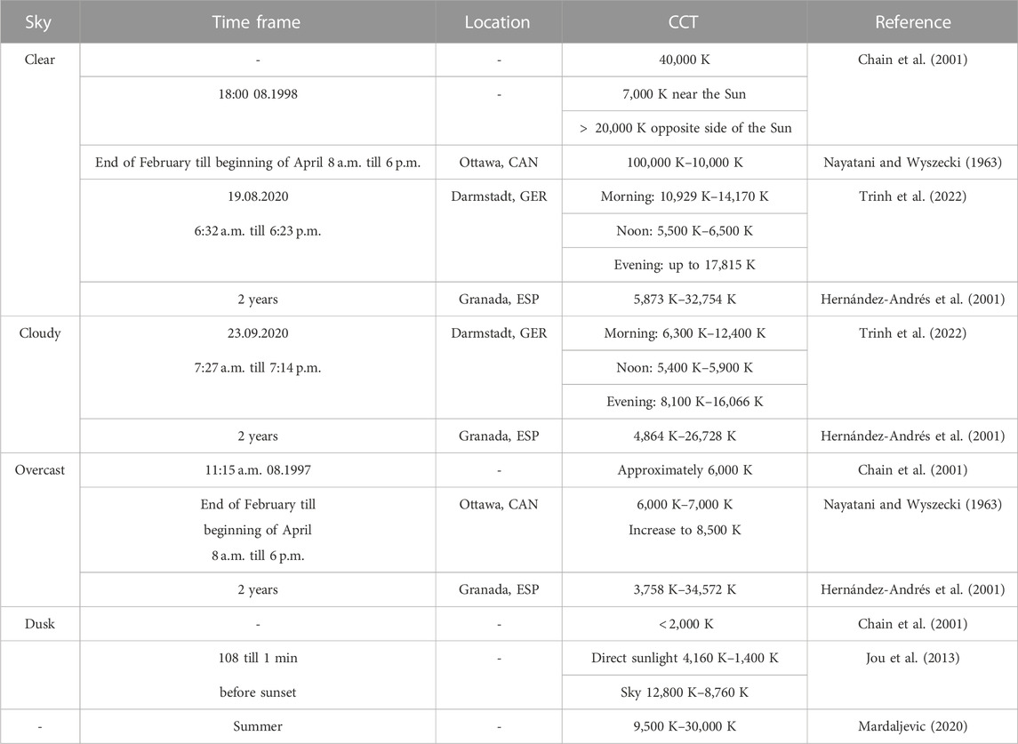
TABLE 1. Literature review of correlated color temperature (CCT) during different time frames, locations, and sky conditions for integrated measurements of the sky. The full range of measurements is provided as stated in the papers.
The following statements can be derived from the currently available literature: illuminance is the main driver for preference. A horizontal level of at least 500 lx should be achieved. For interior lighting, a CCT of 4,000 K–5,000 K is preferred on average. It should be noted that the actually preferred CCT varies over a much wider range with the individual user, performed tasks, and time of day. In real world settings, windows and the sky conditions affect the resulting illuminance and CCT of the lighting conditions as additional factors. The outdoor color temperature range starts from 5,500 K and may reach up to 100,000 K (K Nayatani and Wyszecki, 1963).
In the following section, sky-like, high-CCT ceiling illumination approaches in combination with direct work desk lighting are discussed.
2.3 Blue-enriched light
An approach which combined a blue-enriched 14,000 K ceiling light with a 4,000 K downlight for creating a balanced indirect/direct lighting scenario in classrooms was considered by Keis et al. (2014). During a 5-week intervention period in winter time, it could be shown that the blue-enriched light exerted an acute stimulating, positive effect on the students’ alertness and cognitive performance. Despite these physiologically positive effects, only half of the students were satisfied with the new lighting condition, while the other half reported it to be too bright for their taste. However, the inclusion of an indirect blue-enriched CCT lighting component was still perceived as comfortable by most students. At the eye level (120 cm above ground), the combined CCT was approximately 5,500 K at an illuminance level of 300 lx. The preference for blue-enriched lighting was explicitly examined by Lewinski (1938), who projected chromatic-colored light onto a white reference wall to collect subjective ratings of pleasantness. They found that blue light intensity, in general, was experienced as more pleasant than green, purple, red, orange, or yellow wall illumination. These colors were obtained by accordingly filtered light from a 300-W incandescent light source. Likewise, Kombeiz and Steidle (2018) conducted a study comprising 146 subjects and researched the impact of red and blue accent lighting at a faced wall in a room with white accent lighting. Red and blue accent light combined with white light can improve the performance in creative (Kombeiz and Steidle, 2018) and proofreading tasks (Hoonhout et al., 2009). These study results support the concept of using an accent blue-enriched light in the interior. The limitations to the experiments show that further studies need to be conducted to evaluate whether this is also true if the accent light is placed on the ceiling. Similarly, another study indicated that for office workplaces, the field of view and the viewing angle are important for the brightness reaching the eye (Babilon et al., 2021). Hansen et al. (2022) conducted two experiments with direct spotlights and diffuse indirect light. The first experiment found that 55%–85% indirect light is preferred over different tasks and avoids discomfort due to glare. In the second experiment, 3,300 K, 4,200 K, and 5,800 K light as a combination of direct and indirect light leading to five combinations with and without daylight was used at 500 lx at the desk area. They concluded that 80% of the subjects did not choose the same light as preferred under the two sunlight conditions: clear sky and overcast. The condition with the same direct and indirect light with 5,800 K CCT is the least preferred under both sunlight conditions; 3,300 K direct and 5,800 K indirect light is preferred for clear sky conditions, and both parts (direct and indirect light) with 4,200 K were preferred for the overcast condition. This can be interpreted as indicating that the Sun and blue sky under the clear sky condition have different CCTs and study subjects’ preferences for different sky conditions. For overcast conditions, the separation between direct (sunlight) and indirect (skylight) vanishes, and therefore, the room should also look more homogeneous.
2.4 Direct-to-indirect light ratio
Separate consideration of indirect blue and direct white light leads to the examination of ratios from the two light emitters. de Vries et al. (2021) indicated that a higher ratio of indirect to direct light has a significant higher score on coziness, liveliness, and detachment. Furthermore, a post hoc grouping was provided to the results of the participants, which revealed that only indirect light (no direct light) differs in the rating of the light. In both subject groups, 30% direct light and 70% indirect light were considered good conditions. In unison, Houser et al. (2002) concluded in his experiment that 60% and more indirect horizontal illuminance is preferred in general. A detailed horizontal illuminance with grading of 10% was used, and the three scales (dislike/like, unpleasant/pleasant, and unsatisfying/satisfying) showed no significant difference. Veitch and Newsham (2000) recommended an indirect light ratio of 40%. Increasing effects for the effect of health, cognitive tasks, and wellbeing could not be found after the removal of glare (Fostervold and Nersveen, 2008).
In summary, a luminaire with direct and indirect light is preferred (Boyce et al., 2006). Furthermore, for interior lighting, a higher ratio of indirect light is mostly preferred. There are huge variations in intrapersonal preferences of lighting, and a perfect light for everyone cannot be determined from the literature (Fostervold and Nersveen, 2008; Fotios and Cheal, 2009).
3 Methods
For this research, we conducted a study to examine the effect of high CCTs as ceiling light in the range of different sky conditions and a direct desk light CCT similar to preferred indoor color temperatures with different ratios between direct and indirect emitted light. The difference in the aforementioned studies is that this research investigates higher maximal CCTs for the indirect light emitting part, combined two irradiance ratios of the direct and indirect light. Furthermore, the psychological effects and the similarity to the memorized sky has become the research focus.In this section, the subject study room with the luminaires is introduced, as well as the questionnaire to address the research goals. Subsequently, the study design with the time sequence and light conditions is described.
3.1 Experimental room conditions
The study was conducted in a rectangular experimental room of dimension 6.17 m × 5.48 m located in Darmstadt, Germany, where two subjects could be tested at the same time. Figure 1 shows that the subjects were randomly assigned one of two possible display workplaces, which were set up on a large meeting table centrally aligned with the room dimensions. Each workplace comprised a range of colored objects that may be encountered in typical office environments (e.g., books, beverages, flowers, and paper sheets). The mean reflectance factors of the white table surface, dark table surface, floor, green cupboard, and white walls are 0.93, 0.12, 0.35, 0.45, and 0.88, respectively.
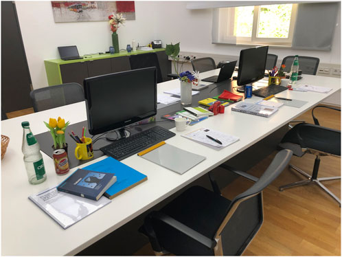
FIGURE 1. Two workstations decorated for the study with everyday office supplies like books, paper, bottles, cans, flowers, keyboard, monitor, and pens.
For illuminating this office-like scenario, six custom-made, individually addressable LED luminaires were suspended from the ceiling. Each luminaire comprised two white-light channels for the downlight component (warm-white at 2,700 K and cool-white at 6,500 K) and a combination of five colored and two white-light channels for the uplight component. The dominant wavelengths of the colored channels were as follows: blue—454 nm, cyan—476 nm, orange—595 nm, lime—540 nm, and red—648 nm. The two white uplight channels comprised an arrangement of warm- and cool-white LEDs with 2,700 K and 6,500 K, respectively. Figure 2 depicts the corresponding relative spectral power distributions (SPDs) of the individual LED channels. It should be noted that the orange, lime, and white-light channels are each composed of phosphor-converted LEDs (i.e., blue chip coated with various phosphor materials), whereas the red channel is formed by a combination of two different, quasi-monochromatic red LEDs at 630 nm and 660 nm, respectively. All other channels use direct-emitting LEDs. In case that all channels were lit to the maximum, the irradiance measured in a central location on the table surface was 749.06 Wm−2, which resulted in an overall, maximally achievable illuminance of 8,517 lx. During operation, a smooth dimming behavior of the luminaires is achieved by a pulse-width modulation (PWM) of 500 Hz for the white LEDs and current dimming for the colored channels. The DALI protocol was used with 170 dimming steps per channel to set the desired spectra.
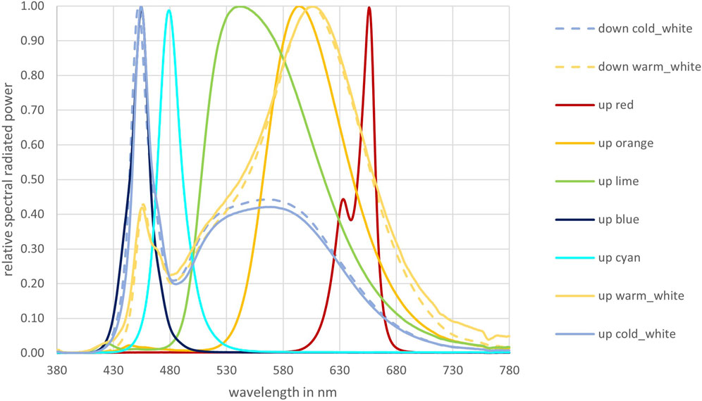
FIGURE 2. Spectra of the two direct (down: 2,700, 6,500 K) and the seven indirect LED channels (up: blue, cyan, orange, lime, red, white 2,700 K, and white 6,500 K) which can be individually controlled.
3.2 Questionnaire
To collect the participants’ subjective preference ratings associated with various sky-like light settings during the experiments, a dedicated questionnaire was used for the assessment, as shown in Figure 3. Regarding its first four questions, a semantic differential with a bipolar seven-point intensity rating scale with words provided for each step between antonyms was adopted from Tifler and Rea (1992), Ploder and Eder (2015), and Hansen et al. (2022), who used this type of scale—identified as suitable for this purpose by Flynn et al. (1979)—to measure subjective impressions in similar lighting contexts. For the fifth question, on the other hand, which collects an overall rating of general appeal for the current lighting situation, a dedicated non-linear, semi-semantic interval scale was applied. This scale was developed by Brückner (2014) and Bodrogi et al. (2014, 2011) for the color rendition evaluation of white light sources but was also applied successfully for modeling user preferences in the context of light and color perception (Khanh et al., 2018; 2019; Klabes et al., 2021).
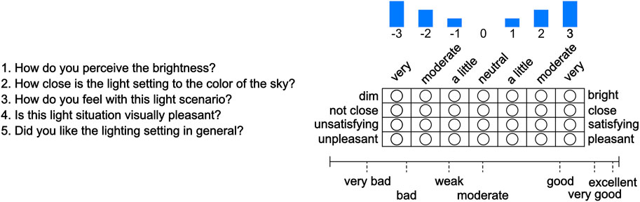
FIGURE 3. Subjective questionnaire that was used for each examining the light setting. The questionnaire was originally provided in German and is presented here as a translation. The original five questions provided in German are: “1. Wie empfinden Sie die Helligkeit? 2. Wie nahe ist die Lichtsituation an der Farbe des Himmels? 3. Wie fühlen Sie sich bei dieser Lichtsituation? 4. Ist diese Lichtsituation visuell angenehm? 5. Hat die Lichtsituation Ihnen allgemein Gefallen?” The first four questions use a semantic differential with a bipolar seven-point intensity rating scale with full verbalization between antonyms, and question 5 uses a semantic interval scale from 0 to 100 with seven semantic terms.
The present study investigates the subjective rating and preference of office lighting with sky-like ceiling light. In the literature review in Section 2, the brightness level of light sources often creates a significant influence on subjective preference (Boyce, 1970; Baniya et al., 2015; Fotios, 2017), and question 1 will focus on this fact and evaluate the subjective brightness from “dim” to “bright.” Question 2 focuses on the sky-like impression of the light setting and evaluates how close the light setting resembles the sky from “not close” to “close.” Question 3 is used to assess the impact on a participant from “unsatisfying” to “satisfying.” The study examines light settings for office environments, and therefore question 4 is used to assess the visual pleasantness from “unpleasant” to “pleasant.” Question 5 is used to assess the general appeal on a semantic interval scale from 0 to 100 with seven semantic terms (“very bad” = 12.8, “bad” = 26.5, “weak” = 41.2, “moderate” = 52.9, “good” = 79.6, “very good” = 91.6, and “excellent” = 97.9) (Bodrogi et al., 2014; 2011; Brückner, 2014). All five questions gather the subjective impression of the room and the surrounding office objects. The subjects were able to view the entire room during adaptation and evaluation phases. The questionnaire was filled out on a sheet of paper, and all five questions were asked for each light setting.
3.3 Study design
The study design is divided into two parts: i) part one explains the aim of the study to the test subjects by reading the same explanation at the start of the experiment to each group. Each subject group consists of up to two subjects. The study was conducted at the end of April 2022 between 8 a.m. and 6 p.m. in Darmstadt, Germany. Due to the COVID pandemic, there were only two subjects in addition to the study leader in the room to maintain a minimum distance of 1.5 m. After the explanation, the Ishihara color vision task using standard pseudoisochromatic plates was performed to rule out color vision deficiencies. ii) During this second phase of the experiment, the light setting which has the most equal CCT for direct and indirect light was shown: 5,500 K direct (Ev = 350 lx) and 6,500 K (Ev = 150 lx) indirect with an illuminance ratio of 30:70 (direct:indirect) according to de Vries et al. (2021). Subsequently, the questionnaire was introduced. In order to clarify possible questions from the subjects, exemplary the questionnaire for the current light setting was answered. These answers were not included in the evaluation. During the complete study, the room was darkened with blackout blinds to exclude sunlight variance. After this first phase that took approximately 10 min, the second phase started with the study subjects in the room. In this part, 32 light settings were randomly provided to the subjects to exclude the order-effects response bias. Each light setting was presented for a 60 s adaptation time in which the subjects should look around, check the room, and notice the objects on the desk. Fairchild and Lennie (1992), Fairchild and Reniff (1995), and Begemann et al. (1997) showed that this adaptation time could be used for 80% chromatic adaptation and is also sufficient for pupil adaptation (Zandi et al., 2020; Zandi and Khanh, 2021). Immediately afterward, a 30 s evaluation time was given for answering the questionnaire. Figure 4 summarizes the study design with the timings. During each study group, the timing and the randomization were fully automated with a graphical interface for the study leader, so every run was made as equal as possible. The interface was programmed specifically for this study using Python 3.7. Every participant received a compensation of 10 Euros after the experiment. A total of 29 people participated in the experiment aged 21–30 years (mean age 25.03 years ± 2.38 standard deviation), of which 14 were female participants and 15 were male participants.
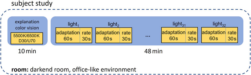
FIGURE 4. Subject study design with the timed sequence of the two parts. Part one provides information and explanations. In part two, the 32 light settings were presented, and the questionnaire was answered by the subjects.
Hereafter, the ratio between direct and indirect light in percent is abbreviated with the letters D for down (direct) and U for up (indirect), meaning 30% direct and 70% indirect emitted light will be referred to as D30 and U70, respectively. The conducted study was evaluated with a total of 32 light settings generated from a combination of the parameters shown in Table 2. The variations include two direct CCTs, eight indirect CCTs, and two irradiance ratios. The CCTs were chosen with respect to the literature explained in Section 2. Direct CCTs were picked for a preference in interior lighting. Values for the indirect CCT were selected to cover the range of possible CCTs for sky conditions and include the standardized D65 and D75 CCTs.
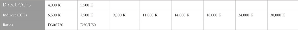
TABLE 2. Examined light parameters during the subject study. A total of 32 light settings were generated from all possible combinations. The ratios are calculated based on the irradiance. The abbreviation D and U indicate the direct and indirect radiated light, respectively.
Due to the fact that the brightness sensitivity curve V(λ) has the highest sensitivity at 555 nm and a quite low sensitivity in the red and blue wavelength areas, the illuminance as a parameter could not be a sufficient measure to evaluate the brightness of CCTs used in this study with up to 30,000 K. However, the illuminance is calculated by weighting the physical spectrum with the V(λ) function.
Since the measured CCTs in this experiment have a high peak in the blue region and, therefore, would have a low illuminance, the irradiance is calculated as the ratio of the direct to indirect light, and illuminance will be noted only for reference. The irradiance ratio is in addition equivalent to the electric energy which is needed to obtain the light ratio. In summary, all light settings consume the same amount of electricity. Furthermore, using question 1, the subjective perceived brightness can be evaluated in terms of brightness sensitivity of the human eye.
The most equal direct and indirect CCT settings from the survey, 5,500 K direct and 6,500 K indirect, was used as reference to determine the irradiance which is kept constant. The illuminance was measured vertically at the approximate human eye level of 120 cm above ground in the middle of the two subjects. A vertical illuminance of 500 lx was used, which corresponds to approximately 850 lx horizontal illuminance in the center of the desk between the subjects. The value was chosen with consideration of the standardized horizontal illuminance of 500 lx (DIN EN 12464-1) and the preference for higher illuminance of 850 lx up to 2,000 lx. Furthermore, in order to ensure comparability to other literature works (Fleischer et al., 2001; Keis et al., 2014; Hansen et al., 2022), the value is not chosen higher. The measured values of irradiance and corresponding illuminance at the eye level are displayed in Table 3 for the direct part and Table 4 for the indirect component. These tables show the decreasing illuminance with an increasing CCT and the nearly constant irradiance Ee.

TABLE 3. Measured values of the direct component with the 30% (D30) and 50% (D50) ratio.
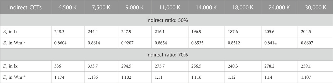
TABLE 4. Measured values of the indirect component with the 50% (U50) and 70% (U70) ratio.
4 Results
The statistical analysis of 29 participants’ data will be determined based on the often used significance level of 0.05. All collected data are dependent samples, without measurement repetition within the subjects. For further statistical analysis, the normal distribution was checked by applying the Shapiro–Wilk test (Shapiro and Wilk, 1965) and crosschecked graphically with a histogram. Both showed that all the samples are not normally distributed (p-value
Three dependent variables were used for further analysis: direct CCT, indirect CCT, and the ratio between direct and indirect irradiance. The dependent variables of the five questions were used as outputs.
4.1 Brightness
The direct/indirect ratio and the indirect CCT are the significant main variables (χ2(1) = 109.59, p
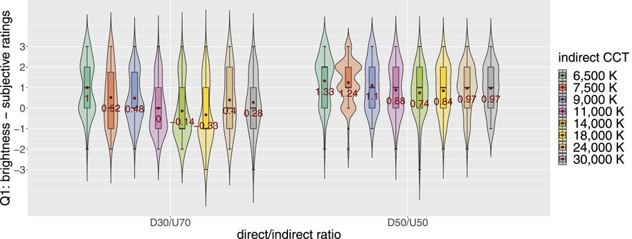
FIGURE 5. Evaluation of brightness with violin plots, on which the mean values (red dots with red numbers) and median values (black lines) are illustrated. Significant main effect of the direct/indirect ratio and indirect CCT. D50/U50 has a higher brightness rating than D30/U70 with respect to all indirect CCTs.
4.2 Sky-likeness
Question 2 (Q2) addresses the sky-like impression of the light setting. The different ratios D50/U50 and D30/U70 have no significant impact (χ2(1) = 1.47, p = 0.2255). Likewise, the direct CCTs, 4,000 K or 5,500 K, have no impact (χ2(1) = 0.087, p = 0.7675). The indirect CCT has an impact on the sky-like feeling of the participants (χ2(7) = 28.41, p = 0.0002) and is consistent with the expectation that the indirect CCT influences the sky-like impression of the room. In addition, all interactions of the variables, direct/indirect ratio, direct CCT, and indirect CCT, have no significant effect. Figure 6 presents the subjective rating separated by the irradiance ratio and indirect CCT. An increase in 24,000 K and 30,000 K can be observed. It is important to note that these two CCTs are directly placed on the Planckian locus, and the other CCTs are placed on the daylight curve (Judd et al., 1964). Nevertheless, a trend toward higher CCTs to be more sky-like can be identified. Tukey’s post hoc test with the Holm–Bonferroni adjustment showed that, in particular, 6,500 K–24,000 K, 6,500 K–30,000 K, and 7,500 K–30,000 K have significantly different ratings for Q2 (p = 0.001164, p = 0.000128, and p = 0.049544, respectively). This indicates that the change from the daylight curve to the Planckian locus between 18,000 K and 24,000 K has no significant effect.
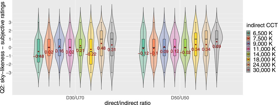
FIGURE 6. Evaluation of sky-likeliness question 2 (Q2) with violin plots, on which the mean values (red dots with red numbers) and median values (black lines) are illustrated. Higher CCTs are more sky-like.
In summary, the indirect CCT has a main effect on the sky-like impression of the room and has a trend toward higher CCTs. In contrast, the overall mean value of the sky-like question rating with a standard deviation of 0.11 ± 1.57 is considered by the subjects as neutral, i.e., neither sky-unlike nor very sky-like. Likewise, if the data are split up for individual parameters, the mean value in all groups is rated as neutral: D30/U70: 0.06 ± 1.57, D50/50: 0.17 ± 1.57, 4,000 K direct: 0.13 ± 1.52, and 5,500 K direct: 0.1 ± 1.62. It follows that it is not sufficient to illuminate the ceiling with a higher CCT to achieve a sky-like appearance; however, this does not have any negative effects.
4.3 Preference
The preference is measured with three questions: Q3 satisfaction, Q4 pleasantness, and Q5 general appeal. The results of both Spearman’s and Pearson’s correlation tests revealed that these three questions have a higher correlation than ρ > 0.78 to each other. A significant test revealed that the subjective satisfaction, pleasantness, and general appeal from Q3, Q4, and Q5 have significant main effects on all dependent variables individually: direct/indirect ratio (χ2(1) = 40.64, p
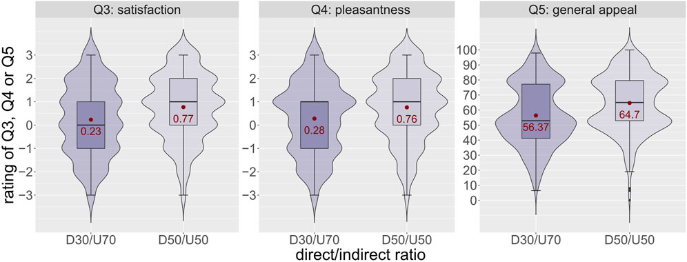
FIGURE 7. Evaluation of satisfaction (Q3), pleasantness (Q4), and general appeal (Q5) with violin plots, on which the mean values (red dots with red numbers) and median values (black lines) are illustrated. D50/U50 has a higher mean rating in all three questions.

FIGURE 8. Evaluation of satisfaction question 3 (Q3) with violin plots, on which the mean values (red dots with red numbers) and median values (black lines) are illustrated. D50/U50 and 4,000 K are the most preferred settings.
The following conclusions for satisfaction, pleasantness, and general appeal can be stated: the subjects preferred the D50/U50 setting with 4,000 K direct light, and the indirect CCT is not the main influencing factor for this light setting. A trend in the direction of lower CCTs follows the order 6,500 K up to 9,000 K.
5 Discussion
In this paper, a study was conducted to evaluate light settings with light emitted to the ceiling (indirect) and directed to the work plane with two direct/indirect irradiance ratios: D50/U50 and D30/U70. Following the fact that the illuminance is not used to define the direct and indirect ratios, the perceived brightness Q1 shows that the irradiance ratio between direct and indirect light and the indirect CCT are significant main variables influencing the brightness level. The perceived brightness of the subjects is higher for the D50/U50 irradiance ratio. A higher brightness for D50/U50 is also explainable by the illuminance that is higher due to the increased ratio of direct emitted light at 4,000 K and 5,500 K that has more intensity at the peak of the V(λ) curve. As a result, we indicate that the illuminance is a good measure to evaluate the perceived brightness.
With a closer look at the influence of the illuminance, Table 5 shows a significance test of the main effects of the linear mixed-effects ANOVA model for three groups of data: all data, only the ratings for D50/U50 light settings, and only for D30/U70. In agreement with previous studies, Table 5 explains that the question about the brightness (Q1) is highly significant with the illuminance. Nevertheless, for all other questions, except for one entry (Q2 with D30/U70 data), the illuminance is a significant main effect. The evaluation results for preference and sky-likeness must, therefore, be interpreted with caution since there is an additional significant influence of the illuminance on these questions.
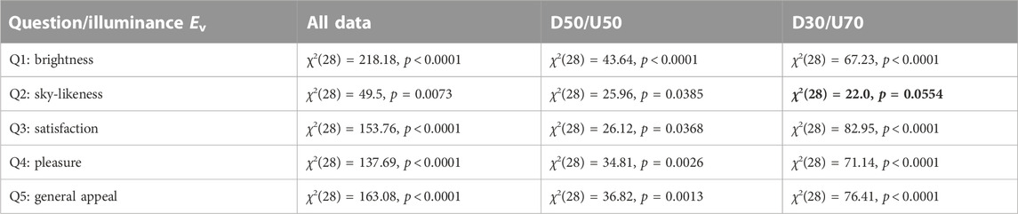
TABLE 5. Significance test for the main effects of illuminance Ev on each of the five questions (Q1–Q5) calculated with the linear mixed-effects ANOVA model for all data and only for the groups D50/U50 and D30/U70. For the sky-like impression (Q2) and D30/U70, there is no significant influence. The illuminance has a significant main effect on all other groups and questions.
The total vertical illuminance of 520 lx down to 389 lx for the light settings used in this paper is in a similar range as described in Suk (2019) with 352 lx or Keis et al. (2014) with 300 lx. Even with the vertical illuminance of 389 lx, a horizontal illuminance of 661 lx was achieved, and the DIN EN 12464-1 standard was complied. In summary, the illuminance positively correlates with the preference such that a higher light level leads to a more preferred lighting within the limits of the illuminance range considered in this paper (Ev: 462 lx–490 lx). With regard to the findings of other preference studies in lighting, (see, e.g., Boyce, 1970; Manav, 2007; Khanh et al., 2019; Aryani et al., 2020), an evaluation of light levels of up to 2,000 lx should be considered in future experiments.
The main aspect of this experiment was to find preferred office light settings which are as sky-like as possible. In this study, we did not find light settings that are perceived sky-like as indicated by the subjects’ answers to Q2, evaluating the degree of similarity of the perceived lighting situation to natural sky conditions. This yields the conclusion that, despite the enhanced spectral and spatial tunability of the lighting system used in this work, it still remains difficult to create sky-like illumination environments with standard interior light source form factors. Thus, the research question whether the sky can be mimicked with pendant luminaires involving a blue-enriched ceiling light in offices remains unanswered.
Mills et al. (2007) and Viola et al. (2008) showed that a high color temperature of 17,000 K positively affects a wide range of psychological measures; however, in their studies, they did not include likeness to the sky. In the study of Keis et al. (2014), a similar setup with 14,000 K indirect and 4,000 K direct CCTs was used for school lighting. With this setting, they observed an increased alertness and cognitive performance, but only half of the students preferred the new lighting conditions. These study results are consistent with those reported here: preference ratings showed that 6,500 K, 7,500 K, and 9,000 K are preferred over higher indirect CCTs. Nonetheless, the preferred range of CCTs for indirect lighting found in the present study is still higher than the values reported in the literature, see, e.g., Smolders et al. (2014). Moving to higher CCTs may be beneficial with regard to human physiology and alertness-related outcome measures. Lasauskaite and Cajochen (2018), for example, evaluated the subjective task demand and mental effort during a 15-min exposure of 2,800 K, 4,000 K, 5,000 K, and 6,500 K after a 10-min adaptation phase at 2,800 K. From their study, a decrease in mental effort can be reported for higher CCTs even under short-time exposures.
Regarding the direct lighting component, subjective ratings for pleasantness, satisfaction, and general appeal pointed out that a CCT of 4,000 K is the most preferred condition amongst all light settings. This complies with the findings of preferred and pleasant interior lighting reported by others (see, e.g., Shamsul et al., 2013; Baniya et al., 2015; Yang and Jeon, 2020).
For the overall resulting CCT at the work plane, the direct/indirect ratio of the respective lighting components is a crucial factor. With respect to the participants’ responses, D50/U50 represents the most preferred setting. For 4,000 K in the direct component and under the assumption of the preferred D50/U50 ratio, this led to the following overall CCTs at the subjects’ vertical eye level (notation: indirect CCT—overall CCT at the vertical eye level): 6,500 K–4,950 K; 7,500 K–5,220 K; and 9,000 K–5,610 K. These resulting CCTs representing the three most preferred light settings of the current experiment are the answers to the research question what difference in direct and indirect color temperatures is preferred by the subjects. These findings are likewise in accordance with the findings of Fotios (2017) and Boyce and Cuttle (1990).In addition, the fact that the combination of different CCTs in the direct and indirect components leads to the most preferred overall light settings, as observed in the present experiments, complies with the findings reported in Hansen et al. (2022). From their preference rating experiments, they concluded that in resembling a clear sky condition, a higher indirect CCT (here: 5,800 K) paired with a direct component of considerably lower CCT (here: 3,300 K) provokes the highest subject ratings. This indicates that, in general, different CCTs in the direct and indirect lighting components are preferred by human observers, which can also be confirmed by the current results of the present paper. These findings may support a more (cost-)efficient human-oriented lighting design, where only the indirect component needs to be dynamically adjustable toward a more blue-enriched lighting of higher CCT, allowing for a great number of optimization possibilities while keeping the resulting CCT on the workplace in a well-balanced range. Furthermore, with a dynamic changing light during a day, adapting to sunlight can preserve the circadian rhythm while satisfying and calming participants (Engwall et al., 2015) as well as maintaining the sleep rhythm in windowless rooms (Wang et al., 2022).
6 Conclusion
To explore the interior light preferences of humans with regard to sky-like illumination scenarios, the presented subject study involved 32 different light settings. These light settings included two different direct-to-indirect irradiance ratios (D30/U70 and D50/U50) with two fixed direct CCTs of 4,000 K and 5,500 K and eight indirect CCTs in the range of 6,500 K–30,000 K. The analysis of the questionnaire completed during the experiments has revealed the following two main aspects: i) individual adjustment of direct and indirect CCTs and the direct/indirect irradiance ratio for pendant lights are insufficient to simulate natural sky conditions in an office environment. ii) Nonetheless, it can be concluded from the outcome of the present study that the most preferred light settings are 4,000 K for the direct light, combined with an irradiance ratio of 50%/50% direct/indirect emitted light (D50/U50) and one of the three indirect CCTs: 6,500 K, 7,500 K, or 9,000 K. This states that light settings with different direct to indirect emitted light components could be preferred as long as the overall CCT at the work plane is in the general preferred range like in this experiment between 4,940 K and 5,600 K.
Data availability statement
The dataset presented in this study can be found in an online repository. The name of the repository and accession number(s) can be found at: https://github.com/KlirS/Sky-Like_Preferences.
Ethics statement
The studies involving human participants were reviewed and approved by the Ethikkommission der TU Darmstadt. The patients/participants provided their written informed consent to participate in this study.
Author contributions
Conceptualization and design, SK; data curation, SK; formal analysis, SK; methodology, SK, SeB, and SiB; study software, SK; statistical analysis, SK; supervision, TK; validation, SK, SeB, and SiB; writing—original draft, SK; writing—review and editing, SK, SeB, SiB, and TK. All authors contributed to the article and approved the submitted version.
Funding
This work was funded by the Deutsche Forschungsgemeinschaft (DFG, German Research Foundation) under Grant No. 445336968 and the Open Access Publishing Fund of the Technical University of Darmstadt.
Acknowledgments
The authors would like to thank the Deutsche Forschungsgemeinschaft (DFG, German Research Foundation) for the research fund (Grant No. 445336968). Furthermore, the authors thank Buyuan Liu for his help with data collection and pre-evaluation.
Conflict of interest
Author SB was employed by Arnold and Richter Cine Technik GmbH and Co., Betriebs KG.
The remaining authors declare that the research was conducted in the absence of any commercial or financial relationships that could be construed as a potential conflict of interest.
Publisher’s note
All claims expressed in this article are solely those of the authors and do not necessarily represent those of their affiliated organizations, or those of the publisher, the editors, and the reviewers. Any product that may be evaluated in this article, or claim that may be made by its manufacturer, is not guaranteed or endorsed by the publisher.
References
Aryani, S. M., Kusumawanto, A., and Suryabrata, J. A. (2020). “Lighting in the workplace as the visual environment that affect the occupant’s mood: A literature review,” in Proceedings of the 3rd International Conference on Dwelling Form (IDWELL 2020), Paris, France, January 2020 (Atlantis Press), 10–19. doi:10.2991/assehr.k.201009.002
Babilon, S., Beck, S., Kunkel, J., Klabes, J., Myland, P., Benkner, S., et al. (2021). Measurement of circadian effectiveness in lighting for office applications. Appl. Sci. Switz. 11, 6936. doi:10.3390/app11156936
Baniya, R. R., Tetri, E., and Halonen, L. (2015). A study of preferred illuminance and correlated colour temperature for LED office lighting. Light Eng. 23, 39–47. doi:10.33383/2017-062
Begemann, S. H., Van Den Beld, G. J., and Tenner, A. D. (1997). Daylight, artificial light and people in an office environment, overview of visual and biological responses. Int. J. Industrial Ergonomics 20, 231–239. doi:10.1016/S0169-8141(96)00053-4
Bodrogi, P., Brückner, S., and Khanh, T. Q. (2011). Ordinal scale based description of colour rendering. Color Res. Appl. 36, 272–285. doi:10.1002/col.20629
Bodrogi, P., Brückner, S., Krause, N., and Khanh, T. Q. (2014). Semantic interpretation of color differences and color-rendering indices. Color Res. Appl. 39, 252–262. doi:10.1002/col.21798
Boyce, P. R., and Cuttle, C. (1990). Effect of correlated colour temperature on the perception of interiors and colour discrimination performance. Light. Res. Technol. 22, 19–36. doi:10.1177/096032719002200102
Boyce, P. R. (1970). The influence of illumination level on prolonged work performance. Light. Res. Technol. 2, 74–94. doi:10.1177/14771535700020020801
Boyce, P. R., Veitch, J. A., Newsham, G. R., Jones, C. C., Heerwagen, J., Myer, M., et al. (2006). Lighting quality and office work: Two field simulation experiments. Light. Res. Technol. 38, 191–223. doi:10.1191/1365782806lrt161oa
Brückner, S. (2014). “Farbdifferenz-Skalierung zur Farbqualitätsbeurteilung von Halbleiter-Lichtquellen,”. Ph.D. thesis (Darmstadt: Technische Universität).
Bullough, J. D., Bierman, A., and Rea, M. S. (2019). Evaluating the blue-light hazard from solid state lighting. Int. J. Occup. Saf. Ergonomics 25, 311–320. doi:10.1080/10803548.2017.1375172
Chain, C., Dumortier, D., and Fontoynont, M. (2001). Consideration of daylight’s colour. Energy Build. 33, 193–198. doi:10.1016/S0378-7788(00)00081-5
de Vries, A., Heynderickx, I., Souman, J., and de Kort, Y. (2021). Putting the ceiling center stage – the impact of direct/indirect lighting on room appraisal. Build. Environ. 201, 107989. doi:10.1016/j.buildenv.2021.107989
Dikel, E. E., Burns, G. J., Veitch, J. A., Mancini, S., and Newsham, G. R. (2014). Preferred chromaticity of color-tunable LED lighting. LEUKOS 10, 101–115. doi:10.1080/15502724.2013.855614
Engwall, M., Fridh, I., Johansson, L., Bergbom, I., and Lindahl, B. (2015). Lighting, sleep and circadian rhythm: An intervention study in the intensive care unit. Intensive Crit. Care Nurs. 31, 325–335. doi:10.1016/j.iccn.2015.07.001
Fairchild, M. D., and Lennie, P. (1992). Chromatic adaptation to natural and incandescent illuminants. Vis. Res. 32, 2077–2085. doi:10.1016/0042-6989(92)90069-U
Fairchild, M. D., and Reniff, L. (1995). Time course of chromatic adaptation for color-appearance judgments. J. Opt. Soc. Am. A 12, 824. doi:10.1364/josaa.12.000824
Fleischer, S., Krueger, H., and Schierz, C. (2001). Effect of brightness distribution and light colours on office staff: Results of the "Lighting Harmony" project. 9th Eur. Light., 76–80.
Flynn, J. E., Hendrick, C., Spencer, T., and Martyniuk, O. (1979). A guide to methodology procedures for measuring subjective impressions in lighting. J. Illum. Eng. Soc. 8, 95–110. doi:10.1080/00994480.1979.10748577
Fostervold, K. I., and Nersveen, J. (2008). Proportions of direct and indirect indoor lighting - the effect on health, well-being and cognitive performance of office workers. Light. Res. Technol. 40, 175–200. doi:10.1177/1477153508090917
Fotios, S. (2017). A revised kruithof graph based on empirical data. LEUKOS 13, 3–17. doi:10.1080/15502724.2016.1159137
Fotios, S. A., and Cheal, C. (2009). Stimulus range bias explains the outcome of preferred-illuminance adjustments. Light. Res. Technol. 42, 433–447. doi:10.1177/1477153509356018
Fotios, S. A. (2001). Lamp colour properties and apparent brightness: A review. Light. Res. Technol. 33, 163–178. doi:10.1177/136578280103300306
Glass, G. V., Peckham, P. D., and Sanders, J. R. (1972). Consequences of failure to meet assumptions underlying the fixed effects analyses of variance and covariance. Rev. Educ. Res. 42, 237–288. doi:10.3102/00346543042003237
Hansen, E. K., Pajuste, M., and Xylakis, E. (2022). Flow of light: Balancing directionality and CCT in the office environment. LEUKOS 18, 30–51. doi:10.1080/15502724.2020.1808014
Harwell, M. R., Rubinstein, E. N., Hayes, W. S., and Olds, C. C. (1992). Summarizing Monte Carlo results in methodological research: The one- and two-factor fixed effects ANOVA cases. J. Educ. Statistics 17, 315–339. doi:10.3102/10769986017004315
Hernández-Andrés, J., Romero, J., Nieves, J. L., and Lee, R. L. (2001). Color and spectral analysis of daylight in southern Europe. J. Opt. Soc. Am. A 18, 1325. doi:10.1364/josaa.18.001325
Hoonhout, H. C., Knoop, M., and Vanpol, R. (2009). Colored lighting in offices the new caffeine? Looking into performance effects of colored lighting. Proc. Hum. Factors Ergonomics Soc. 1, 502–506. doi:10.1518/107118109x12524442635068
Houser, K. W., Tiller, D. K., Bernecker, C. A., and Mistrick, R. G. (2002). The subjective response to linear fluorescent direct/indirect lighting systems. Light. Res. Technol. 34, 243–260. doi:10.1191/1365782802li039oa
Jou, J. H., Wu, R. Z., Yu, H. H., Li, C. J., Jou, Y. C., Peng, S. H., et al. (2013). Artificial dusk-light based on organic light emitting diodes. ACS Photonics 1, 27–31. doi:10.1021/ph400007w
Judd, D. B., MacAdam, D. L., Wyszecki, G., Budde, H. W., Condit, H. R., Henderson, S. T., et al. (1964). Spectral distribution of typical daylight as a function of correlated color temperature. J. Opt. Soc. Am. 54, 1031. doi:10.1364/josa.54.001031
Kazemi, R., Choobineh, A., Taheri, S., and Rastipishe, P. (2018). Comparing task performance, visual comfort and alertness under different lighting sources: An experimental study. EXCLI J. 17, 1018–1029. doi:10.17179/excli2018-1676
Keis, O., Helbig, H., Streb, J., and Hille, K. (2014). Influence of blue-enriched classroom lighting on students’ cognitive performance. Trends Neurosci. Educ. 3, 86–92. doi:10.1016/j.tine.2014.09.001
Khanh, T. Q., Bodrogi, P., Guo, X., Vinh, Q. T., and Fischer, S. (2019). Colour preference, naturalness, vividness and colour quality metrics, Part 5: A colour preference experiment at 2000 lx in a real room. Light. Res. Technol. 51, 262–279. doi:10.1177/1477153517737133
Khanh, T. Q., Bodrogi, P., Vinh, Q. T., Guo, X., and Anh, T. T. (2018). Colour preference, naturalness, vividness and colour quality metrics, Part 4: Experiments with still life arrangements at different correlated colour temperatures. Light. Res. Technol. 50, 862–879. doi:10.1177/1477153517700705
Klabes, J., Babilon, S., Beck, S., Braun, S., Johannbroer, B., Joppien, A.-M., et al. (2021). Towards a comprehensive lighting-quality model: Validation of brightness, visual clarity, and color preference formulae applicability in two realistic mock-up scenarios. OSA Contin. 4, 3139. doi:10.1364/osac.431467
Kombeiz, O., and Steidle, A. (2018). Facilitation of creative performance by using blue and red accent lighting in work and learning areas. Ergonomics 61, 456–463. doi:10.1080/00140139.2017.1349940
Kruithof, A. A. (1941). Tubular luminescence lamps for general illumination. Philips Tech. Rev. 6, 65–96.
Lasauskaite, R., and Cajochen, C. (2018). Influence of lighting color temperature on effort-related cardiac response. Biol. Psychol. 132, 64–70. doi:10.1016/j.biopsycho.2017.11.005
Lewinski, R. J. (1938). An investigation of individual responses to chromatic illumination. J. Psychol. Interdiscip. Appl. 6, 155–160. doi:10.1080/00223980.1938.9917592
Lix, L. M., Keselman, J. C., and Keselman, H. J. (1996). Consequences of assumption violations revisited: A quantitative review of alternatives to the one-way analysis of variance F test. Rev. Educ. Res. 66, 579–619. doi:10.3102/00346543066004579
Lok, R., Smolders, K. C., Beersma, D. G., and de Kort, Y. A. (2018). Light, alertness, and alerting effects of white light: A literature overview. J. Biol. Rhythms 33, 589–601. doi:10.1177/0748730418796443
Manav, B. (2007). An experimental study on the appraisal of the visual environment at offices in relation to colour temperature and illuminance. Build. Environ. 42, 979–983. doi:10.1016/j.buildenv.2005.10.022
Mardaljevic, J. (2020). Encyclopedia of color science and technology. Encycl. Color Sci. Technol., 1–16. doi:10.1007/978-3-642-27851-8
Mills, P. R., Tomkins, S. C., and Schlangen, L. J. (2007). The effect of high correlated colour temperature office lighting on employee wellbeing and work performance. J. Circadian Rhythms 5, 2–9. doi:10.1186/1740-3391-5-2
Moyano, D. B., Fernández, M. S. J., and Lezcano, R. A. G. (2020a). Towards a sustainable indoor lighting design: Effects of artificial light on the emotional state of adolescents in the classroom. Sustain. Switz. 12, 4263. doi:10.3390/su12104263
Moyano, D. B., Sola, Y., and González-Lezcano, R. A. (2020b). Blue-light levels emitted from portable electronic devices compared to sunlight. Energies 13, 4276. doi:10.3390/en13164276
Nayatani, Y., and Wyszecki, G. (1963). Color of daylight from north sky. J. Opt. Soc. Am. 53, 626. doi:10.1364/josa.53.000626
Ploder, A., and Eder, A. (2015). “History of the semantic differential,” in International encyclopedia of the social and behavioral sciences (Amsterdam, Netherlands: Elsevier), 563–571. doi:10.1016/B978-0-08-097086-8.03231-1
Shamsul, B., Sia, C., Ng, Y., and Karmegan, K. (2013). Effects of light’s colour temperatures on visual comfort level, task performances, and alertness among students. Am. J. Public Health Res. 1, 159–165. doi:10.12691/ajphr-1-7-3
Shapiro, S. S., and Wilk, M. B. (1965). An analysis of variance test for normality (complete samples). Biometrika 52, 591. doi:10.2307/2333709
Smolders, K C H J, Wulff, K., Schlangen, L., Lang, D., Novotny, P., Cajochen, C., et al. (2014). Situation analysis on lighting for health and well-being. doi:10.13140/RG.2.1.5117.0166
Suk, J. Y. (2019). Luminance and vertical eye illuminance thresholds for occupants’ visual comfort in daylit office environments. Build. Environ. 148, 107–115. doi:10.1016/j.buildenv.2018.10.058
Tifler, D. K., and Rea, M. S. (1992). Semantic differential scaling: Prospects in lighting research. Light. Res. Technol. 24, 43–51. doi:10.1177/096032719202400105
Trinh, V. Q., Babilon, S., Myland, P., and Khanh, T. Q. (2022). Processing RGB color sensors for measuring the circadian stimulus of artificial and daylight light sources. Appl. Sci. Switz. 12, 1132–1221. doi:10.3390/app12031132
Veitch, J. A., and Newsham, G. R. (2000). Preferred luminous conditions in open-plan offices: Research and practice recommendations. Light. Res. Technol. 32, 199–212. doi:10.1177/096032710003200404
Viola, A. U., James, L. M., Schlangen, L. J., and Dijk, D. J. (2008). Blue-enriched white light in the workplace improves self-reported alertness, performance and sleep quality. Scand. J. Work, Environ. Health 34, 297–306. doi:10.5271/sjweh.1268
Wang, T., Li, J., Wang, Y., Dai, S., Shao, R., and Hao, L. (2022). Active interventions of dynamic lighting on human circadian rhythm and sleep quality in confined spaces. Build. Environ. 226, 109766. doi:10.1016/j.buildenv.2022.109766
Yang, W., and Jeon, J. Y. (2020). Effects of correlated colour temperature of LED light on visual sensation, perception, and cognitive performance in a classroom lighting environment. Sustainability 12, 4051. doi:10.3390/su12104051
Zandi, B., and Khanh, T. Q. (2021). Deep learning-based pupil model predicts time and spectral dependent light responses. Sci. Rep. 11, 841. doi:10.1038/s41598-020-79908-5
Keywords: sky-like lighting, blue enriched, ceiling illumination, human-centric lighting, preference
Citation: Klir S, Babilon S, Myland P, Benkner S and Khanh TQ (2023) Sky-like interior light settings: a preference study. Front. Built Environ. 9:1101534. doi: 10.3389/fbuil.2023.1101534
Received: 17 November 2022; Accepted: 17 July 2023;
Published: 01 August 2023.
Edited by:
Wenye Hu, The University of Sydney, AustraliaReviewed by:
Roberto Alonso González-Lezcano, CEU San Pablo University, SpainAli Sarrafi Nik, Islamic Azad University, Central Tehran Branch, Iran
Copyright © 2023 Klir, Babilon, Myland, Benkner and Khanh. This is an open-access article distributed under the terms of the Creative Commons Attribution License (CC BY). The use, distribution or reproduction in other forums is permitted, provided the original author(s) and the copyright owner(s) are credited and that the original publication in this journal is cited, in accordance with accepted academic practice. No use, distribution or reproduction is permitted which does not comply with these terms.
*Correspondence: Stefan Klir, a2xpckBsaWNodHRlY2huaWsudHUtZGFybXN0YWR0LmRl