
95% of researchers rate our articles as excellent or good
Learn more about the work of our research integrity team to safeguard the quality of each article we publish.
Find out more
ORIGINAL RESEARCH article
Front. Appl. Math. Stat. , 12 July 2023
Sec. Mathematical Biology
Volume 9 - 2023 | https://doi.org/10.3389/fams.2023.1189697
A primary concern in epidemics is to minimize the probability of contagion, often resorting to reducing the number of contacted people. However, the success of that strategy depends on the shape of the dose-response curve, which relates the response of the exposed person to the pathogen dose received from surrounding infected people. If the reduction is achieved by spending more time with each contacted person, the pathogen charge received from each infected individual will be larger. The extended time spent close to each person may worsen the expected response if the dose-response curve is convex for small doses. This is the case when the expected response is negligible below a certain dose threshold and rises sharply above it. This study proposes a mathematical model to calculate the expected response and uses it to identify the conditions when it would be advisable to reduce the contact time with each individual even at the cost of increasing the number of contacted people.
Within the recent effort on understanding the evolution of COVID-2019, an essay by Mukherjee [1] poses two relevant questions regarding the initial viral dose that a susceptible individual receives from an infected person:
Question 1: Does the initial dose affect the probability of infection?
Question 2: Does the initial dose affect the severity of the disease?
Though not asked by him, a pertinent question when investigating the propagation of disease is [2]:
Question 3: Does the initial dose affect the subsequent infectiousness of the exposed person?
These questions are related to two usual goals of epidemics management: reducing the spread of diseases and the severity of the symptoms.
A key concept when answering the questions is the dose-response curve π(q), which estimates the expected severity of the outcome as a function of the pathogen dose q. This curve describes the probability or the expected severity of an outcome, such as infectiousness, immunity, contagion, mild symptoms, severe symptoms, and death. When investigating the spread of the disease, infectiousness and immunity are probably crucial information, but it is also relevant to evaluate the symptoms and the death probability. The dose-response curve was recently employed to describe how the protection against COVID-19 from wearing masks depends on the environmental virus concentration [3].
It is difficult to answer the questions because it is often impossible to measure the initial dose directly. There are relatively few studies focusing on these questions and even fewer trying to find the dose-response curve, π(q). Notwithstanding the difficulties, question 1 has been explored for hematopoietic necrosis virus in trouts [4], antrax [5, 6] cytomegalovirus [7, 8], herpes simplex virus-2 [9], HIV-1 [10–12], and SARS-CoV-2 [13]. Question 2 was addressed for SARS-CoV-2 in Gandhi et al. [14]. Both questions were indirectly addressed by exploring the microscopic dynamics of infection by poliomyelitis viruses [15], Moloney sarcoma virus [16, 17], and herpes simplex virus-2 [18].
It is common for a person not to be able to avoid sharing limited space with other people. Some examples are hospitals [19], transportation [20], classrooms [21], restaurants, sport venues [22], workplaces, and religious gatherings [23]. Nevertheless, in certain cases, the number of distinct people approached by each person can be reduced or increased [24]. For instance, students can be directed to change or keep places at each new class [25]. Staff could alternate the patients and clients attended in hospitals and restaurants. Rules could be applied to pedestrian traffic [26]. Forced ventilation could be used in a closed environment to homogenize the pathogen concentration, playing a role similar to altering the distance between people [27].
If a person encounters many different people but stays for a short time with each of them, he or she will be subject to a low exposition when meeting an infected person. Conversely, if he or she encounters fewer people but stays longer with each person, the chance of encountering a contagious person is lower; but the contamination received from each infected person is higher. As it will be seen, even if the mean exposition is the same in both cases, the standard deviation is different, and this difference can play an essential role in the expected response.
This study presents a simple mathematical model to quantify the expected outcome of changing the number of contacts. It depends on four quantities:
γ Fraction of infectious people in the population.
Nc Number of contacted people, understood as the number of people that got close enough to transmit the pathogen.
Ratio between the utmost pathogen charge (κτ), which would be received if every person met was infected, and the charge is expected to generate 50 % of the maximum response (Q).
h Parameter that controls the concavity of the dose-response curve for low doses, with the form
for small values of q.
In the Section 2, we formulate the model, demonstrate the importance of π(q)'s concavity with a normal distribution of pathogen dose, and apply it to a population of infected people, best described by the binomial distribution of pathogen doses. The numerical evaluation of the model is presented in the Section 3 and analyzed in the Section 4.
We will consider a person who stays close to other Nc people while engaged in a certain activity for a period of time T. The equivalent contact time of that person is defined as
where Δti is the time spent close to person i and nc(t) is the number of nearby people at time t. The equivalent contact time is equal to the total time, T, multiplied by the temporal average of the number of nearby people, .
The binary variable γi defines the infectious state of the person i, with the value 0 for non-infectious and 1 for infectious. The fraction of infectious people in the population of size Npop ≥ Nc is . As a simplifying hypothesis, we assume that nearby infectious people transmit the pathogen to the exposed person with the constant rate κ and that transmission is not possible from afar. Therefore, the charge received from the person i is
and the total charge received is
Brouwer et al. [28] demonstrated that the concavity of the response curve for low doses plays a crucial role in the transmission models of environmentally mediated infectious diseases. Among the curves explored by the authors, only the Hill [29] and the Weibull [30] distributions allow changing the concavity. As discussed in Section 1 of the Supplementary material, these are distinct curves, but their parameters can be adjusted to achieve partial superposition of one over the other within a curve's sector. As it will be shown, most of the intriguing results in this study depend on the behavior of the curve with small values of q. Section 1 of the Supplementary material provides information that allows estimating the values of the parameters of the Weibull distribution that shall produce results similar to the Hill curve in certain limits.
This work uses the Hill curve, but it is reasonable to assume that similar behaviors would result with any function π(q) that possesses the following four properties: (a) it is zero for q = 0; (b) it increases monotonically with q; (c) it approaches a value less than or equal to one as q → ∞; and (d) its concavity near zero can be adjusted as the parameter h in Eq. (1).
We write the dose-response curve as [29]
where the half response charge, Q, is the charge at which the expected response is half of the maximum probability, reached when q → ∞. When h > 1, this curve has an inflection point, defined by , at
As shown in Figure 1, when h ≤ 1, the curve is concave everywhere, and when h > 1, the curve is convex at the left side of the inflection point and concave at the right side. For h = 1, the expected response is proportional to the pathogen charge when this charge is low. For h < 1, minute charges have a high expected response. For h > 1, the expected response is negligible below a pathogen charge threshold.
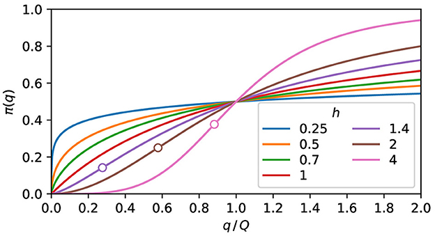
Figure 1. The expected response. Plot of Eq. (5) for some values of h. The curves are concave for h ≤ 1. When h > 1, the convex and the concave parts are, respectively, at the left and right sides of the inflection point, marked as a circle.
When a group of people is submitted to the conditions described in the previous section, with the probability P(q) of receiving the charge q, its mean charge and variance are [30]
and the expected response of this population is
Since the response curve is not a linear function and the population covers a range of pathogen charges, the population's expected response is not equal to the expected response of the mean population charge, i.e., .
If the charge probability distribution is strongly peaked around , with , π(q) in Eq. (8) approximated as a Taylor expansion [31] up to the second-order around , resulting in
This expression indicates that if two symmetric distributions of pathogen doses have the same mean value, the wider one will have a higher expected response if the second derivative is positive. Thus, broadly speaking, a wider population will have a higher expected response if π(q) is convex in the vicinity of , and a lower expected response for concave vicinity.
Figure 2 highlights the dependence of the population's expected response on the concavity of the response curve and the population exposure distribution. If the population exposure is strongly peaked, the population's expected response is very close to the value of the response curve at the mean population charge, as shown in Figure 2A. On the contrary, if the population charge is too diverse, the population's expected response falls unmistakably above or below the response curve, depending on the concavity, as can be seen in Figure 2B. According to Eq. (9), an approximation valid for small values of σq, the expected response should sit on the curve for the middle distributions of Figure 2 since d2π/dq2 = 0 at their centers. The difference observed in the percentages of Figure 2B manifests the inadequacy of Eq. (9) for large values of σq.
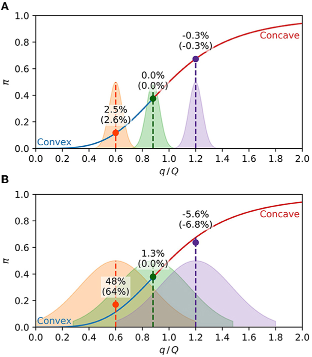
Figure 2. Expected response of a population. The solid line is Eq. (5) with h = 4, with the convex part in blue and the concave part in red. The shaded areas are the population distributions of the pathogen charge in arbitrary units, with the middle distribution centered at the inflection point. The circles are the average expected response of each distribution, given by Eq. (8). The percentages are the relative difference of the average expected response from the response function at the center of the distribution (). The percentages between parenthesis are the same quantities calculated with the approximation Eq. (9). (A) Narrow charge distributions (σq = 0.05) result in the population's expected response close to the value of the response curve at the mean charge. (B) For broader distributions (σq = 0.25), the population's expected response is above or below the response curve, respectively, at the convex and concave parts of the curve.
The total exposure, Eq. (4), is a sum of Nc equally distributed random quantities γiκΔti. We will now consider the situation where Nc and Δti are, respectively, multiplied and divided by the same factor. This operation preserves the value of and, by the Central Limit Theorem [30], makes standard deviation proportional to .
A simple concrete situation that exhibits that behavior is an individual with an equivalent contact time τ, which is equally divided among Nc people, resulting in the same time Δti = τ/Nc spent near each of them. From Eq. (4), the pathogen charge received by this person is
where NI is the number of infected people met. The utmost pathogen charge, κτ, is the charge a person would receive if all people met were infected, i.e., if NI were equal to Nc. Instead, the number of infected people follows the binomial distribution [30],
From the mean value, , and the standard deviation, , of the binomial distribution, the mean value, and the standard deviation of the total charge received may be obtained as
The standard deviation presents the behavior mentioned above. With the discrete distribution Eq. (11), the mean value given by Eq. (8) becomes
In the following lines, we obtain asymptotic expressions of at the limits Nc → 0 and Nc → ∞. If the mean number of encounters with infected people is low enough, , most contacts with infected people will be with just one person, and we can write f(1) ≈ γNc. From Eq. (10), the charge of such encounter is κτ/Nc, and by retaining only the NI = 1 term of Eq. (13), the following approximation is valid for the expected response
This expression is exact for Nc = 1. By handling Nc as a real number, the maximum of Eq. (14) is approximately defined by , resulting in
At the limit γNc ≫ 1, the binomial distribution of q is strongly peaked around the mean value, γκτ, and by retaining only the NI = round(γκτ) term of Eq. (13), the corresponding expected response is
The value of the Eq. (15) is not real for h < 1, and given by Eq. (8) grows monotonically from Nc = 0 to Nc = ∞. For h > 1, the existence of a maximum requires and Eq. (14) results in
If this condition is satisfied, there is a maximum at and two minima, at Nc = 1 and Nc = ∞. The value κτ/Q|×, that separates the values of κτ/Q with the global minimum at Nc = 1 from the values with the global minimum at Nc = ∞, may be obtained by substituting Nc = 1 in Eq. (14) and making it equal to Eq. (16) with Nc → ∞, and we obtain
This expression define the ratio κτ/Q at which has the same value at Nc = ∞ and Nc = 1, both being global minimum points. At the left and the right of this quantity, the global minimum is, respectively, at Nc = ∞ and Nc = 1.
The analytical approximations, Eqs. (9), (14), and (16), help to understand the qualitative properties of the mean response. This section presents the exact numerical calculation of from Eq. (8), with the Gaussian distribution and the binomial distribution, Eq. (11).
The Gaussian population's expected response illustrated by Figure 2 suggests that the contagion rate may be reduced by changing the distribution at the right of Figures 2A, B, i.e., it is possible to reduce the expected response by making the distribution wider at the concave part of the response curve. The standard deviation increase leading to a reduction in illustrates this behavior in Figures 3A, B, and for of Figure 3C. The response of the distributions at the left of Figure 2, which is lower in Figure 2A than in Figure 2B, demonstrates the reverse behavior, i.e., making the distribution thinner reduces the response at the convex part of the function, as illustrated by the curves with of Figure 3C.
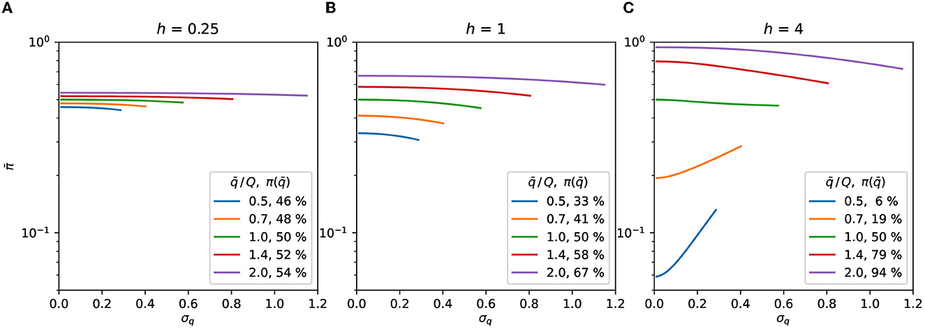
Figure 3. Gaussian distribution. Expected response as a function of σq, Eqs. (7), (8). The symmetry of the distributions is preserved by truncating them at . The curves are plotted up to the highest σq allowed by the truncation for each value of . The value of the curve with σq = 0 in Eq. (9) is shown as the percentage in the legend. (A) h = 0.25, (B) h = 1, (C) h = 4.
Dividing the contact time with more people but spending proportionally less time with each of them results in a thinner distribution with the same mean value. The behavior demonstrated by the distributions at the left of Figure 2 indicates that this would be advisable for convex dose-response curves. The sequence of steps for deciding, by the Gaussian model, if more contacts reduces or increases the contagion probability is shown in Figure 4.
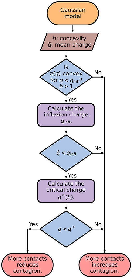
Figure 4. Flowchart of the Gaussian model. The inflection charge is given by Eq. (6), and the critical charge is the largest value of q for which , defined by Eq. (8), is a increasing function of σ. The critical charge, q*, separates the values of q for which is an increasing or a decreasing function of σq, as illustrated in Figure 3C.
While the Gaussian distribution is a standard choice, more realistic pictures require describing how the person divides the contact time among several people. The minimalist model discussed above results in the binomial distribution, Eq. (11), investigated below.
We will determine the number of contacted people, Nc, that minimizes the binomial distribution's expected response. That distribution emerges if a person can choose how many people to meet, spending with each person a time inversely proportional to the number of people met. For h ≤ 1, is a monotonically increasing function of Nc, as can be seen in Figure 5. Therefore, for h ≤ 1, as few people as possible should be contacted to reduce the expected response.
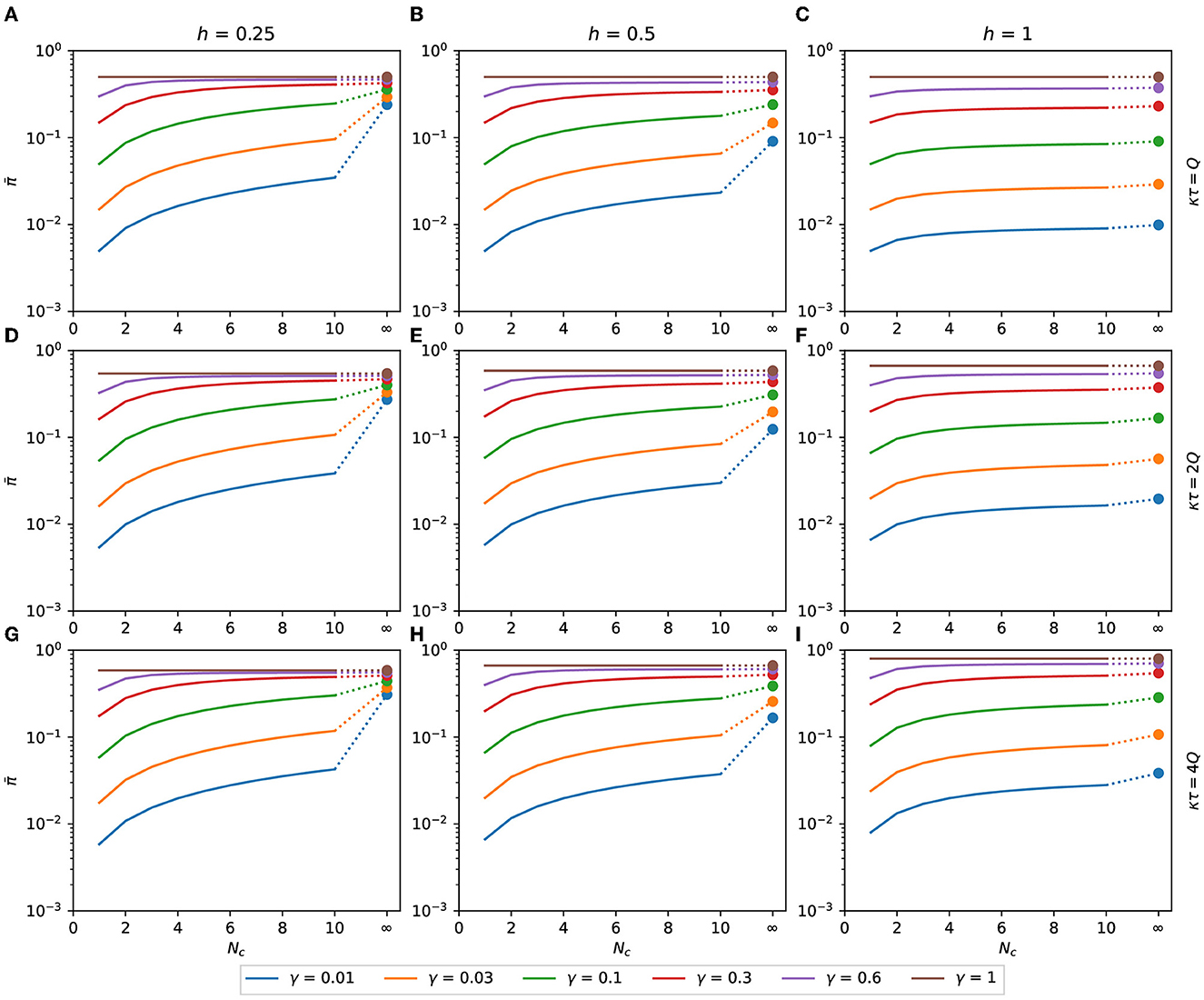
Figure 5. Expected response with h ≤ 1. Binomial expected response as a function of Nc. It is calculated as a function of the number of contacts for the binomial distribution of pathogen charge, Eqs. (10), (11) applied to Eq. (8). Although Nc is an integer variable, the functions are shown as lines to make the plots less bulky. The filled circles are the values of at Nc → ∞, calculated as π(γκτ), Eq. (16). (A) κτ = Q, h = 0.25, (B) κτ = Q, h = 0.5, (C) κτ = Q, h = 1, (D) κτ = 2Q, h = 0.25, (E) κτ = 2Q, h = 0.5, (F) κτ = 2Q, h = 1, (G) κτ = 4Q, h = 0.25, (H) κτ = 4Q, h = 0.5, (I) κτ = 4Q, h = 1.
In Figure 6, we can see for the binomial distribution as a function of Nc for several combinations of h, γ, and κτ, with h>1. The values of predicted by Eq. (15), represented by black dashed lines in Figure 6, are in good agreement with the exact calculation assigned as hollow circles. The value of with Nc → ∞ is plotted as the rightmost point of each function.
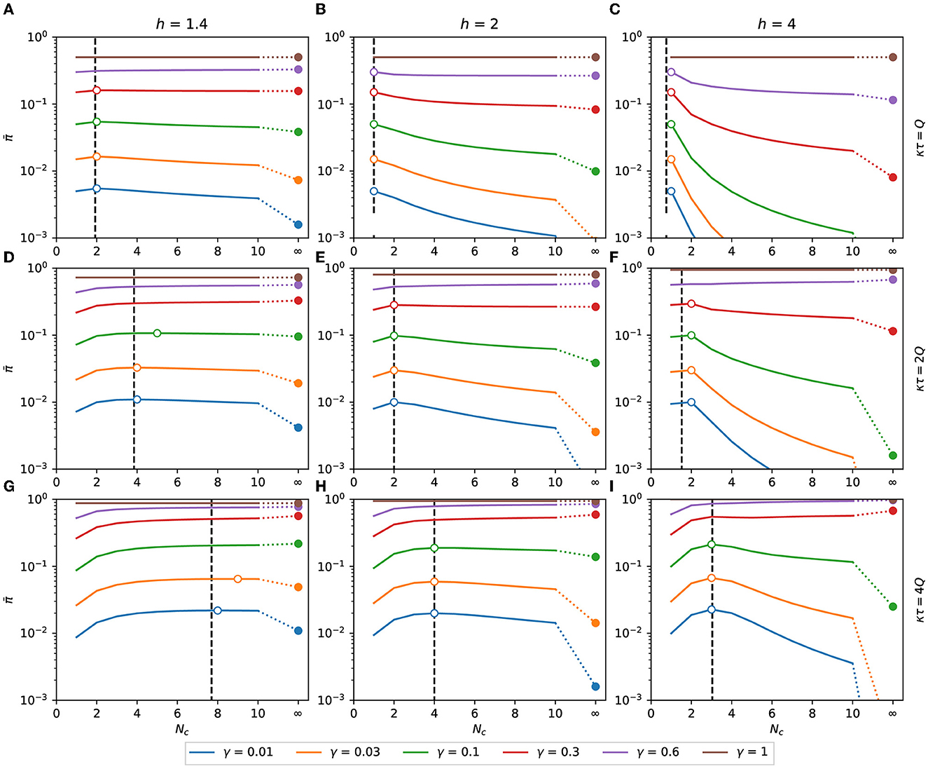
Figure 6. Expected response with h > 1. Expected response as a function of Nc. It is calculated as a function of the number of contacts for the binomial distribution of pathogen charge, Eqs. (10), (11) applied to Eq. (8). Although Nc is an integer variable, the functions are shown as lines to make the plots less bulky. The dashed vertical lines are the points of maximum predicted by the approximation Eq. (15). The hollow circles are the points of maximum of each combination of h, κτ, and γ. The filled circles are the values of at Nc → ∞, calculated as π(γκτ), Eq. (16). (A) κτ = Q, h = 1.4, (B) κτ = Q, h = 2, (C) κτ = Q, h = 4, (D) κτ = 2Q, h = 1.4, (E) κτ = 2Q, h = 2, (F) κτ = 2Q, h = 4, (G) κτ = 4Q, h = 1.4, (H) κτ = 4Q, h = 2, (I) κτ = 4Q, h = 4.
In order to minimize the expected response, it may be necessary to increase or reduce the number of contacts, depending on the values of h, γ, and κτ/Q. From Eq. (17), Nc = 1 is a maximum of if κτ ≤ 0.78Q, 1.5Q, and 1.97Q, respectively, for h equal to 1.4, 2, and 4. As shown in Figure 6, if this condition is satisfied, then is monotonically decreasing with Nc, and the minimum expected response is obtained when the number of contacted people is maximized.
A more detailed analysis is necessary to determine how to minimize the expected response when Nc is finite and bigger than one. Figure 7 summarizes the information required to determine how to reduce the expected response in each case. The number of contacts that maximizes the expected response, , is plotted as a function of κτ/Q in Figures 7A–C for some combinations of h and γ. For low exposure time (κτ/Q → 0), the maximum is at and grows with κτ/Q in steps of unitary height. When κτ/Q reaches a specific value, becomes infinite, signaling that, for κτ/Q larger than that value, is a monotonically growing function of Nc and that the number of contacts must be minimized to reduce the expected response.
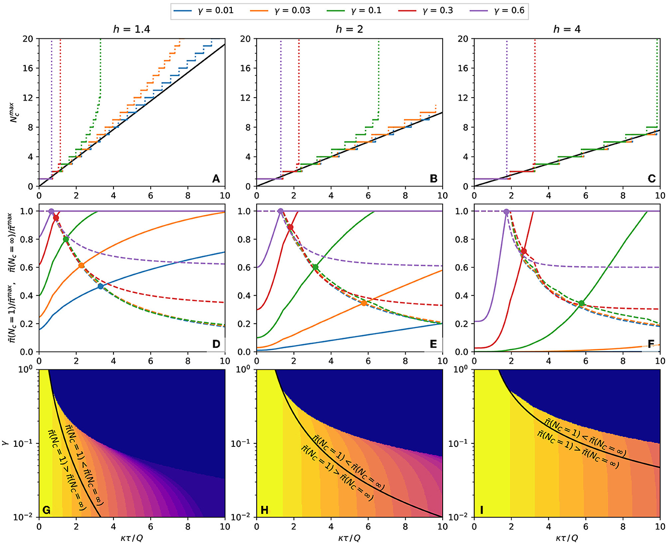
Figure 7. Properties of the population's expected response. (A–C) Number of contacts that result in a maximum probability of contagion for plots such as Figure 6. The continuous black line is the value predicted by Eq. (15). (A) h = 1.4, (B) h = 2, (C) h = 4. (D–F) The dashed lines and the continuous line are the expected response, respectively, at Nc = 1 and Nc = ∞, both relative to the maximum expected response, . The circles mark the crossings of and with the same γ. (D) h = 1.4, (E) h = 2, (F) h = 4. (G–I) Equation (18), plotted as black lines, separates the regions of the γ-κτ/Q phase space where the inequalities written on each side of the curve are observed. The color represents the of each combination of γ and κτ/Q. (G) h = 1.4, (H) h = 2, (I) h = 4.
If is finite, it is necessary to inspect the boundary values of the expected response, and . These quantities are plotted in Figures 7D–F, and their crossing point, described by Eq. (18), are marked by circles. At the left of the crossing point, and at the right of the crossing point, . To reduce the expected response of each combination of h and γ, the number of contacts should be infinite for κτ/Q less than crossing value, and the number of contacts should be 1 for κτ/Q bigger than the crossing value. The black lines of Figures 7G–I represent these frontiers as a continuous function of γ.
The above conclusion is only valid if Nc can be freely chosen in the interval 1 ≤ Nc ≤ ∞ (or that the maximum value of Nc is big enough to be considered infinite). With other lower or upper limits for Nc, a specific calculation may be needed. However, these calculations are unnecessary if the minimum allowed number of contacts is greater than , when the number of contacts should always be maximized. Similarly, if the maximum allowed number of contacts is less than , the number of contacts should always be minimized. The color plot in Figures 7G–I represents the value of Nc as a function of γ and κτ/Q.
The sequence of steps for using the binominal model to determine if contacting more people reduces or increases the contagion probability is shown as flowchart in Figure 8.

Figure 8. Flowchart of the binominal model. The average response as a function of the number of contacts, , is calculated by applying Eqs. (10), (11) on to Eq. (8). It is used to obtain the number of contacts which results in the maximum probability of contagion, .
This study describes how people sharing a limited space in an epidemic respond to the pathogen exposition from their companions. They cannot avoid being close to each other but can change the time spent near each person. The mathematical model supposes five simplifying hypotheses: (a) the number of contacted people changes but the number of nearby people averaged on time is constant, (b) the same time is spent near every person approached, (c) each contacted person can be infectious or not, with no intermediate states, (d) the pathogen is received from nearby infectious people at constant and identical rates, and (e) distant people do not transmit the pathogen.
These hypotheses lead to a simple solution and make it evident what are the main parameters controlling the results. However, more information is necessary to build a detailed model, for example, regarding the viral shedding dynamics [32–34].
Under the above hypothesis, reducing the number of people met leads to an increase in the standard deviation, as expressed by the dependence on of Eq. (12). Most curves of in Figure 3 decrease monotonically with σq, implying that cutting down the number of contacted people, which increases σq, diminishes the response. However, when h > 1, small values of generate monotonically growing functions (Figure 3C with ), originating a counter-intuitive behavior: decreasing the number of contacted people increases the standard deviation and the expected response. The narrower distribution of the received pathogen charge is the cause of this startling evenness curtailing in the expected response, observed in the convex part of the response curve (Figure 2).
The following argument clarifies the origin of the evenness curtailing. When the distribution of received doses is wide, a large fraction of the population is exposed to doses much higher or much lower than the average. If the response curve is convex, the increase in the response of the overexposed people will be more significant than the decrease in the response of the underexposed people, leading to a positive net effect. The wider the distribution, the stronger the average response.
As expressed by Eq. (9), the evenness curtailing is due to the reduction, not in the average, but in the standard deviation. Increasing the number of contacts while keeping the total contact time constant homogenizes the exposition over a larger set of individuals, reducing the standard deviation. Therefore, even if the simplifying hypotheses (b)–(e) are not assumed, increasing contacts should still lessen the response in certain situations.
Unfortunately, little is known about a central aspect of this phenomenon: the parameter h. In the Section 2 of the Supplementary material, we review some experimental works that provide information suitable for estimating the value of h. By fitting Eq. (5) to the experimental data, we find h ranging from 1.12 to 2.29.
As a concrete example of applying the approach presented here, let us imagine a response curve with h = 2 and γ = 3 % of the population transmitting the pathogen. This percentage is less than the fraction of exposed or infected individuals since these patients may not be shedding the pathogen. From Figure 7E, if κτ≲5.7Q, the mean response will be lower for Nc → ∞ than for Nc = 1. Suppose that a worker must spend 8 h in a workplace, sharing a workstation with three colleagues, resulting in τ = 24 h of equivalent contact time. Let us also assume that a 12 h exposition to an infectious person, adding up to the charge Q = 12κ, leads to a contagious probability of 50 %. Therefore, the worker's utmost pathogen charge is κτ = 2Q. If the workers keep their place for the whole shift, they will contact the same three individuals through their shift. In this case, Nc = 3 and from the data used to plot Figure 6E, we obtain a contagion probability of 28 %. If the workers change places every 4 h, Nc = 6 and the contagion probability drops to 19 %. By changing place every 2 h, Nc = 12 and the contagious probability is 12 %. By comparing Figures 6B, E, we conclude that the reduction achieved by increasing Nc would be more robust if the fraction of infectious people, γ, or if the utmost pathogen charge, κτ were lower. Increasing the number of contacts alleviates more the response when γ and κτ are small and h is large.
The dose-response curve quantifies the outcome (probability of becoming infected, viral load, etc) as a function of the pathogen doses received by the patient. It will be linear if these quantities are proportional to each other. If the immune system easily defeats modest exposure but succumbs drastically to sizeable ones, the response curve is convex, i.e., it grows slowlier than the linear function. Convex curves become concave for large enough doses.
Consider person A, who stays some time close to other people. In this study, this time is expressed by the quantity τ, which is equal to the number of hours multiplied by the average number of neighbors. For example, τ will be 4 h ·person if person A spends 1 h close to 4 people, 2 h close to 2 people, or 4 h close to 1 person. For a uniform population, the expected value of the charge received by person A will be the same in all the cases. However, if person A spends 4 h close to person B, she will receive a large charge if person B is infected, or none if not. On the contrary, if person A spends 1 h close to four different people, she will have a higher chance of being exposed but will receive a lower viral charge when exposed.
In the convex region of the reponse curve, it may be better to have high probability of small doses than low probability of large doses since the slow growth of the response curve means that the average prognosis of one large charge is much worse than the sum of the effects of the more often small charges. This study uses a model of uniform infectiousness distribution to evaluate which situation is preferable.
Some conditions must be satisfied for the existence of evenness curtailing of response. First, the expected response must be negligible for small pathogen charges and grow sharply at a certain point. This condition is satisfied with h > 1 in Figure 1. The effect is more substantial for large values of h, which translates into steeper curves. Second, the ratio between the utmost pathogen charge, κτ, and the 50 % response charge, Q, must be below a threshold. The lower the fraction of infected people in the population, γ, the higher the threshold, represented by the black lines of Figures 7G–I. Therefore, the evenness curtailing is observed in activities where the time spent close to other people is not high, with the population primarily unexposed to the pathogen. People in such situations during an epidemic with h > 1 should move around instead of staying too long near the same neighbors.
The present analysis does not encompass the whole dynamics of such a complex phenomenon as the evolution of an epidemic. Nevertheless, it is a tool for understanding specific responses in certain circumstances and clarifying the dynamics' details. Furthermore, it demonstrates the importance of investigating the precise shape of the dose-response curve and determining the curve concavity, mainly for small pathogen charges.
The original contributions presented in the study are included in the article/Supplementary material, further inquiries can be directed to the corresponding author.
The author confirms being the sole contributor of this work and has approved it for publication.
The author declares that the research was conducted in the absence of any commercial or financial relationships that could be construed as a potential conflict of interest.
All claims expressed in this article are solely those of the authors and do not necessarily represent those of their affiliated organizations, or those of the publisher, the editors and the reviewers. Any product that may be evaluated in this article, or claim that may be made by its manufacturer, is not guaranteed or endorsed by the publisher.
The Supplementary Material for this article can be found online at: https://www.frontiersin.org/articles/10.3389/fams.2023.1189697/full#supplementary-material
1. Mukherjee S. How does the coronavirus behave inside a patient? New Yorker Magazine. Available online at: https://www.newyorker.com/magazine/2020/04/06/how-does-the-coronavirus-behave-inside-a-patient (accessed April 06, 2020).
2. Karimzadeh S, Bhopal R, Tien HN. Review of infective dose, routes of transmission and outcome of COVID-19 caused by the SARS-CoV-2: comparison with other respiratory viruses. Epidemiol Infect. (2021) 149:e96. doi: 10.1017/S0950268821001084
3. Cheng Y, Ma N, Witt C, Rapp S, Wild PS, Andreae MO, et al. Face masks effectively limit the probability of SARS-CoV-2 transmission. Science. (2021) 372:1439–43. doi: 10.1126/science.abg6296
4. McKenney DG, Kurath G, Wargo AR. Characterization of infectious dose and lethal dose of two strains of infectious hematopoietic necrosis virus (IHNV). Virus Res. (2016) 214:80–9. doi: 10.1016/j.virusres.2015.12.020
5. Mayer BT, Koopman JS, Ionides EL, Pujol JM, Eisenberg JN. A dynamic dose-response model to account for exposure patterns in risk assessment: a case study in inhalation anthrax. J R Soc Interface. (2011) 8:506–17. doi: 10.1098/rsif.2010.0491
6. Brachman PS, Kaufman A, Dalldorf FG. Industrial inhalation anthrax. Bacteriol Rev. (1966) 30:646. doi: 10.1128/br.30.3.646-659.1966
7. Mayer BT, Krantz EM, Swan D, Ferrenberg J, Simmons K, Selke S, et al. Transient oral human cytomegalovirus infections indicate inefficient viral spread from very few initially infected cells. J Virol. (2017) 91:e00380–17. doi: 10.1128/JVI.00380-17
8. Mayer BT, Krantz EM, Wald A, Corey L, Casper C, Gantt S, et al. Estimating the Risk of human herpesvirus 6 and cytomegalovirus transmission to ugandan infants from viral shedding in saliva by household contacts. Viruses. (2020) 12:171. doi: 10.3390/v12020171
9. Schiffer JT, Mayer BT, Fong Y, Swan DA, Wald A. Herpes simplex virus-2 transmission probability estimates based on quantity of viral shedding. J R Soc Interface. (2014) 11:20140160. doi: 10.1098/rsif.2014.0160
10. Quinn TC, Wawer MJ, Sewankambo N, Serwadda D, Li C, Wabwire-Mangen F, et al. Viral load and heterosexual transmission of human immunodeficiency virus type 1. N Engl J Med. (2000) 342:921–9. doi: 10.1056/NEJM200003303421303
11. Baeten JM, Kahle E, Lingappa JR, Coombs RW, Delany-Moretlwe S, Nakku-Joloba E, et al. Genital HIV-1 RNA predicts risk of heterosexual HIV-1 transmission. Sci Transl Med. (2011) 3:77ra29. doi: 10.1126/scitranslmed.3001888
12. Gray RH, Wawer MJ, Brookmeyer R, Sewankambo NK, Serwadda D, Wabwire-Mangen F, et al. Probability of HIV-1 transmission per coital act in monogamous, heterosexual, HIV-1-discordant couples in Rakai, Uganda. Lancet. (2001) 357:1149–53. doi: 10.1016/S0140-6736(00)04331-2
13. Goyal A, Reeves DB, Cardozo-Ojeda EF, Schiffer JT, Mayer BT. Viral load and contact heterogeneity predict SARS-CoV-2 transmission and super-spreading events. Elife. (2021) 10:e63537. doi: 10.7554/eLife.63537
14. Gandhi M, Beyrer C, Goosby E. Masks do more than protect others during COVID-19: reducing the inoculum of SARS-CoV-2 to protect the wearer. J Gen Intern Med. (2020) 35:3063–6. doi: 10.1007/s11606-020-06067-8
15. Dulbecco R, Vogt M. Plaque formation and isolation of pure lines with poliomyelitis viruses. J Exp Med. (1954) 99:167–82. doi: 10.1084/jem.99.2.167
16. Hartley JW, Rowe WP. Production of altered cell foci in tissue culture by defective Moloney sarcoma virus particles. Proc Natl Acad Sci U S A. (1966) 55:780. doi: 10.1073/pnas.55.4.780
17. Aaronson SA, Jainchill JL, Todaro GJ. Murine sarcoma virus transformation of BALB/3T3 cells: lack of dependence on murine leukemia virus. Proc Nat Acad Sci. (1970) 66:1236–43. doi: 10.1073/pnas.66.4.1236
18. Schiffer JT, Wald A, Selke S, Corey L, Magaret A. The kinetics of mucosal herpes simplex virus-2 infection in humans: evidence for rapid viral-host interactions. J Infect Dis. (2011) 204:554–61. doi: 10.1093/infdis/jir314
19. Tofighi M, Asgary A, Merchant AA, Shafiee MA, Najafabadi MM, Nadri N, et al. Modelling COVID-19 transmission in a hemodialysis centre using simulation generated contacts matrices. PLoS ONE. (2021) 16:e0259970. doi: 10.1371/journal.pone.0259970
20. Shen Y, Li C, Dong H, Wang Z, Martinez L, Sun Z, et al. Community outbreak investigation of SARS-CoV-2 transmission among bus riders in eastern China. JAMA Intern Med. (2020) 180:1665–71. doi: 10.1001/jamainternmed.2020.5225
21. David J, Bragazzi NL, Scarabel F, McCarthy Z, Wu J. Non-pharmaceutical intervention levels to reduce the COVID-19 attack ratio among children. R Soc Open Sci. (2022) 9:211863. doi: 10.1098/rsos.211863
22. Brlek A, Vidovič Š, Vuzem S, Turk K, Simonović Z. Possible indirect transmission of COVID-19 at a squash court, Slovenia, March 2020: case report. Epidemiol Infect. (2020) 148:e120. doi: 10.1017/S0950268820001326
23. Coudeville L, Amiche A, Rahman A, Arino J, Tang B, Jollivet O, et al. Disease transmission and mass gatherings: a case study on meningococcal infection during Hajj. BMC Infect Dis. (2022) 22:1–10. doi: 10.1186/s12879-022-07234-4
24. d'Onofrio A, Banerjee M, Manfredi P. Spatial behavioural responses to the spread of an infectious disease can suppress Turing and Turing-Hopf patterning of the disease. Phys A: Stat Mech Appl. (2020) 545:123773. doi: 10.1016/j.physa.2019.123773
25. Tupper P, Colijn C. COVID-19 in schools: mitigating classroom clusters in the context of variable transmission. PLoS Comput Biol. (2021) 17:e1009120. doi: 10.1371/journal.pcbi.1009120
26. Mello BA. One-way pedestrian traffic is a means of reducing personal encounters in epidemics. Front Phys. (2020) 8:376. doi: 10.3389/fphy.2020.00376
27. Bhagat RK, Wykes MD, Dalziel SB, Linden P. Effects of ventilation on the indoor spread of COVID-19. J Fluid Mech. (2020) 903:F1. doi: 10.1017/jfm.2020.720
28. Brouwer AF, Weir MH, Eisenberg MC, Meza R, Eisenberg JN. Dose-response relationships for environmentally mediated infectious disease transmission models. PLoS Comput Biol. (2017) 13:e1005481. doi: 10.1371/journal.pcbi.1005481
29. Nelson DL, Lehninger AL, Cox MM. Lehninger Principles of Biochemistry. New York, NY: W H Freeman (2008).
30. Papoulis A, Pillai SU. Probability, Random Variables, and Stochastic Processes. McGraw-Hill Series in Electrical Engineering: Communications and Signal Processing. New Delhi: Tata McGraw-Hill (2002).
32. He X, Lau EH, Wu P, Deng X, Wang J, Hao X, et al. Temporal dynamics in viral shedding and transmissibility of COVID-19. Nat Med. (2020) 26:672–5. doi: 10.1038/s41591-020-0869-5
33. Cevik M, Tate M, Lloyd O, Maraolo AE, Schafers J, Ho A. SARS-CoV-2, SARS-CoV, and MERS-CoV viral load dynamics, duration of viral shedding, and infectiousness: a systematic review and meta-analysis. Lancet Microbe. (2021) 2:e13–22. doi: 10.1016/S2666-5247(20)30172-5
Keywords: epidemics, dose-response curve, concavity, pathogen dose, contagion
Citation: Mello BA (2023) When does contacting more people lessen the transmission of infectious diseases? Front. Appl. Math. Stat. 9:1189697. doi: 10.3389/fams.2023.1189697
Received: 19 March 2023; Accepted: 16 June 2023;
Published: 12 July 2023.
Edited by:
Saurav Mallik, Harvard University, United StatesReviewed by:
Soumita Seth, Aliah University, IndiaCopyright © 2023 Mello. This is an open-access article distributed under the terms of the Creative Commons Attribution License (CC BY). The use, distribution or reproduction in other forums is permitted, provided the original author(s) and the copyright owner(s) are credited and that the original publication in this journal is cited, in accordance with accepted academic practice. No use, distribution or reproduction is permitted which does not comply with these terms.
*Correspondence: Bernardo A. Mello, YmVybmFyZG9tZWxsb0B1bmIuYnI=
Disclaimer: All claims expressed in this article are solely those of the authors and do not necessarily represent those of their affiliated organizations, or those of the publisher, the editors and the reviewers. Any product that may be evaluated in this article or claim that may be made by its manufacturer is not guaranteed or endorsed by the publisher.
Research integrity at Frontiers

Learn more about the work of our research integrity team to safeguard the quality of each article we publish.