- School of Mathematics and Statistics, Baise University, Baise, China
The COVID-19 pandemic has taken more than 1.78 million of lives across the globe. Identifying the underlying evolutive patterns between different countries would help us single out the mutated paths and behavior of this virus. I devise an orthonormal basis which would serve as the features to relate the evolution of one country's cases and deaths to others another's via coefficients from the inner product. Then I rank the coefficients measured by the inner product via the featured frequencies. The distances between these ranked vectors are evaluated by Manhattan metric. Afterwards, I associate each country with its nearest neighbor which shares the evolutive pattern via the distance matrix. Our research shows such patterns is are not random at all, i.e., the underlying pattern could be contributed to by some factors. In the end, I perform the typical cosine similarity on the time-series data. The comparison shows our mechanism differs from the typical one, but is also related to each it in some way. These findings reveal the underlying interaction between countries with respect to cases and deaths of COVID-19.
1. Introduction
COVID-19 is in full, the COVID-19 pandemic is still ongoing and is spreading across all the continents (1, 2). The spread of this pandemic is has been studied by many researchers (3–6). There are many ways to look into the behaviors of the viruses or the pandemic itself (7, 8) for the sake of efficacy of travel bans or vaccines (9). Some researches have even have established the relations between cases and deaths of COVID-19 from demographic, economic, and social perspectives (10). In this article, I devise an orthonormal basis (11) 𝔹N which is motived by Fourier analysis (12) and could thus take the underlying frequencies of data into consideration. I utilize the COVID-19 database (13) which records the weekly COVID-19 cases and deaths from Week 15 to 51 (37 weeks in total). By filtering out some non-essential data (countries), I obtain 90 countries as our research targets. By calculating the 36 (the number of intervals from Week 15 to 51) growth rates of the cases and deaths for the 90 countries, I have an input vector. By transforming this vector into a set of coefficients, which is the results of inner product via 𝔹36, I start to rank the coefficients by positive integers,: from 1 to 36. The ranks indicate the strength (relation) between the input vector and the underlying frequencies. A larger coefficient will be assigned a larger positive integer. By doing so, I have a 90 × 36 coefficient matrix, where 90 is the number of the sampled countries and 36 is the number of frequencies (or the length of the input vector). Then, I use Manhattan metric (14) to measure the distances between all the ranked vectors and yield a 90 × 90 distance matrix. Afterwards, I associate each country with its nearest neighbor via the minimal distance in the distance matrix. In the end, I rerun our data with another typical approach: cosine similarity, which could be calculated either from the original time-series data or the transformed frequency coefficients, i.e., both would produce the identical results by the property of an inner product. The interaction between these two approaches are also revealed via Jaccard Index (15). Our research shows that the patterned evolutive correlation between counties not random, i.e., there are some fundamental factors that contribute to such relation. The research also reveals that the correlated patterns for cases and deaths between countries bears no similarity at all. This also indicates that there is a strong discrepancy between evolution of cases and the one of deaths.
2. Methodology and Procedures
I devise a class of orthogonal bases, which are serve as our feature extractors. Then a complete set of procedures are is also described in this section.
2.1. Orthogonal Basis
Motivated by the Fourier series and Fourier transform, I devise an orthonormal basis which is easier and much more intuitive to adopt and interpret the analysis of, since it involves only the real numbers—not the complex numbers, which normally are harder to use to interpret the analyzed results.
Let ℕ denote the set of positive integers. Suppose is a vector whose elements are all non-negative integers. is used to denote its i'th element in the vector and is used to denote its length. Let us assume , where N stands for a natural number in this article. I use to denote its growth vector, i.e., . Observe that . This growth vector is our main research target, since I study the (weekly) growth rates of cases and deaths regarding COVID-19. Later on, I would tweet tweak the definition of growth vector slightly to fit our analytical purpose. For any two vectors and , I use to denote their inner product. Define real functions and and , where x ∈ {1, 2, ⋯ , N}. Define
By some manipulation of mathematical operations, 𝔹N is provend to be an orthogonal basis for all natural number N.
2.2. Procedures
In this section, I describe a procedure to analyze (in the form of a matrix) M × (N + 1) time-series data, where M is the number of the sets and N + 1, which is the number of points of time. The purpose for adding 1 is to simplify our further analysis which utilizes its difference (or N intervals). The whole analytical steps go as follows:
1. Specify the M researched subjects (for example, countries) and N + 1 points of times (for example, weeks). Then collect the sets of time-series data which could then be represented by , where each .
2. Calculate the growth vector for growth rate of each by , where 1 ≤ i ≤ N for all k ∈ {1, 2, ⋯ , M}. Here (for our analytical purpose) the denominator is deliberately added by 1 to avoid the divisor being 0.
3. Calculate the inner products or coefficient vector for each growth vector by , where for all k ∈ {1, 2, ⋯ , M}. Let denote the corresponding coefficient vector. These coefficients serve as the extracted features of the growth rates, as shown in Figure 1.
4. Rank via positive numbers in which the higher the value is among , the higher the positive integer assigned is assigned. Let us call this ranked vector .
5. Calculate the distances between all the ranked vectors via Manhattan metric d among all the M subjects that would result in a distance matrix .
6. Find the minimal pairs (or nearest neighbors) for all the subjects with least distance via the above distance matrix.
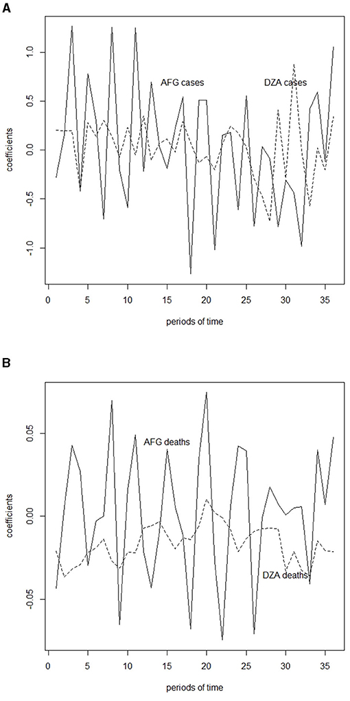
Figure 1. Inner product of case and death growth rates and featured frequencies, which is calculated in Table 1 for Afghanistan (AFG) and Algeria (DZA). (A) Inner product of case growth rates and featured frequencies for Afghanistan (AFG) and Algeria (DZA). (B) Inner product of death growth rates and featured frequencies for Afghanistan (AFG) and Algeria (DZA).
3. Results
In correspondence to section 2, I embark on data analysis and produce the results in this section. I download the historical weekly data (up to Week 51, 2020) of the reported COVID-19 cases and deaths worldwide. In order to avoid biased sampling, I filter the data according to the following criteria:
1. Among all the countries, only the populations with of more than 10 millions are included;
2. Only data from Week 15 to 51, Year 2020 are taken as samples.
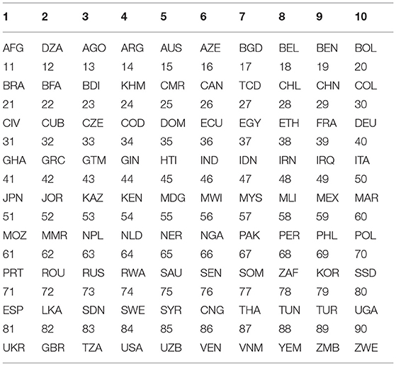
First of all, the global weekly data regarding COVID-19 are read from its source file (13) and stored in a matrix DT whose size is 9,152 by 10. After filtering out the non-essential samples by the above criteria, I obtain 90 countries (with abbreviated country codes and corresponding labels) as shown in Table 1—each of which contains 37 weekly data (from Week 15 to 51). Furthermore, each country is represented by a 37 by 2 matrix, where 2 indicates the two columns chosen (cases weekly and deaths weekly) out of the original ten columns. An example of such matrices for Country AFG and DZA are listed in Table 2. Data for other countries are omitted here for limited space. In the table, “1c” denotes the cases of COVID-19 in AFG; “2c” denotes the cases of COVID-19 in DZA; “1d” denotes the deaths of COVID-19 in AFG and “2d” denotes the deaths of COVID-19 in DZA. Based on this table, I start to calculate the weekly growth rates for cases and deaths by the formula
where Week(n) denotes the growth rates for cases or deaths at Week n. Observe that 1 is added to the denominator to avoid the infinite growth rate. An example of cases and deaths regarding the growth rates for AFG and DZA are presented in Table 3.
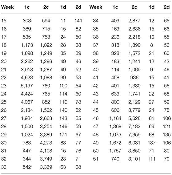
Table 2. Weekly (from Week 15 to 51) COVID-19 cases (c) and deaths (d) for Afghanistan, which is indicated by 1, and Algeria, which is indicated by 2.
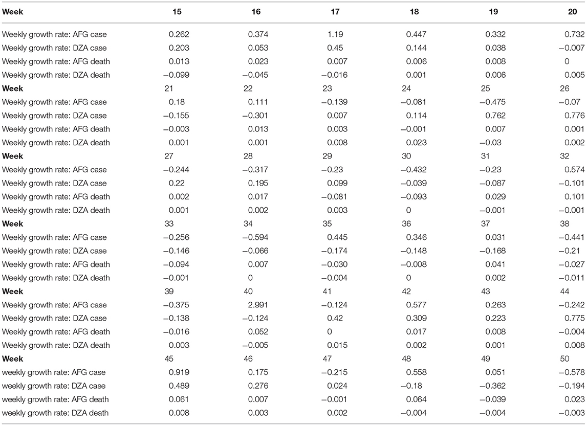
Table 3. Weekly growth rates of cases and deaths for COVID-19 from Week 15 to 50 for Afghanistan (AFG) and Algeria (DZA).
Based on this table and the featured frequencies (vectors), i.e., orthonormal basis 𝔹N (or 𝔹36 in our case), one could then calculate (an example for AFG and DZA) their coefficients (or inner product) as shown in Table 4, in which the meaning of bj is explained in section 2.1.
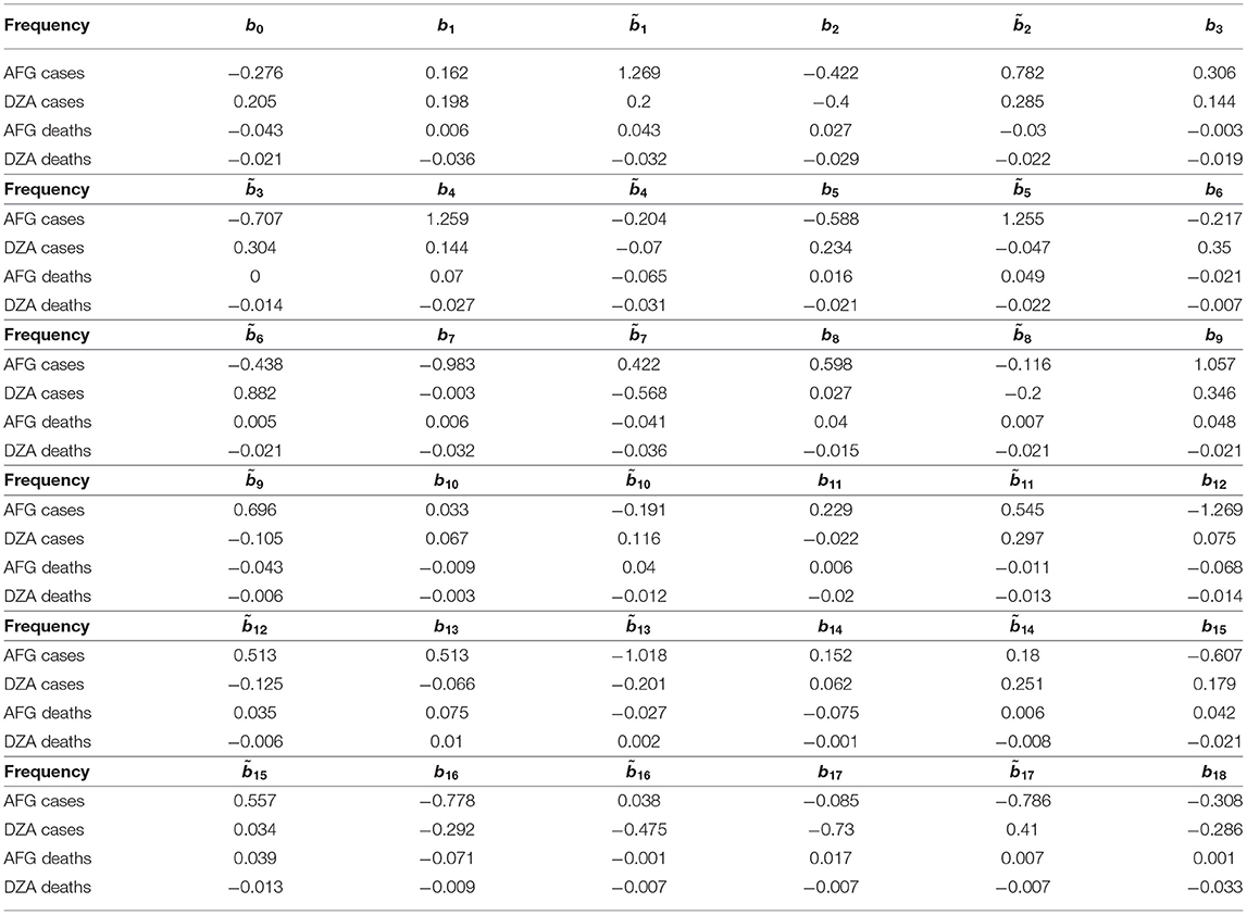
Table 4. Coefficients, or inner product, for 36 frequencies (or features) with respect to weekly growth rates of cases and deaths for Afghanistan (AFG) and Algeria (DZA).
Now I rank the coefficients. A higher positive integer is assigned, if a coefficient is higher. The assignment for each country (here I present only AFG and DZA) is shown in Table 5. The distances of ranked vectors between different countries could then be calculated by Manhattan metric. The results are shown in Table 6. Based on these distance matrices, one could associate each country with its nearest neighbor(s) with respect to cases and deaths. The results are presented in Table 7. In the table, “Cty” stands for Country. Since the death rate for Country 14 is 0, the associated values are ignored when it is involved. Some countries might associate with more than one country.
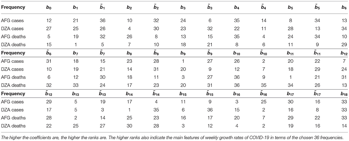
Table 5. Ranking the coefficients calculated in Table 4 for Afghanistan (AFG) and Algeria (DZA).
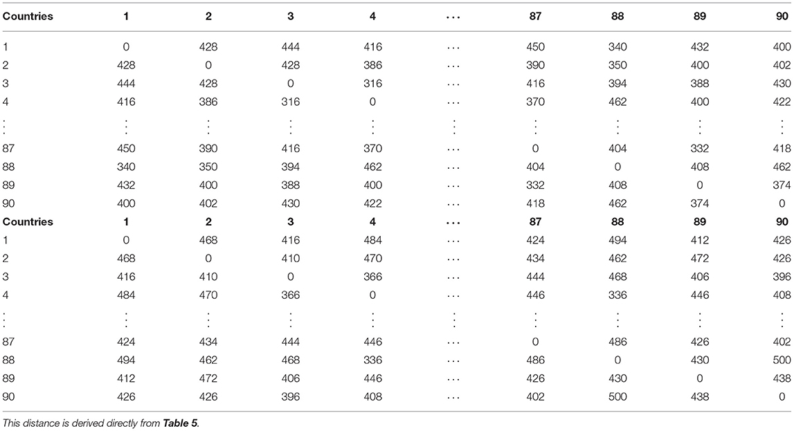
Table 6. Manhattan distance (or ) matrix, which is calculated from table for 90 countries with respect to COVID-19 cases (top block) and COVID-19 deaths (bottom block).
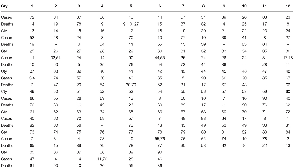
Table 7. Minimal pairs, in term of Manhattan distances from Table 6, for COVID-19 cases and deaths for the 90 countries.
4. Discussion
4.1. Comparison
Here I utilize another typical approach, namely: cosine similarity, to compare our method with others. Though the cosine similarity is highly frequently used in many fields, it focuses less on the some internal structures. For example, if . Then . But, with our ranked Manhattan metric (or d) and . Moreover, when the coefficients are ranked, they tend to reduce the noise of the data—in particular, the cases and deaths are affected by many factors. The results of the cosine similarities for the 90 countries (except the for country 14, which is ignored for the part of deaths, due to its death cases are being zero). The results are presented in Table 8. Again, by linking each country to its neighbor which has the maximal cosine similarities, one has Table 9.
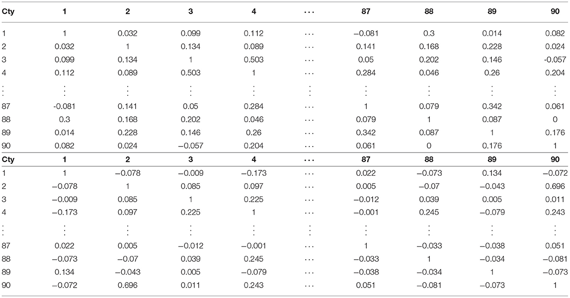
Table 8. Typical cosine similarities of COVID-19 cases (top block) and deaths (bottom block) for 90 countries (Cty).
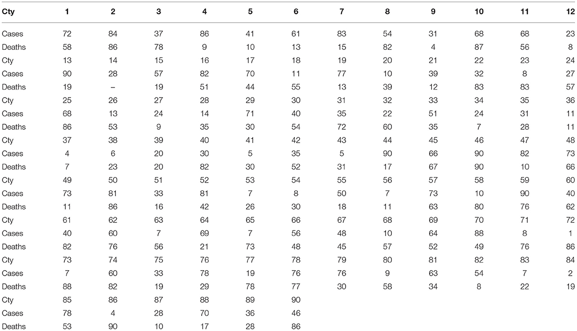
Table 9. Maximal pairs, in terms of typical similarities, of COVID-19 cases and deaths for the 90 countries (Cty).
4.2. Optimal Pairings
In this section, I list and compare the optimal minimal and maximal pairs from Tables 7, 9. The results are shown in Table 10. I could apply Jaccard Index to analyze their relation, where A, B are sets.
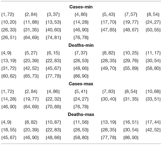
Table 10. Optimal pairings for the countries with respect to cases and deaths in terms of minimal and maximal values.
5. Conclusion and Future Work
Based on our devised orthonormal basis, which is motivated by Fourier analysis, I perform spectral analysis on 90 representative 90 countries. The main purpose for such an analysis is to identify the patterns of evolution of COVID-19 across the globe. To this end, the coefficients which measure the relation between the growth rate of COVID-19 country and the given features in the spectrum are utilized. Then I rank the coefficients to reveal their internal structures and then apply the Manhattan metric to compute the distances between countries. This constructed distance matrix would reveal the relations between the countries regarding the evolution of COVID-19 cases and deaths. In addition, I also identify the nearest neighbor with respect to minimal distance via the distance matrix. By the end, I compare our mechanism with the usual cosine similarity analysis. The result shows these two approaches yield quite different results - this indicates our approach provides another aspect to look into the evolution of COVID-19. The comparison also reveals some points: first of all, the evolutive pattern for cases and deaths are very different—which is concluded from Table 11; secondly, regardless of the cases or the deaths, our method and the typical one are highly related to each other; and thirdly, the relation between the paired countries—no matter which approach one adopts—is not random, since the ratios of pairs formed are very high. This indicates our research provides some insightful structure of the evolution of COVID-19 between countries. However, some of the results about causal relations in this study might not comply with other researches (10). This is reasonable, since the approach I adopt focuses more on feature detection, not solely on causal relation finding. For the future research, one could look into the pairs to identify the fundamental factors that contribute to such correlated patterns between countries. Furthermore, one could also delve into the shift of phrases of the frequencies by lifting the constraint on weekly growth rates. This might yield an even more dynamical pictures of the evolutions.
Data Availability Statement
The original contributions presented in the study are included in the article/supplementary material, further inquiries can be directed to the corresponding author/s.
Author Contributions
The author confirms being the sole contributor of this work and has approved it for publication.
Funding
This work was supported by the Humanities and Social Science Research Planning Fund Project under the Ministry of Education of China (No. 20XJAGAT001).
Conflict of Interest
The author declares that the research was conducted in the absence of any commercial or financial relationships that could be construed as a potential conflict of interest.
Publisher's Note
All claims expressed in this article are solely those of the authors and do not necessarily represent those of their affiliated organizations, or those of the publisher, the editors and the reviewers. Any product that may be evaluated in this article, or claim that may be made by its manufacturer, is not guaranteed or endorsed by the publisher.
References
1. Mahase E. Covid-19: What have we learnt about the new variant in the UK? BMJ. (2020) 371:m4944. doi: 10.1136/bmj.m4944
2. Allyson M, Pollock. Asymptomatic transmission of COVID-19. BMJ. (2020) 371:m4851. doi: 10.1136/bmj.m4851
3. Priyadarshini I, Mohanty P, Kumar R, Son LH, Chau HTM, Nhu VH, et al. Analysis of outbreak and global impacts of the COVID-19. Healthcare. (2020) 8:148. doi: 10.3390/healthcare8020148
4. Asch DA, Sheils NE, Islam MN, Chen Y, Werner RM, Buresh J, et al. Variation in US hospital mortality rates for patients admitted with COVID-19 during the first 6 months of the pandemic. JAMA Intern Med. (2020) 181:471–8. doi: 10.1001/jamainternmed.2020.8193
5. Boudourakis L, Uppal A. Decreased COVID-19 mortality–a cause for optimism. JAMA Intern Med. (2020) 181:478–9. doi: 10.1001/jamainternmed.2020.8438
6. Chen R-M. Randomness for nucleotide sequences of SARS-CoV-2 and its related subfamilies. Comput Math Methods Med. (2020) 2020:8819942. doi: 10.1155/2020/8819942
7. Chen R-M. Quantifying collective intelligence and behaviours of SARS-CoV-2 via environmental resources from virus-perspectives. Environ Res. (2021) 198:111278. doi: 10.1016/j.envres.2021.111278
8. Chen R-M. Track the dynamical features for mutant variants of COVID-19 in the UK. Math Biosci Eng. (2021) 18:4572–85. doi: 10.3934/mbe.2021232
9. Chen R-M. On COVID-19 country containment metrics: a new approach. J Decis Syst. (2021). doi: 10.1080/12460125.2021.1886625. [Epub ahead of print].
10. Valev D. Relationships of total COVID-19 cases and deaths with ten demographic, economic and social indicators. medRxiv (2020). doi: 10.1101/2020.09.05.20188953
12. Schoenstadt AL. An Introduction to Fourier Analysis. (2020). Available online at: https://www.math.bgu.ac.il/~leonid/ode_9171_files/Schoenstadt_Fourier_PDE.pdf (accessed December 29, 2020).
13. European Centre for Disease Prevention and Control. Available online at: https://www.ecdc.europa.eu/en/publications-data/download-todays-data-geographic-distribution-covid-19-cases-worldwide
14. Paul BE. Manhattan Distance. Dictionary of Algorithms and Data Structures (Retrieved December 29, 2020).
Keywords: growth rate, COVID-19, Manhattan metric, similarity measures, spectral analysis
Citation: Chen R-M (2021) The Similarities and Distances of Growth Rates Related to COVID-19 Between Different Countries Based on Spectral Analysis. Front. Public Health 9:695141. doi: 10.3389/fpubh.2021.695141
Received: 12 May 2021; Accepted: 16 July 2021;
Published: 23 September 2021.
Edited by:
Reza Lashgari, Shahid Beheshti University, IranReviewed by:
Sohrab Najafian, SUNY College of Optometry, United StatesMehdi Yousefzadeh, Institute for Research in Fundamental Sciences (IPM), Iran
Copyright © 2021 Chen. This is an open-access article distributed under the terms of the Creative Commons Attribution License (CC BY). The use, distribution or reproduction in other forums is permitted, provided the original author(s) and the copyright owner(s) are credited and that the original publication in this journal is cited, in accordance with accepted academic practice. No use, distribution or reproduction is permitted which does not comply with these terms.
*Correspondence: Ray-Ming Chen, cmF5bWluZ2NoZW5AYnN1Yy5jbg==
 Ray-Ming Chen