 Piergiorgio Vitello
 Claudio Fiandrino
 Andrea Capponi3
 Pol Klopp
 Richard D. Connors
 Francesco Viti
94% of researchers rate our articles as excellent or good
Learn more about the work of our research integrity team to safeguard the quality of each article we publish.
Find out more
ORIGINAL RESEARCH article
Front. Future Transp., 20 May 2021
Sec. Transportation Systems Modeling
Volume 2 - 2021 | https://doi.org/10.3389/ffutr.2021.666212
This article is part of the Research TopicHuman Mobility and Transportation Impacts due to COVID-19View all 4 articles
The global outbreak of the SARS-COVID-19 pandemic has changed our lives, driving an unprecedented transformation of our habits. In response, the authorities have enforced several measures, including social distancing and travel restrictions that lead to the temporary closure of activities centered around schools, companies, local businesses to those pertaining to the recreation category. As such, with a mobility reduction, the life of our cities during the outbreak changed significantly. In this paper, we aim at drawing attention to this problem and perform an analysis for multiple cities through crowdsensed information available from datasets such as Apple Maps, to shed light on the changes undergone during both the outbreak and the recovery. Specifically, we exploit data characterizing many mobility modes like driving, walking, and transit. With the use of Gaussian Processes and clustering techniques, we uncover patterns of similarity between the major European cities. Further, we perform a prediction analysis that permits forecasting the trend of the recovery process and exposes the deviation of each city from the trend of the cluster. Our results unveil that clusters are not typically formed by cities with geographical ties, but rather on the spread of the infection, lockdown measures, and citizens’ reactions.
The Severe Acute Respiratory Syndrome Coronavirus 2 (SARS-COV-2) (Boni et al., 2020) was declared as a global emergency by the World Health Organisation (WHO) as of January 30, 2020. The global outbreak of the pandemic uncovered the unpreparedness of the vast majority of healthcare systems (Simsek and Kantarci, 2020) and led worldwide public institutions to take containing measures such as social distancing, cancellation of public events, and closure of businesses, education, and recreational activities. As a result, business and education systems moved to remote working and teaching, which stressed the limits of fixed and mobile networks (Ericsson Research, 2020; Favale et al., 2020; Feldmann et al., 2020).
The pandemic outbreak caused an unprecedented change to daily habits, including the way we move. Reducing and controlling human movement has been of the utmost importance to contain the pandemic spread and track infections. For example, by employing the DELPHI Epidemiological Model developed at M.I.T. (Bertsimas et al., 2020) to Manila’s metro transportation system, the study of (Egwolf and Austriaco, 2020) unveiled that the confinement measurements adopted by the authorities successfully prevented the rapid spread of infection.
In this paper, we aim at drawing attention to two aspects. First, we aim to gain insight into how has mobility changed in urban environments during the first pandemic wave. Second, we study how such changes - driven by a mix of confinement policies and self-isolation measures - have impacted daily activities and, in turn, have contributed to limit the spread of the virus. Our objective is to perform an analysis encompassing several cities from different European countries and with different properties, to shed light on commonalities between the contrasting mobility reactions to the pandemic. These patterns can help cities to understand how they reacted to this first pandemic wave in terms of mobility and can be useful to detect similar cities helping to predict what will happen for future waves. The insights coming from this work are very important for the concerned stakeholders, e.g., government bodies, decision-makers, and city planners to re-think the existing urban landscape and drive more sustainable city planning. For instance, transportation authorities may monitor cities that reveal similar mobility patterns, and eventually apply policies that were demonstrated effective in those cities. For such a study, we rely on crowdsensed data that providers such as Apple make available. Specifically, we analyze the Apple Maps data that provide aggregated and anonymized information about the variation of popularity in using different transportation systems. Employing Gaussian Processes and clustering techniques, we combine the crowdsensed dataset with information about the number of daily infections. This approach allows identifying patterns of similarity between the cities considered and performing a prediction analysis to forecast the trend of the recovery process. In the remainder of the manuscript, Section 3 illustrates the data employed in the analysis, which is described in Section 4. Finally, Section 5 concludes the work and highlights the final remarks.
The studies that investigate the relation between Covid data and Mobility can be divided into three main categories. The first category includes the works analyzing the impacts of mobility on Covid trends, the authors of (Bryant and Elofsson, 2020) investigate the importance of governmental policies and human mobility in the mitigation of the virus spread, their study draws attention to the correlation between the variations of mobility and the pandemic burden (measured in terms of deaths). The second category includes studies that given the mobility data try to forecast the pandemic evolution, this subject has been approached through different methodologies. In (Kapoor et al., 2020) the authors exploited graph neural networks techniques, while for (Wang and Yamamoto, 2020) has been developed a partial differential equation model. Finally, the last group of studies deals with the influence of the pandemic severity on mobility, the authors of (Zhang et al., 2020) created an impact analysis platform able to compute the effects of SARS-COVID-19 metrics on human mobility and social distancing.
Our analysis falls into the third category, whereas most of these works focus on determining the factors that influenced mobility, we decided to examine the similarities and the differences between citizens mobility for distinct urban areas. To perform our analysis, we exploit a crowdsourced dataset. Mobile CrowdSensing (MCS) has become a popular paradigm to perform sensing campaigns using sensors embedded in mobile devices like smartphones (Capponi et al., 2019). To combat the epidemic, many applications have been developed to monitor and establish contact tracing systems (Kendall et al., 2020; Reelfs et al., 2020; Whitelaw et al., 2020). Corona-Warn-App, Immuni, and Radar COVID are examples respectively adopted by Germany, Italy, and Spain, and subscribers of the latter helped identify that loss of smell and taste could indicate the presence of the infection (Menni et al., 2020). This approach falls in the category of participatory MCS that requires some efforts from the participants’ side. With these applications, the users have to manually register and possibly declare themselves infected. Then the system takes care of controlling whether the level of exposure is high with the risk of contacting infected people. At the other extreme of the MCS landscape is the opportunistic paradigm: here, participants make no effort and the application takes care of sharing relevant information from the mobile device to the system. The crowdsourced dataset exploited for this study belongs to the opportunistic paradigm, many recent works used a similar dataset for mobility analysis. In (Engle et al., 2020), the authors combined GPS data and SARS-COVID-19 case data to understand how pandemic and restrictions affected the citizens’ mobility in the United States. In (Rahman et al., 2020), the authors exploited crowdsourced data from Google to analyze the different impacts of the pandemic in 88 countries. Recent studies exploited the popularity of Point of interest (POIs) to quantify the mobility patterns of a city, the information on POIs can be extracted from different sources, the authors of (Mahajan et al., 2021) used data from Google popular times, while in (Roy and Kar, 2020) the dataset of POIs is taken from SafeGraph Places data. While these studies analyzed the general mobility of citizens our approach aims at investigating more in deep the different modes of transport. Other studies focused on the mobility of a specific country, the authors of (Pullano et al., 2020) investigated how mobility in France changed before and during lockdown using mobile phone data, while in (Dahlberg et al., 2020) the authors analyzed the reactions of citizens under mild policies in Sweden. Another important characteristic of our work is the focus on the European situation, in the closest to our work (Sannigrahi et al., 2020) the authors perform a socio-demographic analysis nationwide in Europe. By contrast, we work at a resolution of single cities.
This Section explains the dataset we employ for the analysis. Specifically, we highlight the cities for which we obtain real data from different sources, i.e., Apple Maps1 and Joint Research Centre (JRC)2. Besides illustrating the types of data considered for mobility and SARS-COVID-19 cases, we also delve into analyzing the morphology of the cities, population, and other metrics on the urban fabric. In such a way, the reader is provided with all the details necessary to understand the analysis of Section 4.
Mobile users have at their disposal several ways to share data such as location-based social networks (LBSN) (e.g., Facebook, Foursquare, and Twitter), and crowdsourced applications (e.g., OpenStreetMap, Waze) (Capponi et al., 2019). Such contributions have made available large datasets that enable an analysis of citizens’ mobility, travel behaviors, and accessibility of urban areas. Apple Maps data provides information on transportation modalities worldwide with zero privacy leakage, i.e., data is anonymized, and no information about the single users is disclosed. This is in line with what other popular crowdsensed providers like Google do [e.g., with Google Popular Times (Capponi et al., 2019)]. Rather, the data comes in a way that shows the aggregate requests for directions in Apple Maps for a given transportation mode, e.g., driving, walking, or site, e.g., transit, stations. Further, the data is provided as a relative increase or decrease with respect to average past request, i.e. following pre-SARS-COVID-19 outbreak values, starting from January 13th, 2020. Our study analyzes the Apple dataset from February 23rd, 2020, when the first lockdown measures were applied in Europe.
The JRC collects the numbers of contagious individuals and deaths at sub-national levels (admin level 1) for all the European countries. The data are imported directly from the National Authorities sources (National monitoring websites, when available). Since our analysis is at the city level, we considered the trend of the corresponding region. We extracted the evolution of the cumulative number of contagions normalized by the total number of contagions for each area.
After having described the type of data that will be employed for the analysis, we now describe the cities that have been selected. We began to collect data for Milan first, being one of the earliest cities hit by the SARS-COVID-19 outbreak and, for comparison, Luxembourg City that during the same period was not in the same situation. We started to pay attention to the possible dynamics of the virus diffusion, and this led to the monitoring of Valencia, where during March 10th, 2020 a Champions League football match took place with an Italian team from Bergamo, Lombardia (shortly reported as one of the worst-hit areas in Italy). The study then was extended to consider multiple cities within Europe.
Table 1 shows the list of considered cities. For each of them, we include the population (as of 2018 from Eurostat database3), its morphological properties and whether Apple data have also been recorded. Concerning the morphological properties, we take into consideration properties that define the urban network. Specifically, we resort to OpenStreetMaps (OSM), which defines the street network with a graph
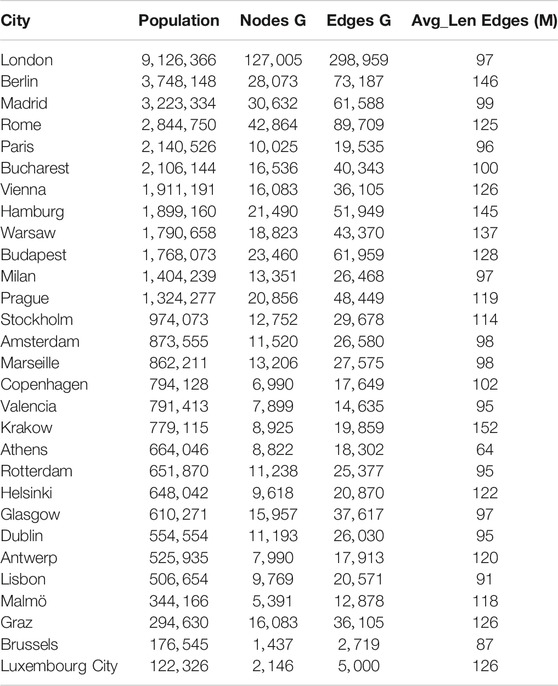
TABLE 1. Comparison of population, number of edges, average initial edge length of each edge, and nodes for different cities.
Given that OSM is based on voluntary contributions, different cities might have a different precision level. For a fair comparison, we provide in the table the information given by the Augment-OSM Precision algorithm (AOP) (Vitello et al., 2018). Specifically, AOP augments the graph that OSM provides by adding through additional interpolation edges so that the resulting street graph contains nodes with a fixed distance, e.g., 1 m. A high density of nodes defines cities with an extensive mobility network, e.g., streets and squares. Further to this information, we also include the number of edges graph and the average edge length in the city. In this case, we prune the street graph so that only two nodes define a street. As a result, we get knowledge about the degree of connectivity and regularity of the urban fabric.
This Section presents the analysis of the dataset illustrated in Section 3. Specifically, in Section 4.1, we show for Luxembourg City the trends of infected individuals and fatalities, in relation to the lockdown measurements taken by the country, and the impact of such measures on the cities’ mobility patterns (driving, walking, transit). In Section 4.2, we show the methodology employed to verify the similarity trends observed in the mobility categories, group together those cities with similar patterns, and derive a prediction method to forecasts future mobility trends per category. In Section 4.3, we show the results for clustering and forecasting. Finally, in Section 4.4, we analyze the correlation between mobility and the trend of SARS-COVID-19 infected cases. Practically, we verify whether the mobility-based clusters of cities identified in Section 4.2 are still applicable when looking at the evolution of the number of SARS-COVID-19 infected cases.
Figure 1 shows in a comprehensive graph for Luxembourg City, from bottom to top, the evolution over time of infected cases and fatalities, the lockdown measurements taken by the government, the percentage increase or decrease of mobility modes usage, and the presence in activities. The time evolution spans from February 23rd to July 3rd, and during such a time frame we have data for both Apple Maps and SARS-COVID-19 trends.
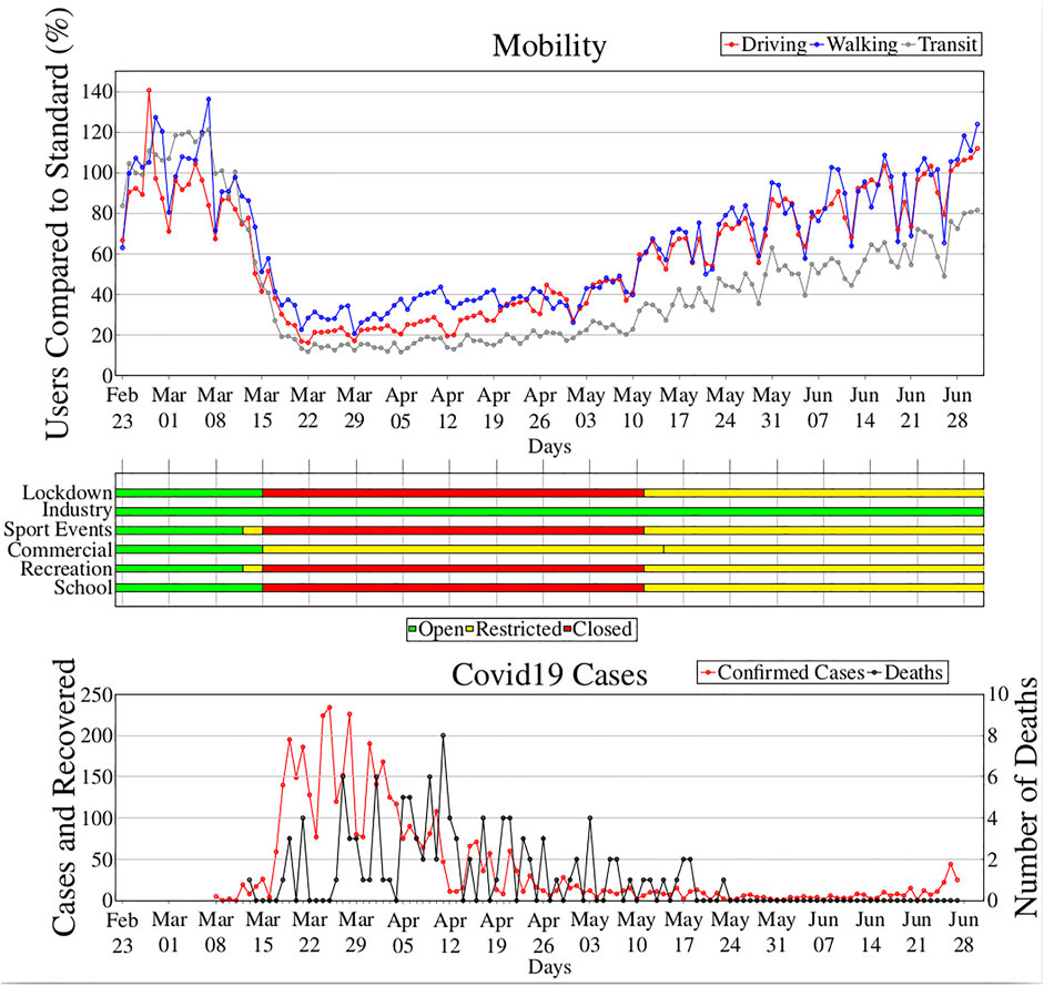
FIGURE 1. Comprehensive timeline with SARS-COVID-19 cases, lockdown measures, impact on mobility, and cities’ activities.
The figure shows how the government started imposing hard lockdown measures as from March 15th, aligning with what other EU countries did despite a relatively low number of identified cases. However, in terms of mobility, it is possible to notice that the population started to reduce moving earlier, indicating an anticipation of actions following the announced restrictive measures or self-adaptation of the population to the emergency conditions. For example, were driving activities reduced already in a notable way from March 10th to March 11th while the other categories from March 11th to March 12th. The rate of decrease is comparable for all categories, revealing a pattern for all of them, reaching the lowest rate after a week from the start of the lockdown. Then during the lockdown the rate slowly increased, further increasing after the lockdown policy was stopped on May 11th. Transit experienced a substantial decrease, it started from 120% of users before the Lockdown, and after March 15th, it reached the lowest values (less than 20%) compared to Driving and Walking. Interestingly, during the first phase of the lockdown (March 15th–April 20th) Walking category experienced the highest values. This was due to good weather, which prompted people to take the opportunity to enjoy being outdoors while this was allowed. After lockdown, both walking and driving were observed to restore to normal conditions and even exceeded the expected rates, whereas transit did not. From this data there is clear evidence of a reduction in Transit ridership and an increase for driving and walking mode, the reasons behind this change could be different. A possible explanation could be a potential mode shift from public transport to walking and driving as using public transport was perceived as a more risky alternative in terms of potential contacts with infected people. On the other hand, another explanation for transit reduction can be found on the working from home policy that caused a drastic decrease in transit commuters. The case of Luxembourg City exemplifies the evident correlations between the three collected data sets, namely the mobility patterns via the Apple data, the lockdown policies, and the COVID-19 data. Similar correlations were observed in the collected cities. The aim of this study is to identify commonalities in how mobility trends changed across Europe as a consequence of the epidemic spread and the imposed restrictive measures. Capturing these commonalities may help in understanding how specific reductions in mobility have contributed to limit the spread of the virus, to better predict the evolution of future waves and suggest which policies may be more indicated.
The objective of this subsection is to identify similarity trends observed in the mobility categories of Apple data for the cities considered (see Table 1). For this, we resort to clustering techniques. The proposed methodology consists of three interconnected components:
• Regression with Gaussian processes.
• Clustering with unsupervised machine learning models.
• Prediction with again Gaussian processes.
We start from the raw Apple dataset at a city level, exploiting the full dataset (February 23rd–July 3rd). In this phase (regression), we want to obtain a mean function for each city that characterizes each category well (namely, Driving, Walking, Transit). The scope of this function is to find the general trend of the original data, avoiding outliers and peaks that could influence the clustering process. We noted that the interpolation could be affected by outliers due to data changes occurring in the presence of specific events (e.g., the Catholic and Orthodox Easter days). To obtain the mean function, we employ the Gaussian Processes (GPs) models that are one of the most commonly employed stochastic processes for application to datasets with data evolving over space and time (time series are a good example). When selecting the methodology to use, we explored both GPs and neural networks (NNs) like Multi-layer Perceptron and General Regression NNs. Unlike GPs, neural networks appear to be more suitable for larger and more complex datasets than the one at our disposal. Furthermore, GPs can be optimized exactly, i.e., there is no need for complex training procedures to tune the hyper-parameters. The main characteristic of GPs is that they are entirely determined by the mean and the covariance. This aspect helps the model fitting because only the first- and second-order moments should be specified. The covariance of the GPs is described by a Kernel (covariance function), in this work we use a kernel based on the combination by addition of a Matèrn component, an amplitude factor, and observation noise. The hyperparameters of the GP model are optimized by the limited memory Broyden–Fletcher–Goldfarb–Shanno algorithm (LM-BFGS) (Liu and Nocedal, 1989). To prevent the possibility of finding a local maximum in the marginal likelihood, we run the optimization algorithm three times, using randomly-chosen starting coordinates. Once we obtained the mean functions, they are used to represent the city behavior for a specific category.
In the second phase, we first determine for each city a reference day that represents the arrival in town of the SARS-COVID-19 pandemic. Since the virus was observed to start spreading at different time periods in Europe, and in order to align the data seeking for comparability, we defined a reference point as the moment in which the city (or the region containing it) reached 1% of total SARS-COVID-19 cases. Next, starting from these reference dates, we create windows of time with a fixed duration given in the number of days (e.g., 80 days). These windows are common in all cities. Once all the time windows are defined, we extract the corresponding intervals of the mean function obtained from the Apple Maps dataset for each city.
For the clustering technique, we use a hierarchical approach with a well-known distance metric:
where M is the mean function from apple dataset and
In the third step, we re-apply the same GP model applied in the first step, but this time at the cluster level and for prediction. Indeed, GP can be employed not only for regression but also for prediction, and we are now interested in this feature. Specifically, we removed from the cluster dataset the values of the last 10 days and use them as ground truth to evaluate the prediction results. For the evaluation results, we compute the absolute error for each day within the prediction interval and then average this value with the ones obtained for the whole period. In such a way, we determine the average prediction error.
The reason why we look at predictions for the cluster is in the application of the method for early detection of future waves. Some city in the cluster could be a few days earlier in the virus spread than others, hence our analysis is of help to predict what will happen if the city in the cluster keep the same policy in terms of confinement policy or deviate and use that of another cluster if this may result to be more effective.
Figure 2 shows an example of the application of the above procedure obtained for Amsterdam and Milan, to identify the trend from the data of the driving category. Note that Italy’s more rigid restrictions rules reduced the variability of Milan’s weekly patterns significantly. By contrast, in Amsterdam the recovery started earlier and the weekly patterns exhibit an increase in variability magnitude that becomes higher with time since March 15th.
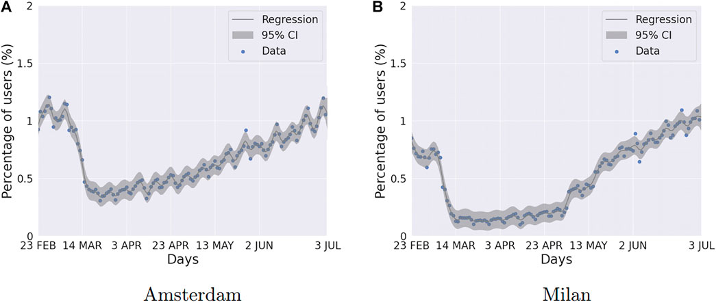
FIGURE 2. Comparison of dendrograms obtained as result from 40 to 60 days intervals for Driving Category.
This Section analyzes the results obtained with the methodology explained above for both clustering and forecasting.
We first start by analyzing the results obtained by the clustering operation for each of the three categories, i.e., Driving, Walking, and Transit. For each city, we extracted data concerning 20, 40, 60, and 80 days since when the 1% of total SARS-COVID-19 cases were reported. We applied the clustering approach to these different intervals to investigate the mobility evolution along the time. Figures 3–5 plot respectively the transition from the cluster obtained at an interval and the next one, i.e., Figure 3 shows the difference between the clusters obtained using the first 20 days, and the period between 20 and 40 days, respectively. Clusters are rendered in the form of dendrograms that are a natural way of showing hierarchies and exposing similarities. In Figures 3–5, the dashed lines highlight the clusters while the red lines between the dendrograms indicate a change of cluster. For space reasons, we only include the plots obtained for Driving.
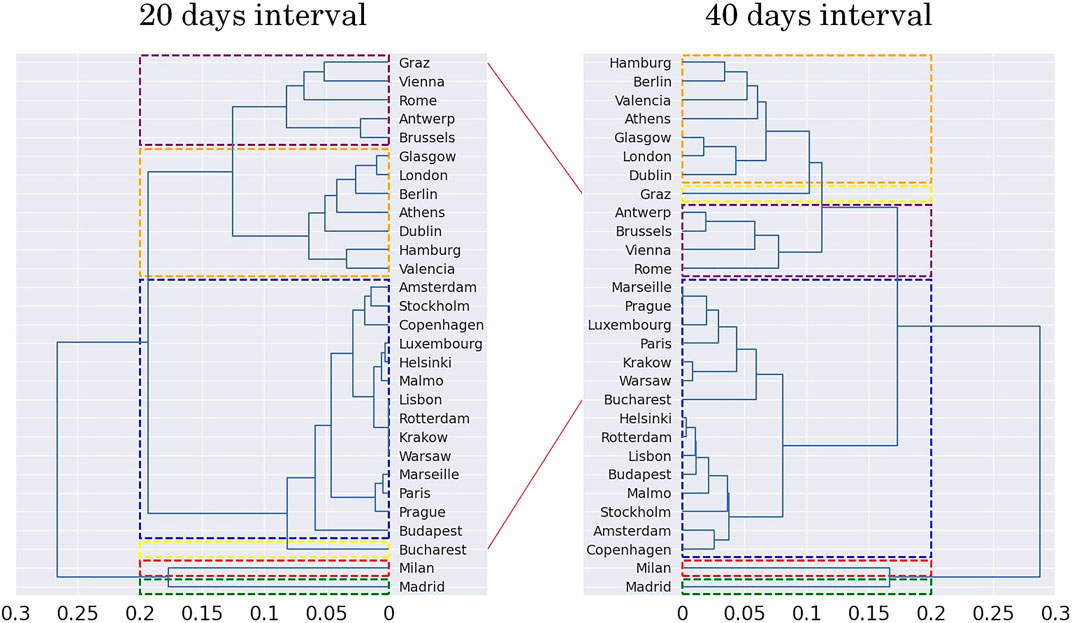
FIGURE 3. Comparison of dendrograms obtained as result from 20 to 40 days intervals for Driving Category.
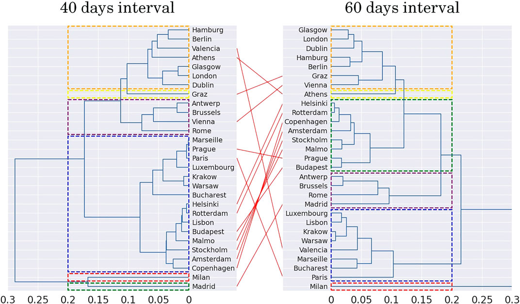
FIGURE 4. Comparison of dendrograms obtained as result from 40 to 60 days intervals for Driving Category.
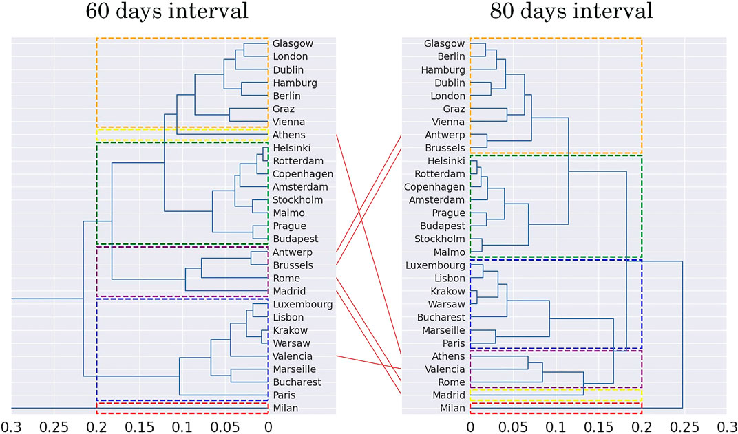
FIGURE 5. Comparison of dendrograms obtained as result from 60 to 80 days intervals for Driving Category.
We resort to using only six clusters that better balance the number of cities per cluster for all the results. The x-axis represents the distance between each cluster. Note that the similarity between the two dendrograms is very high, and the only cities changing of cluster are Bucharest and Graz. Bucharest, originally a one-city-only cluster, becomes part of the blue cluster (with Paris, Luxembourg, etc.) while Graz does the opposite and transits from the purple cluster (Vienna, Rome, etc.) shift to a one-city-only cluster. Figure 4 shows the dendrograms of the clusters transiting from a window of 40–60 days. In such a timeframe, we witness a more extensive transformation. For example, the blue cluster splits into two smaller groups, one that comprises mostly the Scandinavian cities, while the other is a mix of different cities, including French and Eastern European towns. The creation of a specific cluster for the Scandinavian cities highlight the consequences of the specific public health measures taken by these countries, which were notably different than other European countries.
Some of the results obtained are easy to explain, others not. Specifically, considering the 80 days dendrogram on the right of Figure 5, the sets are as follows:
• Cluster 1 comprises most of the cities from the central-north European region (Berlin, Hamburg, London, Glasgow, Dublin, Vienna, Graz, Antwerp, and Brussels).
• Cluster 2 comprises Scandinavian (Stockholm, Malmö, Copenhagen, Helsinki) and Dutch (Amsterdam, Rotterdam) cities, plus Budapest and Prague.
• Cluster 3 comprises French (Paris and Marseille) and Polish (Warsaw and Krakow) cities, plus Luxembourg, Lisbon, and Bucharest.
• Cluster 4 comprises cities from the south European region (Rome, Valencia, Athens).
• Cluster 5 comprises Madrid.
• Cluster 6 comprises Milan.
Most clusters identify cities belonging to the same geographical region like cluster 2 and cluster 4 representing Scandinavian and Southern European regions. These two groups are an example of two radically different approaches to tackle the pandemic. The public institutions of cluster 4 applied very strong lockdown policies, while Scandinavian countries applied soft restrictions by encouraging citizens to follow government instructions at the same time.
Concerning clusters that include cities from different geographical regions, the explanation for being grouped is profound and has to be found in the pandemic spread in the city, the specific measures taken by authorities, and the citizens’ reaction. Cluster 3 is an example of such clusters as it combines cities from eastern Europe (e.g., Bucharest, Warsaw, Krakow) with cities from western Europe (e.g., Luxembourg, Paris, Marseille).
Looking at all the clusters, it is interesting to note how there is no strong correlation between the clusters and the morphology of cities. With reference to Table 1, we can see how cities with similar average edge lengths (i.e., cities with roads of similar length) like Helsinki (122) and Antwerp (120) or Milan (97) and Rotterdam (95) end up on different clusters. Another important morphology parameter is the number of edges that together with the population of the city provides a measure of urban density. We can see how the clusterization is not influenced by this parameter. An example is given by Cluster 3 which includes Paris and Bucharest that have the same population (2,14 and 2,10 million residents - accounting only for the residents in the municipality and not the neighboring areas), but while Paris has a number of edges close to 20 thousand, Bucharest has a complete different urban density with a number of edges that is double, i.e., more than 40 thousand.
It is also interesting to note how cities from the same country can belong to different clusters. For example, the Italian cities (Rome in cluster 4 and Milan in cluster 6) and Spanish cities (Valencia in cluster 4 and Madrid in cluster 5), although they share similar mobility trends, differ in the evolution of the number of SARS-COVID-19 infected people. Specifically, Madrid and Milan had the earliest outbreak of the pandemic in their respective countries and in general in the considered set of cities in this work.
Next, we perform a forecasting analysis per mobility category (Driving, Walking, and Transit) using as history the time horizon of 80 days after the 1% of cases and we obtain forecasts for the subsequent 10 days. Please note that the starting day from which we count the 80 days is different for each city and that the 6 resulting clusters are different for each category. For example, for the driving category (dendrogram on the right inside of Figure 5), there are two one-city-only clusters for Milan and Madrid, but this is not valid any longer for transit and walking categories. For sake of completeness we decided to show all clusters including the one-city-only, in this way we show the peculiarity of these cities that justifies being clusters of their own.
We first show the prediction results, and later we show the error made computed with the Root Mean Square Error (RMSE):
where
Driving: Figure 6 shows the results obtained for Driving. As mentioned above, two of the six clusters are one-city-only clusters for Madrid and Milan. In Figure 6A, these cities are included in cluster 4 and 6 respectively. Their behavior is characterized by the fact that the municipalities had the earliest cases of SARS-COVID-19 in Europe. The plots show how in the first 10 days the level of driving activities follows standard trends in both cities, and is followed by a rapid decrease caused by the application of the confinement policies. By contrast, cluster 1 shows cities that in their first 10 days are already at a low level of driving activities. The reason is that cluster 1 includes cities like Valencia and Rome for which the citizens learned the lesson from Madrid and Milan, and they reduced their mobility before reaching a high number of SARS-COVID-19 cases.
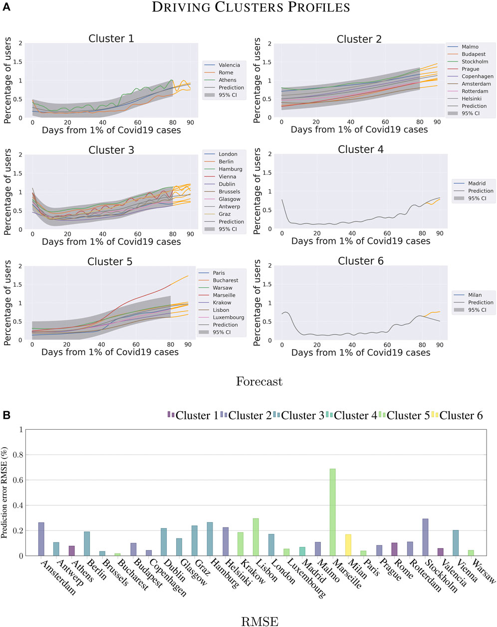
FIGURE 6. Forecasting analysis for the different clusters on Driving category.
Figure 6B shows that the predictions for cluster 5 are the worst of the category (average error 18%), the highest error is attributed to Marseille (68%). We observe a much earlier re-start for this city than in all the other cities in the cluster. Note that Marseille never hit the low level of driving activity possible to observe for the other cities of this cluster (i.e., a decrease of around 20%).
Within the cluster 2, cities of Sweden like Malmö, Stockholm have benefited from mild lockdown restrictions, which explains why their driving activities profile is high. The average forecasting error for the cluster is on the average 15%. As for the remaining cluster, Cluster 3, the predictions are reasonably accurate (the prediction error is on average 17%). We observe the following interesting fact. Compared to the other cities, the cities of the United Kingdom and Ireland (e.g., London, Glasgow, and Dublin) did not apply strong lockdown restrictions, but their driving activities profile is the lowest of the cluster. It indicates that citizens reduced their driving activities themselves.
Walking: Figure 7 shows the results obtained for Walking. First of all, please note that compared to Driving, the different groups of cities in the clusters are different. For example, the new Cluster 1 now includes some cities that in the Driving category belong to Cluster 4 (e.g., Marseille and Bucharest).
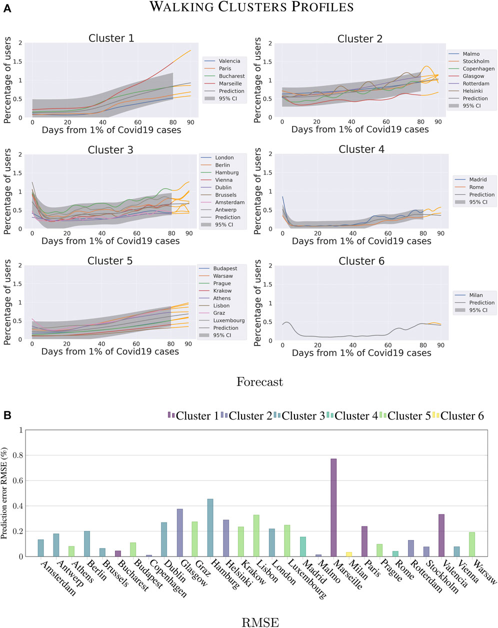
FIGURE 7. Forecasting analysis for the different clusters on Walking category.
The cities in Cluster 1 have in common the following characteristic: low walking activities values during the first 40 days after having reached the 1% of SARS-COVID-19 cases and a high increase in the second 40 days. The prediction accuracy for this cluster (see Figure 7B) is high, except for Marseille that shows the highest re-start compared to other cities (close to 200%) and the corresponding highest error (77%). This confirms that the response of Marseille in tackling the pandemic was unique as both driving and walking activities differ significantly from those of the respective comparable cities per-category. Low values characterize the profile of Cluster 5 in the first half, likewise Cluster 1, but the recovery is slower during the second half of the observation window. The prediction error of this cluster is reasonably accurate, as it is always under 30%.
With respect to the Driving category, Cluster 2 does not contain anymore Amsterdam, Budapest, and Prague that moved to Cluster 3 and 5. This cluster now contains mainly cities from northern Europe, and the forecasting error is low (i.e., %14). The forecasting error increases for Cluster 3, mainly because of the presence of Hamburg that behaves differently from the cities of the cluster (with a prediction error of 46%).
Regarding cluster 4, the only difference with respect to the Driving category is the addition of Rome. Madrid and Rome share a similar profile for walking activities, and the reasons for this similarity can be found in the analogous type of reactions enforced by the local authorities and the comparable size and population of the two cities. Cluster 6 still includes only Milan.
Transit: Finally, Figure 8 shows the results for the Transit category for which the Apple dataset does not provide data for 8 cities (Athens, Bucharest, Graz, Krakow, Lisbon, Milan, Vienna, Warsaw). The reason is that not every city allows Apple Maps to give indications on public transport, which forces users to make use of alternative applications.
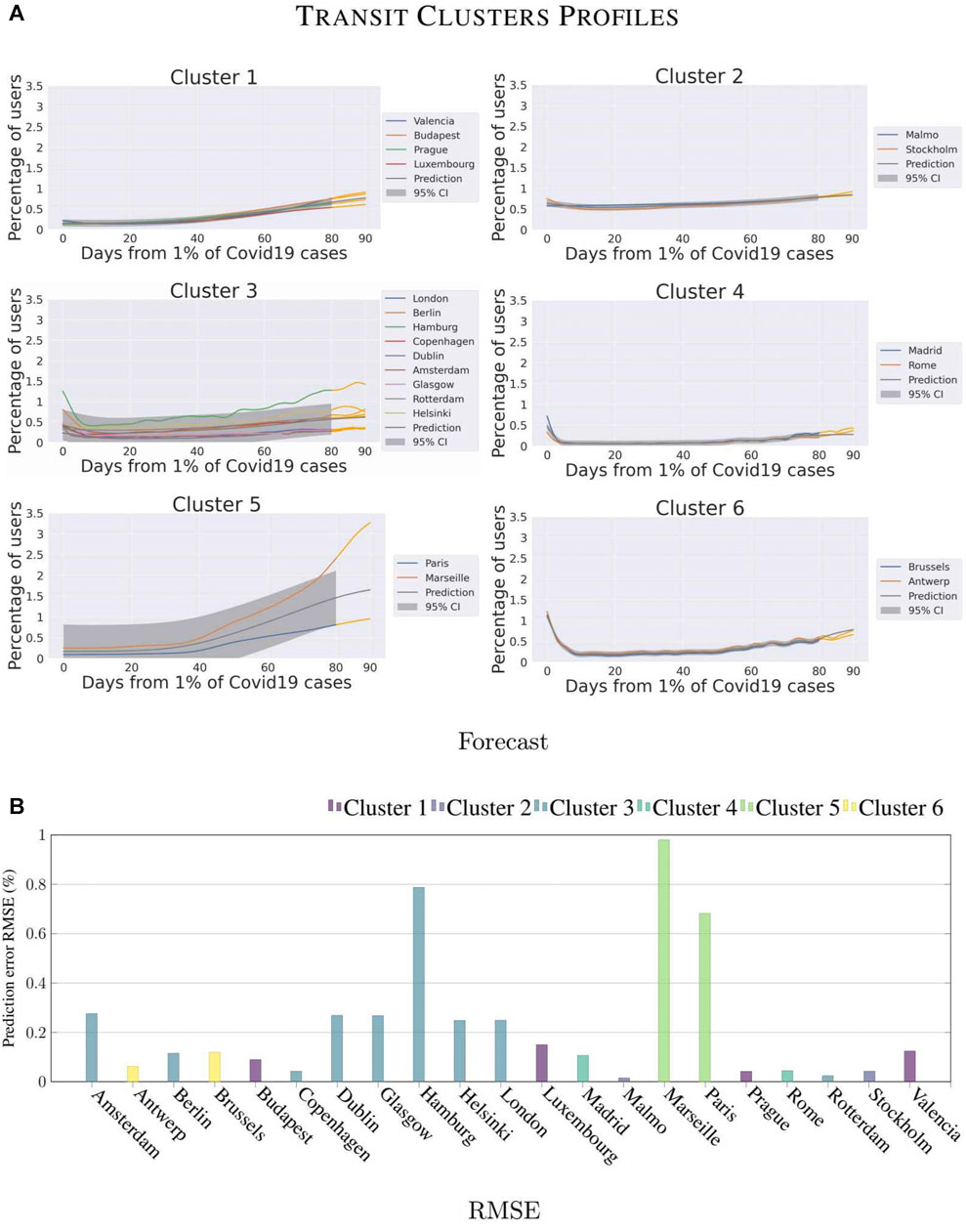
FIGURE 8. Forecasting analysis for the different clusters on Transit category.
As a consequence, the clusters are very different from the ones obtained for the other categories. It is worth noticing that 3 clusters include only a pair of cities belonging to the same country, namely Malmö-Stockholm in Cluster 2, Paris-Marseille in Cluster 5, and Brussels-Antwerp in Cluster 6. The reason for this regional-based clusterization is indeed the lower dimension of the dataset due to the missing cities, but we can observe in Figure 8B that we obtained different forecasting results. While the forecasting precision for the Belgian and the Swedish clusters is high (error of 2 and 1%), the French cities differ significantly one with the other (forecasting error of 86% mainly because there are only two cities with Marseille being radically different). This confirms that the response of the citizens of Marseille has been unique in terms of mobility for all the transportation modalities. At a lower scale, Hamburg as well has tackled the pandemic differently from other cities of the clusters it belongs to. In this category, the error is of 78%. It is remarkable how the values for transit have reached lower percentages than the other two categories and also the restart is slower. This can be appreciated because most of the cities never reached 100% of transit users even after 80 days from 1% of cases. It is interesting to notice that the restriction policies on public transport do not have a strong influence on the composition of clusters. Cluster 4 is a clear example, this group is composed of Madrid and Rome. We analyzed the policies of the corresponding countries through the Oxford COVID-19 Government Response Tracker dataset4, we verified that Spain and Italy adopted a different strategy for public transport in April. While Spain only recommended citizens to not use transit services, in Italy public authorities enforced a policy of strict closure and reduction of capacity. These different strategies reveal that clusters are not lead only by governmental decisions, this is something we would like to study in deep in future researches, in order to detect which are the factors that influenced the most citizens behavior.
This Subsection analyzes the correlation between mobility and the evolution of the number of SARS COVID-19 cases in various cities. To this end, we verify whether the clusters of cities identified in Section 4.2 reflect the same similarities also in terms of the number of infected cases. We choose the clusters obtained from Driving category with a timeline of 80 days after the 1% of contagious, Driving is the category with the largest dataset and 80 days is the longest available timeline in our dataset. To compute the SARS COVID-19 similarity between cities, we extract the number of cases for each city for the same timelines of Driving clusters (80 days) and then we normalize by the total number of cases in the city. The SARS COVID-19 dataset contains a lower subset of cities than the Apple Maps dataset. Compared to the driving dataset, we excluded four cities, Bucharest, Budapest, Paris, and Marseille.
Figure 9 shows the results obtained. The similarity matrix compares the different SARS COVID-19 trends while the red lines display the Driving clusters. The similarity is computed with the JSD metric that is explained in Section 4.2. The cities are sorted by driving cluster and the order inside the cluster is given from the similarity distance between the cities for driving data.
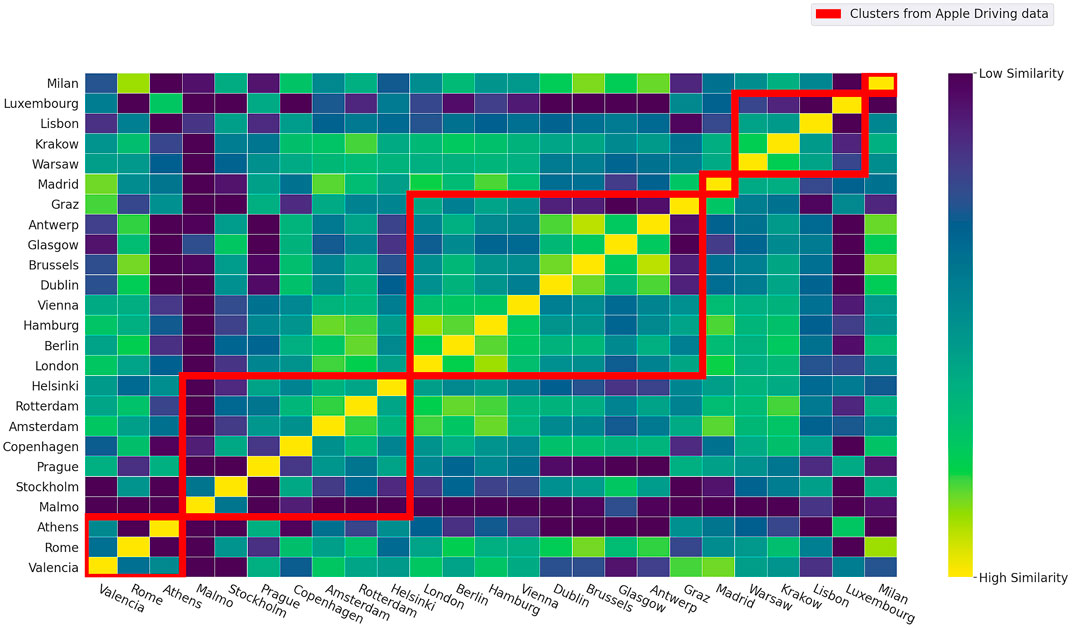
FIGURE 9. Similarity Matrix of contagious trends of SARS COVID-19.
We first observe the presence of different outliers, Malmö and Luxembourg, because have the lowest values of similarities with respect to other cities. As for Malmö, our mobility analysis highlighted that the city behaves similarly to Stockholm for all the categories while in terms of the number of infections it is interesting to note that the cities are profoundly different. A possible reason could be that many residents in Malmö commute daily to Copenhagen, Denmark, hence it has in terms of potential contacts a very distinct behaviour with respect to Sweden’s capital city. As for Luxembourg, the difference can be justified by i) the peculiarity of the city (in terms of population, number of workers commuting every day from neighboring countries) and the large scale testing applied by the government.
Next, we observe that it is possible to identify strong intra-cluster similarity for Clusters 2, 3, and 5. For example, with regard to Cluster 2, we can identify a sub-cluster of Amsterdam, Rotterdam, and Helsinki. With regard to Cluster 3, we can identify two sub-clusters: London to Vienna and Dublin to Antwerp. Further, by performing a clustering analysis solely based on the number of SARS COVID-19 cases, the resulting clusters would be different. For example, Amsterdam, Rotterdam, London, Berlin, Hamburg, and Vienna would be assigned to a single cluster.
In this paper, by using different crowdsensed datasets, we perform an analysis to uncover the impact of the SARS COVID-19 outbreak on the changes in mobility in urban environments. Specifically, we use Gaussian Processes and clustering techniques on the Apple Maps data to uncover patterns of similarity between the major European cities and perform a prediction analysis that permits forecasting the trend of the recovery process.
We identify a range of interesting behaviors. For example, the repetition of our clustering methods over different intervals highlighted an evolution of the mobility trends of many cities along the days after the outbreak. We detected a group of cities that defined a cluster only after many days after the outbreak, such as the Scandinavian cities that became a proper cluster only after 60 days from the outbreak. Apart from few changes, our methodology produced stable clusters, most of them region-wise, from which we extracted a common trend useful to understand the behaviors of different cities and improve the forecasting of the next days.
Regarding the forecasting, we exploited the 80 days after the outbreak to predict the coming 10 days, we predicted the trend of each cluster obtaining low prediction errors, on average we obtained prediction errors of 14% for driving category, 19% for walking, and 24% for transit. We identified outlier cities like Marseille and Hamburg, i.e., cities where citizens have used transportation modes radically differently from the cities in the respective clusters.
The results of this study are useful for municipalities and local authorities to identify other towns with a similar reaction to the pandemic spread in terms of mobility. The possible application of the mobility clusters and their patterns is to help cities to perform a critical assessment of the efficacy of confinement measures enforced and whether might be more convenient to adopt a different policy used by cities in other clusters.
In our future research, we plan to extend this study in different directions. First, we would like to exploit additional crowdsourced datasets, the Apple maps data is based on Apple users who asked for directions while using multiple sources of data could help on representing the true travel behaviors of all citizens. Second, while this study aims at drawing attention to similarities between cities’ reactions to the pandemic, our intention is to analyze on a future work the implications of confinement policies and self-isolation measures on urban environments. Specifically, we want to focus on the impacts that changes of our daily habits produced on urban mobility and activities. The utility of such analysis is to determine which factors influence the most urban mobility and daily activities. To reach this goal we will use different techniques compared to this study, the methodology will be based on Structural Equation Modeling (SEM), which is a statistical method that can be exploited to detect causal relationships between two or more variables.
Publicly available datasets were analyzed in this study. This data can be found here: https://covid19.apple.com/mobility, https://covid-statistics.jrc.ec.europa.eu/.
PV, CF, AC, RC, and FV modeled the idea of the study and designed the methodology. PK extracted and cleaned the database. PV, CF, RC, and FV wrote sections of the manuscript. All authors contributed to proofreading and approved the submitted version.
PV work is supported by the Luxembourg National Research Fund (PRIDE17/12252781/DRIVEN).
Author AC is currently employed at Northvolt.
The remaining authors declare that the research was conducted in the absence of any commercial or financial relationships that could be construed as a potential conflict of interest.
1https://www.apple.com/covid19/mobility
2https://covid-statistics.jrc.ec.europa.eu/
3https://ec.europa.eu/eurostat/web/cities/data/database
4https://www.bsg.ox.ac.uk/research/research-projects/covid-19-government-response-tracker#data
Bertsimas, D., Boussioux, L., Wright, R., Delarue, A., Kitane, D., Lukin, G., et al. (2020). COVIDanalytics Project. [Dataset].
Boni, M. F., Lemey, P., Jiang, X., Lam, T. T.-Y., Perry, B. W., Castoe, T. A., et al. (2020). Evolutionary Origins of the SARS-CoV-2 Sarbecovirus Lineage Responsible for the COVID-19 Pandemic. Nat. Microbiol. 5, 1408–1417. doi:10.1038/s41564-020-0771-4
Bryant, P., and Elofsson, A. (2020). Estimating the Impact of Mobility Patterns on Covid-19 Infection Rates in 11 European Countries. PeerJ 8, e9879. doi:10.7717/peerj.9879
Capponi, A., Fiandrino, C., Kantarci, B., Foschini, L., Kliazovich, D., and Bouvry, P. (2019). A Survey on Mobile Crowdsensing Systems: Challenges, Solutions and Opportunities. IEEE Commun. Surv. Tutorials 21, 2419–2465. doi:10.1109/COMST.2019.2914030
Capponi, A., Vitello, P., Fiandrino, C., Cantelmo, G., Kliazovich, D., Sorger, U., et al. (2019). “Crowdsensed Data Learning-Driven Prediction of Local Businesses Attractiveness in Smart Cities”, in Proc. of IEEE Symposium on Computers and Communications, Barcelona, Spain, July 2019 (New York, NY: IEEE), 1–6.
Dahlberg, M., Edin, P.-A., Grönqvist, E., Lyhagen, J., Östh, J., Siretskiy, A., et al. (2020). Effects of the Covid-19 Pandemic on Population Mobility under Mild Policies: Causal Evidence From Sweden. [Dataset].
D’Silva, K., Noulas, A., Musolesi, M., Mascolo, C., and Sklar, M. (2018). Predicting the Temporal Activity Patterns of New Venues. EPJ Data Sci. 7, 13. doi:10.1140/epjds/s13688-018-0142-z
Egwolf, B., and Austriaco, N. (2020). Mobility-guided Modeling of the COVID-19 Pandemic in Metro Manila. medRxiv. doi:10.1101/2020.05.26.20111617
Engle, S., Stromme, J., and Zhou, A. (2020). Staying at Home: Mobility Effects of Covid-19. Available at: https://papers.ssrn.com/sol3/papers.cfm?abstract_id=3565703 (Accessed April 15, 2020).
Ericsson Research (2020). Mobility Report June 2020. Available at: https://www.ericsson.com/en/mobility-report?gclid=EAIaIQobChMI8dbz3-Ov8AIVT6uWCh2tngN7EAAYASAAEgKZlPD_BwE&gclsrc=aw.ds [Dataset].
Favale, T., Soro, F., Trevisan, M., Drago, I., and Mellia, M. (2020). Campus Traffic and E-Learning during COVID-19 Pandemic. Comput. Netw. 176, 107290. doi:10.1016/j.comnet.2020.107290
Feldmann, A., Gasser, O., Lichtblau, F., Pujol, E., Poese, I., Dietzel, C., et al. (2020). “The Lockdown Effect: Implications of the COVID-19 Pandemic on Internet Traffic”, in Proceedings of the ACM Internet Measurement Conference (IMC), October, 2020 (New York, NY: Association for Computing Machinery), 65–72.
Kapoor, A., Ben, X., Liu, L., Perozzi, B., Barnes, M., Blais, M., et al. (2020). Examining Covid-19 Forecasting Using Spatio-Temporal Graph Neural Networks. arXiv preprint arXiv:2007.03113.
Kendall, M., Parker, M., Fraser, C., Nurtay, A., Wymant, C., Bonsall, D., et al. (2020). Quantifying SARS-CoV-2 Transmission Suggests Epidemic Control with Digital Contact Tracing. Science 368, eabb6936. doi:10.1126/science.abb6936
Liu, D. C., and Nocedal, J. (1989). On the Limited Memory BFGS Method for Large Scale Optimization. Math. Program. 45, 503–528. doi:10.1007/bf01589116
Mahajan, V., Cantelmo, G., and Antoniou, C. (2021). Explaining Demand Patterns during Covid-19 Using Opportunistic Data: A Case Study of the City of Munich. Eur. Trans. Res. Rev. 13, 26. doi:10.1186/s12544-021-00485-3
Menni, C., Valdes, A., Freydin, M. B., Ganesh, S., El-Sayed Moustafa, J., Visconti, A., et al. (2020). Loss of Smell and Taste in Combination with Other Symptoms is a Strong Predictor of Covid-19 Infection. medRxiv. doi:10.1101/2020.04.05.20048421
Pullano, G., Valdano, E., Scarpa, N., Rubrichi, S., and Colizza, V. (2020). Evaluating the Effect of Demographic Factors, Socioeconomic Factors, and Risk Aversion on Mobility During the Covid-19 Epidemic in France Under Lockdown: A Population-Based Study. Lancet Digit. Health 2, e638–e649. doi:10.1016/S2589-7500(20)30243-0
Rahman, M. M., Thill, J.-C., and Paul, K. C. (2020). Covid-19 Pandemic Severity, Lockdown Regimes, and People’s Mobility: Early Evidence from 88 Countries. Sustainability 12, 9101. doi:10.3390/su12219101
Reelfs, J. H., Hohlfeld, O., and Poese, I. (2020). “Corona-Warn-App: Tracing the Start of the Official COVID-19 Exposure Notification App for Germany”, in Accepted as Poster in Proceedings of the ACM Special Interest Group on Data Communication (SIGCOMM), August, 2020 (New York, NY: Association for Computing Machinery), 1–3.
Roy, A., and Kar, B. (2020). “Characterizing the Spread of Covid-19 From Human Mobility Patterns and Sociodemographic Indicators”, in Proceedings of the 3rd ACM SIGSPATIAL International Workshop on Advances in Resilient and Intelligent Cities, Seattle, Washington, Nov, 2020 (New York, NY: Association for Computing Machinery). doi:10.1145/3423455.3430303
Sannigrahi, S., Pilla, F., Basu, B., Basu, A. S., and Molter, A. (2020). Examining the Association between Socio-Demographic Composition and Covid-19 Fatalities in the European Region Using Spatial Regression Approach. Sustain. Cities Soc. 62, 102418. doi:10.1016/j.scs.2020.102418
Simsek, M., and Kantarci, B. (2020). Artificial Intelligence-Empowered Mobilization of Assessments in COVID-19-Like Pandemics: A Case Study for Early Flattening of the Curve. Int. J. Environ. Res. Public Health 17, 3437. doi:10.3390/ijerph17103437
Vitello, P., Capponi, A., Fiandrino, C., Giaccone, P., Kliazovich, D., and Bouvry, P. (2018). “High-precision Design of Pedestrian Mobility for Smart City Simulators”, in Proc. of IEEE International Conference on Communications (ICC), Kansas City, MO, May 20, 2018 (New York, NY: IEEE), 1–6. doi:10.1109/ICC.2018.8422599
Wang, H., and Yamamoto, N. (2020). Using a Partial Differential Equation With Google Mobility Data to Predict Covid-19 in Arizona. Math. Biosci. Eng. 17, 4891–4904. doi:10.3934/mbe.2020266
Whitelaw, S., Mamas, M. A., Topol, E., and Van Spall, H. G. (2020). Applications of digital technology in COVID-19 pandemic planning and response. Lancet Digit. Health 2, E435–E440. doi:10.1016/S2589-7500(20)30142-4
Keywords: COVID-19 pandemic, lockdown, urban sensing, clustering, regression and forecasting
Citation: Vitello P, Fiandrino C, Capponi A, Klopp P, Connors RD and Viti F (2021) The Impact of SARS-COVID-19 Outbreak on European Cities Urban Mobility. Front. Future Transp. 2:666212. doi: 10.3389/ffutr.2021.666212
Received: 09 February 2021; Accepted: 27 April 2021;
Published: 20 May 2021.
Edited by:
Elise Miller-Hooks, George Mason University, United StatesReviewed by:
Aleksandar Stevanovic, University of Pittsburgh, United StatesCopyright © 2021 Vitello, Fiandrino, Capponi, Klopp, Connors and Viti. This is an open-access article distributed under the terms of the Creative Commons Attribution License (CC BY). The use, distribution or reproduction in other forums is permitted, provided the original author(s) and the copyright owner(s) are credited and that the original publication in this journal is cited, in accordance with accepted academic practice. No use, distribution or reproduction is permitted which does not comply with these terms.
*Correspondence: Piergiorgio Vitello, cGllcmdpb3JnaW8udml0ZWxsb0B1bmkubHU=
Disclaimer: All claims expressed in this article are solely those of the authors and do not necessarily represent those of their affiliated organizations, or those of the publisher, the editors and the reviewers. Any product that may be evaluated in this article or claim that may be made by its manufacturer is not guaranteed or endorsed by the publisher.
Research integrity at Frontiers
Learn more about the work of our research integrity team to safeguard the quality of each article we publish.