 Ana Delicado*
 Jussara Rowland
- Instituto de Ciências Sociais da Universidade de Lisboa, Lisbon, Portugal
This article aims to contribute to the understanding of the social dimensions of the 2020 pandemic, with a particular emphasis on the visual practices of science communication in times of health emergency, by analyzing how the coronavirus disease-2019 (COVID-19) pandemic is being visually represented. It seeks to identify the format and content of images used to illustrate online information about the pandemic, in particular, from websites of policy institutions, research promoters, and media in Portugal and Spain. By examining a sample containing 600 images, it aims to identify the messages being conveyed and the effects these images intend to provoke and to illuminate the differences in representations among the three sources of communication. Differences and similarities with visual images of previous pandemics (influenza, AIDS) are examined. This article ascertains that policy websites aim to be mostly prescriptive, relying on infographics to convey prevention and care instructions to its audiences. On the other hand, science websites rely mostly on stock photos and images from scientific articles to illustrate current research, while newspaper websites are the most diversified in terms of the images they use and the topics they cover. This study concludes that representations of science are still very much based on stereotypical imagery of labs and white coats, that representations of the medical side of the pandemic are focused on images of intensive care that aim to generate fear and stimulate responsible behavior, and that the social aspects of the pandemic are illustrated by images that focus either on pandemic prevention (e.g., washing hands) or on the impacts of the pandemic itself (e.g., empty streets during lockdown).
Introduction
The coronavirus disease-2019 (COVID-19) pandemic has brought science to the forefront of the international public sphere. Never have so many newspaper articles been written, so many press conferences held, and so many minutes of television news broadcasted in such a short amount of time about a microscopic virus and the science dedicated to investigate it.
The pandemic has generated its own peculiar images. Doctors are hidden behind extensive protective gears, row upon row of intubated patients in hospital intensive care units, nervous officials presenting the tally of the day for infected and deceased, empty streets in usually busy cities, and masked citizens queuing for the supermarket in addition to graphs and maps charting the unstoppable progression of the disease, hunched scientists on laboratory benches rushing to produce reliable tests or effective vaccines, and the virus itself, a colored blob covered in menacing nail-like spikes.
Thus, how is the COVID-19 pandemic being represented visually in media, government, and academia? What arguments are being conveyed by the images? What aspects of the pandemic do these images give visibility to? Are there differences in representation among these three sources of communication? Which points of view are being showed and which are being omitted? Are there differences between the COVID-19 visual images and those of previous pandemics (influenza, AIDS)?
This study will focus on Portugal and Spain, two countries with quite similar backgrounds (scientific, social, economic, and political) but with fairly different experiences with the pandemic: the first wave was far milder in Portugal than in Spain, but that was not the case with the second wave, although the mortality rate is still higher in Spain. At the time of writing, Spain has a cumulative incidence (after 292 days) of 3,687.01 cases per 100,000 inhabitants, while Portugal has a cumulative incidence (after 286 days) of 3,354.22 cases per 100,000 inhabitants. Mortality figures are more distinct: 54.09 per 1,000 inhabitants in Portugal and almost double (101.46) in Spain [Source: COVID-19 Dashboard by the Center for Systems Science and Engineering (CSSE) at Johns Hopkins University, Dong et al., 2020].
Science communication often relies on images to convey its messages. A great deal of literature has dealt with the role of images in the dissemination of scientific knowledge among peers (Latour and Woolgar, 1986; Cetina, 1999) and in the communication of science to the general public. According to Davies and Horst (2016), “no matter what the content is, images, graphics, and visual representations are a vital part of almost any kind of science communication, from news stories to public lectures. Communicators often take it for granted that they will use visuals in their work, and it is standard advice to scientists that they should produce images or graphics to help them explain their research.” Accordingly, some authors have focused on visual representations of science in the media (Lewenstein, 1995; Jarman et al., 2012), while others have focused on the need for visual literacy by communicators and audiences for effective science communication (Trumbo, 1999; Bucchi and Saracino, 2016). Desnoyers (2011) created a typology of images in science communication. Some studies concern visual representation in particular disciplines (Nerlich, 2008) or scientific topics (O'Neill and Smith, 2014). Portraits of scientists and science in popular media are also frequent subjects of analysis (Cho et al., 2009).
Hentschell (2014) discusses the transfer of chromophotography, film recording and interactive simulation from the realm of science production to science popularization, with changes in meaning and simplification. He gave the use of scientific icons in the advertisement as an example: “it is often just a metaphorical transfer onto a commercial product of desirable attributes such as high reliability or laboratory precision. For this purpose only well-known icons of science are chosen—the stereotypical scientist (a wizened male, sometimes with the unkempt Einstein hairdo and wearing protective goggles) functions as a guarantor of proven quality.” (Hentschell, 2014, p. 258–259).
However, the use of images for science communication is not neutral. Cetina (1999) coined the word “viscourse,” in analogy to the discourse of Foucault, to denote the elaborate lattice of visual interconnections between “images and their contexts of presentation, usage, and critique” (Hentschell, 2014, p. 262). Haraway (1991) considered scientific images as objectivizing gazes that aim to be neutral and objective but, in fact, highlight some points of view and obscure others. For Davies and Horst (2016), images show one truth among several, are produced and interpreted in particular cultural contexts and are used to put forward arguments and persuade audiences. The visual communication of medical sciences and medical issues has its own specific characteristics, from representations of the human body to medical imaging, and from public health posters to medical devices and instruments (Jordanova, 2013).
Materials and Methods
With the purpose of collecting a sample of images that could epitomize the most common visual representations of the pandemic, we retrieved images from three types of websites in the two countries:
• Government health departments: the Ministry of Health in Spain, the Directorate-General of Health, the National Health Service, and a dedicated COVID-19 webpage of the Ministry of Health in Portugal;
• Government science bodies: a dedicated website within CSIC (National Research Council, a network of research institutes similar to CNRS in France or Max Planck in Germany) in Spain and a dedicated website within the Foundation for Science and Technology (science funding agency) in Portugal, in both cases focusing on ongoing research about COVID19;
• Newspapers: El Pais in Spain and Público in Portugal (leading quality newspapers).
The purpose of choosing the two countries was to assess whether there were differences in representation between two neighboring countries with quite different experiences with the pandemic, and the results presented below show that the differences are tenuous.
Collection was carried out using the image search engine of Google (for research with a similar strategy see, for instance, Christidou and Kouvatas, 2013, or Einsiedel et al., 2017) with COVID as the search term, and between November 24 and December 10, 2020, in which the first 100 images from each type of website were identified and coded according to their type (drawing, photo, chart, etc.), content (what is being represented), message (what type of information is attached), and location (section within website or newspaper). The content was first analyzed through a detailed description of the image, which was inductively sorted into three categories: science, medicine, and social aspects (see Table 1 below). The images from each category were then analyzed through open coding in order to identify the main themes represented (Strauss and Corbin, 2008). This process generated a sample containing 600 images.
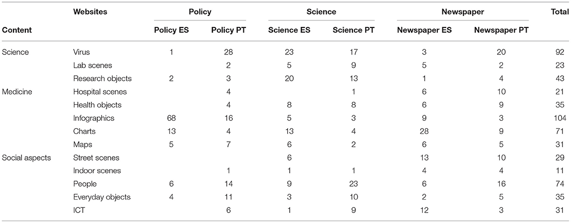
Table 1. Content of images in policy, science, and media websites.
This procedure has, of course, multiple limitations. Search algorithms vary results according to the history of previous search activities (even though the history of the browser was deleted), the location of the user, preferred language, and the date of search (most recent images are shown first). The selection of the websites also is limited and other possibilities might have been explored, such as printed editions of the newspapers, other printed materials (leaflets, posters), social media, TV, etc. However, we believe that at a time when digital information was much sought after, institutional websites and online newspapers provide a fairly sound basis for examining what images of science communication the public has been exposed to (though not how the images are being received, understood, or interpreted by the public) and particularly how this scientific issue is being visually portrayed.
Results
The sample containing 600 images was classified by type of website and by the content the images show. The content was aggregated in three main types: science, medicine, and social aspects (Table 1).
Epidemics are an object for public policy (Osborne, 1995). It falls on national governments (and partially on supranational bodies) to take the measures to monitor, control, and eliminate them. In both countries, the government has created dedicated websites that are aimed mostly at journalists and the general public to concentrate relevant information and showcase its actions in dealing with the pressing problem. On the Spanish Ministry of Health website (henceforth will be identified as Policy ES), COVID-19 images are used mainly as illustrations in infographics, in particular about two topics: health-related information (symptoms, prevention measures, what to do in case of infection, existing treatments, and vaccines) and social measures (what to do in case of unemployment, social rights, telework, housing, etc.). The objective is mainly pedagogical and practical: to help citizens make better choices, prevent the spread of the pandemic, and exercise their rights. The same infographic is made available in multiple languages, not just the ones used in the country (Spanish, Catalan, and Basque) but also by foreigners (English, Russian, and Chinese). The second most common type of content is charts, mainly used in reports, that most frequently represent the number of cases and other scientific data, such as viral load and antibodies.
Conversely, on the Portuguese government websites (henceforth will be identified as Policy PT), the most common type of image is depictions of the severe acute respiratory syndrome-coronavirus-2 (SARS-COV-2) in drawing, most probably from stock images. These depictions are used to illustrate news articles covering a wide range of issues without a clear trend: number of cases, number of outbreaks, what COVID-19 is, immunity tests, confinement measures, etc. The second most common kind of content is representations of people (men and women, of varied age groups), mostly in the form of photos or drawings, also illustrating news articles and retrieved from repositories. The only identifiable person is the Minister for Health, in a news article about strengthening the National Health Service. If anything, the absence of more photos of policymakers on a government website is surprising. A significant number of infographics has also been found, mostly associated with recommendations concerning hygiene (handwashing, food preparation, and shopping), prevention, and respiratory etiquette. Finally, there are also images of everyday objects, mostly food, shopping carts, and tables and chairs; and these are likely to be associated with the priority awarded recently to healthy eating policies by the Ministry, which seem to have extended to COVID-19 recommendations as well.
Regarding the two science websites also purposely created for COVID-19, they are fairly similar in content. Both mostly present information about new research projects being developed in Portugal and Spain in response to the COVID-19 crisis. They are aimed at journalists, the general public (to show how national science has risen to the challenge of fighting the pandemic), and the scientific community itself, to advertise opportunities for funding and collaboration. The images are mostly illustrations accompanying project information, some clearly from stock images, others directly pertaining to a specific project. In the case of the Spanish CSIC website (henceforth will be identified as Science ES), it also contains reports summarizing international research results (each synthesis of a published article is usually accompanied by an image) and event announcements (each with its poster, pictures of the speakers, and an image connected to the subject of a debate). The Portuguese science website (henceforth will be identified as Science PT) also has calls for project proposals and a news section, always including images. This website is intended to be fed by scientists themselves. They can log on to the website, create a profile with a picture and their research interests, post news about their projects, and upload datasets. Validation of the information is performed by a scientific committee.
For both websites, the most frequent kind of image content is depictions of SARS-COV-2, mostly through a drawing used in a banner of a webpage or as illustration accompanying the description of a research project. On Science ES, the second most common type of content is research objects: lab equipment such as test tubes and Petri dishes, and depictions of cells, DNA helixes, and molecules. In most cases, these are stock images (in particular disembodied gloved hands holding unidentified test tubes). The third most frequent image is charts, all of them included in reports summarizing international research results and therefore retrieved from scientific articles published in journals or pre-prints in repositories.
On Science PT, the most common content found in images is people of different gender and age groups, either in photographs or drawings. Most people in the images are wearing lab coats or protection equipment, and the images are used as an illustration to a research project description. In few cases, people are shown in a non-scientific setting, such as a couple in a kitchen (illustrating a project on healthy eating habits in time of COVID-19) or two children using a hand gel dispenser (illustrating a news article about research projects led by a health research network). In four cases, the persons in the photo are identified: the Minister for Science, Technology and Higher Education visiting research laboratories, in one instance accompanied by the Prime Minister. As in the previous case, research objects are also a common content of the images and are used as illustrations of a research project or a news article: test tubes, microscopes, or a robot.
Finally, newspaper websites, aimed at the general public, tend to show a wider diversity of contents in images. Whereas, the Portuguese newspaper website (henceforth will be identified as Newspaper PT) has created a whole section dedicated to the new coronavirus where the vast majority of images (78) can be found, on the Spanish newspaper website (henceforth will be identified as Newspaper ES) photos are used in multiple sections, but mostly in the lifestyle (15), business (13), and society (13) sections. On Newspaper ES, charts are the leading type of image content and, surprisingly, most are not related to COVID-19 cases but rather to stock value and other economic data. The following most frequent type of content in the images is street scenes, illustrating news articles about the social impacts of the pandemic, not just in Spain but also in Africa and Latin America, and highlighting the international orientation of the newspaper. Finally, images of information and communication technologies (ICT) (computers, mobile phones) are used to accompany articles about new services put forward by technology companies, such as Google and Twitter, to both provide sound information and restrict false information about the pandemic, and about new apps and games used to contribute to scientific research. Pictures of the virus (in this case, mostly from microscopic photography) are still dominant on Newspaper PT but nearly absent on Newspaper ES. The second most frequent kind of image concerns people, mostly in a photographic format, in articles mentioning risk groups, testing, cases and fatalities, and immunity. There are just two identifiable persons, the head of the Directorate General of Health and a famous footballer infected with COVID-19. The lack of photos of policymakers is, again, surprising, since both in Portugal and Spain, throughout the pandemic, there have been almost daily press conferences with policy representatives who became household names and faces: Fernando Simon, the head of the Director of the Coordination Centre for Health Alerts and Emergencies of the Spanish Ministry of Health and Salvador Illa, Minister for Health of the Spanish government; Graça Freitas, head of the Directorate General of Health and Marta Temido, Minister for Health of the Portuguese government. The third most common type of image represents hospital scenes (usually showing doctors and patients) and is used in news articles about cases and fatalities, hospital capacity, immunity, and outbreaks in hospitals. With the same frequency, photographs of street scenes also illustrate news on cases, fatalities, and outbreaks, and on restrictions to everyday life activities and impacts on the older population.
Discussion
Visualizing the Virus
When a new disease emerges, identifying the cause is a much needed step to diagnose cases and find effective treatments. Hentschell (2014) described how colored lithographs first (which were considered too subjective) and microphotographs later (considered as “the veritable retina of the scientist”) of Bacillus anthracis were instrumental for Koch to demonstrate the existence of bacteria as causal agents of disease. As Treichler (1992, p. 75) postulated “a virus is a constructed entity, a representation whose legitimacy is established and legitimized through a whole series of operations and representations, all highly stylized.” Graphic representations of a virus, such as its chemical and molecular schemes, are cultural constructions, a symbolic model of reality.
Viruses were first identified in the nineteenth century, but it took the invention of the electron microscope in the 1930s to be able to visualize them. AIDS started causing fatalities in the late 1960s, but it was not until 1983 that the human immunodeficiency virus (HIV) was discovered. Since then, science has accelerated to the point that SARS-CoV-2 was identified only a couple of weeks (January 12, 2020) after the first cluster of cases of the disease in the Wuhan province of China (in late December, 2019), and its genetic sequencing was published just a few months afterward (Wang et al., 2020).
The first images of the newly discovered virus were produced on the same day that the Coronavirus Study Group of the International Committee on Taxonomy of Viruses named the virus SARS-Cov-2 and the disease COVID-19 (February 11, 2020). Similar to what happened with AIDS (Treichler, 1992; Feldman, 1995), the disease and the virus are frequently mixed up in non-expert discourses. The first images of the virus were produced using the scanning and transmission electron microscopes of the Rocky Mountain Laboratories of the National Institute of Allergies and Infectious Diseases (NIAID). The virus did not differ much from other types of coronavirus, such as the firstSARS-CoV (discovered in 2002), named as such because of its crownlike appearance due to spikes on its surface (NIAID, 2020). Much like how Martin (1994) ascertained for HIV, electron micrographs are presented as scientific “proof” of the virus to produce closure in arguments among scientists. The SARS-CoV-2 images were made available to the public for free and as such are among those retrieved for the sample in this article. However, it should be said that actual photographs of the virus were only found on Newspaper PT. The vast majority of the 98 virus images we found were drawings that smooth out the blurriness of microscopic photography (which in itself is also manipulated by colorization) and draw out the nail-like appearance of the spikes. The colors chosen for the virus are varied but often strong (red, blue, and green). In some cases, the spikes are painted in a contrasting color, often red, and the virus seems to be floating in a background of the same color but of a watered down shade. As Weaving (2020) pointed out, “Images of viruses reveal a monochrome world of gray. Like electrons, atoms, and quarks, viruses exist in a realm where color has no meaning.” The use of color, thus, highlights the menacing nature of the virus, making it look more threatening. Drawings also make it possible to combine the image of the virus with other images, adding another layer of meaning, such as a picture of the virus with a human skull inside (an article about cultural events on Newspaper PT), with a DNA helix (illustration accompanying a research project on Science PT), a microscope (banner for a call for proposals on Science PT), chart lines (a news article on the number of cases on Policy PT), or a stop traffic sign (a poster on what COVID-19 is on Policy PT).
Among the images found on Newspaper PT and Newspaper ES were photos of 3D printed models of the virus, also in vibrant colors, similar to the plush toys manufactured by the Giant Microbes company (Jermy, 2016), which also duly issued a version of SARS-Cov-2 in 2020.
Science as Lab
A crucial dimension of the COVID-19 pandemic is the science around it, and that is clear on the images that are chosen to represent it. A problem that was first seen in the hospital was immediately transferred to the lab, so that it could be “solved.” What started as a virology and clinical health science puzzle rapidly transformed into a multidisciplinary one: immunologists, epidemiologists, mathematicians, pharmacologists, public health experts, mechanical engineers, economists, psychologists, sociologists, and jurists, all became key players to address the multifarious nature of the pandemic. At the time of writing, less than a year before the pandemic started, there are close to 60,000 scientific articles on COVID-19 on the Web of Knowledge and over 84,000 in the PubMed database. Dedicated funding lines for research projects about COVID-19 were created, both at national (including Portugal and Spain) and supranational levels (e.g., the European Union), for multiple scientific areas.
In contrast with the wide-ranged nature of research, pictorial representations of the pandemic went out the old familiar road of stereotyping science as a sole test tube and lab bench activity. We found 66 depictions of lab scenes or research objects (11% of the sample of images). The vast majority were photographs of laboratories with benches and covered in sophisticated apparatus, and people wearing lab coats (most with their backs turned to the camera, to signify a generic scientist and not some specific practitioner), and of lab equipment (in particular test tubes, Petri dishes, pipettes, and microscopes), often pictured against neutral white backgrounds, being held by disembodied gloved hands, representing the human-non human interaction that underlies the production of science. Lab equipment, thus, serves as a metaphor for science, together with other easily recognizable science signifiers: DNA helixes, cells, molecules, radiographs (which Henschell calls “one of the most impressive visual culture ever created” (2014, p. 281); curiously, only one of these images represents an X-ray of the lungs, the most affected organ by the COVID-19 disease, the others are images of bones). The only concession to the specificity of the pandemic lies in the fact that in some of the lab scenes people are wearing protective gears and face masks. People in lab scenes are both men and women, which is in line with the gender balance of science in Portugal and Spain (close to 50% of scientists and engineers are women), but no ethnic diversity is shown, which mirrors the underrepresentation of minorities in the scientific community. The mise-en-scène of lab photos refers the audience to the role of a passive onlooker, in some cases (general panoramic) observing the scene from a distance, in others (close-ups) peeking over the shoulder of a scientist.
Only the Science PT website included some of these images directly related to actual research projects being carried out on the subject and that are not from stock photo archives. That explains why there is also more diversity in the objects being represented, in particular non-lab related equipment (a robot used in hospital settings, new prototypes for ventilators, and 3D printers) and why some of the lab scenes include public figures, such as the Minister for Science, Technology and Higher Education.
In short, the choice of images to illustrate the COVID-19 science tends to reproduce stereotyped notions of scientific research as a laboratory-centered activity, which in turn is replicated in the perception of lay public and in representations (Schummer and Spector, 2007; Christidou and Kouvatas, 2013; Bernard and Dudek-Rózycki, 2017). This follows a long-standing tradition of equating medical science with laboratory research that is questioned even within the field (Warner, 1985).
Representing Private Illness and Public Health
COVID-19 is first and foremost a disease and a health problem. Hospitals are “machines for healing,” the most obvious and concentrated areas of medical practices (Rose, 1995). Thus, it is unsurprising that over 50 pictures related to hospital settings and medical devices were found. The special characteristic of a contagious and severe illness is reflected in the photographs of hospital scenes: medical doctors, in close proximity to patients in intensive care beds, surrounded by machinery and cables. Other photos show people being tested by medical personnel through nasal swabs, and other ones show people having their temperature measured with infrared thermometers or ambulances parked outside hospital buildings. A common trait of these photos is the heavy protective gear that most doctors and medical personnel are using: personal protective equipment (PPE), several layers of scrubs, gloves, face masks and shields, head coverings, and rubber boots. These sights are more common in other more deadly diseases (see Gerlach, 2019, for the work of the hazardous material (hazmat) suit as a visual signifier of Ebola) or disaster movies such as Outbreak or Contagion than in traditional hospital images, and reinforce the message that COVID-19 is a dangerous new disease and more stringent protocols and protections are needed. The dominant colors in these photos are white (beds and medical machinery) and blue (hospital scrubs), evoking notions of cleanliness, asepsis, and professionalism. Despite the fact that most carriers of the virus are asymptomatic, that most symptomatic cases are mild and do not require hospitalization, and that even in those cases only a minority requires intensive care, the predominance of these images tends to generate a sense of dread and even panic that may also intend to induce the public to take care and avoid infection.
Some objects are also used as a proxy for representing medicine. Such is the case of photographs and drawings of syringes, vials with blood, pill flasks, and blister packs. These symbolize different stages of medical intervention: testing and diagnosis, treatment, and vaccination. In particular, on the newspaper websites, images of vaccine vials have become more frequent since the announcement of the production of several effective vaccines.
Ventilators are among the most common medical machinery represented, highlighting the technical dimension of medicine (Lawrence, 1990), both in hospital scenes on the newspaper websites and as part of a research project on Science PT. Being placed on a ventilator symbolizes the maximum risk of COVID-19, the final stage of the evolution of the disease, from which two outcomes are possible: death or long-term morbidity (ventilated patients are placed in a coma, sometimes for weeks on end, after which they often have to undergo rehabilitation to relearn how to eat, walk, and perform simple tasks). The number of existing ventilators in hospitals became a point of concern and contention, in particular during the first wave of the pandemic. Lack of equipment led to the need for improvisation and adaptation (e.g., 3D printing of parts and manufacture of low-cost machines—Iyengar et al., 2020).
Due to its contagious nature, COVID-19 is not only an individual illness but also a public health threat. This is particularly evident in the high number of charts we found among the samples images. Charts are a staple of scientific communication among peers and actually started to be used to illustrate basic facts in social sciences in the eighteenth century (Hentschell, 2014), In this case, bar charts, column charts, line charts, pie charts, and combinations of them appear in news articles, scientific reports, or press briefings. They are mostly used to illustrate the chronology of the pandemic and its tally in terms of tests, cases, and fatalities; but in the case of Newspaper ES, charts are used also to show the impacts of the pandemic, both on economic indicators (prices, stock value, insurance, international trade, and investments) and social ones (unemployment, youth emancipation rate, and opinion polls). In the case of Science ES and Policy ES, we found a wider diversity, including reproduction of charts from scientific publications that address specific issues: forecasts of cases, viral load, antibodies count, antibiotic resistance at the molecular level, genetic profiles, mobility data, survey results, comparisons with other diseases, etc.
Map charts are another common feature in website illustration concerning COVID-19, not in the traditional sense of geographical maps, which show topographic data, but as charts that position data in a geographical context. Whereas, charts often show the evolution of the pandemic over time, maps allow to visualize it in spatial terms, again in relation to cases and fatalities but more often in terms of rates (more comparable) than absolute figures. The global nature of the problem is expressed in the presence of world maps that often show the distribution of cases per country or region or the flows through which the virus spread from its point of origin (China) to all regions of the world, highlighting the risks of an intensively and extensively interconnected world. As members of the European Union and subjected to its political influence and public health issues, the Spanish and Portuguese websites also include maps of Europe. However, much like O'Neil (1990) characterized AIDS as a “global panic” but a “national state epidemic,” it falls on national governments to take measures to monitor and quell the disease within its own borders. Thus, the policy websites more often contain maps of the country, with data per region or municipality. That became more frequent in the autumn of 2020, as both countries had moved from nationwide measures (full lockdown) in the first wave of the pandemic to regional or local ones in the second wave of the pandemic: in Spain, the autonomous communities were given more responsibility to define their own restrictions; in Portugal, a risk classification by municipality based on the number of cases per 100,000 inhabitants led to specific measures according to the level of risk (represented in a colored scale of increasing menacing shades of red).
Infographics are combinations of images and texts that provide an overview of a topic. They are increasingly used in science communication and in public health communication, because they are appealing and easy to understand (Lazard and Atkinson, 2015; Polman and Gebre, 2015; Occa and Suggs, 2016; Li et al., 2018). We found infographics that were used for many different purposes in our sample. On the science websites, they are used mainly to illustrate the stages of a research project or its results. On the policy websites, infographics are mostly used to provide simple explanations of scientific information (how the virus is transmitted, which treatments exist, and how vaccines will work) and to issue prescriptions and recommendations: how to avoid being infected; how to recognize the symptoms; what to do in case of infection; how to maintain hygiene (wash hands, prepare food) and wear a mask; how to act in particular settings (such as schools, workplaces, shops, public transportation, restaurants, beaches, and pools); how to provide psychological support to elderly people, children, and teenagers; and how to claim social provisions (in case of unemployment, layoff, telework, or eviction). Accordingly, these infographics mainly rely on drawings (icons) of people, body parts (face, hands), objects, or actions, at times connected by arrows to illustrate processes. Although always accompanied by textual information (in several languages in the case of Policy ES), some are meant to be understood even by illiterate audiences. Hygiene discourses stem from moralizing campaigns, previous to the discovery of microorganisms, which attributed illness to uncleanliness (Martin, 1994; Lupton, 2012). Hygiene campaigns supported by visual aids, such as posters and postcards, are an often studied topic in the social analysis of epidemics, such as syphilis or AIDS (Cooter and Stein, 2010; Bastos, 2011; Hamilton, 2019). This tool of public health exhorts individuals to take responsibility for their own bodies to maintain health and prevent disease (Lupton, 2012). Yet, the sociology of health and illness shows that “there is no direct relationship between an individual's level of knowledge of and attitudes toward a disease and behavior. Information alone is therefore insufficient to promote meaningful changes in risk behavior” (Pollak, 1992, p. 32). The same author explained that the most effective messages need to contain explicit information about the severity of a disease, individual susceptibility, how likely the change in behaviors will lower the probability of becoming ill, and how the benefits of changing behaviors are higher than the costs.
On newspaper websites, infographics are mostly used to convey information from scientific research in a clear and understandable way. Of particular note is the two animated infographics published by Newspaper ES on “An analysis of three Covid-19 outbreaks: how they happened and how they can be avoided” (18.06.2020) and on “Aerosol transmission of Covid-19—A room, a bar, and a classroom: how the coronavirus is spread through the air” (29.10220), that were widely shared and commented on. The latter was read by over 12 million people and republished in English, French, and Portuguese. This infographic was prepared by a dedicated team in the newspaper, responsible for “Visual Narratives” and inspired by an article written by a researcher in the same paper a few months back (Equipo de Comunicación, 2020).
Social Aspects of a Pandemic
COVID-19 is far from being only a scientific or medical issue. As in any pandemic, the social conditions that turn an individual illness into a public health problem (transmission) and the social impacts of a disease whose control requires restrictions to everyday life are another dimensions that are also expressed through visual means.
Photographs of empty streets, closed down shops, people wearing surgical masks on a subway, in a street market, or in a classroom (also a regular sight in photographs of the 1918 influenza pandemic), and of people sitting inside plastic bubbles in a pavement café are a common feature on the two newspaper websites, and are used to illustrate news articles about government measures and statistics on the number of cases and fatalities. Conversely, there can also be found photos with a diametrically opposite content: large gatherings of people without masks in public parks or in street demonstrations. These photos accompany news articles about countries that eschewed lockdowns or where demonstrations against restrictive policy measures took place. On Newspaper ES, it is curious to note the geographical diversity of these photos, showing scenes not just in Europe but also Africa and Asia, a symbol of the global nature of the pandemic (and also the international reach of the newspaper).
On Science ES, photos of street scenes are used to exemplify research projects of a sociological nature and an online debate between scientists on the social impacts of the pandemic.
Images of common people (as in not identifiable as scientists or medical personnel), both photographs and drawings, are mostly used to illustrate the social impacts of the pandemic and risk groups (in particular older people and pregnant women). They tend to show gender and age diversity but not ethnic diversity. Despite sizable communities of non-European descent in both countries, they are mostly underrepresented or invisible, erased from the public space and “from representations of the banal country” (Carvalheiro, 2006, p. 87; see also Ferin et al., 2008; Marcos Ramos et al., 2020). The social impacts most often illustrated by these pictures are the growth rate of unemployment, decrease in tourism (particularly worrying in two countries whose economies strongly rely on this sector), restrictions to consumption (non-essential shops, restaurants, and leisure businesses forced to close down), and impacts over education (school closures affecting learning outcomes).
Everyday objects, such as foods, kitchen utensils, shopping carts, and bottles of detergents, are usually shown in isolation (iconic value) and are used to represent research projects on the science websites and prevention recommendations on the policy websites, which remain particularly focused on hygiene (washing hands, disinfecting surfaces, and decontaminating food) rather than protection against aerosol transmission.
ICT objects are here in a class of their own. Photos or drawings of mobile phones and computers, either by itself or in the act of being used by human actors, are present in all types of websites. They show how digital technologies play an unprecedented role in this pandemic. They are shown in images representing apps to trace contagions, the widespread move to telework, fake news circulating in social media and the efforts to curb them, the growth of online shopping, phone psychological support, or the COVID-19 global trackers provided by diverse scientific (WHO, Johns Hopkins University) and media institutions (BBC, CNN). They illustrate how ICT objects have become fundamental tools to collect and share information about the disease, perform scientific research, provide services to consumers, and allow many dimensions of every day to continue functioning, albeit in a virtualized mode. Their downsides, for example, in terms of the rapid spread of misinformation and disinformation, often about scientific issues, also became more acute and an issue for political concern.
Final Remarks
In short, pandemics are social, health, scientific, medical, and political issues, and their diverse nature is reflected in the way they are visually communicated with different media. The analysis of the visual content of the three types of websites from Portugal and Spain allowed us to explore the multiple forms of representations of a pandemic. The differences between the two countries are slight, with some exceptions, such as the predominance of images of the virus on the Portuguese websites, of economic charts on the Spanish newspaper website, or few more images of politicians on the Portuguese websites.
We have found that, as in previous pandemics, the visual representation of the virus, with its distinctive spikes, available at a much earlier stage than usual, became a convenient shorthand to identify all website contents pertaining to the pandemic. Stylized drawings or blurry electron microscope photographs signal that what the audiences are about to read concerns COVID-19 as a disease, research topic, object for policy intervention, or cause for social impacts.
The scientific dimension of the pandemic is still very much represented by people in white coats and goggles, laboratory benches or microscopes, and DNA helixes. Despite the strenuous work of epidemiologists, mathematicians, biostatisticians, engineers, economists, and sociologists, they still do not get their own symbols and identifiers. However, the data they produce do appear, under the guise of charts, maps, and other illustrations of scientific results.
The medical side of COVID-19 is present in frightening pictures of intensive care units, doctors in hazmat suits, and unconscious patients in ventilators. A further cause for panic is the visual impact of statistics of ever-growing curves and ever-expanding blots on maps.
Some graphic representations are explicitly intended to induce change in behavior through prescriptive illustrations of protection measures in different settings or, if that fails, of what to do in case of contagion.
The social aspects of the pandemic are mostly represented by striking images of the impacts of the lockdown measures (eerily empty streets, closed shutters in shop fronts, and commuters in surgical masks), and of prevention measures particularly focused on hygiene (washing hands and disinfecting shopping carts) and healthy eating. It is unprecedented what central digital technologies have become and how often they are present in illustrations of the pandemic.
So, what is new about the visual representation of the COVID-19 pandemic? Not everything, since there are many throwbacks to previous pandemics (AIDS, the 1918 influenza, even Ebola) and to stereotyped ways of showing science. It is unprecedented how fast science was able to produce photographs of a new virus invisible to the naked eye, how widespread graphic representations of data concerning the spread of the pandemic became, and how exceptional the images of once bustling and now empty cities. Just as invisible as the virus are the ways in which it is transmitted. Infographics attempt to make this invisibility visible, providing useful advice to concerned citizens.
What we have tried to show is that there is more than a way to represent a pandemic, but not all of them can be covered by the analysis we have performed. At a time when moving images are so dominant, to focus on still images from websites is undoubtedly reductive. Though this is a young pandemic, a diachronic examination of the year of images would have yielded more information on changes over time; and by focusing on what is shown, we seldom reflected on what is omitted from the visual representation of the pandemic.
Data Availability Statement
The raw data supporting the conclusions of this article will be made available by the authors, without undue reservation.
Author Contributions
AD conceived the presented idea, carried out literature revision, collected the data, and drafted the first version of the manuscript. JR contributed to the design and implementation of the research, analysis of the results, and writing of the manuscript. Both authors contributed to the article and approved the submitted version.
Conflict of Interest
The authors declare that the research was conducted in the absence of any commercial or financial relationships that could be construed as a potential conflict of interest.
References
Bastos, C. (Ed.). (2011). Clínica, Arte e Sociedade: A Sífilis no Hospital do Desterro e na Saúde Pública. Lisboa: Imprensa de Ciências Sociais
Bernard, P., and Dudek-Rózycki, K. (2017). Revisiting students' perceptions of research scientists: outcomes of an indirect draw-a-scientist test (InDAST). J. Baltic Sci. Educ. 16, 562–575. Available online at: http://oaji.net/articles/2017/987-1503905214.pdf
Bucchi, M., and Saracino, B. (2016). “Visual Science Literacy” images and public understanding of science in the digital age. Sci. Commun. 38, 812–819. doi: 10.1177/1075547016677833
Carvalheiro, R. (2006): ‘Da representação mediática à recepção política. Discurso de uma minoria’, en Sociologia, problemas e práticas 51, 73–93. Available online at: http://www.scielo.mec.pt/pdf/spp/n51/n51a05.pdf
Cetina, K. K. (1999). Epistemic Cultures: How the Sciences Make Knowledge. Cambridge, MA: Harvard University Press.
Cho, S., Goodman, M., Oppenheimer, B., Codling, J., and Robinson, T. (2009). Images of women in STEM fields. J. Sci. Commun. 8:A03. doi: 10.22323/2.08030203
Christidou, V., and Kouvatas, A. (2013). Visual self-images of scientists and science in Greece. Public Underst. Sci. 22, 91–109. doi: 10.1177/0963662510397118
Cooter, R., and Stein, C. (2010). “Visual imagery and epidemics in the twentieth century,” in Imagining Illness, Public Health and Visual Culture, ed D. Serlin (Ann Harbour, MN: University of Michigan Press), 169–192.
Davies, S. R., and Horst, M. (2016). Science Communication: Culture, Identity and Citizenship. London: Palgrabe Macmillan.
Desnoyers, L. (2011). Toward a taxonomy of visuals in science communication. Tech. Commun. 58, 119–134. Available online at: https://www.ingentaconnect.com/contentone/stc/tc/2011/00000058/00000002/art00002
Dong, E., Du, H., and Gardner, L. (2020). An interactive web-based dashboard to track COVID-19 in real time. Lancet. Inf. Dis. 20:533–534. doi: 10.1016/S1473-3099(20)30120-1
Einsiedel, E. F., Remillard, C., Gomaa, M., and Zeaiter, E. (2017). The representation of biofuels in political cartoons: ironies, contradictions and moral dilemmas. Environ. Commun. 11, 41–62. doi: 10.1080/17524032.2015.1076017
Equipo de Comunicación (2020). Intrahistoria de ‘Un Salón, un Bar y una Clase’, Blog El País que Hacemos. Available online at: https://elpais.com/elpais/2020/11/05/el_pais_que_hacemos/1604578467_225260.html
Feldman, J. L. (1995). Plague doctors: Responding to the AIDS Epidemic in France and America. Westport: Bergin and Garvey.
Ferin, I., Santos, C. A., and Fortes, I. (2008). Media, Imigração e Minorias Étnicas 2005-2006, Vol. 28. Lisbon: Observatório da Imigração, ACIDI, IP.
Gerlach, N. A. (2019). Visualizing Ebola: Hazmat suit imagery, the press, and the production of biosecurity. Can. J. Commun. 44, 191–210. doi: 10.22230/cjc.2019v44n2a3341
Hamilton, S. N. (2019). Envisioning a habitus of hygiene: hands as disease media in public health handwashing campaigns. Can. J. Commun. 44, 263–288. doi: 10.22230/cjc.2019v44n2a3402
Haraway, D. J. (1991). Simians, Cyborgs, and Women: The Reinvention of Nature. London: Free Association Books.
Iyengar, K., Bahl, S., Vaishya, R., and Vaish, A. (2020). Challenges and solutions in meeting up the urgent requirement of ventilators for COVID-19 patients. Diabetes Metab. Syndr. Clin. Res. Rev. 14, 499–501. doi: 10.1016/j.dsx.2020.04.048
Jarman, R., McClune, B., Pyle, E., and Braband, G. (2012). The critical reading of the images associated with science-related news reports: establishing a knowledge, skills, and attitudes framework. Int. J. Sci. Educ. B 2, 103–129. doi: 10.1080/21548455.2011.559961
Jordanova, L. (2013). “Medicine and the visual arts,” in Medicine, Health and the Arts, eds V. Bates, A. Bleakley, and S. Goodman (London: Routledge), 53–75.
Latour, B., and Woolgar, S. (1986). Laboratory Life: The Construction of Scientific Facts. Princeton: Princeton University Press.
Lawrence, G. (1990). “Object lessons in the museum medium,” in Objects of Knowledge, eds S. Pearce (London: The Athlon Press), 103–124.
Lazard, A., and Atkinson, L. (2015). Putting environmental infographics center stage: the role of visuals at the elaboration likelihood model's critical point of persuasion. Sci. Commun. 37, 6–33. doi: 10.1177/1075547014555997
Lewenstein, B. V. (1995). “Science and the media,” in Handbook of Science and Technology Studies, eds S. Jasanoff, G. E. Markle, J. C. Peterson, and T. Pinch (Thousand Oaks: Sage), 343–360.
Li, N., Brossard, D., Scheufele, D. A., Wilson, P. H., and Rose, K. M. (2018). Communicating data: interactive infographics, scientific data and credibility. J. Sci. Commun. 17:A06. doi: 10.22323/2.17020206
Marcos Ramos, M., González-de-Garay, B., and Arcila Calderón, C. (2020). Grupos minoritarios en la ficción televisiva española: análisis de contenido y percepciones ciudadanas para la creación de un índice de diversidad. Cuadernos. Info. 46, 307–341. doi: 10.7764/cdi.46.1739
Martin, E. (1994). Flexible Bodies: Tracking Immunity in American Culture From the Days of Polio to the age of AIDS. Boston, MA: Beacon Press.
Nerlich, B. (2008). Powered by imagination: nanobots at the Science Photo Library. Sci. Cult. 17, 269–292. doi: 10.1080/09505430802280743
NIAID (2020). New Images of Novel Coronavirus SARS-CoV-2. Retrieved from: https://www.niaid.nih.gov/news-events/novel-coronavirus-sarscov2-images
Occa, A., and Suggs, L. S. (2016). Communicating breast cancer screening with young women: an experimental test of didactic and narrative messages using video and infographics. J. Health Commun. 21, 1–11. doi: 10.1080/10810730.2015.1018611
O'Neil, J. (1990). “AIDS as a globalizing panic,” in Global Culture: Nationalism, Globalization and Modernity, ed M. Featherstone (London: Sage), 329–342.
O'Neill, S. J., and Smith, N. (2014). Climate change and visual imagery. Wiley Interdiscip. Rev. Clim. Change 5, 73–87. doi: 10.1002/wcc.249
Osborne, T. (1995). “On anti-medicine and clinical reason,” in Reassessing Foucault, eds C. Jones and R. Porter (London: Routledge), 28–47.
Pollak, M. (1992). Attitudes, beliefs and opinions. Curr. Sociol. 40, 24–35. doi: 10.1177/001139292040003007
Polman, J. L., and Gebre, E. H. (2015). Towards critical appraisal of infographics as scientific inscriptions. J. Res. Sci. Teach. 52, 868–893. doi: 10.1002/tea.21225
Rose, N. (1995). “Medicine, history and the present,” in Reassessing Foucault, eds C. Jones and R. Porter (London: Routledge), 48–72.
Schummer, J., and Spector, T. I. (2007). “Popular images versus self-images of science: visual representations of science in clipart cartoons and internet photographs,” in Science Images and Popular Images of Science, eds B. Hüppauf and P. Weingart (London; New York, NY: Routledge), 69–95.
Strauss, A. L., and Corbin, J. (2008). Basics of Qualitative Research, 3rd Edn. Newbury Park, CA: SAGE.
Treichler, P. A. (1992). “AIDS, HIV, and the cultural construction of reality,” in The Time of AIDS: Social Analysis, Theory, and Method, ed G. Herdt (London: Sage), 65–98.
Trumbo, J. (1999). Visual literacy and science communication. Sci. Commun. 20, 409–425. doi: 10.1177/1075547099020004004
Wang, H., Li, X., Li, T., Zhang, S., Wang, L., Wu, X., et al. (2020). The genetic sequence, origin, and diagnosis of SARS-CoV-2. Eur. J. Clin. Microbiol. Infect. Dis. 39, 1629–1635. doi: 10.1007/s10096-020-03899-4
Weaving, S. (2020). Scary Red or Icky Green? We Can't Say What Colour Coronavirus Is and Dressing it Up Might Feed Fears. The Conversation. Available online at: https://theconversation.com/scary-red-or-icky-green-we-cant-say-what-colour-coronavirus-is-and-dressing-it-up-might-feed-fears-134380
Keywords: laboratory, virus, hospital, photograph, infographics
Citation: Delicado A and Rowland J (2021) Visual Representations of Science in a Pandemic: COVID-19 in Images. Front. Commun. 6:645725. doi: 10.3389/fcomm.2021.645725
Received: 23 December 2020; Accepted: 15 March 2021;
Published: 07 May 2021.
Edited by:
Dara M. Wald, Iowa State University, United StatesReviewed by:
Jennifer Peeples, Utah State University, United StatesArren Mendezona Allegretti, Santa Clara University, United States
Copyright © 2021 Delicado and Rowland. This is an open-access article distributed under the terms of the Creative Commons Attribution License (CC BY). The use, distribution or reproduction in other forums is permitted, provided the original author(s) and the copyright owner(s) are credited and that the original publication in this journal is cited, in accordance with accepted academic practice. No use, distribution or reproduction is permitted which does not comply with these terms.
*Correspondence: Ana Delicado, YW5hLmRlbGljYWRvQGljcy51bGlzYm9hLnB0